Portal icons
In Xpand Portal backoffice, there are many settings that allow you to choose a different icon for a control on a page instead of the default icon that was chosen by the development team.
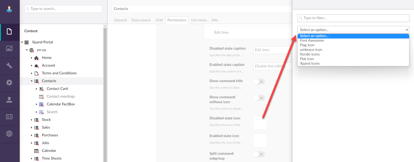
An empty setting where you configure an icon normally means that the default icon will be used. If you decide to configure a different icon, Xpand Portal suggests several icon libraries to choose from.
Icon libraries for front-end controls
The following icon libraries are used for front-end page elements:
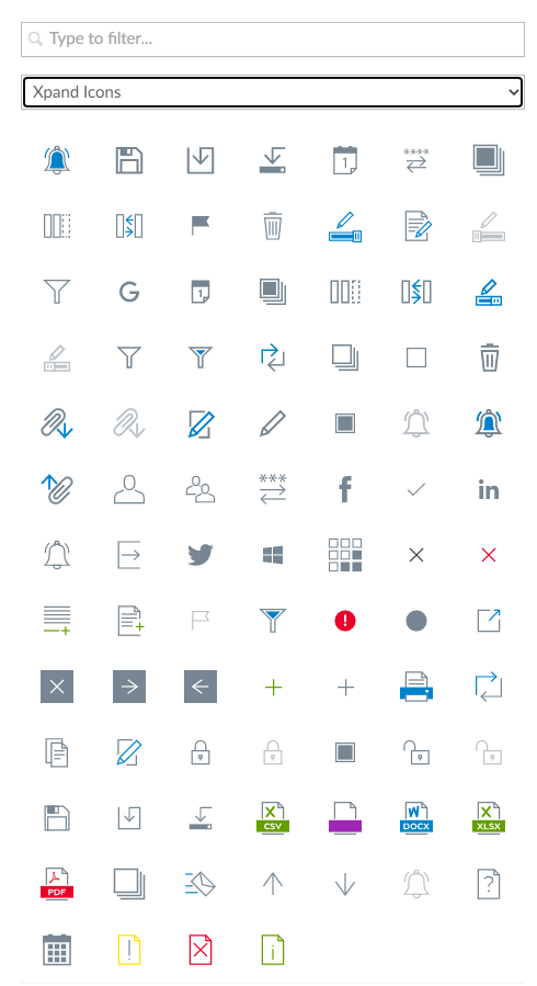
- Xpand Icons (icomoon) - Icons that are based on the Icomoon icon pack. This icon library is suggested by default and is recommended by Xpand in most cases.
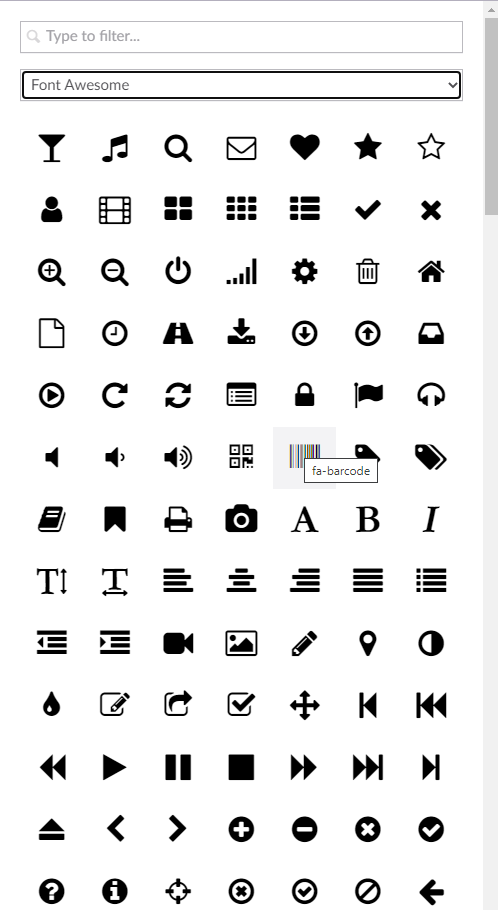
- Font Awesome - An alternative icon pack that can also be used for front-end eleemnts.
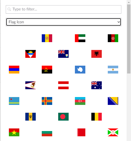
- Flag Icon - This icon is mostly suited for cases when you need to show a flag/country, such as localization-related controls.
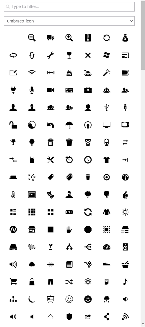
Icon library for CMS only
For back-end elements, a different icon library is used; this library is available only in the application areas where the development teams configures CMS (For example, in Settings > Document Types ...). You can also change the color of the back-end icons.