Release notes for version 4.4.0.0
| Release date | January 29, 2026 |
Version 4.4.0.0 of Xpand Portal introduces the following features and improvements:
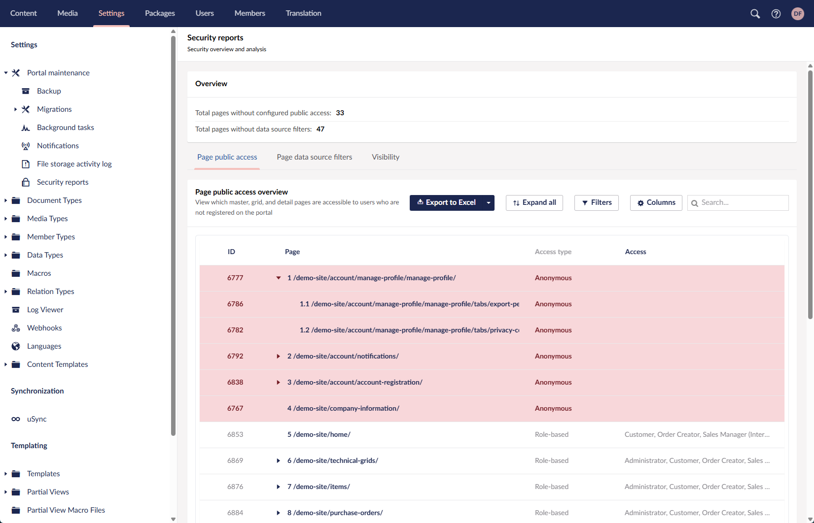
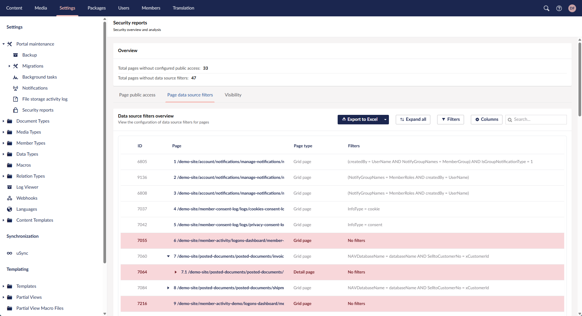
Security dashboard
With Xpand Portal, we take data security seriously and continuously look for ways to improve it. In this release, we’re introducing the Security dashboard — a centralized page that gives you a clear overview of security-related settings at a glance.
Because access to data is governed by multiple settings across the portal, the Security dashboard brings everything together in one place. It allows you to review key security configurations and quickly navigate to the relevant pages to make changes when needed.
With reports on the Security dashboard, you can:
- Review public access settings
See which master, grid, and detail pages are accessible to anonymous users, or — when role-based access is applied — which user roles have access to each page.
- View configured data source filters
Get an overview of all data source filters currently applied to pages.
- Check visibility permissions
Inspect visibility settings for pages (including menu items) and individual page parts.
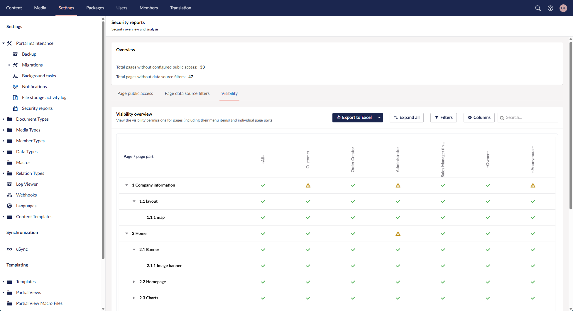
Across all security reports, you can export data to Excel, expand or collapse nodes, and customize the view using filters, column visibility, and column width. Selecting a page or page part takes you directly to the corresponding settings page, where you can adjust the related security configuration if necessary.
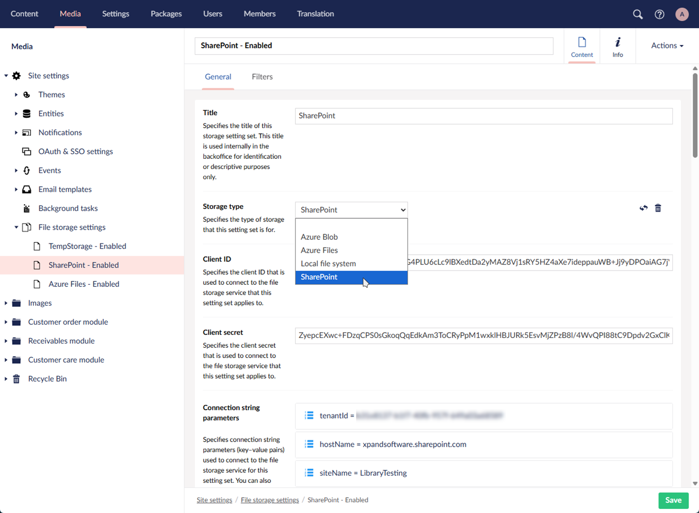
Integration with online file storage services
Xpand Portal now supports storing all files uploaded through the portal using configurable file storage services. You can choose to store files on the local file system or integrate with external file storage services, depending on your infrastructure and requirements.
Out of the box, Xpand Portal provides integration with Azure Files, SharePoint, and Azure Blob, with the local file system available as an alternative storage option. The storage architecture is extensible, allowing additional file storage services to be added in the future if required.
This storage mechanism is applied consistently across the portal, regardless of where files are uploaded. When an external storage service is configured, uploaded files are stored outside the portal while remaining fully accessible from portal pages and workflows.
Xpand Portal also supports multiple file storage configurations. By using filters, you can route uploaded files to different storage locations based on configurable conditions, enabling flexible storage strategies for different types of content.
File storage activity log
Integration with file storage services includes a File storage activity log that provides visibility into file storage operations across all configured storage services. When the debug mode is enabled, the log captures statistics and registers detailed entries for file-related events.
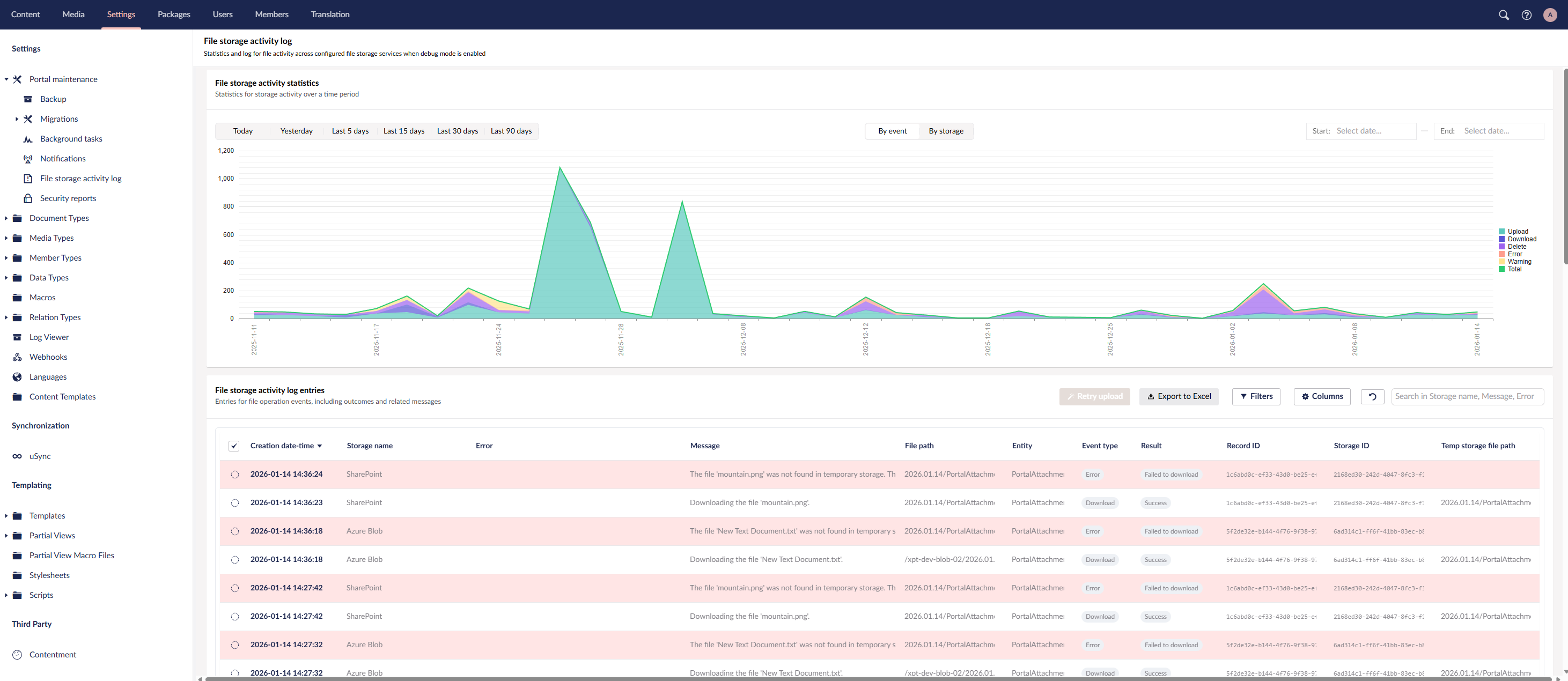
With the File storage activity log, you can:
- View statistics for file storage activity over a selected time period.
- Analyze activity grouped by storage type or event type.
- Review detailed log entries for all file storage events, including the event result and related messages.
- Retry uploading files that failed during upload.
- Customize the log view by setting filters, adjusting visible columns, and changing column width.
The File storage activity log helps administrators monitor storage behavior, troubleshoot errors, and verify that file operations are processed as expected.
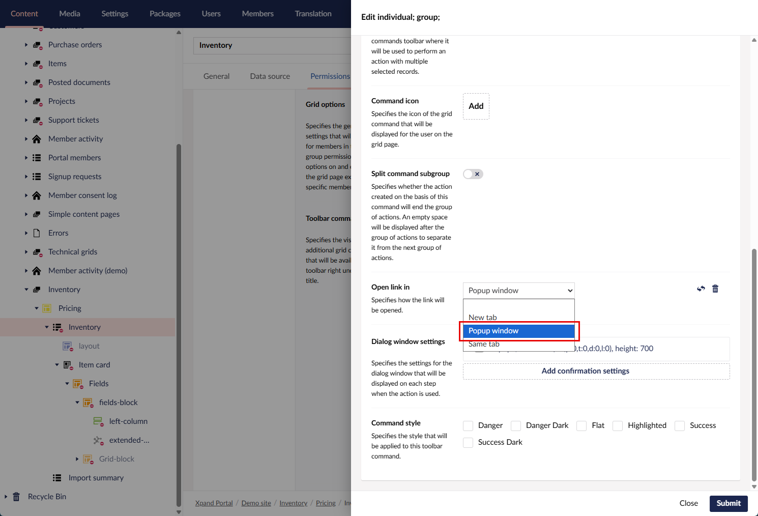
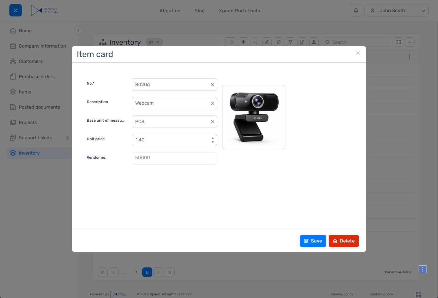
Pages in pop-up windows
To support scenarios where users need to quickly enter or preview data without leaving the current page, we’ve added the ability to open portal pages in pop-up windows.
A new option has been added to the hyperlink settings (for example, within field data format string settings or settings of certain page actions), allowing you to open any portal page or external URL in a pop-up window.
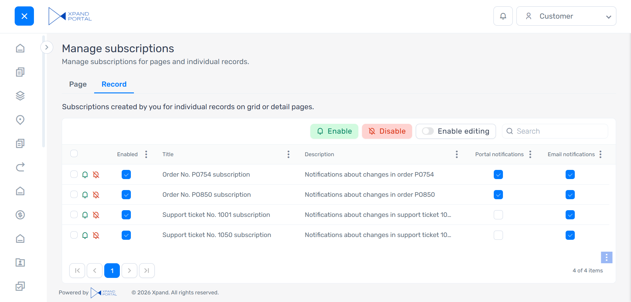
Simplified notifications subscription management
We made a number of improvements to the process of managing notifications from the member profile menu (Your profile > Manage subscriptions) to make it clearer and easier to use.
A new default member role: Subscription Manager
Members with this role can view both page-level and record-level subscriptions and have extended permissions to create and edit page-level subscriptions. This role is designed for scenarios where certain members need to manage page-level subscriptions, which are assigned to member roles, without having full administrative access.
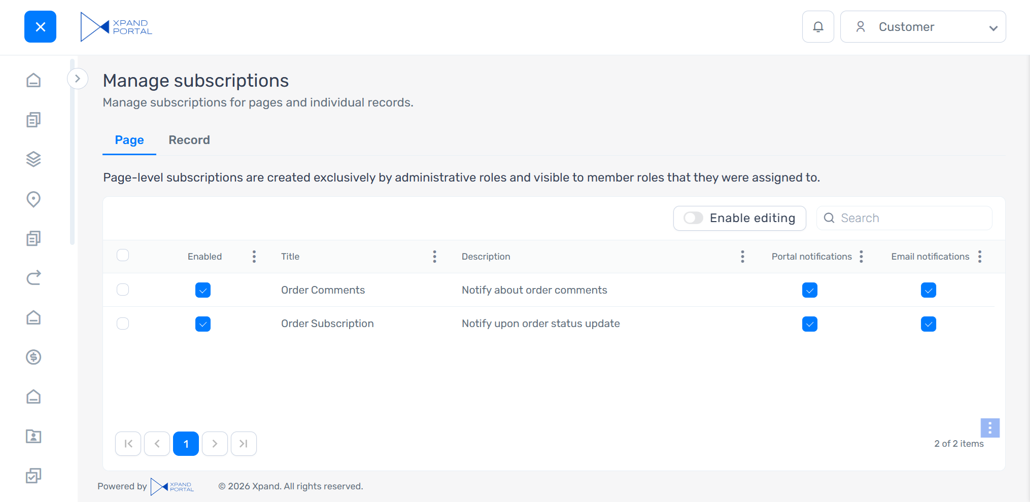
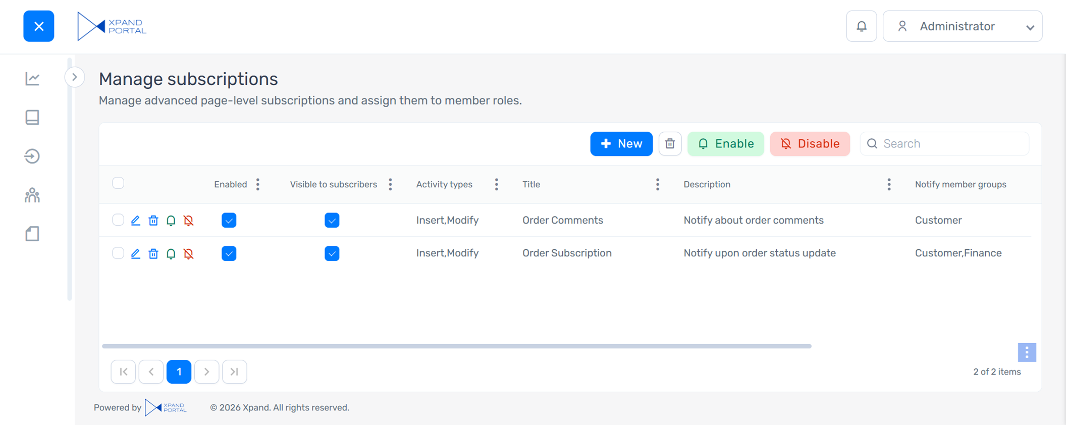
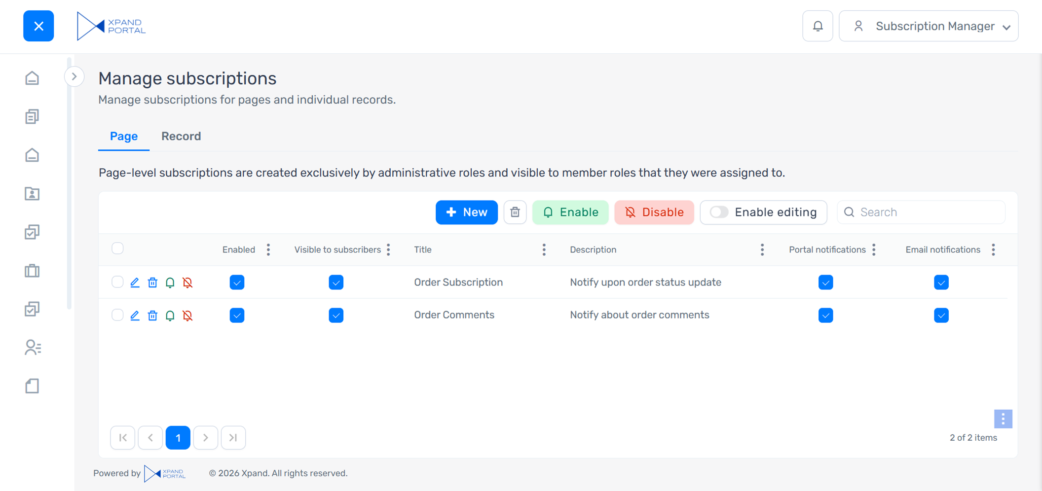
The Manage subscriptions page improvements:
- Improvements for all member roles:
- The default layout and captions were revised to simplify the subscription management experience.
- New actions allow members to enable or disable subscriptions directly from the Manage subscriptions page, in addition to the existing check boxes for disabling specific notification types.
- To efficiently use portal resources, direct subscriptions are automatically cleaned up:
- Direct subscriptions that are disabled or have both portal and email notifications turned off are automatically deleted the next day.
- Direct subscriptions are deleted after 30 days, even if they remain enabled.
- The Title and Description columns are now automatically populated using the pattern configured for the Notifications action on the portal page where the subscription was created. For this, two new action settings, Subscription title and Subscription description, were added. These settings support variables, allowing subscription titles and descriptions to be context-specific and easier for members to understand.
- To simplify the subscription management for non-administrative members, in the default portal configuration, the ability to create advanced page-level subscriptions (with conditions that are configured on the subscription card) is now available only for administrators and subscription managers.
- Improvements for administrators and subscription managers:
- A new Visible to subscribers check box was added to the subscription card as well as Manage subscriptions grid. This option allows administrators and subscription managers to control whether a subscription is visible to subscribers on the Page tab of their Manage subscriptions page.
Business member’s view (not administrator or subscription manager):
Administrator’s view:

Subscription manager’s view:
|
These configuration changes apply to new portal installations. To upgrade an existing installation, you’ll need to add the new role and restore the corresponding content using the files provided in the release package. |
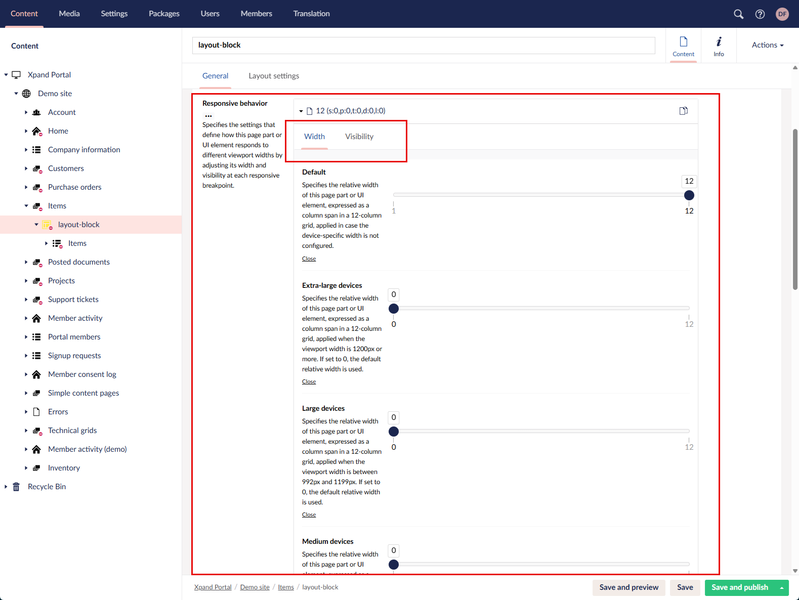
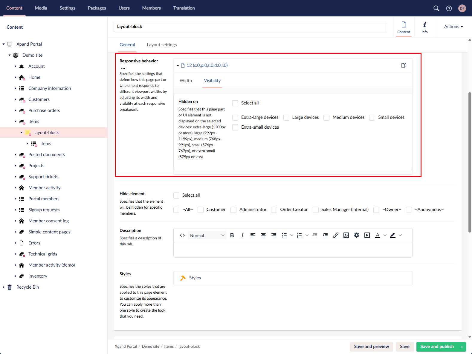
Overhauled responsive behavior settings
We revised and expanded the responsive behavior settings. Previously, you could configure only the relative width of a UI element for different devices (viewports). You can now also control element visibility by hiding it for specific viewport widths.
We also updated the layout, captions, and descriptions of these settings for improved clarity and usability.
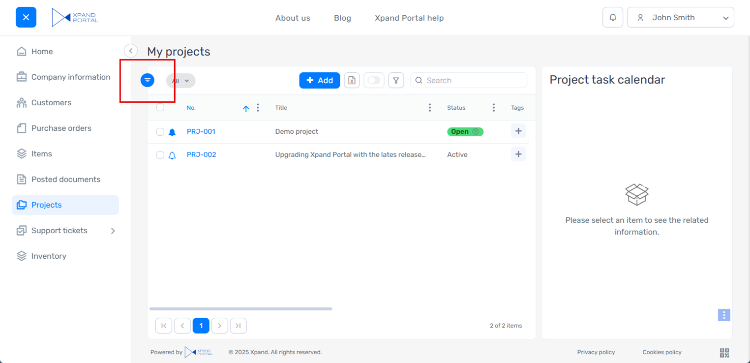
Optimized space for horizontal collapsing/expanding
To further optimize space usage, we refined the UI for horizontally collapsing and expanding page parts. Previously, the Expand action icon for a collapsed page part was positioned near the part itself, which consumed more horizontal space than desired.
In the updated design, the Expand action icon is placed directly on the page part’s border line, reducing visual clutter and making better use of available space.
Old version:
New version:
Minor improvements
- [Umbraco] Updated Umbraco to version 13.13.0.
- [Act on behalf] Improved the "Act on behalf" functionality:
- Now when acting on behalf of somebody, the permissions of the actor are applied (previously, the permissions of the member on behalf of whom you were acting were used).
- If the member who is acting on behalf of another member creates a new record, the following fields show information about the record creator:
- Created by - Shows the member on behalf of whom the record creator was acting.
- Created by representative - Shows the member who acted on behalf of another member.
- If you close the browser while acting on behalf of another member, a confirmation message will be displayed the next time you open a portal page asking you whether you want to want to continue acting as another member.
- New member fields were added that allow configuring member groups or individual members that the member is allowed or disallowed to act on behalf of.
 Note
NoteThe configuration changes, related to the “act on behalf” functionality, apply to new portal installations. To upgrade an existing installation, you’ll need to restore the corresponding content using the files provided in the release package.
- [Validation] Added validation to the Field name setting to prevent digits as the first character. Field names must start with a letter.
- [Configuration packages] Adjusted the package installation process to include processing of configuration changes.
- [License] Corrected grammar and wording in the license expiration reminder and added the exact expiration date.
- [Notifications] Added a progress bar with statistics for the cleanup of notifications and related log entries.
- [Export] Updated the default action icon that is used for the CSV export type in the Export grid action for a more suitable one.
- [Dictionary] Corrected the structure of the dictionary items related to the “act on behalf” functionality.
- [Page actions] Updated the icons for some grid and detail actions shown in the side panel when adding a new action to a page, to better represent their functionality.
- [Captions and descriptions] Corrected the caption for the Smooth collapsing/expanding layout block setting.
- [Captions and descriptions] Revised an inaccurate description of the Email template setting group in the Password recovery page settings.
- [Captions and descriptions] Revised the captions and descriptions of the drag-and-drop-related settings to improve wording and clarity.
- [Captions and descriptions] Revised several captions in the global filter settings for consistency and clarity.
- [Captions and descriptions] Revised a validation-related setting caption and description in the Import action settings to improve clarity.
- [Captions and descriptions] Revised the description for the Allowed file types setting for a field with the Image uploader or File uploader data type in an extended field to ensure the correct supported file extensions are listed.
- [Captions and descriptions] Corrected the Login setting in the member settings in the backoffice. Now the captions for the Login setting in the member settings and the caption for the Sign in button that signs you in to the backoffice are separated (initially the caption was shared; however, two different captions were required in these places).
- [Captions and descriptions] Revised several captions and descriptions in the Delete account page settings.
- [Captions and descriptions] Revised a caption in OAuth 2.0 Authentication settings to more accurately reflect its functionality.
- [Captions and descriptions] Revised captions, descriptions, and tooltips in Settings > Portal maintenance > Migrations to improve clarity.
- [Captions and descriptions] Revised the text that is shown in an extended field with the Image uploader data type when there are no files uploaded yet to correct grammar and improve wording.
- [UI] Adjusted the spacing between the grid border and various grid elements.
- [UI] Adjusted the alignment of the Sign in and Sign up buttons in the header.
- [UI] Adjusted the width of certain confirmation messages that are related to the “act on behalf” functionality.
- [UI] Added spacing between page parts in scenarios when they were too close to each other.
- [UI] Adjusted the alignment of the Expand/Collapse action icon in the menu.
- [UI] Removed an obsolete menu item, which is no longer used: Media > Site settings > Background tasks.
- [Themes] Updated the footer color in the Svitiaz (Dark Blue) theme to make it suitable for the dark theme.
- [Themes] Updated the background color of the saving status popup in the Svitiaz (Dark Blue) theme to make it more suitable for this theme.
- [Themes] Updated the font color in promoted filters in the Svitiaz (Dark Blue) theme to make it readable and suitable for this theme.
- [Themes] Updated the icons in the message header in the Svitiaz (Dark Blue) theme to make them readable and suitable for this theme.
- [Themes] Updated the icon that shows the number of notifications and the font in the portal notifications pane in the Svitiaz (Dark Blue) theme to make them readable and suitable for this theme.
- [Themes] Updated the hover font color for grids in the Svitiaz (Dark Blue) theme to make it more suitable for this theme.
- [Themes] Updated the background color for the filters pane (with filter expressions) in the Svitiaz (Dark Blue) theme to make it more suitable for this theme.
Fixed issues
- [Filters] Fixed an issue where constant values were displayed incorrectly in filters for the fields with the Decimal type.
- [Cookies consent log] Fixed an issue where the cookies consent expiration date was not displayed in the cookies consent log.
- [Entity fields] Fixed an issue where the fields available for selection in the Value field name and Sort-by field name lookup settings of an entity field were not filtered by the specified lookup entity.
- [Display mask] Fixed an issue where the display mask of a field didn’t work correctly.
- [Data masking] Fixed an issue where data masking did not work on detail pages. Note that if data masking is used, the field data type must be String; otherwise, the field value will be empty.
- [Value formatting] Fixed an issue where field value formatting wasn’t applied if the condition for its usage was based on a value with specific characters.
- [License] Fixed an issue where the license expiration reminder could not be closed on the first attempt.
- [Notifications] Fixed an issue where the notifications didn’t work due to a scope-related error.
- [Notifications] Fixed a browser console error that appeared when executing the cleanup of notifications and related log entries.
- [Notifications] Fixed an issue that prevented direct notifications from being processed properly.
- [Background tasks] Fixed an issue where the Optimize-UmbracoNodes background task didn’t run on site startup or after reloading the application. Additionally, fixed an issue where this background task run on every site startup. Now this task runs only once after all packages have been installed.
- [Data synchronization] Fixed errors caused by data synchronization attempts from Business Central during package installation.
- [Validation] Fixed an issue where the configured client-side validation for ensuring unique member logins did not work.
- [Validation] Fixed a validation error that could occur on saving changes in the backoffice when there was more than one setting set added for a setting group that expected only one setting set. Now, an error message is displayed when you try to add more than one setting set where only one set is allowed.
- [Comments] Fixed an issue where the title and subtitle for the Comments page part were not displayed.
- [Act on behalf] Fixed an issue where the member who had been acting on behalf of another member could still see the content for that member after signing out of that role.
- [Data source] Fixed an issue that caused a different entity to be used instead of the one specified as the page data source.
- [Attachments] Fixed an issue where an attachment field from an extended field set was not displayed on the page if the field was configured to be non-editable.
- [Attachments] Fixed an issue where files could not be uploaded using the drop zone.
- [Maximum file size] Fixed in issue where the Maximum file size field setting for a field with the Image uploader or File uploader data type in an extended field set used bytes instead of kilobytes.
- [Related entity page] Fixed an issue where the Related entity > Related entity page setting value in Site settings > Events was not restored during metadata upload.
- [Saving] Fixed an issue where changes could be saved while required fields that allow multiple selections were not filled in.
- [Synchronization] Fixed an issue where changes on the member card were not synchronized properly between the front-end and back-end member cards.
- [Set column visibility] Fixed an issue where the dropdown menu for hiding or showing grid columns in the Set column visibility action was not displayed.
- [OAuth 2.0 authentication] Fixed an issue that caused errors in the log after updating a refresh token for OAuth 2.0 authentication.
- [OAuth 2.0 authentication] Fixed an issue where using the Authorize action in the SMTP OAuth 2.0 authentication settings caused errors when the debug mode was disabled.
- [Password] Fixed an issue where current password confirmation was incorrectly required during a password reset via Forgot password?.
- [Configuration packages] Fixed an issue in configuration packages where the Customer and Project fields were not filled in automatically as expected.
- [Tags] Fixed an error that prevented tags from being added.
- [Backup & Restore] Fixed an issue where the side panel could not be closed after using the Upload archive action on the Backup configurations page in the backoffice.
- [Two-factor authentication] Fixed an issue that prevented the entered two-factor authentication token from being processed correctly, resulting in an inability to sign in when two-factor authentication was enabled.
- [UI] Fixed an issue where the background highlight on hover over content nodes in the backoffice was not updated properly in certain scenarios.
- [UI] Fixed an issue that caused an unnecessary horizontal or vertical scrollbar to appear on a page part where it wasn’t needed.
- [UI] Fixed an issue where the layout elements moved or unexpected UI elements appeared after a dialog or another pop-up window was shown.
- [UI] Fixed an issue where the Maximize/Minimize and Expand/Collapse action icons did not move as expected after the corresponding actions.
- [UI] Fixed an issue where maximizing a grid caused it to cover other UI elements.
- [UI] Fixed an issue where the file extension was not fully visible on an icon in a field with the Image uploader or File uploader data type from an extended field set.
- [UI] Fixed an issue where menu items were displayed incorrectly on hover after scrolling the page to the bottom.
- [UI] Fixed an issue where the header border was displayed incorrectly when scrolling a page.
- [UI] Fixed an issue where the field box was not adjusted properly for multiple values in a field that allows multiple selections.
- [UI] Fixed an issue where the Disable transparency layout block style was not applied.
- [UI] Fixed an issue where the view layout was not updated properly after expanding or collapsing page parts in a scenario when there were multiple collapsible parts on the page.
- [UI] Fixed an issue where the second-level menu was too small for its items, resulting in an undesired scrollbar.
- [UI] Fixed an issue where an unnecessary background was displayed behind the saving status popup.
- [UI] Fixed an issue where the Show more action was not displayed in the comments.
- [UI] Fixed an issue where the values of some log columns in the Notification control panel were incorrectly aligned with the right margin.
- [UI] Fixed an issue where the page part height was lower than expected for two related parts with grids on a single page. With the revised internal logic, to avoid this issue, the page part height should be set manually in such a scenario; otherwise, the default height is used.
- [UI] Corrected action alignment on detail pages in the configuration packages.
- [Themes] Fixed an issue where the Header > Background color setting in theme customization didn’t work correctly.
- [Themes] Fixed an issue where the theme customization was not applied after portal deployment.