Release notes for version 4.5.0.0
| Release date | April 28, 2026 |
Version 4.5.0.0 of Xpand Portal introduces the following features and improvements:
Translation management tool
Managing multilingual portal content is now faster and more consistent with the new Translation management tool.
By default, when a new language is added in the backoffice, a site copy is created with shared nodes and shared settings. However, configuration of non-shared content and translation are still required, which can be time-consuming and error-prone.
The Translation management tool streamlines this workflow by introducing the following capabilities:
- Copy site configuration between languages
Copy the full site configuration from one language to another, overwriting the target configuration, including setting values. This allows you to quickly align languages and use the copied setup as a consistent basis for translation. - Export front-end localization to CSV and import translated values back into the portal
Export all front-end-related values from the Content area and dictionary items into a CSV file, translate or fill them in externally, and import them back into the portal. This provides an alternative to translating directly in the backoffice UI, enables efficient bulk translation in a single place, and simplifies collaboration with translators.
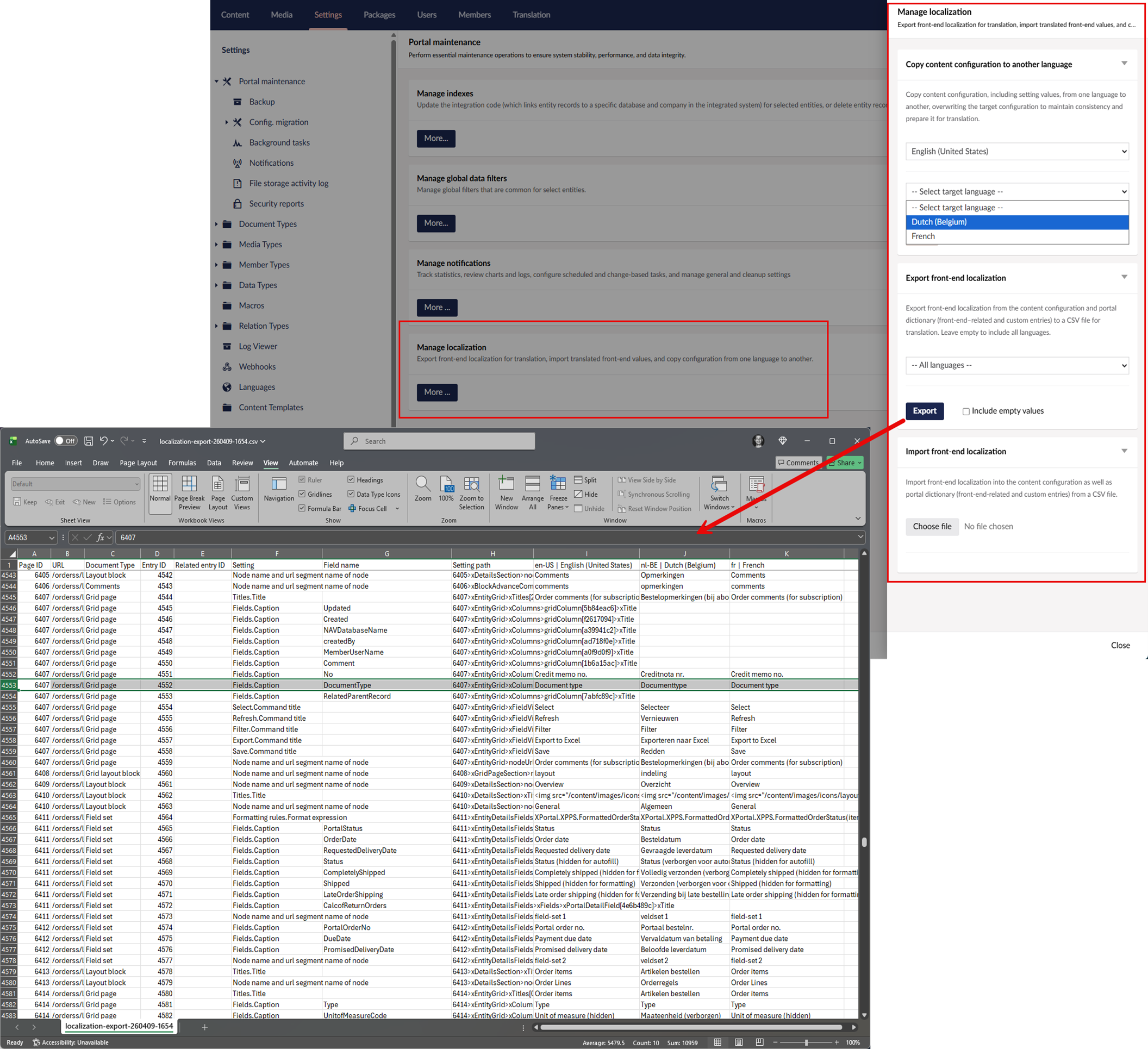
These improvements reduce manual effort, ensure consistency across languages, and accelerate the overall localization process.
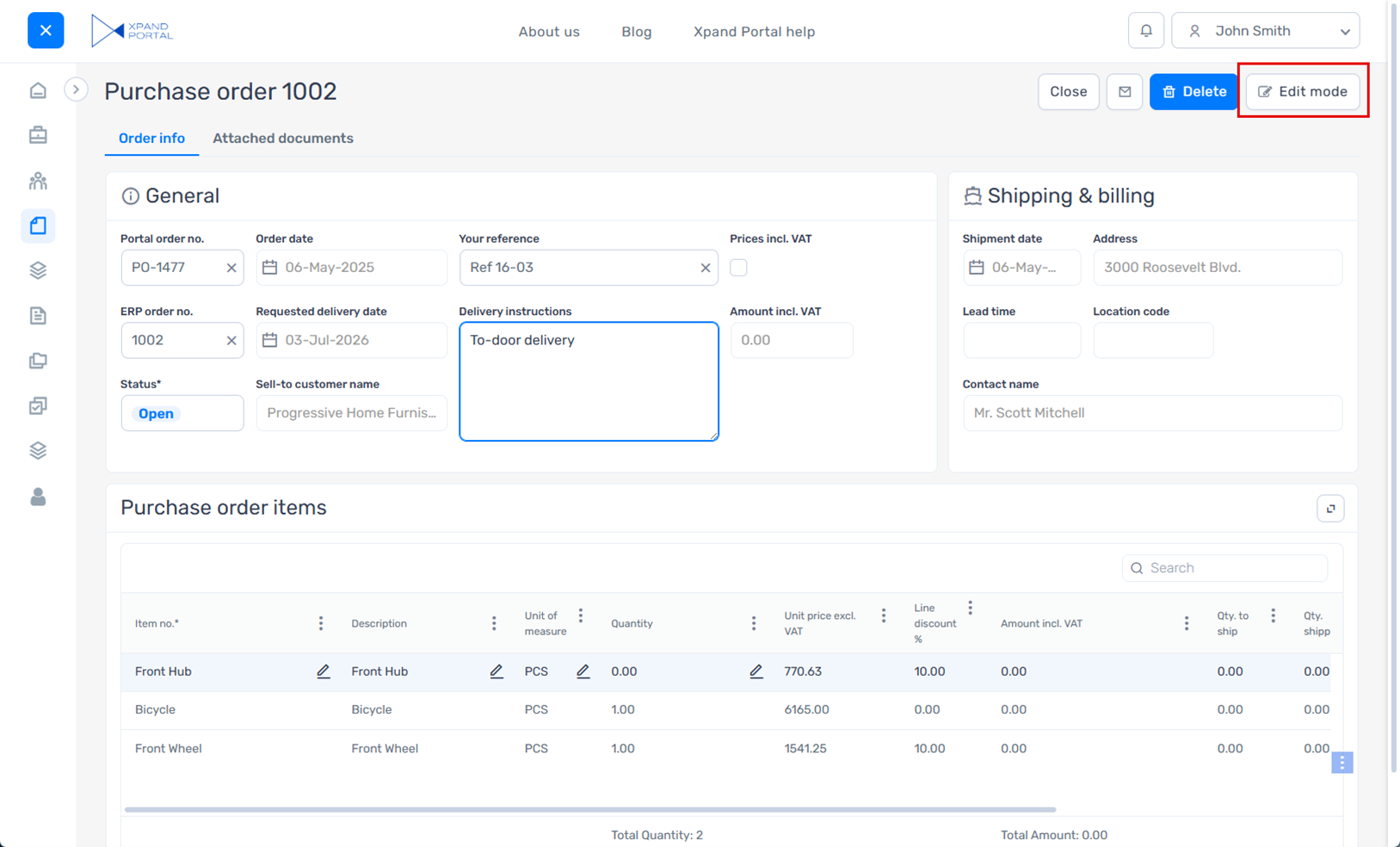
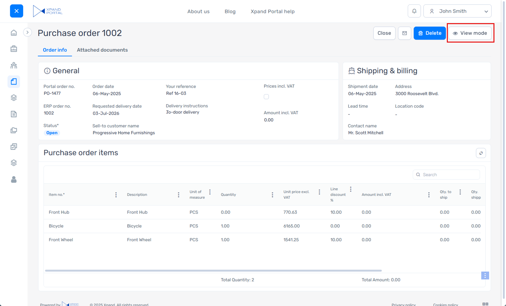
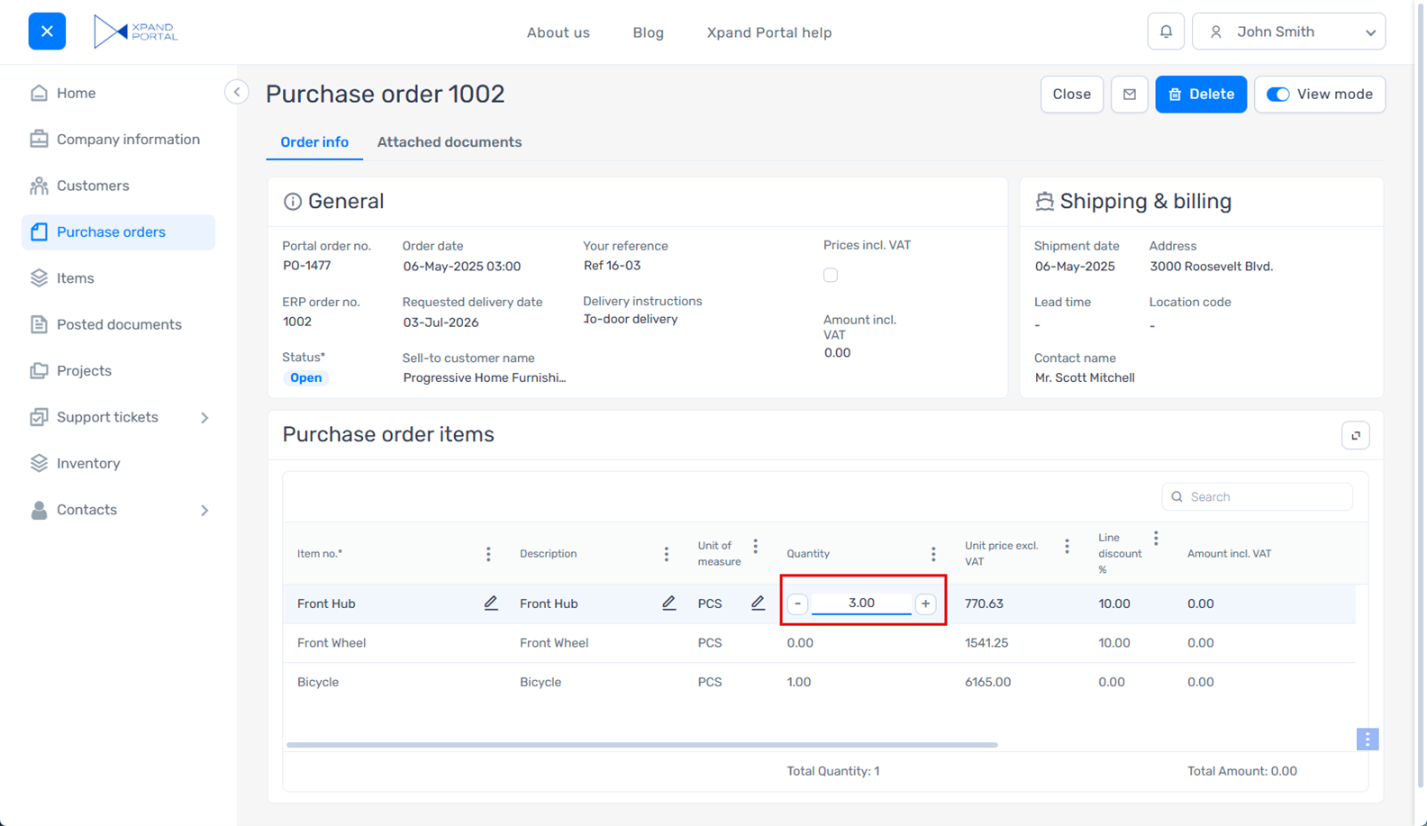
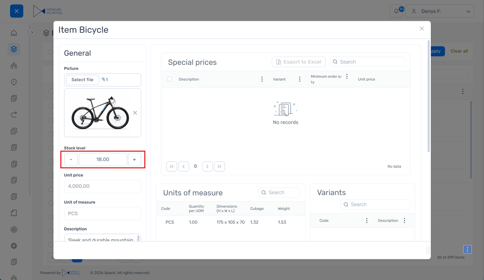
View mode for detail pages
You can now switch between view and edit modes on detail pages, giving you more control over how data is displayed and edited.
Previously, detail pages were always editable, which made it harder to present a clean, read-only view of the data. Even in scenarios where users only needed to review information, all fields and interactive elements remained visible, resulting in a more cluttered interface.
With the introduction of View mode, you can present data in a simplified, read-only layout that reduces visual noise and improves clarity. By hiding editing controls and optionally actions, View mode provides a cleaner and more focused experience for reviewing information, while still allowing users to switch to edit mode when needed.
With this update, detail pages include a new Toggle view mode action that lets you quickly switch between view and edit modes.
In addition to standard action settings, you can:
- Set the default mode
Choose whether a detail page opens in view or edit mode by default. - Apply mode to the entire page
Configure the action so that the selected mode applies to the entire page, including embedded page parts. In this case, the mode controls not only field editability but also the editability of other elements, such as comments, embedded grid, attachments, etc.
In addition, all detail page actions now include an optional setting to hide the action in View mode.
Edit mode example:
View mode example:
A similar capability for switching between modes was previously available on grid pages and is now extended to detail pages, providing a more consistent and flexible user experience across the portal.
Phone number editor data type
A new Phone number editor data type is available for fields in extended field sets, providing a dedicated input for phone numbers with country dialing codes.
This data type presents the field in a phone number–specific format, including country code selection (with flags) and structured input, making it clearer and more intuitive for users to enter phone numbers.
With this data type, you can:
- Control available country codes
Define which country dialing codes are available for selection. - Set a default country code
Preselect a country dialing code for the field. When specified, it overrides automatic country detection. - Enable automatic country detection
Automatically detect the user’s location based on IP and preselect the corresponding country dialing code. - Prioritize frequently used countries
Display selected country codes at the top of the list for quicker access. - Exclude specific countries
Prevent certain country dialing codes from being selected.
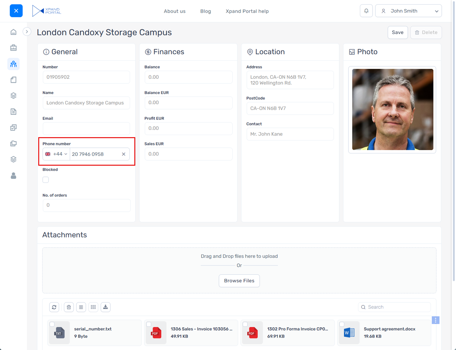
This data type improves clarity and usability when entering phone numbers and helps ensure consistent formatting.
New design for numeric editor
The numeric input control has been redesigned to improve usability and make value adjustment easier.
The updated design features larger, more accessible increment and decrement controls within the field, allowing users to adjust values more comfortably and with greater precision, especially on mobile devices.
The new design is applied consistently across grid and detail pages, providing a more uniform and user-friendly data entry experience throughout the portal.
Compact design for promoted filters when using the wide (horizontal) layout
A new Wide filter-set container style is available for promoted filters when using the wide (horizontal) layout, allowing you to save space while keeping key filters easily accessible.
This style reduces padding and adjusts visual spacing to create a more compact filter pane at the top of the page. To achieve the intended layout, configure the filters accordingly (for example, avoid adding optional elements such as summary items within promoted filter summary, titles, or icons). When set up properly, it helps preserve more space for the grid while still providing quick access to essential filtering options.
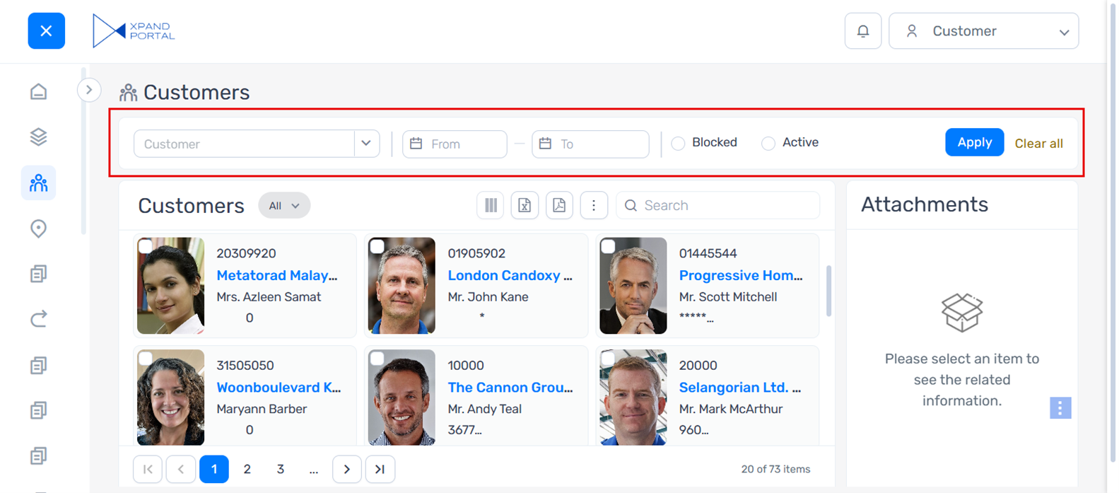
This layout is best suited for scenarios with a limited number of key filters.
The existing (non-compact) layout remains available and can still be used where more space or additional elements are required.
Right-side view style for popup windows
An enhanced display option is now available for pop-up windows, extending the existing Pages in pop-up windows functionality.
A new Right-side view style can be configured within popup window settings in places where the Open link in setting is available (for example, in certain actions).
When applied, the popup window snaps to the right side of the page or to the top-right corner (depending on the popup window height). If the height is not specified, the popup appears as a panel that occupies the full height of the page, providing more usable space while keeping the context of the underlying page visible.
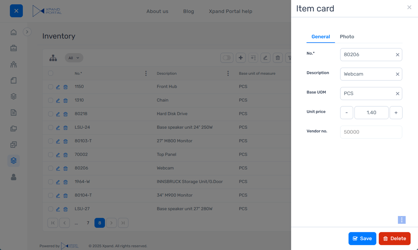
This style is especially useful when working with lists or forms with many fields, as it allows for more focused data entry without navigating away from the current page.
Other improvements
- [Umbraco] Updated Umbraco to version 13.13.1.
- [Client-side validations] Added a new client-side validation option in field settings that can be used to ensure that the Boolean field is set to True.
- [Dictionary] Added dictionary items for certain text constants that were previously hard-coded so that they can be localized or customized.
- [SMTP/SSO] In SMTP OAuth 2.0 and SSO settings, added a new OAuth prompt type provider-specific setting that allows you to configure what will be shown during authorization. It is used with the Microsoft Entra ID and Google providers. Supported values:
- login – A sign-in window is shown during authorization where the user needs to enter account credentials.
- select_account - An account selection window is shown during authorization where the user selects an account to sign in with.
- consent - A request window is shown during authorization where the user needs to grant permissions to the app.
 Note
NoteThe standard none type is not used in Xpand Portal.
- [SMTP/SSO] To enhance security, the client secret from the SMTP OAuth 2.0 and SSO settings is now also encrypted in the portal JSON configuration file. The SMTP legacy authentication password has been removed from the configuration file because it is not used there.
- [API] To extend the integration capabilities, added the ability to authenticate on the portal through Xpand Portal API using additional authentication flows: authorization code without PKCE, password credentials, and client credentials (in addition to the authorization code with PKCE flow, which was already available).
- [Client events] Added support for client events to directly refresh a grid field and display its current value.
- [Client events] Added support for fields to look up values provided by client events.
- [Grid] Added the ability to display the grid title as a tooltip on hover, which can be useful when it is too long to fit within the available space.
- [Two-factor authentication] Added an error message that is shown when the entered two-factor authentication verification code is not valid.
- [Extended field sets] Revised the icons and their colors in the menu for selecting a data type of a field in an extended field set to better reflect actual behavior, improve consistency, and support faster navigation.
- [Captions, descriptions, and messages] In the email notification template settings and portal notification template settings (Site node > Templates tab), revised the shared caption and description of the Update where-used places action to improve clarity and correct grammar.
- [Captions, descriptions, and messages] Revised the text of error messages that are shown when the maximum allowed number of setting sets is exceeded and when at least one setting set is required but hasn't been configured.
- [Captions, descriptions, and messages] Revised the text that is shown during the notification cleanup process in the Notifications Control Panel to improve wording and clarity.
- [Captions, descriptions, and messages] Revised several SMTP-related settings to improve clarity.
- [Captions, descriptions, and messages] Revised several captions and descriptions in the Notifications action settings to improve clarity and better reflect the actual behavior.
- [Captions, descriptions, and messages] Revised the description of the Critical Error Notification Recipients setting in Media > Site settings > Notifications > Notification settings tab to correct grammar and improve clarity.
- [Captions, descriptions, and messages] Revised the caption and description of the Disabled weekdays setting in the Calendar control data type settings for fields in an extended field set to improve clarity.
- [Captions, descriptions, and messages] Revised the captions and descriptions of several settings for the Single value picker and Multiple value picker data types in extended field sets to improve clarity and better reflect the actual behavior.
- [Captions, descriptions, and messages] Revised the captions and descriptions of the settings in the menu for export/import of the dictionary to improve grammar, consistency, and clarity.
- [Captions, descriptions, and messages] Revised the caption and description of the Position setting within the grid layout block settings to improve clarity and better reflect the actual behavior.
Security and maintenance
As part of this release, all Xpand Portal components listed in the XPT - Vulnerability Scan Report.xlsx file (included in the release package) have undergone a routine vulnerability check. Where necessary, components have been updated to newer versions to ensure security and stability.
Fixed issues
- [Layout blocks] Fixed an issue where the action icon did not move as expected after maximizing or expanding a layout block.
- [Responsive behavior] Fixed an issue where an outdated version of the caption and description for the Responsive behavior settings was still displayed in certain backoffice areas.
- [Personalized views] Fixed an issue where promoted filters displayed data incorrectly after saving a personalized view for the related page.
- [Fields] Fixed an issue where fields from an extended field set were not displayed on a page in certain scenarios.
- [Fields] Fixed an issue where field value was not auto-filled properly on a new record.
- [Fields] Fixed an issue where a field dropdown could not be opened.
- [Fields] Fixed an issue where the time zone offset from the member card settings was not applied correctly when saving values in a DateTime field.
- [Fields] Fixed an issue where an image uploaded to a field with the Image uploader data type was not displayed until the changes were saved.
- [Fields] Fixed an issue where aggregation was not calculated correctly in a field value.
- [Fields] Fixed a cache-related issue where fields added to a portal entity and configured on a page were not visible on the front end.
- [Fields] Fixed an issue where the .pdf file format was not allowed for uploading in fields with the File uploader data type in extended field sets even though this file format is supported.
- [Fields] Fixed an issue where the calendar control in a date field within an extended field set could not be edited properly and displayed an unexpected tooltip on hover.
- [Fields] Fixed an issue where grid fields were not auto-filled correctly.
- [Lookup] Fixed an issue where the Value from entity lookup filter didn’t work correctly.
- [Promoted filters] Fixed an issue where the filter value placeholder text was not displayed when the filter was configured to look up its value.
- [Promoted filters] Fixed an issue where the action to clear the field value was not displayed for date fields in promoted filters.
- [Promoted filters] Fixed an issue where data was not filtered correctly if the filter value contained special characters.
- [Promoted filters] Fixed an issue where values in a promoted filter with multiple selections were not cleared after using the Clear all action.
- [Validation] Fixed an issue where email validation did not work consistently when changing a field value and when saving changes on a page. Updated the accepted email formats to align with RFC 5322.
- [Validation] Fixed an issue with validation of letter-only and Latin-only field values to allow whitespace characters and, for Latin letters, specific Unicode symbols.
- [Validation] Fixed an issue where space was incorrectly treated as a special character during validation.
- [Validation] Fixed an issue where validation of the uniqueness of the member’s login and email did not work as expected in certain scenarios.
- [Two-factor authentication] Fixed an issue where the session expired faster than expected, requiring re-entry of the two-factor authentication token.
- [Client events] Fixed an issue where client events triggered autosave while the user was editing a grid field.
- [Client events] Fixed an issue where decimal formatting did not work due to URL encoding.
- [Actions] Fixed an issue where the Complex Delete action didn’t work correctly.
- [Members] Fixed an issue that prevented member registration through a registration request.
- [Grid] Fixed an issue that caused an error in the log after publishing a grid page.
- [Simple content page] Fixed an issue that caused errors in the console after adding a Simple content page node to the portal site.
- [Integration] Fixed an issue where the record creation date was unexpectedly updated after receiving an update for that record from Business Central.
- [File storage] Fixed an issue where files were not removed from temporary storage after being uploaded to the target online storage.
- [Saving] Fixed an issue where the page could enter a loop and continuously attempt to resave changes in certain scenarios.
- [SSO] Fixed an issue where a member was prompted to select multiple Microsoft accounts during SSO if they were authenticated with more than one account.
- [SSO] Fixed an issue where SSO-related errors were not displayed on the front end.
- [Performance] Fixed an issue where a very large file storage activity log caused performance and stability issues on the portal.
- [Packages] Fixed an issue that caused errors during package installation.
- [CSS] Fixed an issue where Umbraco .css files were not compiled after deployment.
- [Calendar] Fixed an issue where the Calendar page could not be opened.
- [Health Check] Fixed various configuration, security, services, and uSync issues reported by the built-in Health Check tool.
- [Localization] Fixed an issue that prevented navigation from a front-end page to the corresponding backoffice page when more than one language was configured on the portal.
- [Localization] Fixed an issue where field captions in a detail page field set were not updated to the corresponding localization when switching languages
- [Localization] Fixed an issue where an invitation email for a new member contained the link to a portal site with a wrong localization. Now, if the localization is not configured for the member who is being invited, the localization for the link in the invitation email is determined as follows:
- If the invitation email is sent from the front end, the invitation email will contain a link to a site with the localization of the member who sent the invitation.
- If the invitation email is sent from the backoffice, the invitation email will contain a link to a site with the default localization (en-US).
- [UI] Fixed an issue where an unexpected scrollbar appeared in promoted filters under certain conditions.
- [UI] Fixed an issue where a dropdown from a child grid page was displayed on a page in certain scenarios with validation was triggered.
- [UI] Fixed an issue where the loading animation appeared in an unexpected location when navigating between pages and quickly scrolling down.
- [UI] Fixed an issue where unnecessary vertical and horizontal scrollbars appeared in the information message window after a successful password change.
- [UI] Fixed an issue where the background partially remained in the foreground when the Change Password dialog window was displayed.
- [UI] Fixed an issue where the error message was not displayed correctly when attempting to reset a password using an email address not registered to any portal member.
- [UI] Fixed an issue where layout block size was not adjusted properly on a page under certain conditions.
- [UI] Fixed an issue where the Apply all and Clear all actions from summary items in promoted filters were not displayed.
- [UI] Fixed an issue where page actions were displayed in incorrect positions on a page.
- [UI] Fixed an issue where the footer of a page in a popup window was displayed when it was not necessary.
- [UI] Fixed an issue where the member profile menu was displayed behind page actions instead of in the foreground after selecting a menu item.
- [UI] Fixed an issue where the layout of a layout block with the Accordion view type did not appear as expected.
- [UI] Fixed an issue where the value in a non-editable field was not vertically centered.
- [UI] Fixed an issue where the spacing between the field caption and the extended field was larger than expected.
- [UI] Fixed an issue where the spacing between the field caption and the checkbox for a Boolean field was larger than expected.
- [UI] Fixed an issue where the spacing between the home tile caption and its data was larger than expected.
- [UI] Corrected padding in promoted filters with the wide (horizontal) layout.
- [UI] Removed unnecessary spacing on the right side of the banner.
- [UI] Removed unnecessary spacing between the tooltip box and the tooltip pointer.
- [UI] Removed unnecessary spacing between the menu and the header.
- [UI] Fixed an issue where the clear value and notification icons overlapped in a grid field.
- [UI] Fixed an issue where the field validation error message overlapped with the section border on a page displayed in a popup window.
- [UI] Fixed an issue where the search box on a grid in a popup window was moved below the title in certain scenarios.
- [UI] Fixed an issue where the placeholder text color in promoted filters differed between single- and multiple-choice filters.
- [UI] Fixed an issue where layout blocks on a detail page were misaligned in certain scenarios.
- [UI] Fixed an issue where the calendar control in a field was rendered behind the page action buttons.
- [UI] Fixed an issue where the Expand action icon was not centered when the layout block was collapsed.
- [UI] Fixed an issue where detail page actions changed position after performing actions when tags were present on the page.