Configuring grid options
Grid options allow you to hide or configures various grid page features. These grid options are divided into two categories:
- Grid options that are applied to the grid only for members of specific member groups—these grid options are configured through page permissions when you are creating or editing an existing grid page. This makes it possible to configure portal grid pages in such a way that portal members will have access only to page features, which are allowed for the member group they are assigned to. You can have several sets of permissions and each set may have its own general page settings.
- Grid options that are applied to the grid for all members regardless of the member group they belong to.
The sets of of options for member groups and all members are different. Most options are configured for all member groups.
Grid options for member groups
To configure grid options that are available for specific member groups:
- When you are creating or editing a grid page (a page with the
 icon), on the Permissions tab, under Member group permissions, select Add Permission to create a new permission set.
 - Under Member group, select one or several member groups, for which the general page settings below will be applicable. Alternatively, you can select the ~All~ check box to have the settings below applicable for all member groups (without the necessity to select every member group's check box) or select the Member Group check box to have all member groups selected at once.
- After you have specified the member group(s), under Grid options, configure page settings that will be applicable for the specified member groups:
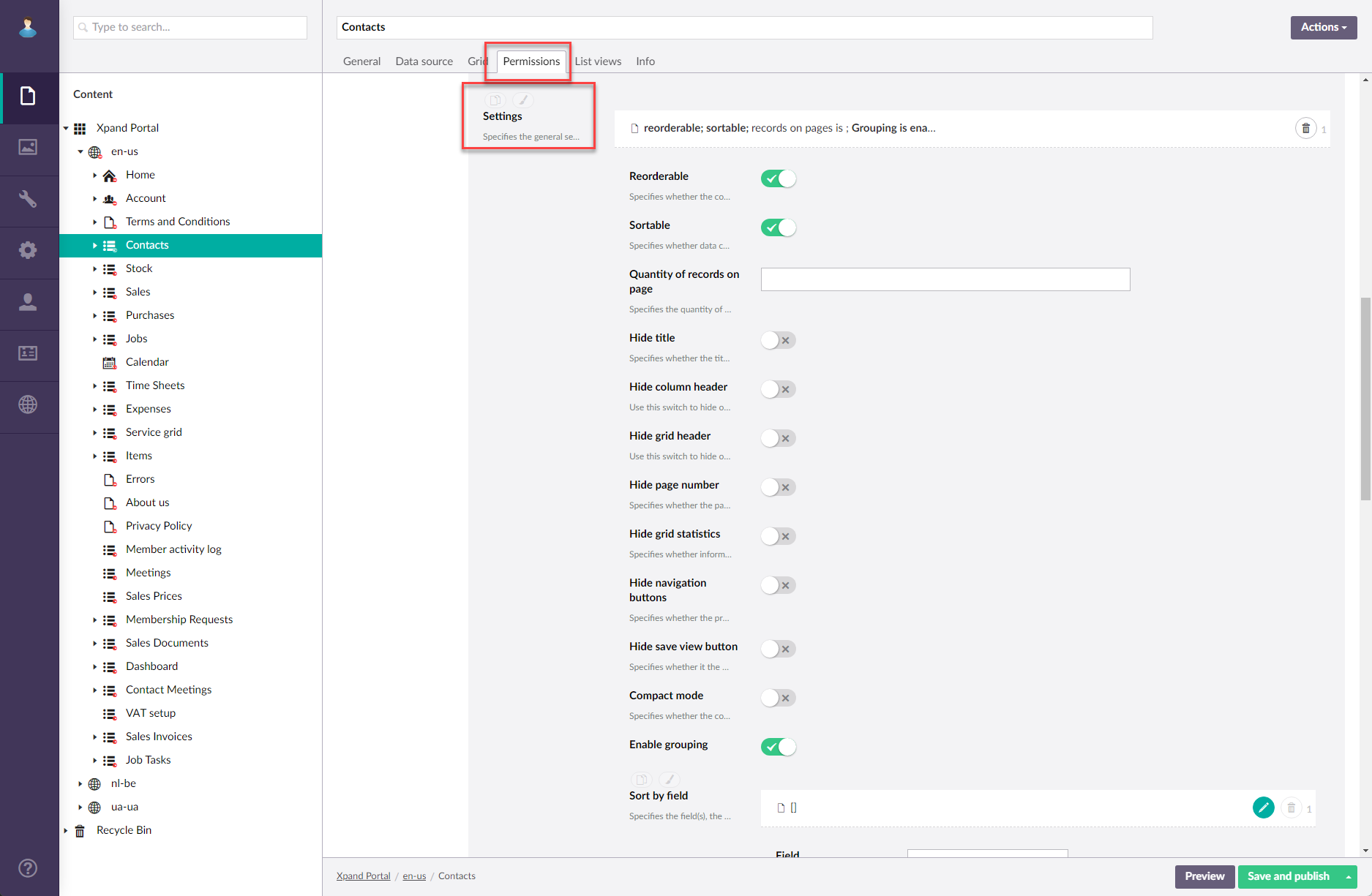
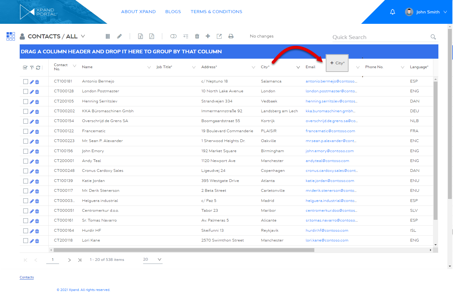
You can configure the following general grid options for specific member groups:- Enable grouping - Use this switch to enable or disable the ability to group data by column.
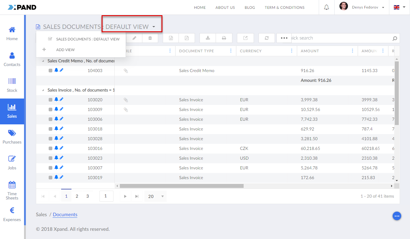
- Hide save view button - Use this switch to hide or make visible again the action that allows the portal member to save the current view (after it has been personalized) as well as select a previously saved view or switch back to the default view.
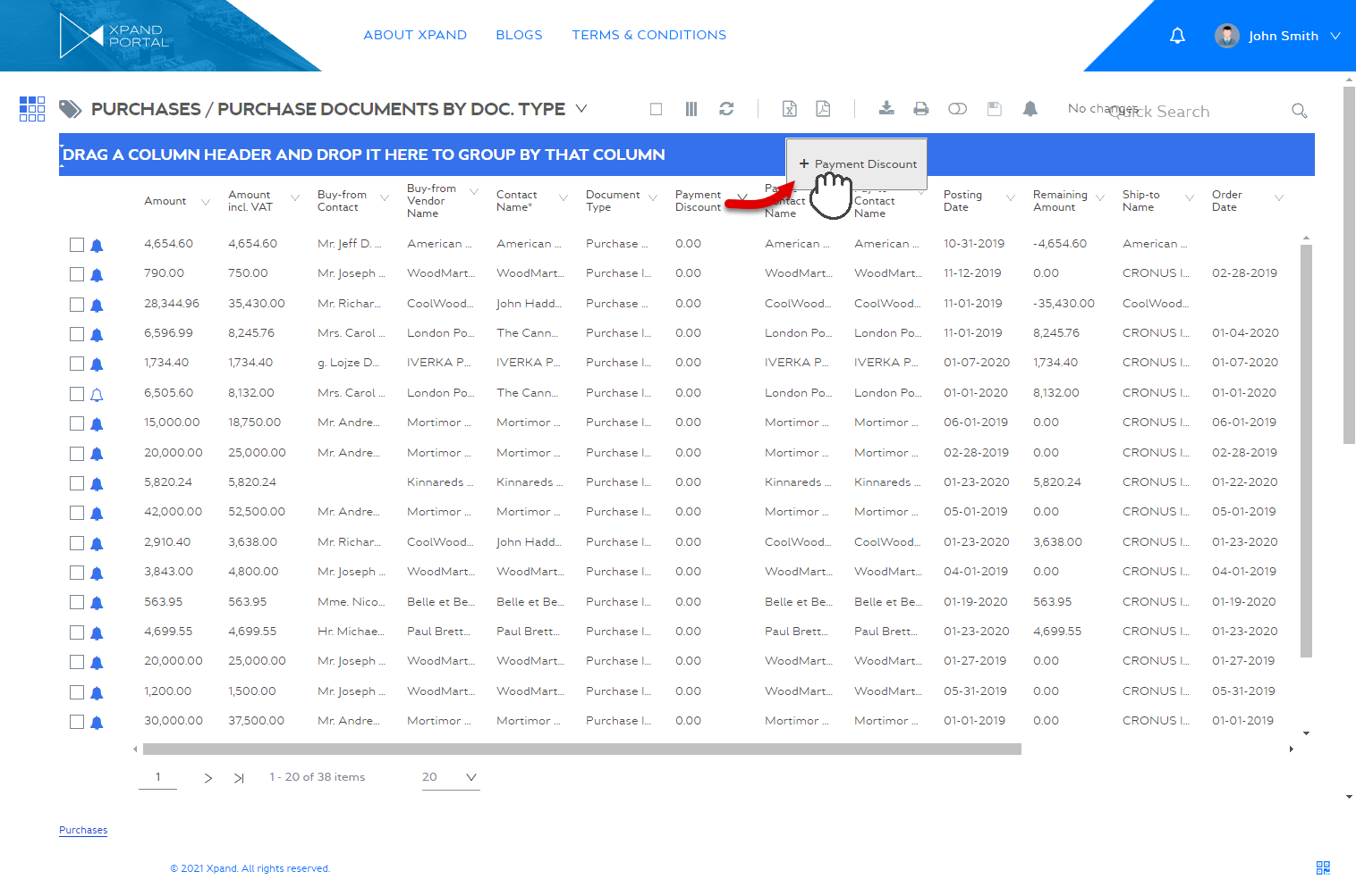
- Enable grouping - Use this switch to enable or disable the ability to group data by column.
- Optionally, you can create another permission set with other grid options.

- Select Save and publish to save the changes and publish them on the front end. Optionally, if you were editing the page, you can select Save and preview to preview how the page will look like on the front end.
Grid options for all members
To configure grid options that are available for all members regardless of the member group(s) they belong to:
- When you are creating or editing a grid page (a page with the
 icon), on the Grid tab, under Grid options select Grid options to configure grid features that will be available for all members regardless of the member group(s) they belong to.
 - After you have specified the member group(s), under Grid options, configure page settings that will be applicable for the specified member groups:
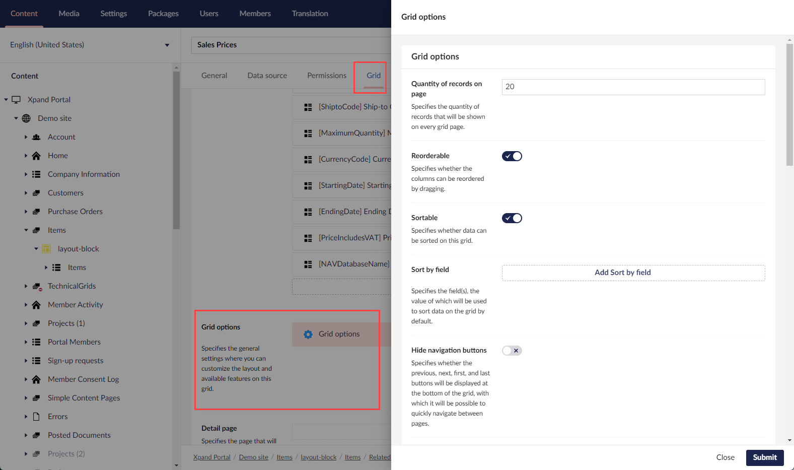
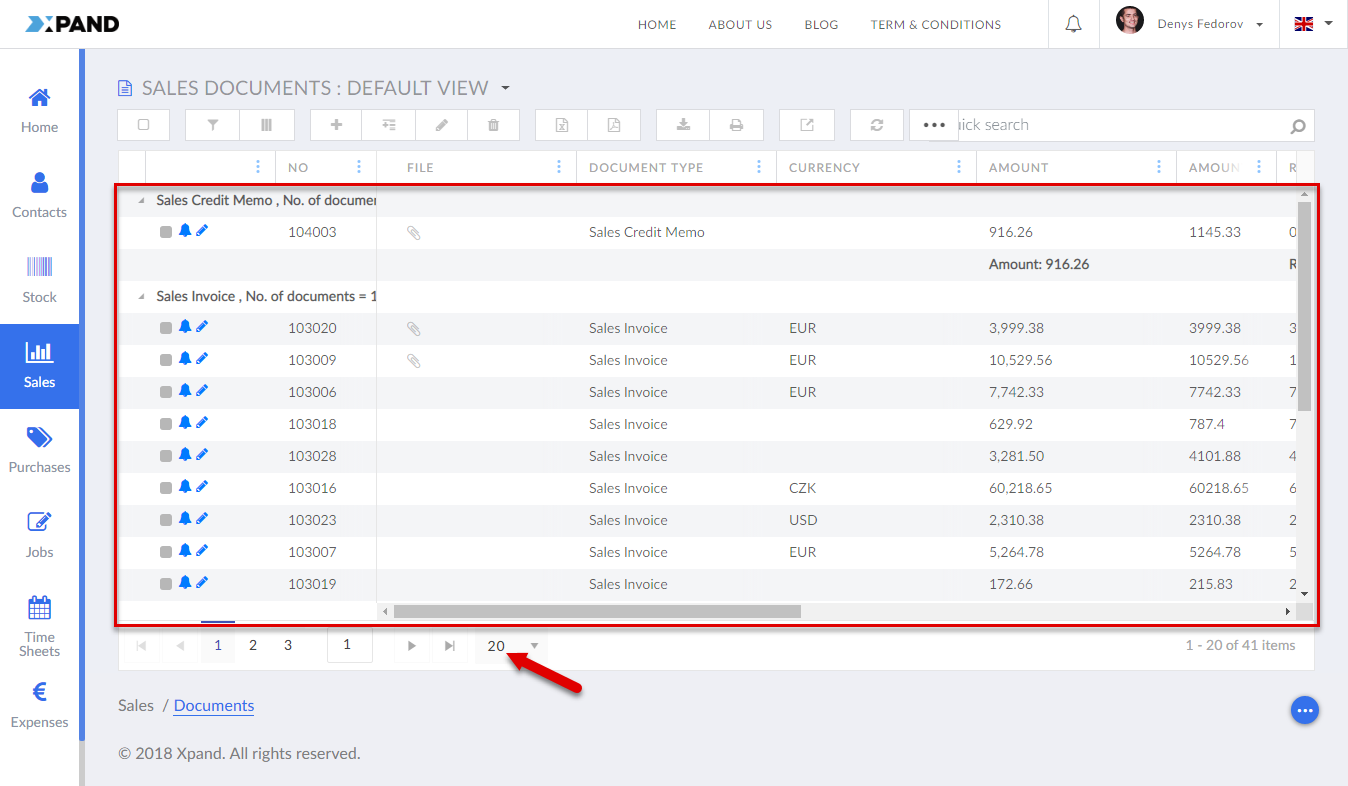
You can configure the following general grid options for all members:- Quantity of records on page - Specifies the maximum number of records that will be shown on one page of the grid. If you leave this field empty, the default quantity will be used: up to 20 records per page.
- Reorderable - Use this switch to turn on or off the ability to rearrange columns on a grid page for portal members that belong to the specified member groups in this permission set.
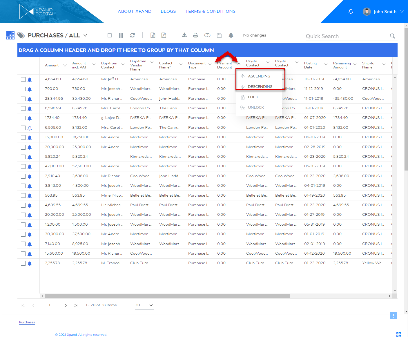
- Sortable - Use this switch to turn on or off the ability to sort records by column in the ascending or descending order.
- Sort by field - Use this setting to apply sorting to grid records by value in a specific field(s). You can set up more than one field the value of which will be used to sort records by. If this setting is not used, by default the records are sorted by the updated field value.
- Field - Specifies the field, the value of which will be used to sort data on the grid by default.
- Direction - Specifies the direction that will be applied to the sorting.:
- [blank] - The sorting is not applied by value of this field.
- Ascending - Records will be sorted in the ascending order, from the lowest value to the highest one.
- Descending - Records will be sorted in the ascending order, from the lowest value to the highest one.

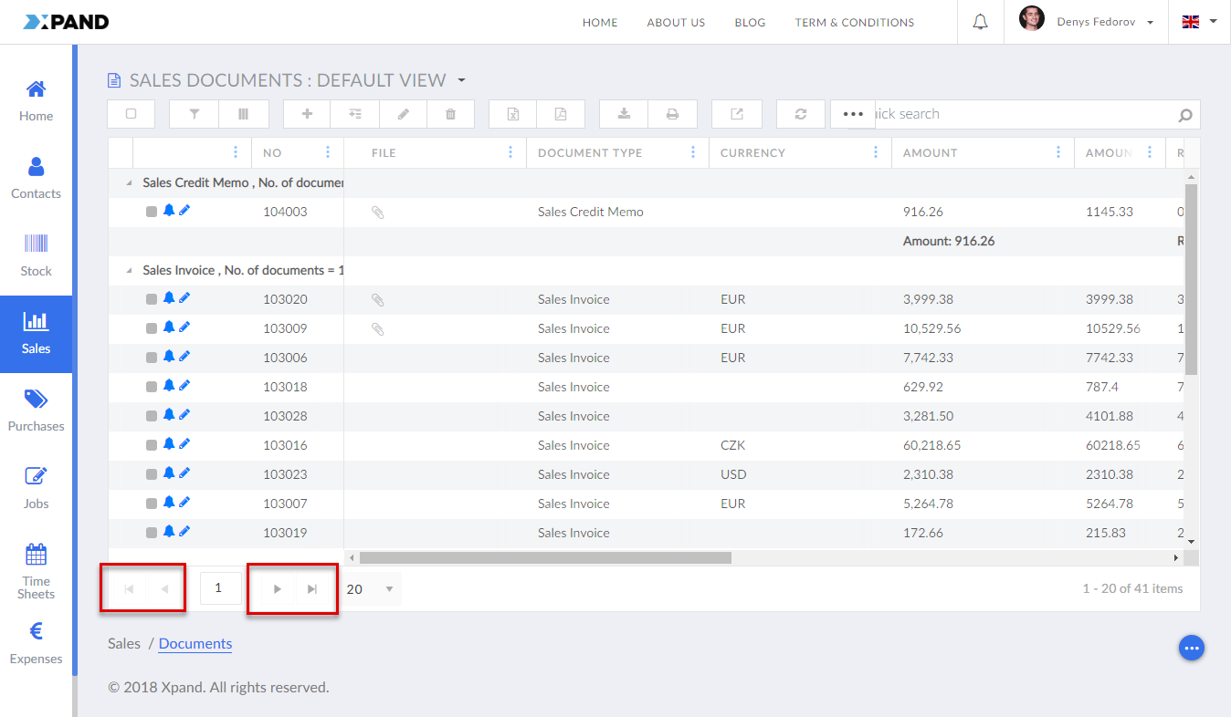
- Hide navigation buttons - Use this switch to hide or make visible again the navigation buttons, which provide the ability to switch between pages on the grid.
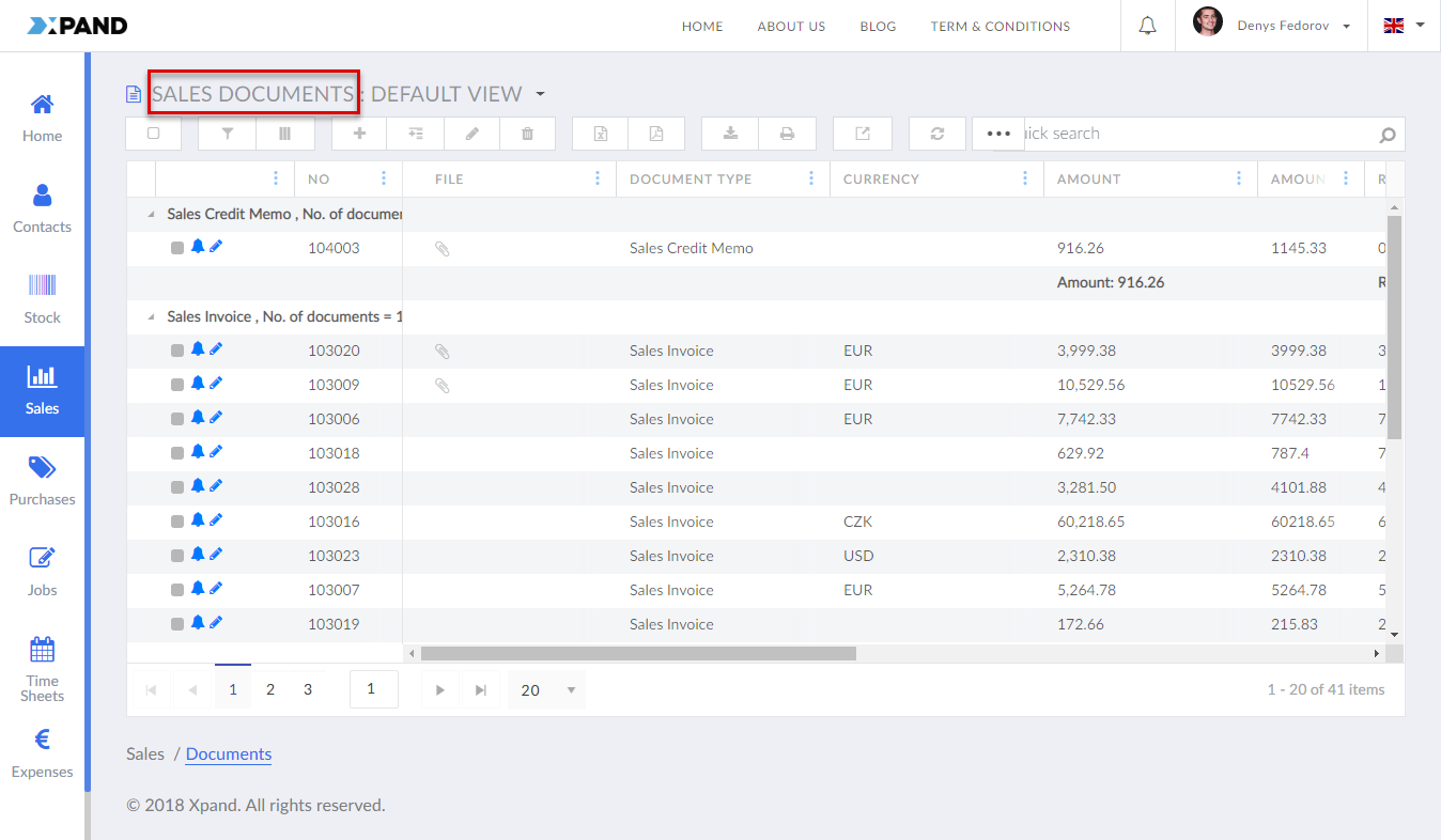
- Hide title - Use this switch to hide or make visible again the title of the page.
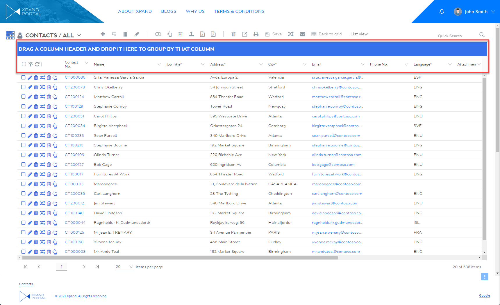
- Hide grid header - Use this switch to hide or make visible again the grid header, which contains the action toolbar, grid title, subtitle, and quick search.

- Hide column header - Use this switch to hide or make visible again the column header, which displays the field captions, on the page.
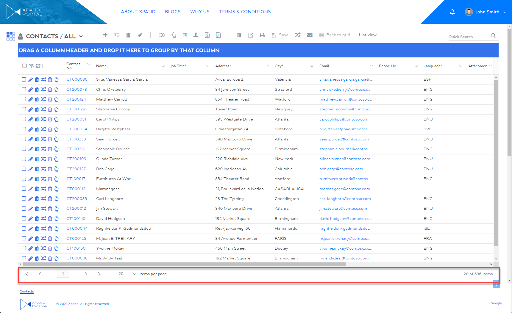
- Hide footer - Use this switch to hide or make visible again the footer of the grid.
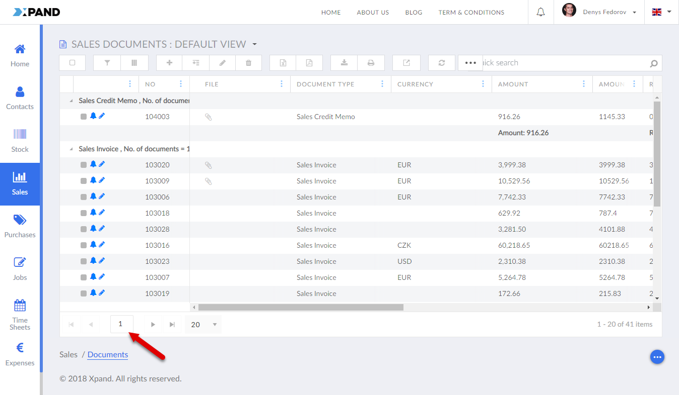
- Hide total number of pages - Specifies that the total number of pages is not displayed in the navigation section under the grid. If this is hidden, the navigation style switches to the numbered pagination where you can navigate to a specific page by selecting a button with a page number. Additionally, when this is enabled, the number of items per page is also not displayed.
- Hide grid statistics - Use this switch to hide or make visible again information about the total number of records on the grid as well as the number of records currently displayed on the grid, which is displayed in the bottom right corner of the grid.
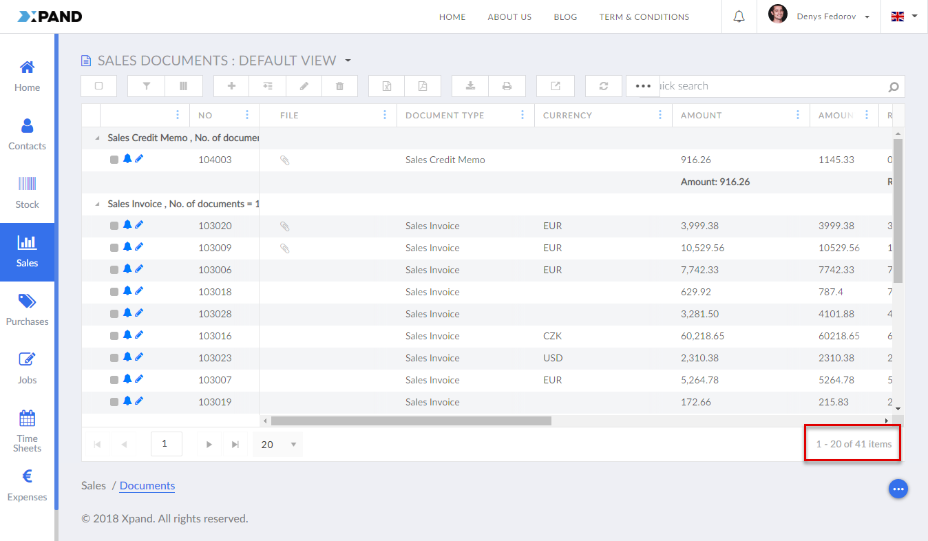
- Hide Search box - Specifies that the search box is not displayed on the grid page.

- Compact mode - Use this switch if you want the columns to be displayed in the compact mode, in which the actions that are available directly on the lines are not displayed until you use the drop-down menu on the line.
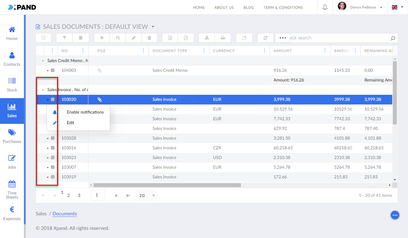
- Infinite scrolling - Specifies that page records are loaded continuously as you scroll down the grid. If this is disabled and you scroll to the end of a grid page, you need to navigate to the next page to see other records.
- Kendo UI script - Specifies a sсript(s) that can be used in addition to available grid settings. For additional information refer to this guide.
- Quantity of records on page - Specifies the maximum number of records that will be shown on one page of the grid. If you leave this field empty, the default quantity will be used: up to 20 records per page.
- Optionally, you can create another permission set with other grid options.
- Select Save and publish to save the changes and publish them on the front end. Optionally, if you were editing the page, you can select Save and preview to preview how the page will look like on the front end.