HTML block (configuration)
An HTML block is an element of a  grid or
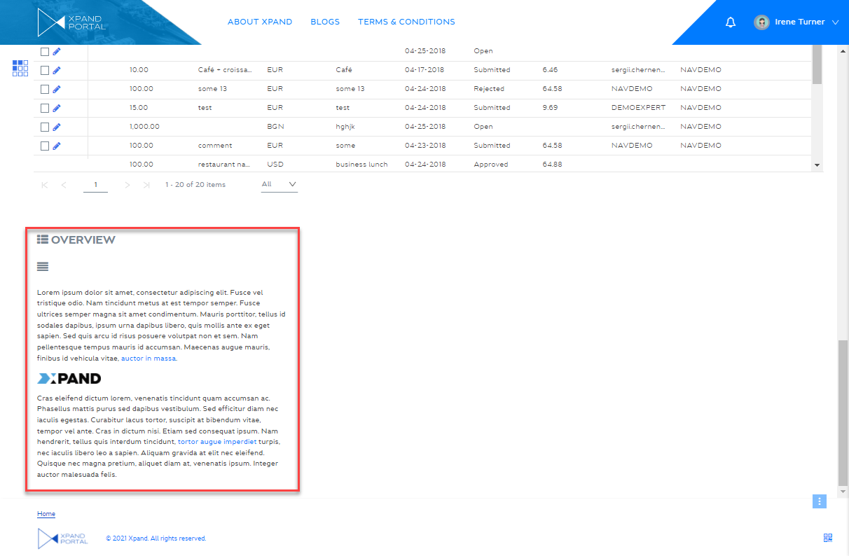
  dashboard layout block. This block can contain simple content, such as images, text, links, etc. embedded into a layout block. You can use custom styles for this type of content. This type of content is not based on any data source and can also be part of a simple content page.
To add an HTML block to a page
- In the backoffice, go to Content and expand the node of a
 grid page or
  dashboard (home) depending on where you want to add an HTML block.
 - Select the
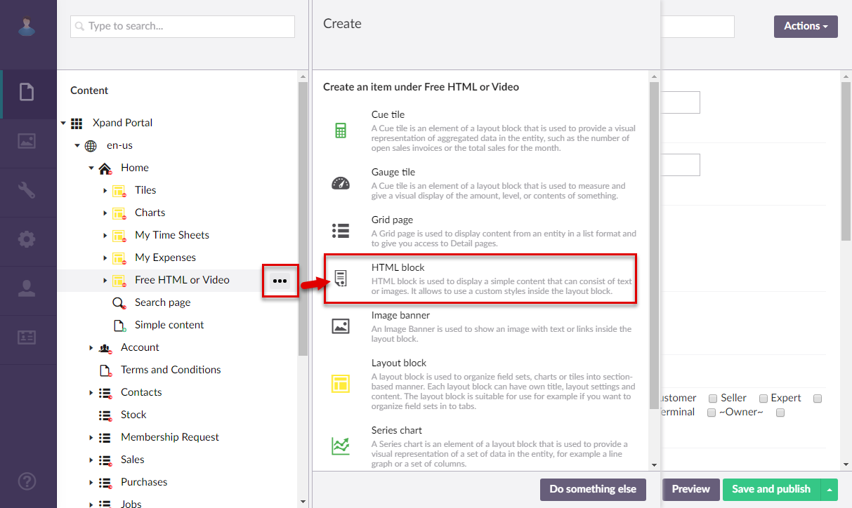
 icon next to the corresponding layout block node ( grid or home dashboard). Alternatively, select and hold (or right-click) the node, and then select Create.
 - Select
 HTML block.
- On the header, enter the HTML block name that will be used to identify it in the backoffice.
- On the General tab, fill in general settings as follows:
- Titles - Specifies the settings where you can configure the title of various elements on this page.
- Title - Specifies the title that will be displayed in the header of the created page or page element.
- Subtitle - Specifies the subtitle that will be displayed in the header of the created page or page element.
- Icon - Specifies the image that will be displayed in front of the title if specified. Adding an icon is optional. You can leave this setting empty (in this case, the default icon, chosen by the development team, will be used) or choose an icon from one of the available icon libraries.
- Responsive behavior - Specifies the settings that define how this page part or UI element responds to different viewport widths by adjusting its width and visibility at each responsive breakpoint.
- Hide element - Specifies that the element will be hidden for specific member groups. Select one or several member groups, for which this layout block element will be hidden. Alternatively, you can select the ~All~ checkbox to hide it for all member groups (without the necessity to select every member group's checkbox) or select the Hide element checkbox to have all member groups selected at once.
- Description - Specifies a description of this layout block element.
- Content-from page - Specifies the page the content of which will be displayed instead of the content of this page when this page is opened via a direct link. The URL in the address bar will remain that of the original page. For a page element, filling in this setting is not required.
- Redirect-to page - Specifies the page that will be displayed instead of this page when this page is opened via a direct link. The URL in the address bar will be that of the target page. For a page element, filling in this setting is not required.
- Module assignment & protection - Specifies settings that allow you to assign this content element (localization, page, etc.) to an internal module as well as to protect this element from certain operations (copying, changing, deletion). Select the Configure button to configure module assignment & protection or the Change button to edit existing configuration if it has already been configured.
- Titles - Specifies the settings where you can configure the title of various elements on this page.
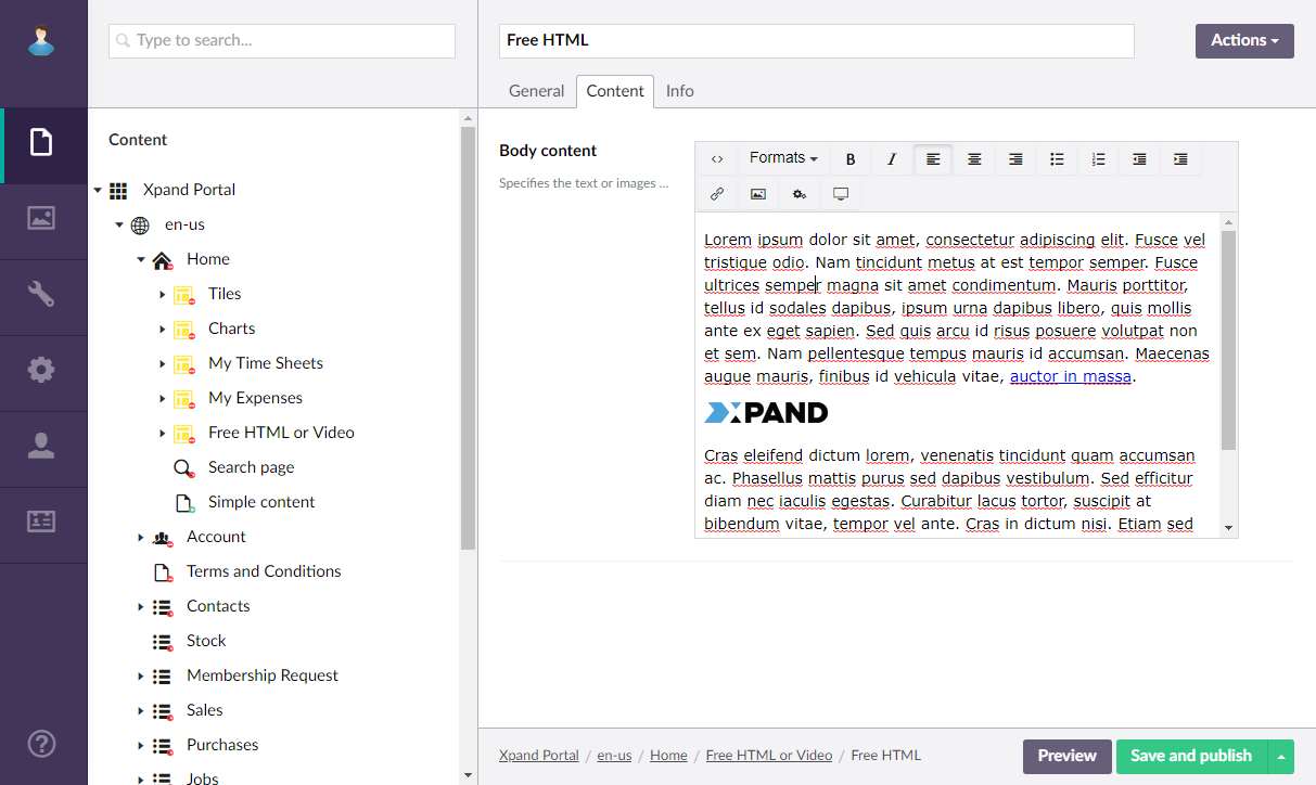
- On the Content tab, configure the content of this HTML block. You can use formatting, images, links, and other supported HTML editor features to customize the appearance of the content.
- Select Save and publish to save the changes and publish them on the front end. Optionally, if you were editing the page, you can select Save and preview to preview how the page will look like on the front end.
|
The layout settings of the parent layout block determine how this layout block element will be displayed on the page (on a tab, on top or below of other content elements, etc.). |
 Note
Note