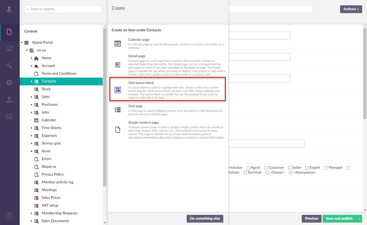
Creating layout blocks for grid page content
A grid page layout block is a page that serves as a container for grid page content, such as embedded detail page or various home page elements. Since the content of a grid page is added within layout blocks, layout blocks must be created before the content.
To add a layout block to a grid page
- In the backoffice, go to Content.
- Select the content node, and then select a
 grid page for which you want to create a layout block.
 - Select the
 icon of the selected node (the icon appears when you point to the node title).
 - Select
 Layout block in the Create dialog window that appears.
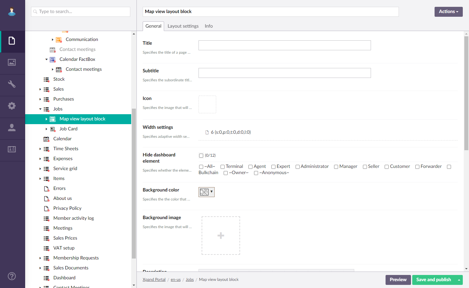
- On the header, enter the layout block name that will be used to identify it in the backoffice.
- On the General tab, fill in general settings.
- Titles - Specifies the settings where you can configure the title of various elements on this page.
- Title - Specifies the title of the layout block that will be displayed on the page if specified. Specifying the title is optional.
- Subtitle - Specifies the subtitle of the layout block that will be displayed on the page if specified. Specifying the subtitle is optional.
- Icon - Specifies the image that will be displayed in front of the layout block title if specified. Adding an icon is optional. The color of this icon can be customized in the theme settings if necessary.
- Width - Specifies the adaptive grid width settings for the layout block per device. The width is automatically adjusted depending on the device the page is opened from.
- Hide element - This setting hides the layout block from the parent page. It can be configured per member group. Select one or several member groups, for which this layout block will be hidden. Alternatively, you can select the ~All~ check box to hide it for all member groups (without the necessity to select every member group's check box) or select the Hide element check box to have all member groups selected at once.
- Description - Specifies a description of this layout block.
- Styles - Specifies the styles that are applied to this page element to customize its appearance.
- Background color - Specifies the color that will be used as a background of this layout block.
- Border color - Specifies the color of the border of this layout block's UI element on the page.
- Background image- Specifies the image that will be displayed in the background of this layout block.
- Content-from page - Specifies the page the content of which will be displayed instead of the content of this page when this page is opened via a direct link. The URL in the address bar will remain that of the original page. For a promoted filter summary, filling in this setting is not required.
- Redirect-to page - Specifies the page that will be displayed instead of this page when this page is opened via a direct link. The URL in the address bar will be that of the target page. For a promoted filter summary, filling in this setting is not required.
- Module assignment & protection - Specifies settings that allow you to assign this content element (site, page, page element, etc.) to an internal module as well as to protect this element from certain operations (copying, changing, deletion). Select the Configure button to configure module assignment & protection or the Change button to edit existing configuration if it has already been configured.
- Titles - Specifies the settings where you can configure the title of various elements on this page.
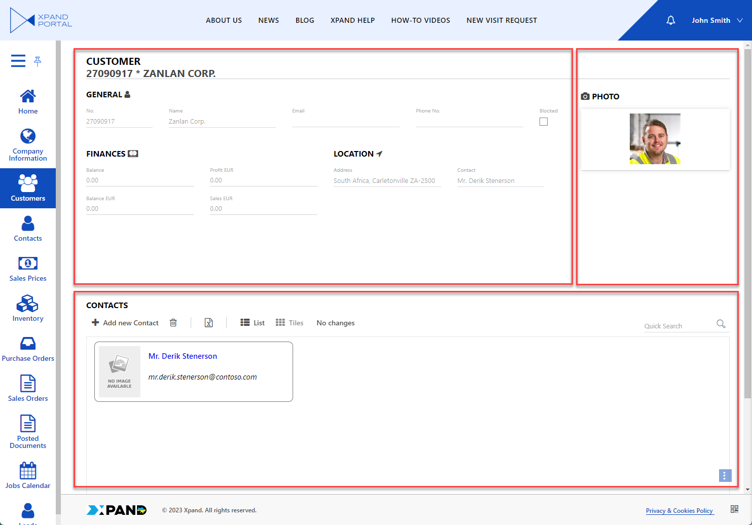
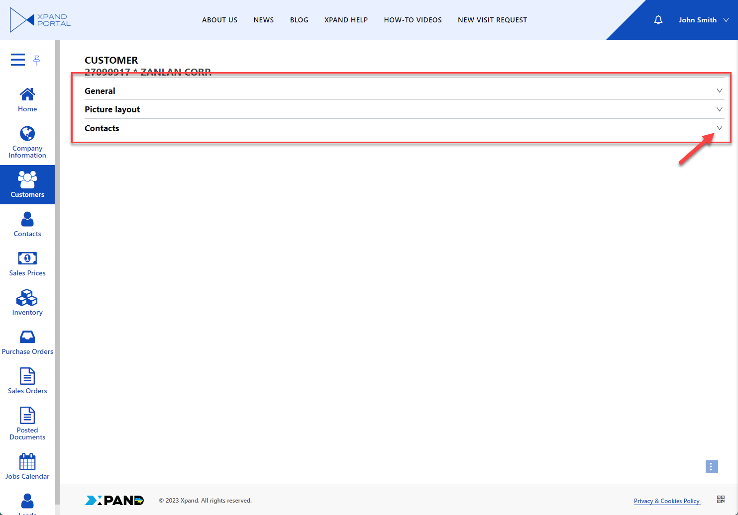
- On the Layout setting tab, specify how the content of this layout block will be presented.
- View type - Specifies how content in the child layout blocks is presented:
- Default (or empty)- With the default view type, child layout blocks will be displayed on top of each other or side by side depending on the layout block width. If you are going to use this view, you need to create a layout block for every type of detail page content (field set, grid) as a child page under the detail page.
- Accordion - With this view type, the child layout blocks are collapsed on top of each other when you open open the page.
- DropDown - With this view type, one child layout block will be displayed at a time, and other child layout blocks will be selectable from a drop-down menu.

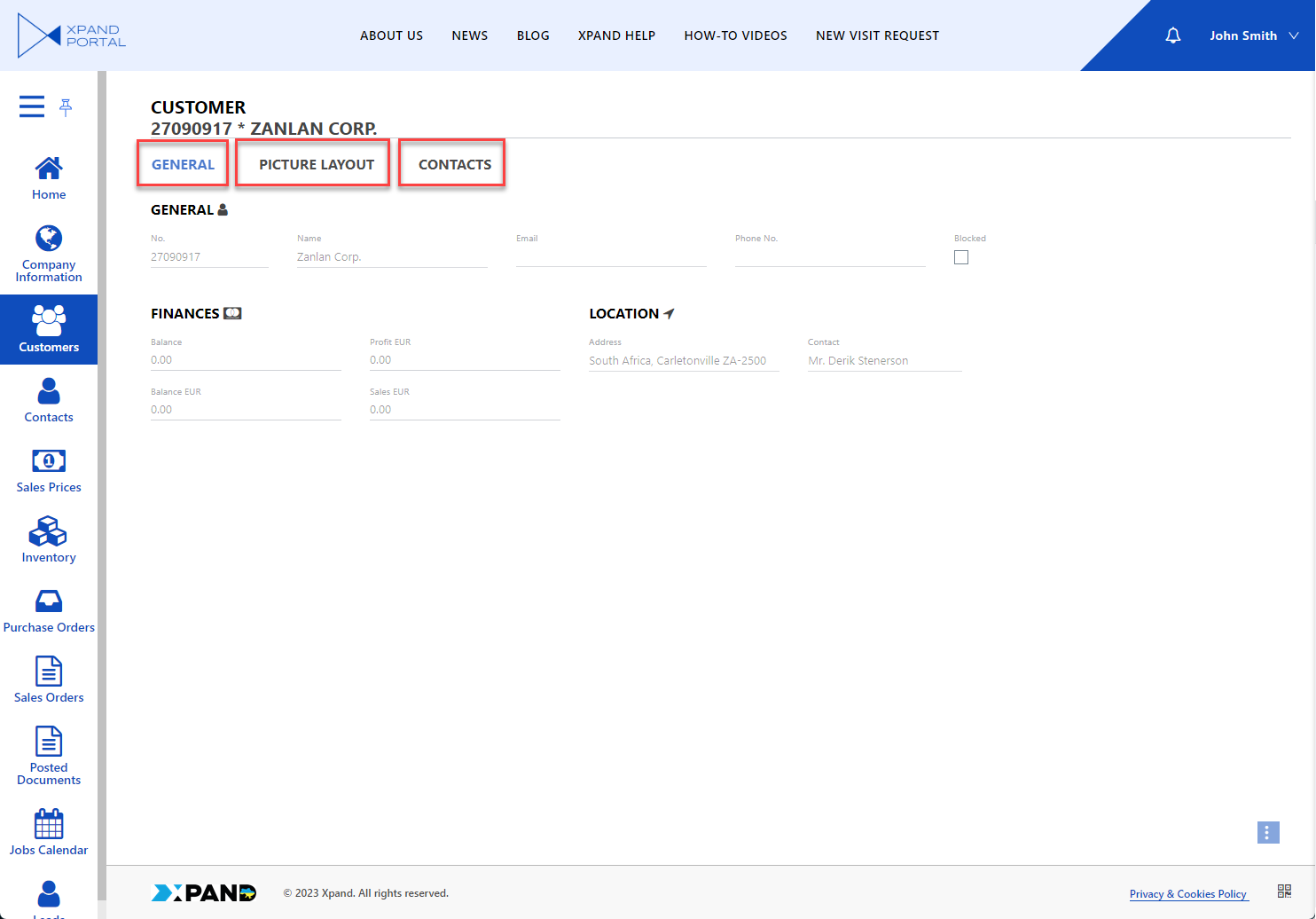
- Tab - With this view type, child layout blocks are displayed on tabs. The tabs are displayed above the content.
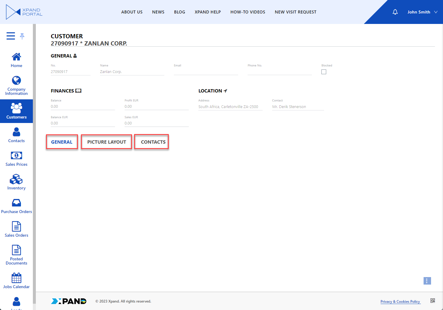
- Tab (bottom) - With this view type, child layout blocks are displayed on tabs. The tabs are displayed below the content.
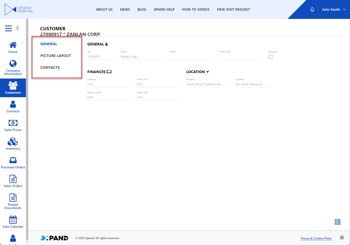
- Tab (left) - With this view type, child layout blocks are displayed on tabs. The tabs are displayed to the left of the content.
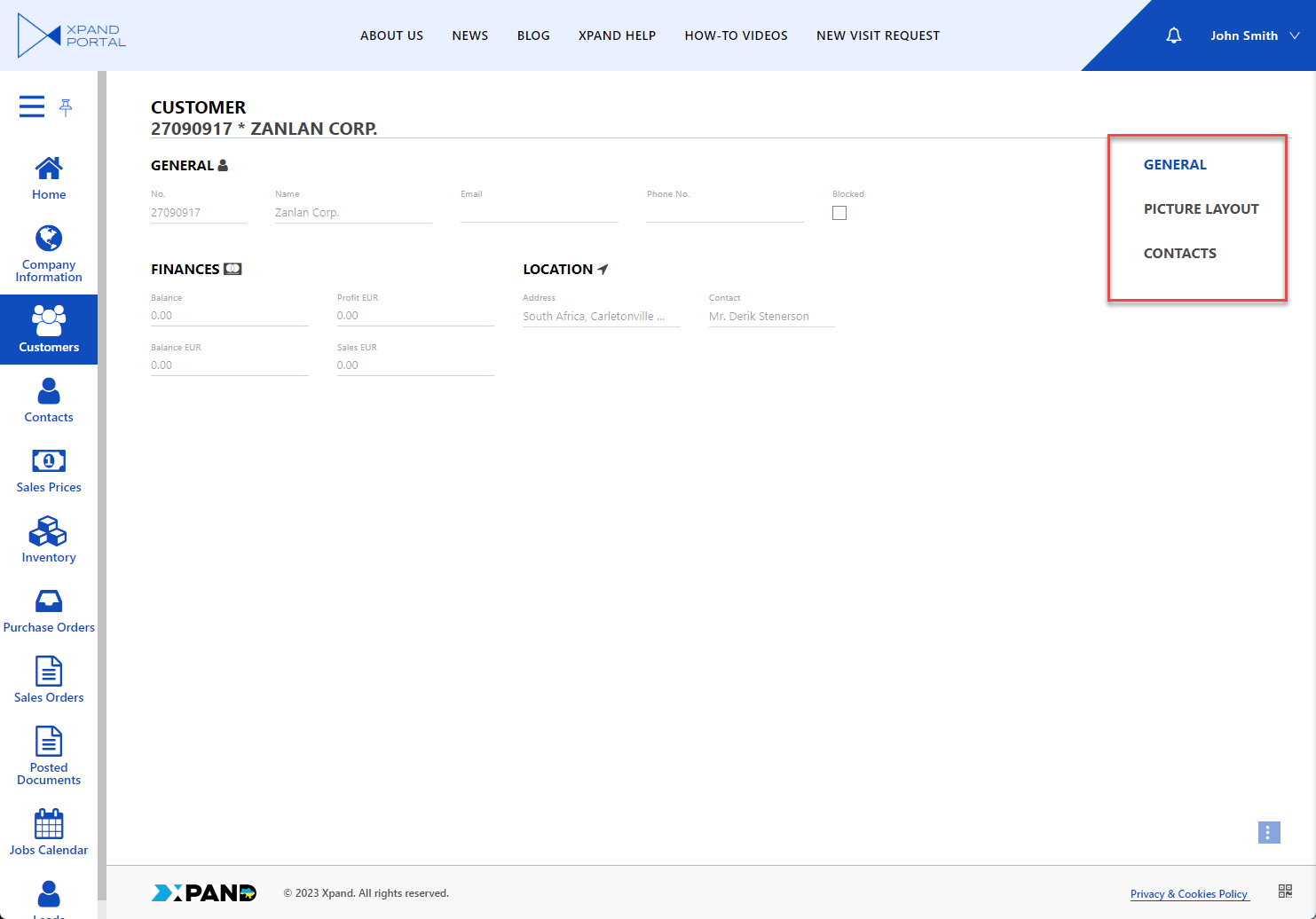
- Tab (right) - With this view type, child layout blocks are displayed on tabs. The tabs are displayed to the right of the content.
- Wizard (tab view) - An alternative method of presenting data on tabs. This view tab currently works as the Default view.
- Default (or empty)- With the default view type, child layout blocks will be displayed on top of each other or side by side depending on the layout block width. If you are going to use this view, you need to create a layout block for every type of detail page content (field set, grid) as a child page under the detail page.
- Enable quick link - Specifies whether the layout block caption will appear as a link on the page header to navigate between layout blocks from the header. The header link will be displayed only when the page with this layout block is opened.
- Heights - Specifies settings that allow you to configure the minimum, standard, and maximum height of the view elements in pixels on this layout block.
- Collapsing - Specifies the settings that allow you to control the default state of the layout block, add a button that allows members to expand or collapse it, and configure how it can be expanded/collapsed.
- Enabled - Specifies that this set of settings is activated.
 Tip
TipIf a layout block title is configured, the Collapse/Expand action will be on the title level. If the layout block title is not configured, the Collapse/Expand action will be automatically moved to the child element if possible.
- Dimension - Specifies in which dimension the layout block can be expanded or collapsed.
- Vertical - Specifies that the layout block can be expanded and collapsed vertically. When collapsed, other layout blocks will occupy the remaining area.
- Button position - Specifies the place of the button that expands/collapses the layout block on the layout block header.
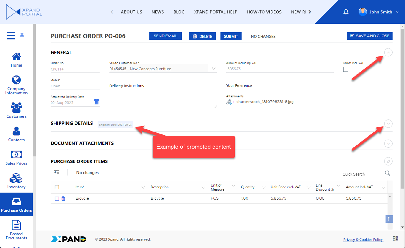
- Promoted content position - Specifies the place of the promoted content on the layout block header. Promoted content is shown in addition to the title when the layout block is collapsed. Promoted content may include rich text or another embedded content block(s).
- Horizontal - Specifies that the layout block can be expanded and collapsed horizontally. When collapsed, other layout blocks will occupy the remaining area.
- Collapsed block width - Specifies the width of the layout block in the horizontally collapsed state. The default value is 12.
- Vertical - Specifies that the layout block can be expanded and collapsed vertically. When collapsed, other layout blocks will occupy the remaining area.
- Default state - Specifies the state of the layout block that will be used by default on opening the page.
- Show button on hover - Specifies that the button that collapses or expands the layout block is visible only when you hover over its position on the layout block header. If this setting is disabled, the button is always visible.
- Collapsed state icon - Specifies the icon that will be used for the button that expands or collapses the layout block when it is in the collapsed state.
- Expanded state icon - Specifies the icon that will be used for the button that expands or collapses the layout block when it is in the expanded state.
- Smooth collapsing/expanding - Specifies that collapsing or expanding of the layout block is animated smoothly. If this setting is disabled, collapsing/expanding will appear to have abrupt movement.
- Promoted content - Specifies rich text that will be shown as promoted content on the layout block header.
- Rich text - Specifies rich text that will be used as promoted content on the layout block in the collapsed state. Rich text allows you to incorporate various visual elements and enhancements such as different fonts, font sizes, colors, styles (bold, italic, underline), alignment, lists, hyperlinks, and even embedded images or multimedia content. For example, a piece of code that shows the formatted caption of a specific entity field and its value: <p><span style="background-color: #e9f0ff; display: inline-block; padding: 5px;">Shipment Date: [[shipmentdate]]</span></p> where [[shipmentdate]] is a variable that will be replaced with the value of the corresponding entity field.
- Text - Specifies rich text that will be shown as promoted content on the layout block header. Rich text allows you to incorporate various visual elements and enhancements such as different fonts, font sizes, colors, styles (bold, italic, underline), alignment, lists, hyperlinks, and even embedded images or multimedia content.
- Show vertically - Specifies rich text that will be shown as promoted content on the layout block header. Rich text allows you to incorporate various visual elements and enhancements such as different fonts, font sizes, colors, styles (bold, italic, underline), alignment, lists, hyperlinks, and even embedded images or multimedia content.
- Content block - Specifies a content block that will be used as promoted content on the layout block in the collapsed state.
- Nodes - Specifies nodes that will be used as promoted content blocks on the layout block header in the collapsed state.
- Title - Specifies the title of the promoted content block that will be displayed on the layout block header in the collapsed state.
- Rich text - Specifies rich text that will be used as promoted content on the layout block in the collapsed state. Rich text allows you to incorporate various visual elements and enhancements such as different fonts, font sizes, colors, styles (bold, italic, underline), alignment, lists, hyperlinks, and even embedded images or multimedia content. For example, a piece of code that shows the formatted caption of a specific entity field and its value: <p><span style="background-color: #e9f0ff; display: inline-block; padding: 5px;">Shipment Date: [[shipmentdate]]</span></p> where [[shipmentdate]] is a variable that will be replaced with the value of the corresponding entity field.
- Enabled - Specifies that this set of settings is activated.
- Maximizing - Specifies the settings that allow you to add buttons that fit the content of the layout block into a specific area.
- Enable - Specifies that this set of settings is activated.
Tip
If a layout block title is configured, the Maximize/Minimize action will be on the title level. If the layout block title is not configured, the Collapse/Expand action will be automatically moved to the child element if possible.
- Mode - Specifies the area that the content of the layout block will fit into when the button of this setting set is used by the member on the layout block header:
- Browser's content area - The layout block will be maximized to fit its content into the visible area of a browser web page.
- Parent block's content area - The layout block will be resized to fit its content into the content area of the parent layout block if any.
- Portal page content area - The layout block will be resized to fit its content into the content area of a portal page, which is the area between the header and the footer.
- Browser's content area - The layout block will be maximized to fit its content into the visible area of a browser web page.
- Show button on hover - Specifies that the button that resizes the layout block to fit its content into a specific area is visible only when you hover over its position on the layout block header. If this setting is disabled, the button is always visible.
- Enable - Specifies that this set of settings is activated.
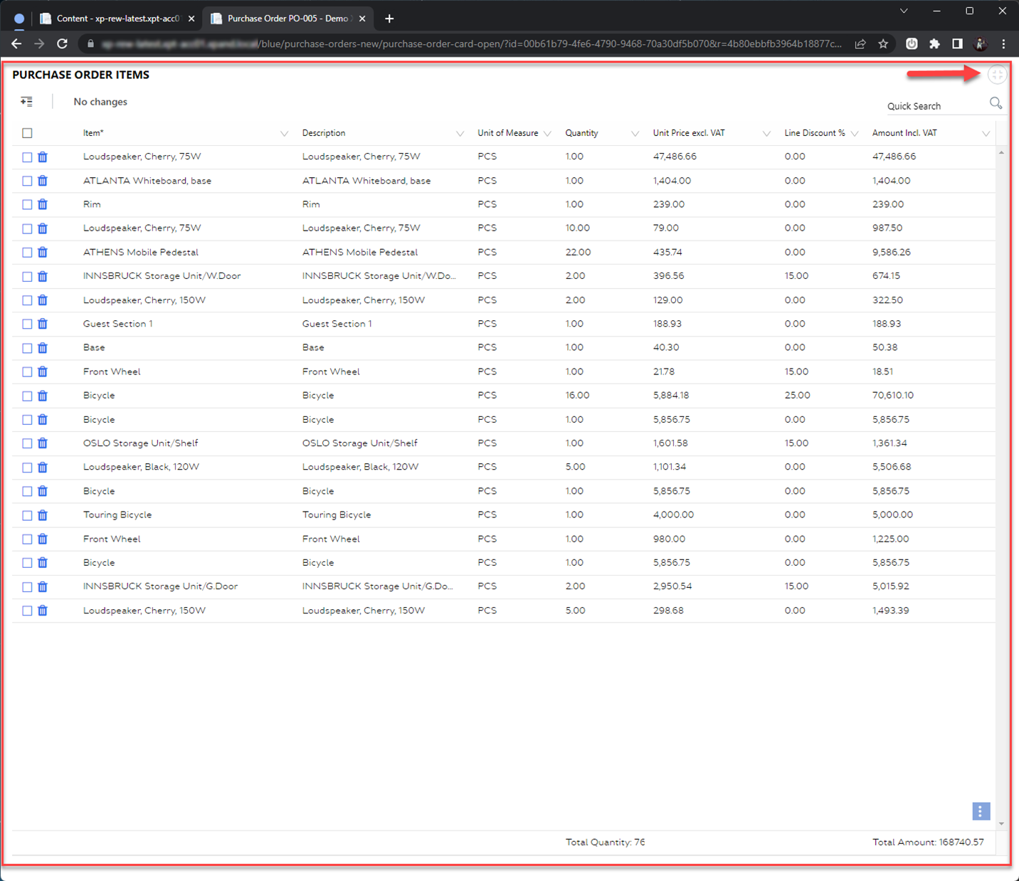
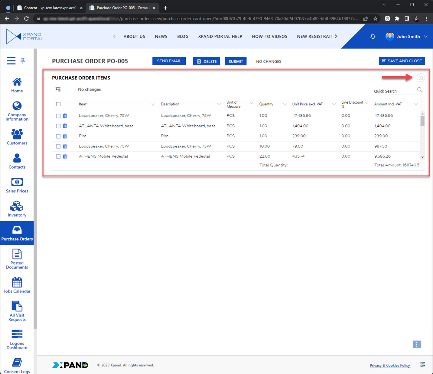
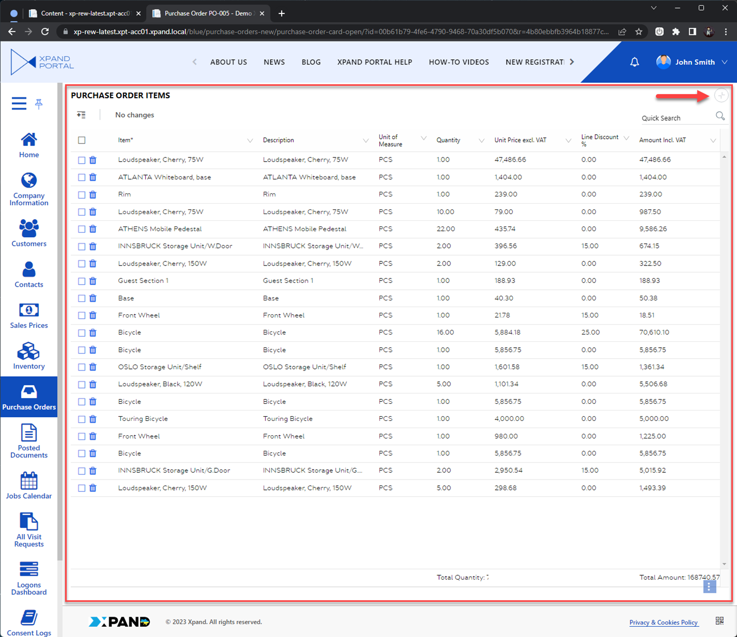
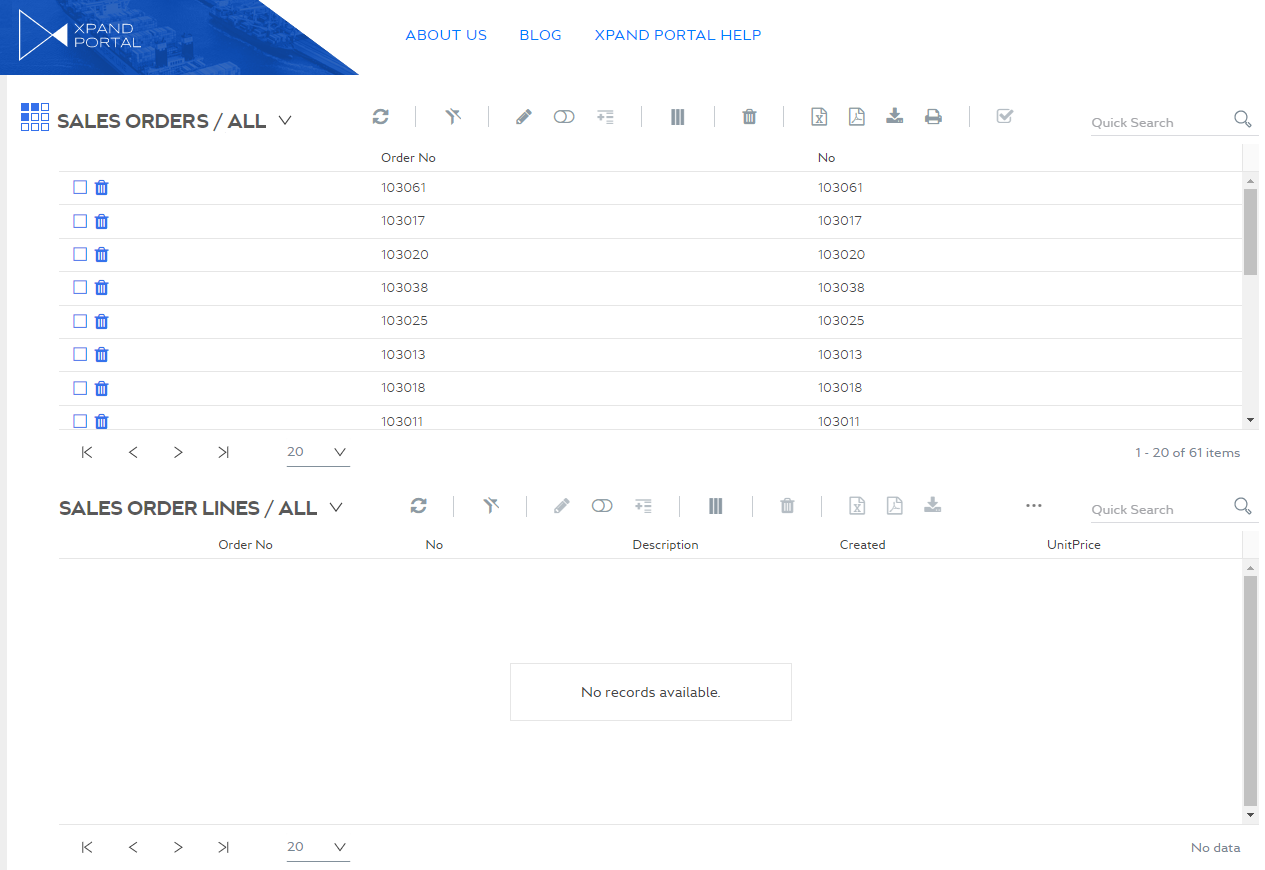
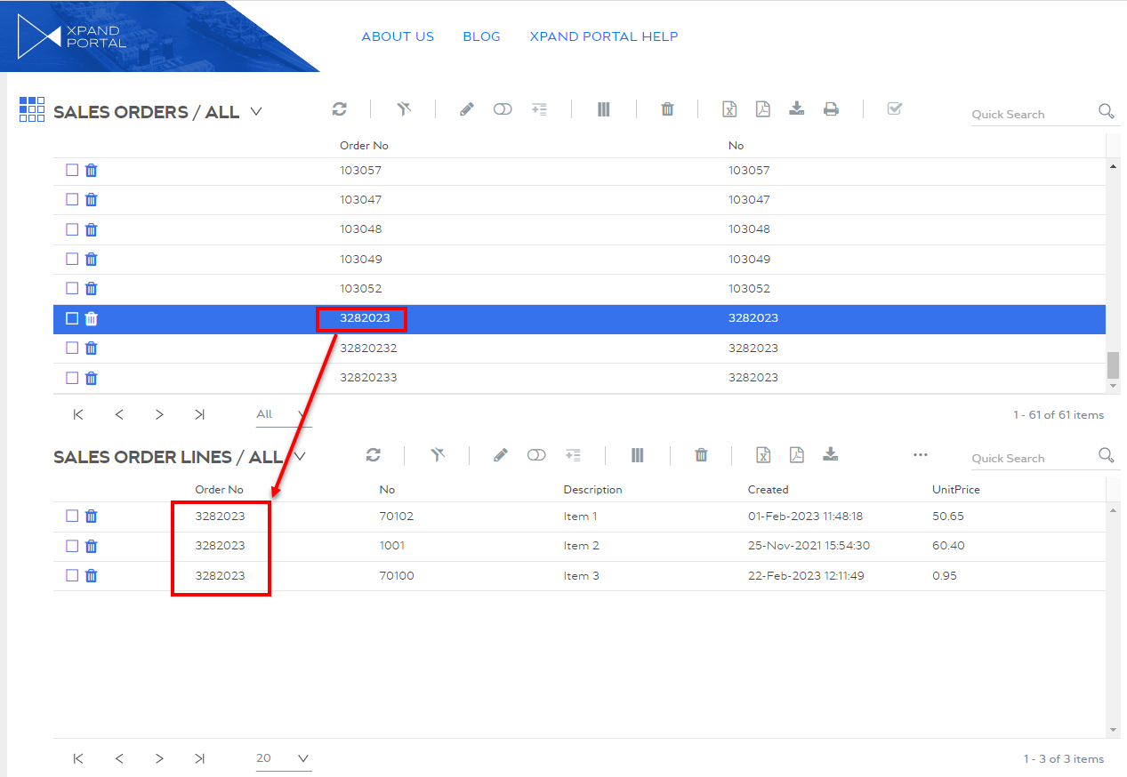
- Layout block style - Specifies the style that defines how the layout block content will be displayed on the page in relation to other layout blocks. By default, the layout block will occupy all available space from top to bottom taking into account the width settings. This can be useful when you want to display related grids on a single page where one grid would display records only for a selected record on the related grid (for grid relation to work, the grid's layout block must have a style applied here). For example:
Two related grids (one under the other) with no records selected:
With a record selected:
- View type - Specifies how content in the child layout blocks is presented:
- Select Save and publish to save the changes and publish them on the front end. Optionally, if you were editing the page, you can select Save and preview to preview how the page will look like on the front end.
- If you created a layout block with the Tab view type, select the created layout block, and then repeat steps 3 through 8 for every tab that you want to add. For these child layout blocks, select any view source type other than Tab. The title of these child blocks will be displayed as tab captions on the grid page.