Map view (configuration)
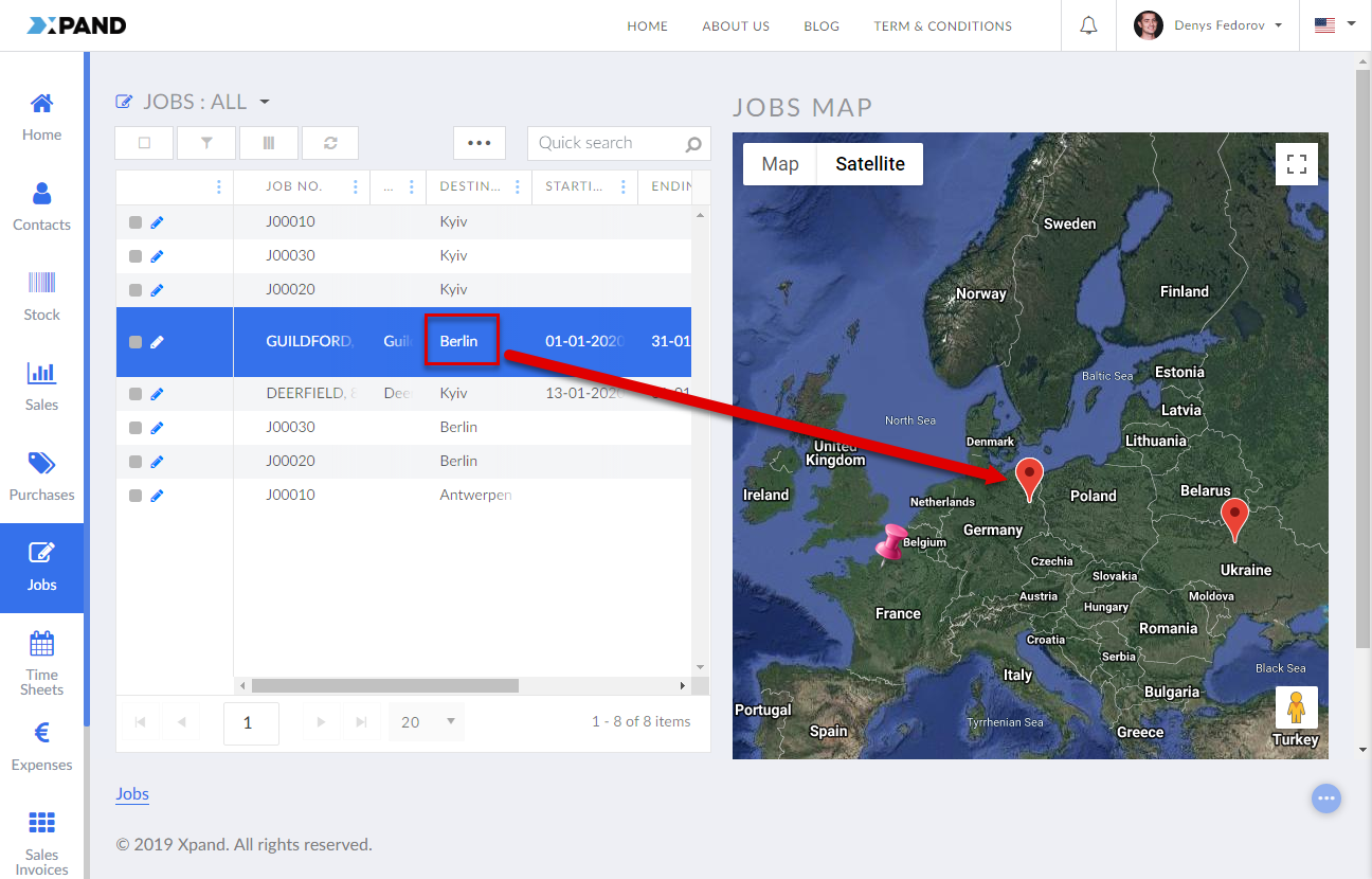
The map view is one of the optional elements that can be added to a grid page within the grid page layout block. A map can either display static predefined markers or be linked to fields on the grid, from which the marker coordinates, such as latitude and longitude or city name, will be retrieved. You can use this view to visualize data related to location. Its availability can be configured per permission set (for the parent layout block).
To add an Earth map view to a grid page
- In the backoffice, go to Content.
- Select the content node, and then select a
 grid page into which you want to add a map view.
 - On the General tab, set the Width setting to the desired width, making sure that this width combined with the width of the layout block does not exceed 12.
- Select the
 icon of the grid page node (the icon appears when you point to the node title).
 - Select
 Grid layout block in the Create dialog window that appears.
 - On the header, enter the layout block name that will be used to identify it in the backoffice.
- On the General tab, in Responsive behavior, specify the width of the layout block to have it displayed to the side of the grid. The layout block width in combination with the parent grid's width must not exceed 12. Otherwise, the layout block will be displayed below the grid.
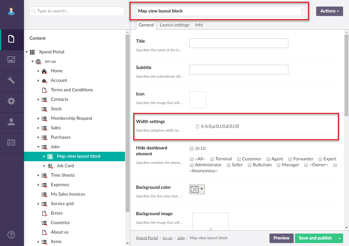
- On the Layout settings tab, in Heights > Minimum height setting, specify the minimum height of the layout block in pixels. The recommended height: 600 or above.
- If you want the map view to be shown before the grid (on the left side or above the grid depending on the grid layout block width settings within the Responsive behavior settings), turn on Show before grid. If you leave it turned off, the map view will be shown after the grid (on the right side or below the grid depending on the grid layout block width settings).
- You can leave other layout block settings with default values. The layout block will serve as a container for the map view. Select Save and publish.
- Ensure that this layout block that will contain a map view is the first child node under the grid page node. If necessary, use node sorting (select and hold (or right-click) the node, and then select Sort) to put right under the parent node.
- Select the icon of the created grid page node.
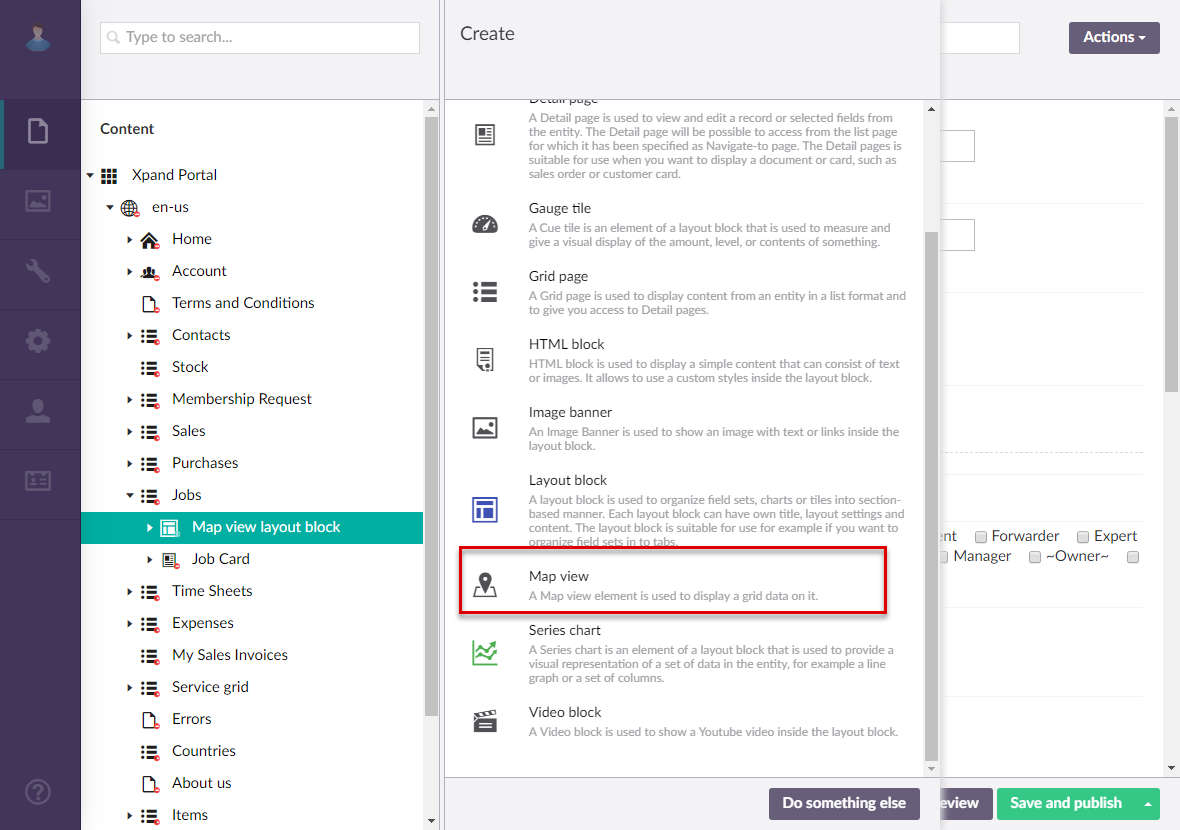
- Select
 Map view.
- On the header, enter the map view name that will be used to identify it in the backoffice.
- On the General tab, configure the settings as described below:
- Titles - Specifies the settings where you can configure the title of various elements on this page.
- Title - Specifies the title that will be displayed in the header of the created page or page element.
- Subtitle - Specifies the subtitle that will be displayed in the header of the created page or page element.
- Icon - Specifies the image that will be displayed in front of the title if specified. Adding an icon is optional. You can leave this setting empty (in this case, the default icon, chosen by the development team, will be used) or choose an icon from one of the available icon libraries.
- Responsive behavior - Specifies the settings that define how this page part or UI element responds to different viewport widths by adjusting its width and visibility at each responsive breakpoint.
- Hide element - Specifies that the element will be hidden for specific member groups. Select one or several member groups, for which this layout block element will be hidden. Alternatively, you can select the ~All~ checkbox to hide it for all member groups (without the necessity to select every member group's checkbox) or select the Hide element checkbox to have all member groups selected at once.
- Description - Specifies a description of this layout block element.
- Content-from page - Specifies the page the content of which will be displayed instead of the content of this page when this page is opened via a direct link. The URL in the address bar will remain that of the original page. For a page element, filling in this setting is not required.
- Redirect-to page - Specifies the page that will be displayed instead of this page when this page is opened via a direct link. The URL in the address bar will be that of the target page. For a page element, filling in this setting is not required.
- Module assignment & protection - Specifies settings that allow you to assign this content element (localization, page, etc.) to an internal module as well as to protect this element from certain operations (copying, changing, deletion). Select the Configure button to configure module assignment & protection or the Change button to edit existing configuration if it has already been configured.
- Titles - Specifies the settings where you can configure the title of various elements on this page.
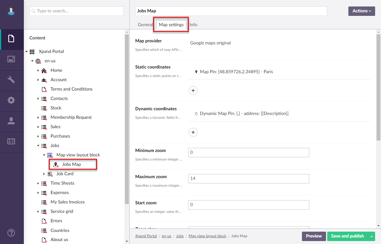
- On the Map settings tab, configure the settings as described below:
- Map provider – Specifies the map provider for the map view. The map provider defines the look of the map and its markers. Select one of the available providers.
- Static coordinates – Specifies the settings where you can configure map markers with static coordinates. These static markers will always be displayed on this map view. You can add more than one static marker if necessary. To add a static marker, select Add map point, and then fill in the settings as described below:
- Latitude value – Specifies the distance north or south of the equator measured in degrees for this static marker.
- Longitude value – Specifies the distance east or west of the equator measured in degrees for this static marker.
- Static coordinate marker – Specifies the image of the marker icon. You can select an image from the library, upload your image or leave this field empty to use the default image of the map provider.
- Coordinate tooltip – Specifies the tooltip that will be displayed when selecting this static marker.
- Dynamic coordinates – Specifies the settings where you can configure map markers with dynamic coordinates. Dynamic marker may retrieve coordinates (either latitude + longitude or city name) from field values on a record. You can add more than one dynamic marker if necessary. To add a dynamic marker, select Add parent grid dynamic coordinates, and then fill in the settings as described below:
- Latitude value – Specifies the name of a field from the data source entity, the value of which will be used to retrieve the distance north or south of the equator measured in degrees for this dynamic marker marker. You can leave this setting empty if you want to use a city name to identify the marker location (the Address field setting).
- Longitude value – Specifies the name of a field from the data source entity, the value of which will be used to retrieve the distance east or west of the equator measured in degrees for this static marker.
- Dynamic coordinate marker - Specifies the path to the image that will be used as a map marker. You can use a variable to have different marker icons for different values. For example: [[Transport]].png where Transport is the name of a field from the source data entity, the value of which will be used as an indicator of which icon to use. Thus, depending on the transport, a different map marker will be used. If you are going to use a dynamic map marker icon, ensure that for every possible value of the specified variable field, you have an image with the same file name in the portal image library. You can leave this setting empty to use the same default marker.
- Coordinate tooltip - Specifies the tooltip that will be shown when selecting the dynamic marker. You can use a variable field to retrieve this tooltip from a field value. E.g. [[Description]] means that the Description field value will be used as a marker tooltip.
- Address field - Specifies the variable field the value of which will be used to identify the marker location on the map. You must specify a field in double square brackets, the value of which will contain a city name. E.g. [[DestinationName]]. You can leave this setting empty if you want to use a city name to identify the marker location (the Address field setting).
- Minimum zoom – Specifies an integer that defines how far you can zoom out on the map.
- Maximum zoom – Specifies an integer that defines how close you can zoom in on the map.
- Start zoom – Specifies an integer that defines the starting zoom value.
- Zoom step – Specifies the zoom step that will be used when you zoom out or zoom in on the map.
- Show selected record coordinates only – Specifies whether record coordinates, represented by map markers, will be shown only for the currently selected record on the grid or for all records. Static coordinates are shown irrespective of this setting.
- Auto-switch focus between coordinates – Specifies whether a popup tooltip will be displayed above the marker when a record is selected.
- Minimum height – Specifies the minimum height of the map view. If you leave this setting empty, the minimum height of the layout block will be used.
- Select Save and publish to save the changes and publish them on the front end. Optionally, if you were editing the page, you can select Save and preview to preview how the page will look like on the front end.