Facet filters (configuration)
Facet filters can help you quickly and easily find information on potentially large data sets. They allow the portal member to select multiple field values from a grid to filter grid records by selected field values.
Facet filters must be pre-configured for the grid pages where you want to use them. Facet filters can be added as an element of a  grid or
  dashboard layout block.
To add facet filters to a grid page
- In the backoffice, go to Content.
- Select the content node, and then select a
 grid page for which you want to add facet filters.
 - Select the
 icon of the selected node (the icon appears when you point to the node title).
 - Select Layout block in the Create dialog window that appears, and then fill in the grid layout block settings.
 Tip
TipIf you want facet filters to be displayed next to the grid, ensure that you configure the width settings within the responsive behavior settings for the facet filters' layout block and the width settings within the responsive behavior settings for the grid so that they both fit the page. Otherwise, the layout block with facet filters will be shown below the grid.
- Select Save and publish to save the changes and publish the layout block.
- Select the icon, next to the created Layout block, and then select
 Facet filters.
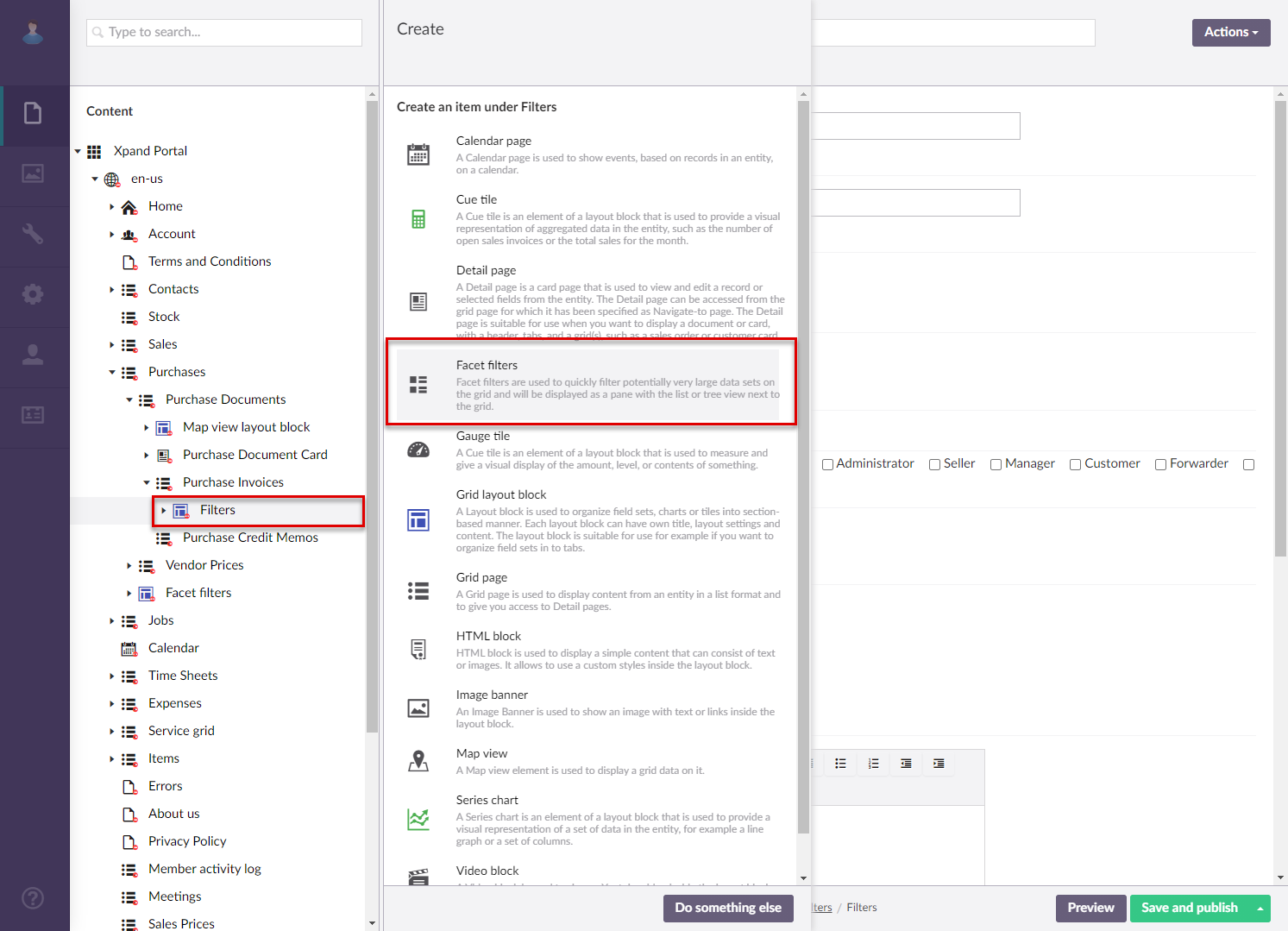
- On the header, enter the name that will be used to identify the facet filters page in the backoffice.
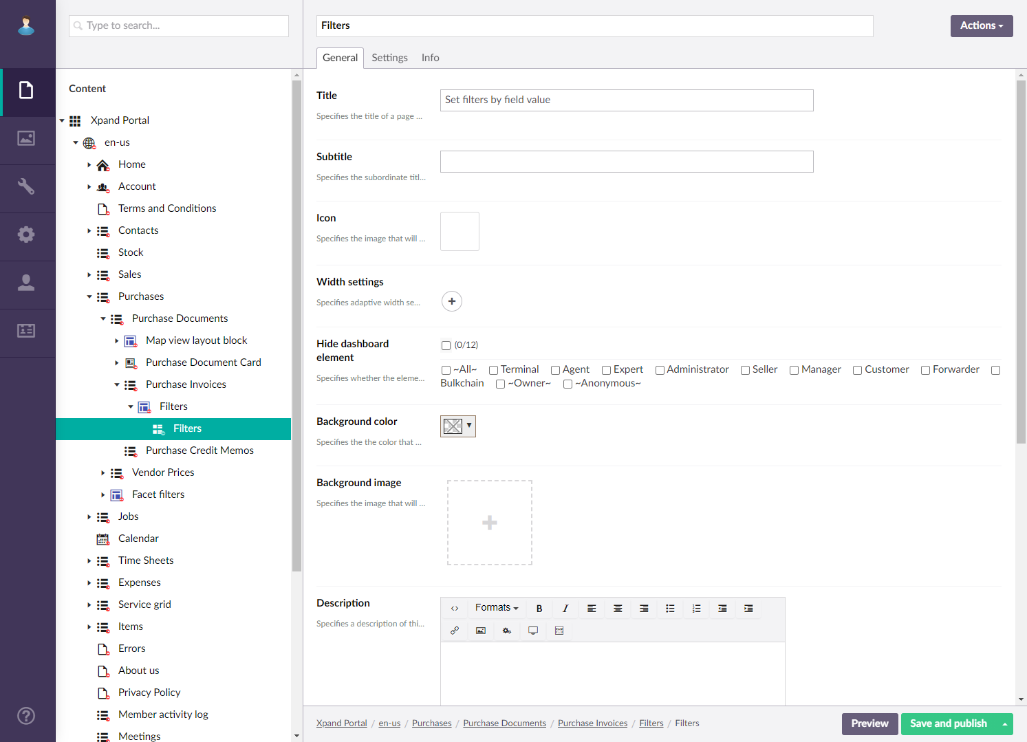
- On the General tab, fill in general settings:
- Titles - Specifies the settings where you can configure the title of various elements on this page.
- Title - Specifies the title that will be displayed in the header of the created page or page element.
- Subtitle - Specifies the subtitle that will be displayed in the header of the created page or page element.
- Icon - Specifies the image that will be displayed in front of the title if specified. Adding an icon is optional. You can leave this setting empty (in this case, the default icon, chosen by the development team, will be used) or choose an icon from one of the available icon libraries.
- Responsive behavior - Specifies the settings that define how this page part or UI element responds to different viewport widths by adjusting its width and visibility at each responsive breakpoint.
- Hide element - Specifies that the element will be hidden for specific member groups. Select one or several member groups, for which this layout block element will be hidden. Alternatively, you can select the ~All~ checkbox to hide it for all member groups (without the necessity to select every member group's checkbox) or select the Hide element checkbox to have all member groups selected at once.
- Description - Specifies a description of this layout block element.
- Content-from page - Specifies the page the content of which will be displayed instead of the content of this page when this page is opened via a direct link. The URL in the address bar will remain that of the original page. For a page element, filling in this setting is not required.
- Redirect-to page - Specifies the page that will be displayed instead of this page when this page is opened via a direct link. The URL in the address bar will be that of the target page. For a page element, filling in this setting is not required.
- Module assignment & protection - Specifies settings that allow you to assign this content element (localization, page, etc.) to an internal module as well as to protect this element from certain operations (copying, changing, deletion). Select the Configure button to configure module assignment & protection or the Change button to edit existing configuration if it has already been configured.
- Titles - Specifies the settings where you can configure the title of various elements on this page.
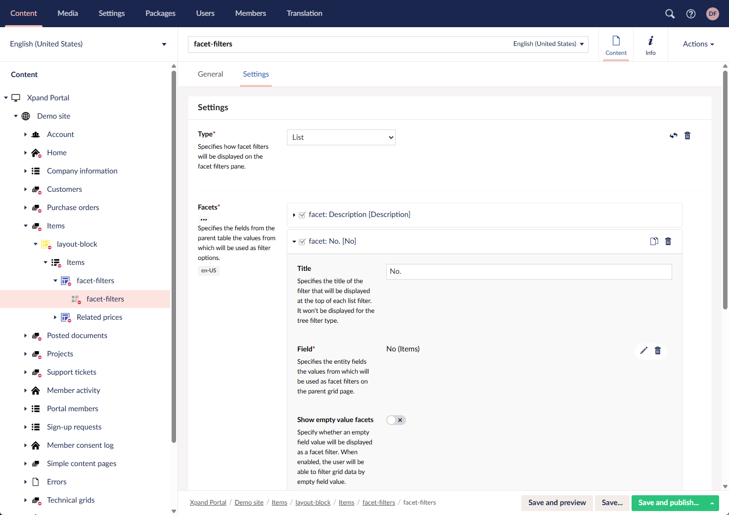
- On the Settings tab, specify the settings for the filters pane as described below.
- Type - Specifies the type of the view for the filters pane:
- List - In this view, each field with its values, by which you can set filters, is shown on top of each other. In this case, other filter options will by ruled out in parallel field nodes as soon as you start to apply filters by selecting field values.
- Tree - In this view, initially only one field is shown with its values, by which you can set filters, and all additional fields with their values are shown when you expand a field value. In this case, child filter options will be already filtered by the parent filter node.
- Facets - Specifies the fields from the grid page data source, the values of which will be available as facet filters. Select the icon to add a new field, and then fill in the settings as described below. Only add fields, the values of which you want to use as facet filters.
- Title - Specifies the title of the field filter. Type the title that you to have displayed on the facet filters pane for the field. For example, you can type a field caption here.
- Field - Specifies a field from the grid page data source, the values of which will be available as facet filters.
- Show empty value facets - Specifies whether an empty field value will be available as a facet filter. When this setting is enabled, the member will be able to filter records by empty field value.
- Sorting - Specifies how the facet filter values will be sorted on the facet filters pane.
- Show facet value count - Specifies whether a filter count value will displayed right to the filter caption. This value shows how many values are available for this filter.
- Type - Specifies the type of the view for the filters pane:
- Select Save and publish to save the changes and publish them on the front end. Optionally, if you were editing the page, you can select Save and preview to preview how the page will look like on the front end.
|
The layout settings of the parent layout block determine how this layout block element will be displayed on the page (on a tab, on top or below of other content elements, etc.). |
 Note
NoteNow you can use the added facet filters pane to filter the records of the parent grid by value of the selected fields.