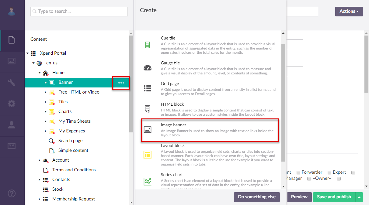
Image banner (configuration)
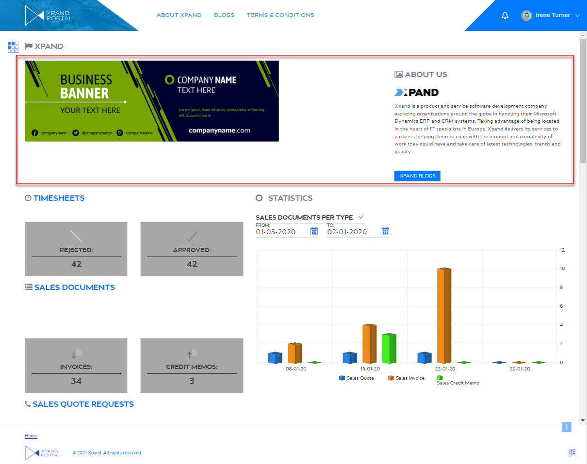
An image banner is an element of a  grid or
  dashboard layout block where you can add an image that will be displayed on the home or grid page. The banner may have text or links on it.
To add an image banner to a page
- In the backoffice, go to Content and expand the node of a
 grid page or
  dashboard (home) depending on where you want to add an HTML block.
 - Select the
 icon next to the corresponding layout block node ( grid or home dashboard). Alternatively, select and hold (or right-click) the node, and then select Create.
 - Select
 Image banner.
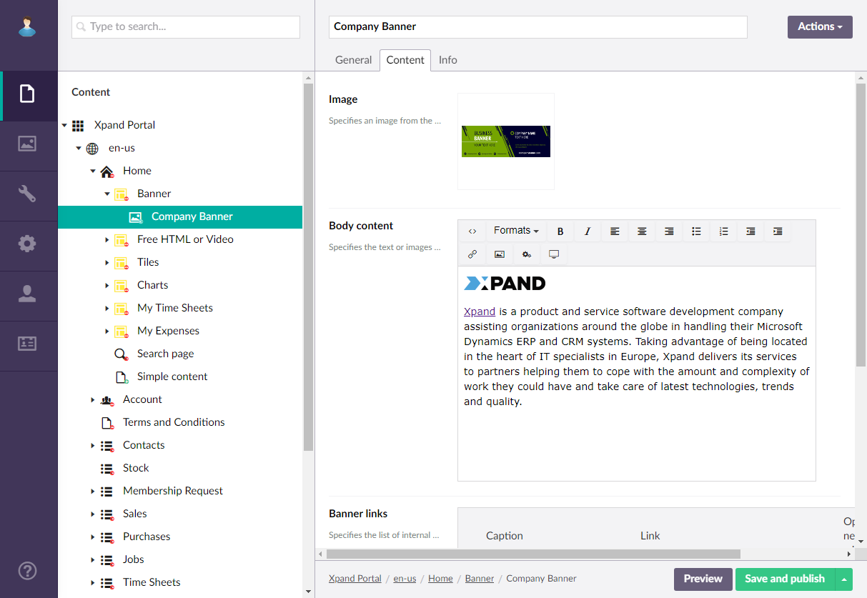
- On the header, enter the image banner name that will be used to identify it in the backoffice.
- On the General tab, fill in general settings as follows:
- Titles - Specifies the settings where you can configure the title of various elements on this page.
- Title - Specifies the title that will be displayed in the header of the created page or page element.
- Subtitle - Specifies the subtitle that will be displayed in the header of the created page or page element.
- Icon - Specifies the image that will be displayed in front of the title if specified. Adding an icon is optional. You can leave this setting empty (in this case, the default icon, chosen by the development team, will be used) or choose an icon from one of the available icon libraries.
- Responsive behavior - Specifies the settings that define how this page part or UI element responds to different viewport widths by adjusting its width and visibility at each responsive breakpoint.
- Hide element - Specifies that the element will be hidden for specific member groups. Select one or several member groups, for which this layout block element will be hidden. Alternatively, you can select the ~All~ checkbox to hide it for all member groups (without the necessity to select every member group's checkbox) or select the Hide element checkbox to have all member groups selected at once.
- Description - Specifies a description of this layout block element.
- Content-from page - Specifies the page the content of which will be displayed instead of the content of this page when this page is opened via a direct link. The URL in the address bar will remain that of the original page. For a page element, filling in this setting is not required.
- Redirect-to page - Specifies the page that will be displayed instead of this page when this page is opened via a direct link. The URL in the address bar will be that of the target page. For a page element, filling in this setting is not required.
- Module assignment & protection - Specifies settings that allow you to assign this content element (localization, page, etc.) to an internal module as well as to protect this element from certain operations (copying, changing, deletion). Select the Configure button to configure module assignment & protection or the Change button to edit existing configuration if it has already been configured.
- Titles - Specifies the settings where you can configure the title of various elements on this page.
- On the Content tab, specify the banner settings:
- Image - Specifies the banner image. You can use an existing image from the library or upload a new one.
- Banner content - Specifies the content of the banner, which may include images, text, hyperlinks, etc. This setting allows adding banner content in the Richtext editor as well as apply formatting; some of these elements can be configured separately.
- Banner links - Specifies the links that will be available as button under the body content of the banner.
 Internal link - Use this option to add a link to an internal portal page.
- Caption - Specifies the link caption.
- Link - Specifies a portal page that will be opened when a member follows the link. Select Add, and then navigate to a portal page.
- Open in new window - Specifies whether the link will be opened in a new window.
- Enable activity tracking - Turn this switch on if you want to track this link. If enabled, when a member follows the link, this activity will be shown in the member activity log with the link click action type.
 External link - Use this option to add a hyperlink to an external resource.
- Caption - Specifies the link caption.
- Link - Specifies the URL of a web page that will be opened when a member follows the link.
- Open in new window - Turn this switch on if you want the link to open the page in a new browser window.
- Enable activity tracking - Turn this switch on if you want to track this link. If enabled, when a member follows the link, this activity will be shown in the member activity log with the link click action type.
- Resposive behavior (Image width) - Specifies the settings that define how this page part or UI element responds to different viewport widths by adjusting its width and visibility at each responsive breakpoint.
- Image behind text - Specifies that the banner image is displayed behind the banner text.
- Position text first - Specifies that the banner text is positioned before the banner image. The banner text occupies the avalable space of the banner container after the banner image width is specified.
- Select Save and publish to save the changes and publish them on the front end. Optionally, if you were editing the page, you can select Save and preview to preview how the page will look like on the front end.
|
The layout settings of the parent layout block determine how this layout block element will be displayed on the page (on a tab, on top or below of other content elements, etc.). |
 Note
Note