Login page
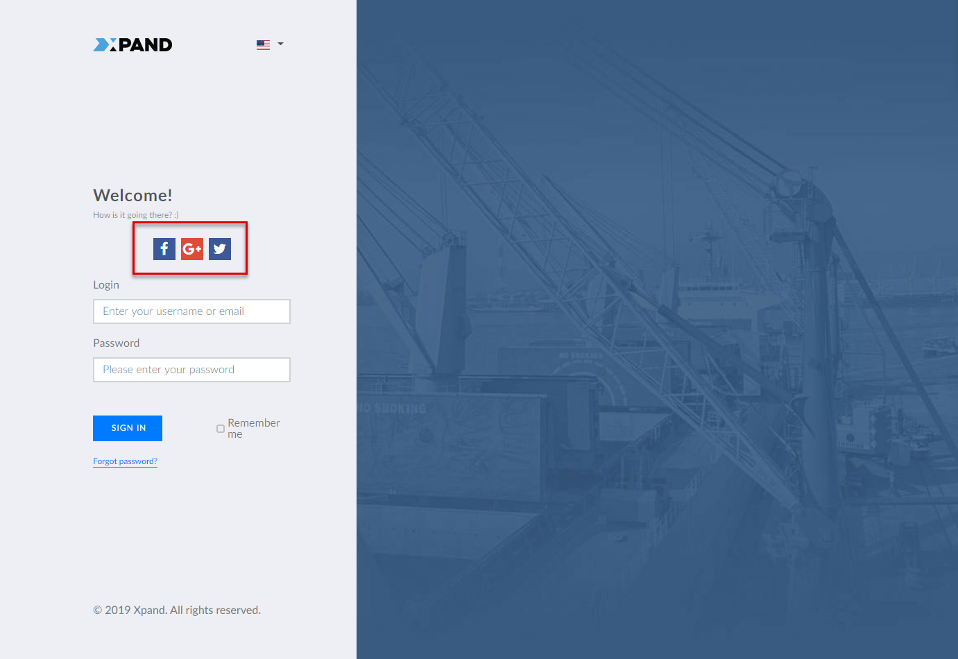
The Login page is a portal page that will be opened when a portal member is signing in to Xpand Portal front end. On this page, the member will be able to enter the username and password, register or open the page to recover the forgotten password.
To create a Login page for your portal
- In CMS, go to Content.
- Select the
 icon next to the node with the
  icon (or select and hold (or right-click) the node, and then select Create).
 Note
NoteThe
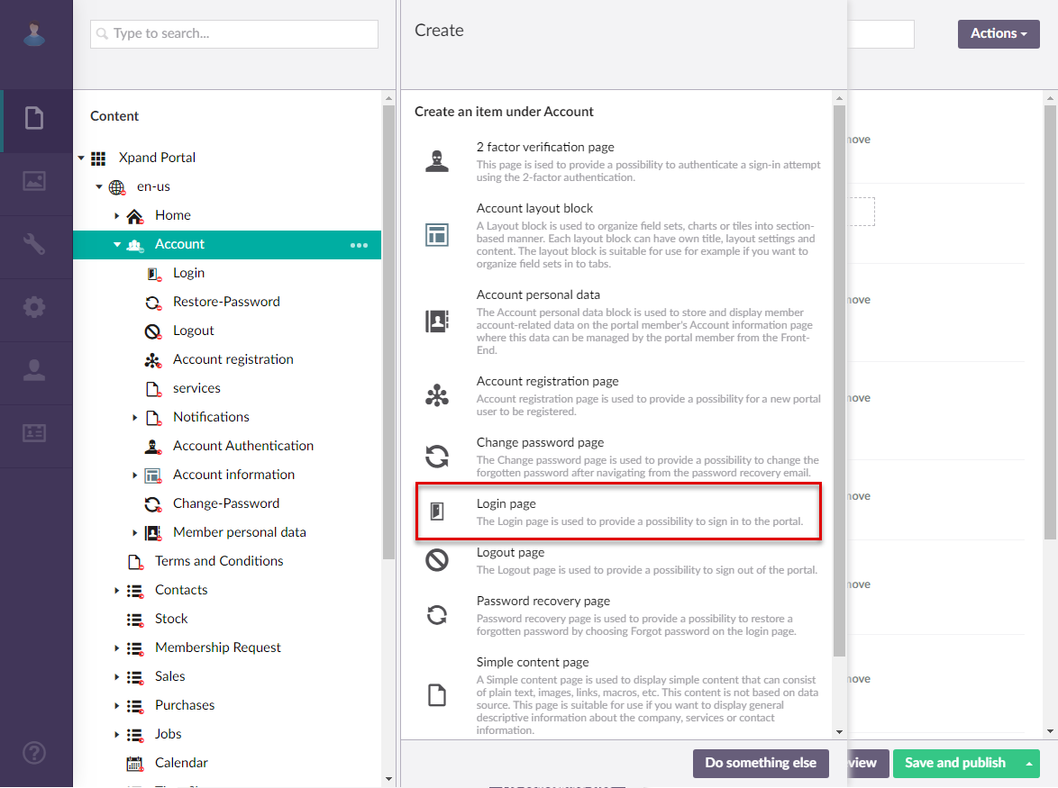
icon identifies the My Account page. The name of the page, which is also displayed as the node name, is customizable and can be different in your case. - In the Create pane, select
 Login page.
- On the header, type the name of the page, which will also be displayed as the node name in the site localization tree.
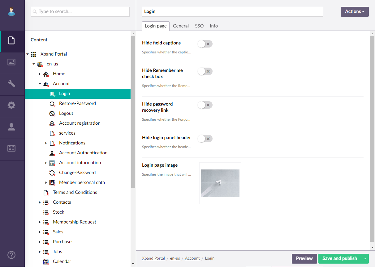
- On the Login page tab, configure the settings as described below.
- Hide field captions - Use this switch to hide all field captions on the login page.
- Hide Remember me check box - Use this switch to hide the Remember me check box. which is used to remember the portal member's username and password.
- Hide password recovery link - Use this switch to hide the Forgot password link on the login page, which is used to open the Password recovery page.
- Hide login panel header - Use this switch to hide the login page header, which may contain such information as the motto text and logo.
- Login page image - Specifies the image that will be displayed on the login page. Select the
 icon to add an image. You can browse the portal media library to select an existing image or upload a custom one. To edit an already specified image as well as view its details, point to the image thumbnail and select the
  icon. To remove the image, point to the image thumbnail and select the
  icon.
icon.
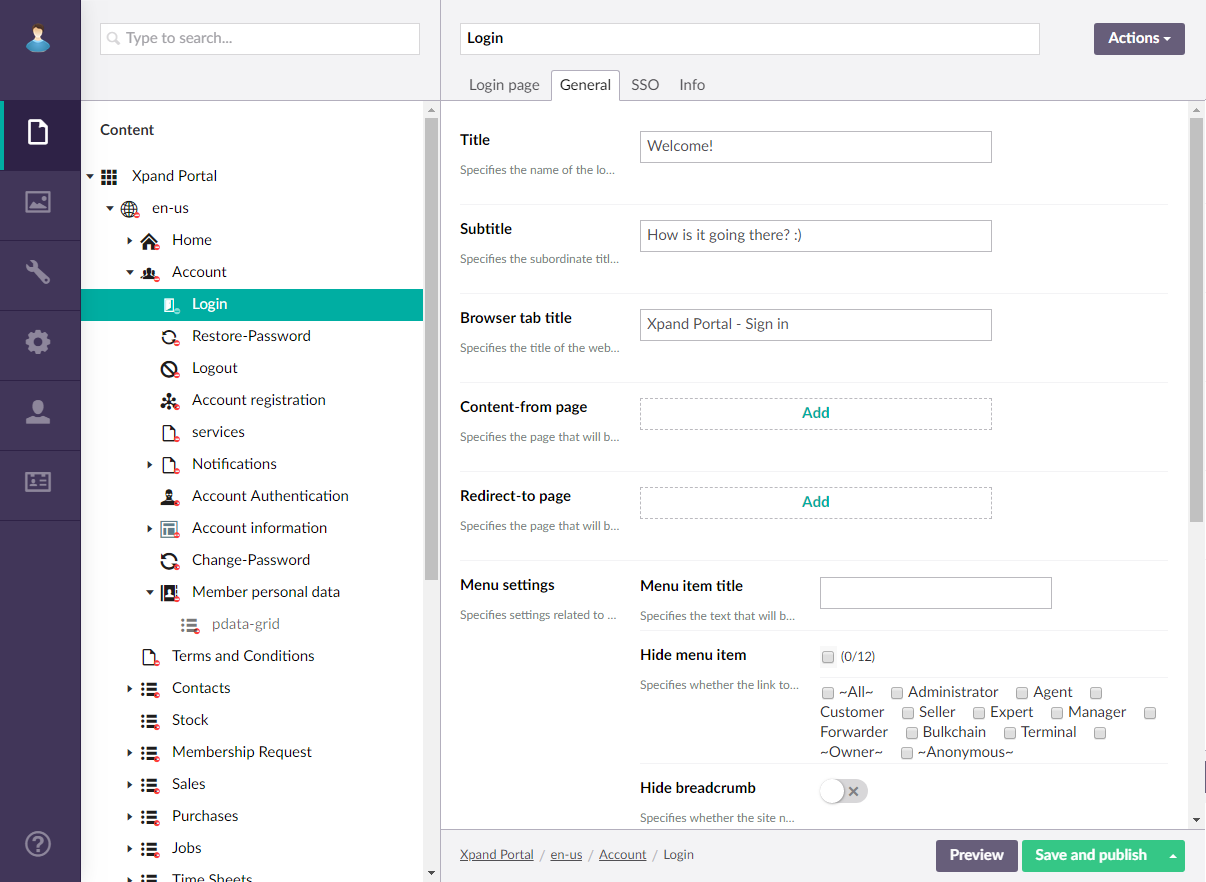
- On the General tab, configure the settings as described below.
- Title - Specifies the title that will be displayed in the header of the Login page.
- Subtitle - Specifies the subtitle that will be displayed in the header of the Login page. You can, for example, type a motto here or any other text that you want to be displayed on the login page.
- Browser tab title - Specifies the title of the web browser tab that will be displayed when the Login page is opened and the member point to the browser tab.
- Content-from page - Specifies the page the content of which will be displayed instead of the content of this page when this page is opened via a direct link. The URL in the address bar will remain that of the original page.
- Redirect-to page - Specifies the page that will be displayed instead of this page when this page is opened via a direct link. The URL in the address bar will be that of the target page.
- Menu settings:
- Menu item title -Specifies the title of the menu item, which will be displayed in the navigation pane for this page.
- Hide menu item - Specifies whether the menu item for this page will be hidden, and for which member groups. Only members that were added to the members groups that you select here will have this menu item available in their navigation pane. If you leave this check box cleared, the menu item will be visible to all member groups.
- Hide breadcrumb - Use this switch to hide or make visible again the page breadcrumb trail at the top of the page. A breadcrumb trail is used as a navigational aid to help portal members keep track and maintain awareness of their locations within the portal.
- Menu item icon - Specifies the icon of the menu item for this page. Select the square and browse to the icon in the portal media library. Adding an icon is optional. You can leave this setting empty (in this case, the default icon, chosen by the development team, will be used) or choose an icon from one of the available icon labraries.
- Menu item title color - Specifies the color of the menu item for this page.
- Split menu - Specifies whether a split line will be displayed after the menu item of this page.
- Compact menu - Specifies whether menu items will be displayed as icons in the main menu (navigation pane) for this page.
- Hidden menu - Specifies whether the main menu (navigation pane) will be hidden when this page is opened. The navigation can always be accessed by selecting the corresponding icon at the top of the page.
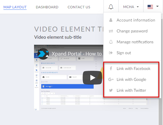
- On the SSO tab, configure the Single Sign-on (SSO) settings that provide the ability to sign in to Xpand Portal with social network accounts:
- Enable SSO - Use this switch to enable or disable the ability of portal members to sign in to Xpand Portal with social network providers on the front end. Additionally, for each social network account, you must set up the corresponding provider in the SSO settings. This setting does not affect the CMS login page; the CMS login page will always have buttons to sign in with the corresponding social network accounts if they are configured in the SSO settings. Xpand Portal supports single sign-on with the following social networks accounts:
-
 Facebook - For this provider to work correctly, you also must set up the Facebook provider in the SSO settings.
 -
 Google - For this provider to work correctly, you also must set up the Google provider in the SSO settings.
 -
 Twitter - For this provider to work correctly, you also must set up the Twitter provider in the SSO settings.
 -
 Microsoft - For this provider to work correctly, you also must set up the Microsoft provider in the SSO settings.
-
- Providers - Contains settings that can be used to adjust the default authentication providers settings. You do not have to configure authentication providers if you want to use predefined settings for all supported social authentication providers. If you want to adjust the default settings, you need create and configure settings for each supported authentication provider. To adjust the default settings for a provider, select the
 icon and configure the settings as described below:
- Authentication provider - Specifies the authentication provider for which these settings will apply. Select one of the supported authentication providers: Facebook, Google, Twitter, or Microsoft. These providers are available for selection here only if they have been properly configured in the SSO settings.
- Enabled - Use this switch to enable or display the ability to sign in to front end with this authentication provider.
- Icon - Specifies the image that will be used as the button to sign in with a social network that corresponds to this authentication provider. You can leave this setting empty to use the predefined icon. You can leave this setting empty (in this case, the default icon, chosen by the development team, will be used) or choose an icon from one of the available icon labraries.
- Title - Specifies the title of the authentication provider.
- CSS class name - Specifies the name of the CSS (Cascading Style Sheets), which can be used to apply styles to the sign-in link of this authentication provider. This setting is optional.
- Allow linking/unlinking accounts - Use this switch to allow linking a portal member account with a social network account of this authentication provider from the front end or unlinking previously linked accounts. If you enable this, the action to link the accounts will be available from the front end header in the member menu. This enables portal members to link accounts after they have already signed in and then use the social network account to sign in to the portal.
- Link title - Specifies the caption of the action that links the portal member account with a social network account of this authentication provider. Specify this caption if you enabled the Allow linking/unlinking accounts switch.
- Unlink title - Specifies the caption of the action that unlinks the portal member account from a social network account of this authentication provider. Specify this caption if you enabled the Allow linking/unlinking accounts switch.
- SSO links alignment - Specifies how single sign-on buttons are aligned on the login page.
- Allow creating member accounts from provider - Use this switch to allow portal members to create a portal member account using their social network account in case they try to sign in with a social network account without having a portal member account. If you enable this, you must also specify in the Template member field a portal member account, which will be used as a basis for creating a new portal member from a social network account.
- Template member - Specify which portal member account will be used as a basis for creating a new portal member from a social network account. Specify this if you enabled the Allow creating member accounts from provider switch. Roles, related contacts, related customers and other required information will be copied to from this template member to the new member account. Select Add, and then select a portal member account to use as a template account.
- Enable SSO - Use this switch to enable or disable the ability of portal members to sign in to Xpand Portal with social network providers on the front end. Additionally, for each social network account, you must set up the corresponding provider in the SSO settings. This setting does not affect the CMS login page; the CMS login page will always have buttons to sign in with the corresponding social network accounts if they are configured in the SSO settings. Xpand Portal supports single sign-on with the following social networks accounts:
- Select Save and publish to save the changes and publish them on the front end. Optionally, if you were editing the page, you can select Save and preview to preview how the page will look like on the front end.
- Specify the created Login page on the My account page in the Login page field.