Creating a custom portal theme
To be able to apply a custom portal theme, you need to create a custom theme first. Xpand Portal is shipped with a number of the pre-configured themes that can be applied or used as a basis for creating a custom theme.
To create a custom portal theme
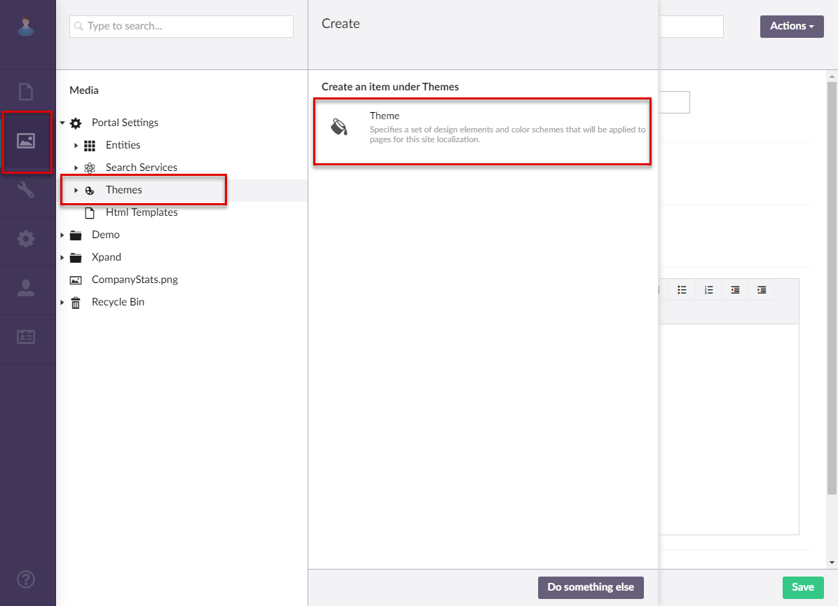
- In the backoffice, go to Media > Site settings > Themes.
- Select the
 icon next to Themes (or select and hold (or right-click) the node, and then select Create), and then select Theme to create a new theme.
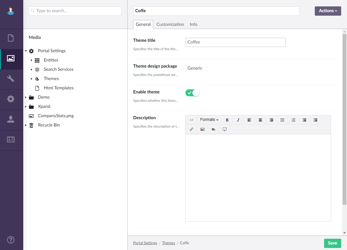
- On the header, type a title of theme that will be used to identify this theme in the backoffice.
- On the General tab, configure the settings as follows:
- Theme title – Specifies the title of the theme that will be displayed in the Theme field in the site settings when you are choosing which theme to apply.
- Base theme – Specifies the title of the pre-configured theme that will be used as a basis for this custom theme.
- Enable theme – Use this switch to enable your custom theme to make it available for selection in the Theme field in the site settings or to temporarily disable your theme.
- Description – Specifies a description of theme. Optionally, you can provide some information about your custom theme.
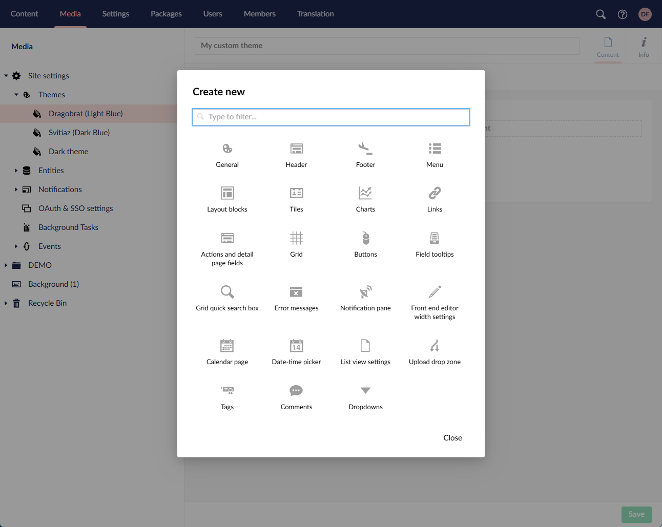
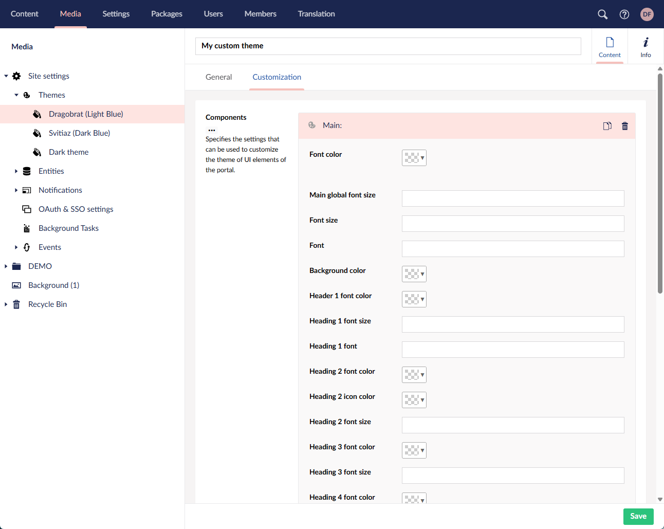
- On the Customization tab, under Components, select Add content to add a UI component that you want to customize for this theme. For each component, change the properties to suit this theme. You can change the color, background color, font, font color, font size of various UI elements, etc. When you need to specify a font size, enter a rem value (for example, 1.25rem). Availability of properties to configure varies depending on the component that you select. You can customize the following theme components:
- General – Specifies the general theme properties that allow you to customize the look of various common portal elements, such the global font size (font size that will be applied to most portal UI elements), secondary font and font size (for secondary elements), font and color for headings, detail field labels, detail page subtitles, scrollbar settings, loading icon, and other general elements.
- Header – Specifies the theme properties that allow you to customize the look of the page header. You can change the color, background color, font color, and font size of various elements of the header, such as header links, language selection menu, avatar, etc.
- Footer – Specifies the theme properties that allow you to customize the look of the page footer. You can change the color, font color, and font size of various elements of the footer.
- Menu – Specifies the theme properties that allow you to customize the look of various elements on the menu (navigation pane). You can change the color, background color, font, font color, and font size of various calendar elements, such menu items, icons, scroll bar, menu split lines, etc.
- Layout blocks – Specifies the theme properties that allow you to customize the look of layout blocks. You can change the color, background color, font color, and font size of various layout block elements, such the layout block title, layout title drop-down menu items, layout block tabs, etc.
- Tiles – Specifies the theme properties that allow you to customize the look of various elements of the home page tiles. You can change the color, background color, and font color of various tile elements.
- Charts – Specifies the theme properties that allow you to customize the look of various elements on series charts, which can be added to various layout blocks. You can change the chart font color and font size.
- Links – Specifies the theme properties that allow you to customize the look of various page links, including such elements as action icons, AssistButton icons, tile block title links, etc. You can the font color for various links.
- Actions and detail page fields – Specifies the theme properties that allow you to customize the look of detail page fields as well as change the look of various actions that can be met throughout the portal. You can change the color, background color, font, font color, and font size of various elements of portal actions and detail page fields.
- Grid – Specifies the theme properties that allow you to customize the look of various elements on the grid (list) pages. You can change the color, background color, font, font color, and font size of various grid elements, including grid fields, grid header, and links.
- Buttons – Specifies the theme properties that allow you to customize the look of various buttons on the portal. You can change button caption font, button caption font size, button caption font color, button background color, button icon color, button border, and other button-related properties.
- Field tooltips – Specifies the theme properties that allow you to customize the look of tooltips that appear when you hover over a field, the value of which is not fully visible due to column width. You can change the color, background color, font, font color, and font size of various field tooltip elements.
- Grid quick search box – Specifies the theme properties that allow you to customize the look of various elements on quick search box, which is used to find entries on a grid page. You can change the color and background color of various quick search box elements.
- Error messages – Specifies the theme properties that allow you to customize the look of portal error messages. You can change the color, background color, font, font color, and font size of various error message elements.
- Notification pane – Specifies the theme properties that allow you to customize the look of various elements on notifications pane, which is displayed when you click the notifications icon on the header. You can change the color, background color, font color, and font size of various notifications pane elements.
- Front end editor width settings – Specifies the theme properties that allow you to customize the width settings, which are used in the front end editor. You can change the font color in these settings.
- Calendar page – Specifies the theme properties that allow you to customize the look of various elements on the Calendar pages. You can change the color, background color, font, font color, and font size of various calendar elements.
- Date-time picker – Specifies the theme properties that allow you to customize the look of date-time pickers. A date-time picker is a type of control that allows you to specify a date and/or time in a field with the date-time value type. You can change the color, background color, font, font color, and font size of various date-time picker elements.
- List view settings - Specifies the theme properties that allow you to customize the look of the list views. You can change the colors of the items, labels, borders, background, and font. You can also change the font size.
- Upload drop zone - Specifies the theme properties that allow you to customize the look of the upload drop zone that is used when managing attachments.
- Tags - Specifies the theme properties that allow you to customize the look of tags.
- Comments - Specifies the theme properties that allow you to customize the look of comments.
- Dropdowns - Specifies the theme properties that allow you to customize the look of dropdowns that are used in multiple places.
 Tip
TipTo reset a customized theme to its default state, delete the customized settings on the Customization tab.
- Click Save.
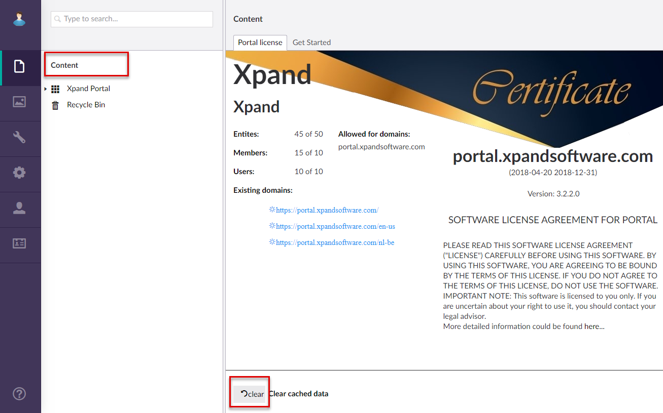
- If you were making changes to the existing custom theme, you need to clear the portal cache to have the changes applied on the front end. To clear the portal cache, in the backoffice go to Content, and then select Clear cached data at the bottom of the page. Alternatively, you can select More > Reload Application.
 Important
You must reload application whenever you make changes in the Media section of the backoffice. Otherwise, your changes may not take effect.
 After a custom theme is created and enabled, you can apply it in the portal localization settings.