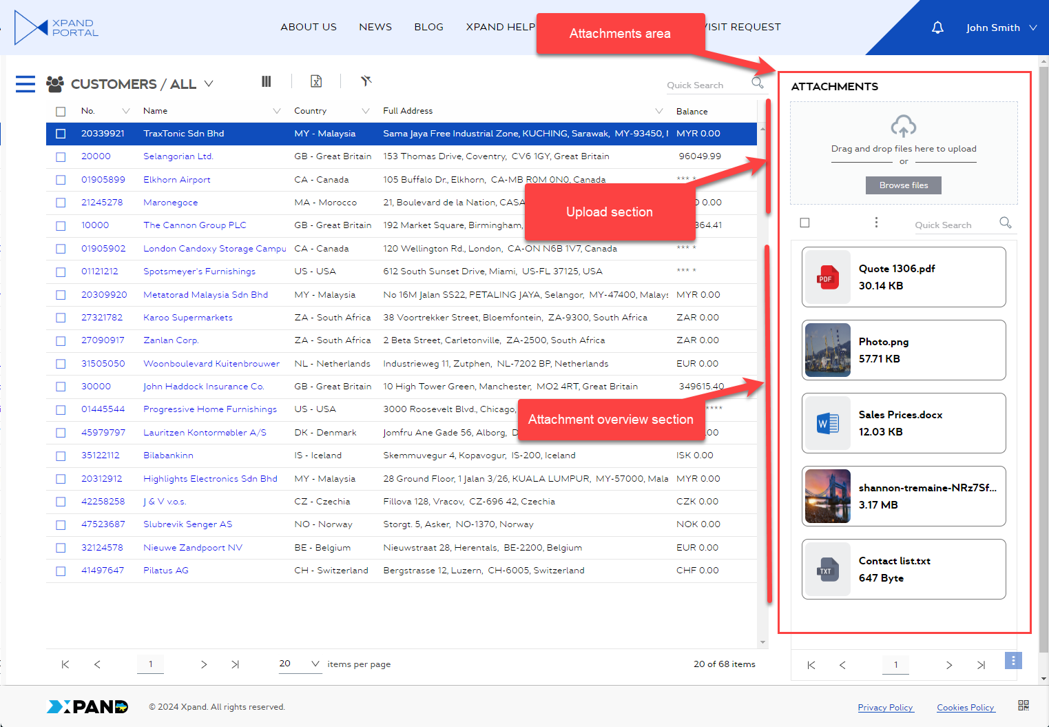
Attachments area (configuration)
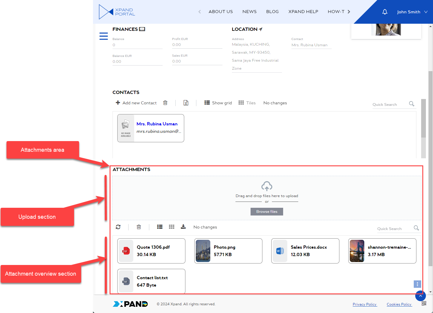
Record attachments can be uploaded in two ways on the portal: in a specific attachment field or in an attachments area. Using the attachment area is more convenient because by default it has a separate upload section (where members can drag files to upload them or use the Browse files action to browse for a file(s) to upload) as well as an overview section (which is basically a grid page where members can see and manage uploaded files).
An attachment area can be added to a detail page (within a  detail layout block), a grid page (also within detail layout block), or a home (dashboard) page (within a
  dashboard layout block).
An example on a grid page:
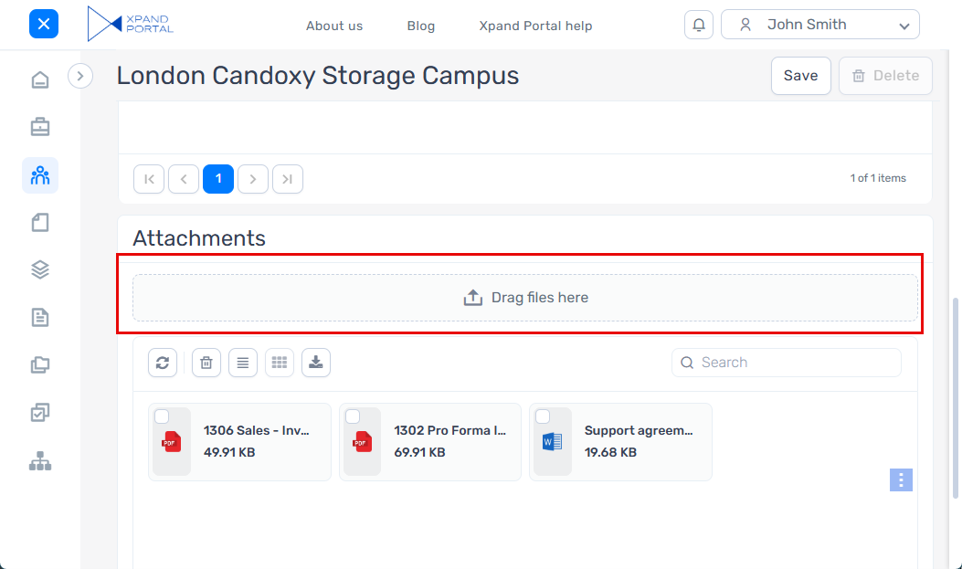
An example on a detail page:
There are two approaches to configuring an attachment area:
- To have attachments linked to records (when a member uploads files, they need to select a record that the file will be attached to). In this case, the structure of pages should follow this rule: the attachments area is added within a detail layout block, while its parent detail page must be a child page to a grid page that contains records, to which attachments will be linked; both the detail page and its parent grid page must have the same data source. An attachment area on a detail page is already related to a specific record.
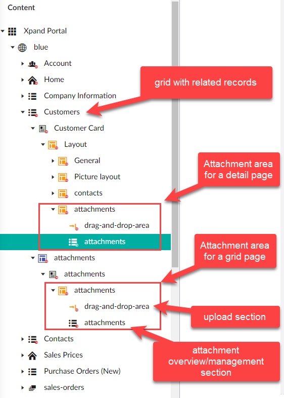
- To have attachments linked to the whole page (uploaded files are not related to a specific record). In this case, there are no requirements to have a parent grid page with the same data source as the attachment area layout block's parent page. The attachment area can be added as part of dashboard or detail layout block.
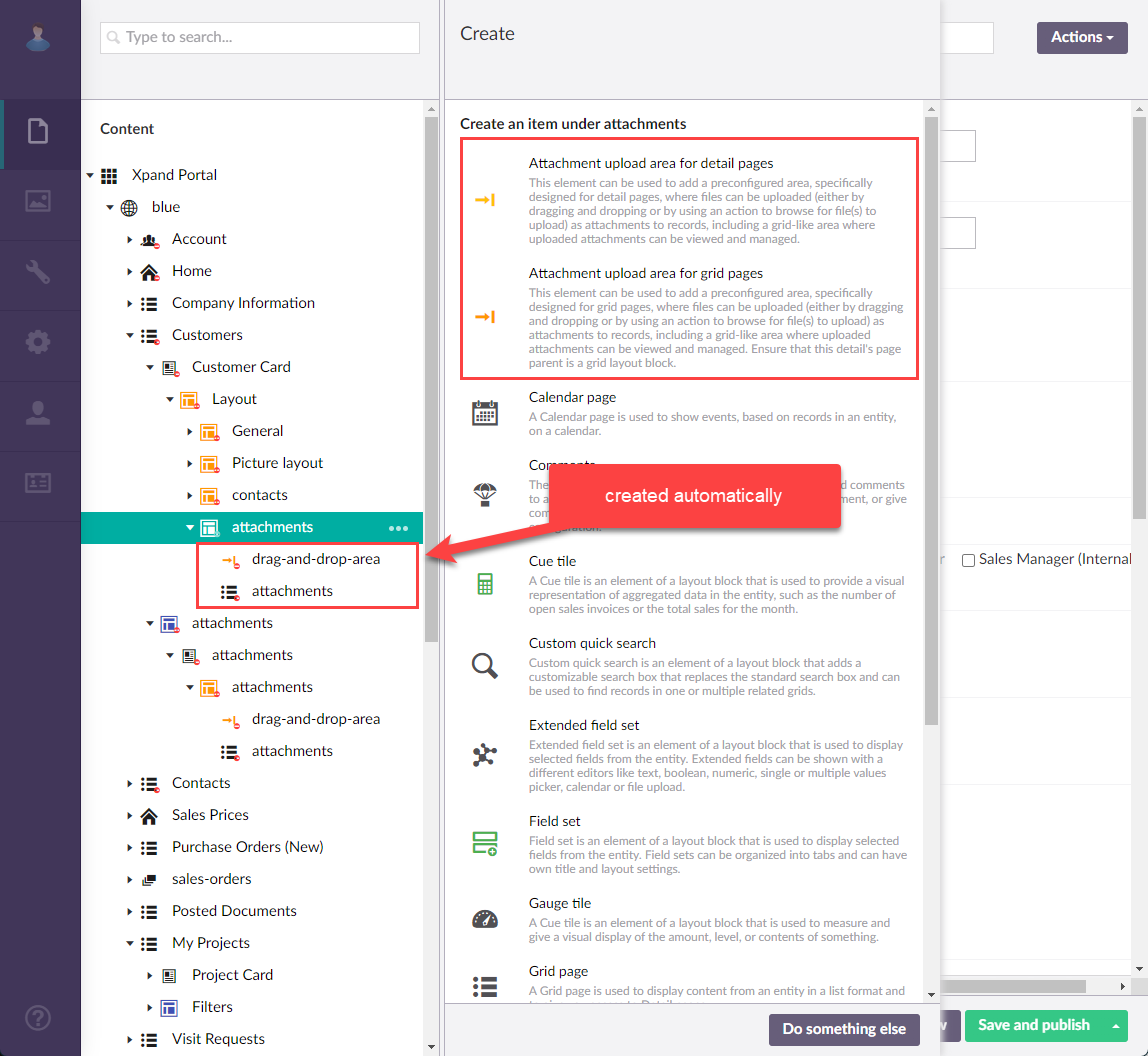
To simplify configuration of attachments, Xpand Portal provides two pre-configured sets of settings that can be added as part of dashboard or detail layout block:  Attachment upload area for detail pages and
  Attachment upload area for grid pages. When you add one of these layout block parts, the child pages required for the attachment area (an upload area and a grid for attachment overview/management), including default settings, are added automatically. However, you can adjust the settings according to your needs. These two layout block items have the same elements; they are only different in default settings, which were pre-configured to be suitable either for a grid or detail page.
To configure an attachment area
- On the detail, or dashboard layout block of a page where you want to add an attachment area (see the requirements for the structure of the parent pages and layout blocks that define whether attached files will be linked to records or the whole page), select the
 icon, and then select Attachment upload area . If it is dashboard layout block, select Attachment upload area for detail pages (if the attachment area is going to be embedded in a detail page) or Attachment upload area for grid pages (if the attachment area is going to be embedded in a detail page). The child elements required for the attachment area are created automatically and have the default settings suitable either for a grid or detail page depending on your choice. The default settings are enough to publish the pages and start using the functionality, but you can review and adjust them if necessary.
- Go to the created child or page that represents the upload area where members can upload files by dragging them into this area or using the Browse file action.
- On the General tab, configure/adjust the general settings:
- Titles - Specifies the settings where you can configure the title of various elements on this page.
- Title - Specifies the title of the layout block element that will be displayed on the page or page element if specified. Specifying the title is optional.
- Subtitle - Specifies the subtitle of the layout block element that will be displayed on the page or page element if specified. Specifying the subtitle is optional.
- Icon - Specifies the image that will be displayed in front of the title if specified. Adding an icon is optional. You can leave this setting empty (in this case, the default icon, chosen by the development team, will be used) or choose an icon from one of the available icon libraries.
- Responsive behavior - Specifies the settings that define how this page part or UI element responds to different viewport widths by adjusting its width and visibility at each responsive breakpoint.
- Hide element - This setting hides the layout block element from the page. It can be configured per member group. Select one or several member groups, for which this layout block element will be hidden. Alternatively, you can select the ~All~ checkbox to hide it for all member groups (without the necessity to select every member group's checkbox) or select the Hide element checkbox to have all member groups selected at once.
- Description - Specifies a description of this layout block element.
- Content-from page - Specifies the page the content of which will be displayed instead of the content of this page when this page is opened via a direct link. The URL in the address bar will remain that of the original page. For a page element, filling in this setting is not required.
- Redirect-to page - Specifies the page that will be displayed instead of this page when this page is opened via a direct link. The URL in the address bar will be that of the target page. For a page element, filling in this setting is not required.
- Module assignment & protection - Specifies settings that allow you to assign this content element (localization, page, etc.) to an internal module as well as to protect this element from certain operations (copying, changing, deletion). Select the Configure button to configure module assignment & protection or the Change button to edit existing configuration if it has already been configured.
- Titles - Specifies the settings where you can configure the title of various elements on this page.
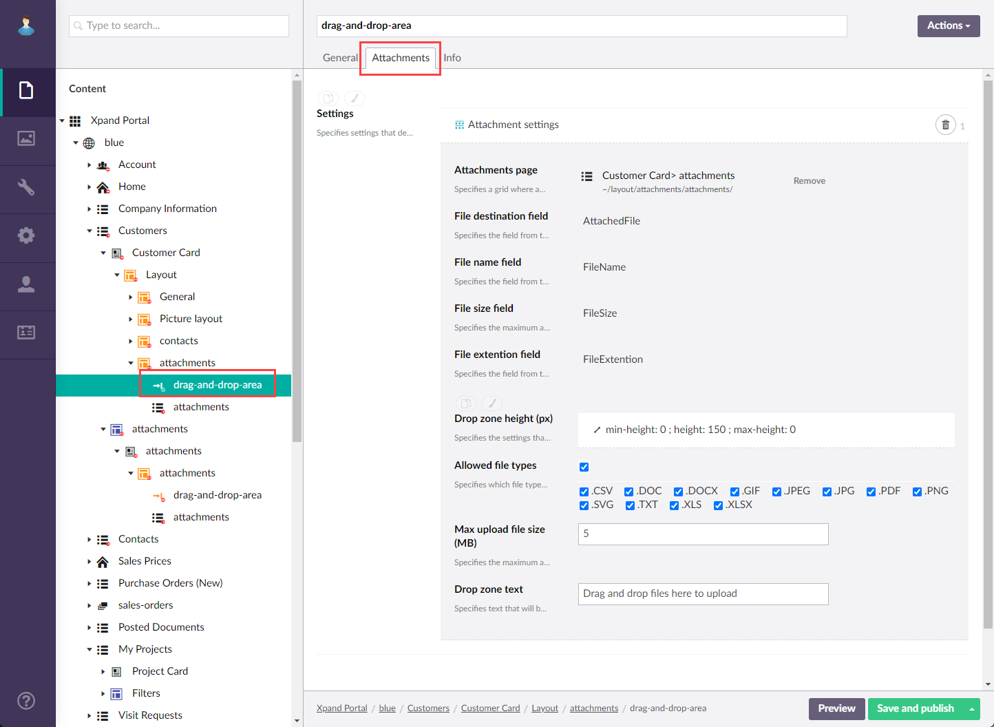
- On the Attachments tab, configure the following settings:
Uploading process
- Attachments page - Specifies a grid where attachments are stored and displayed.
- File destination field - Specifies the field from the selected grid where attachments are stored.
- File name field - Specifies the field from the selected grid where the name of the attached file is stored.
- File size field - Specifies the field from the selected grid where the size of the attached file is stored.
- File extension field - Specifies the field from the selected grid where the extension of the attached file is stored.
- Allowed file types - Specifies which file types are allowed for attachments.
- Max no. of files per upload - Specifies the maximum number of attachments per upload. If this setting is empty, the default limit is 10 files.
- Max upload file size (MB) - Specifies the maximum allowed file size for attachments in megabytes.
Drop zone
- Layout - Specifies the settings that define how the drop zone appears. You can select one of the preconfigured variants and customize it if needed.
- Compact drop zone - A short-height drop zone without a button; the entire area is clickable and allows icon customization.
- Icon - Specifies the image that will be displayed in the drop zone. This setting is available only for the compact drop zone type.
- Drop zone text - Specifies the text that will be displayed in the drop zone.
- Drop zone height (px) - Specifies the settings that allow you to configure the height of the zone where attachments are dropped in pixels.
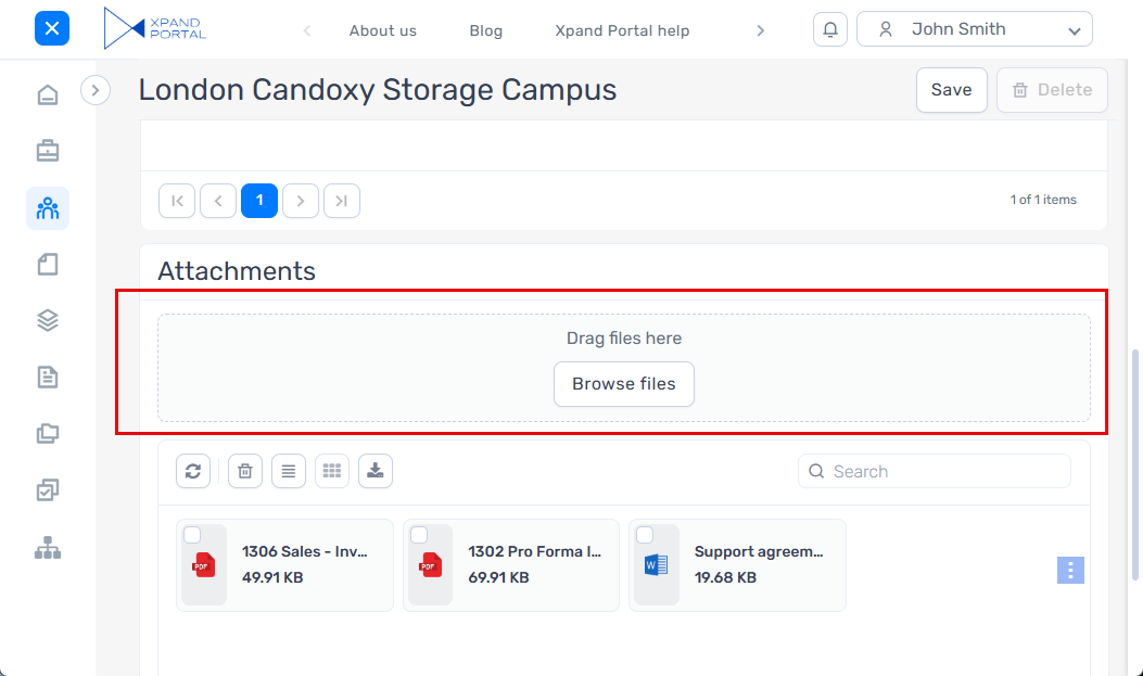
- Standard drop zone - A medium-height drop zone with an upload button and no delimiter.
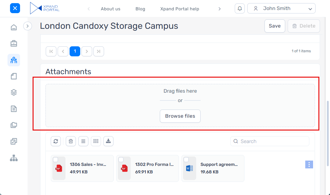
- Large drop zone - A larger, tall-height drop zone with an upload button and a delimiter for improved visibility.
- Compact drop zone - A short-height drop zone without a button; the entire area is clickable and allows icon customization.
- Select Save and publish to save the changes and publish them on the front end. Optionally, if you were editing the page, you can select Save and preview to preview how the page will look like on the front end.
- Go to the next created child grid page that represents the section where uploaded attachments can be seen as well as managed (downloaded or deleted). Adjust the settings in the same way you do when creating grid pages. For this child grid page, the following settings are important:
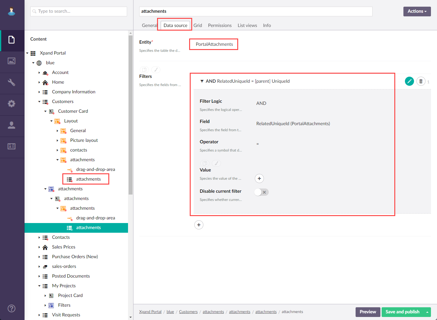
- On the Data source tab, in the Entity setting, the PortalAttachments entity must be selected, which was designed for the purpose of displaying attachments. Also, a filter must be set up where RelatedUniqueid = [parent] UniqueId.
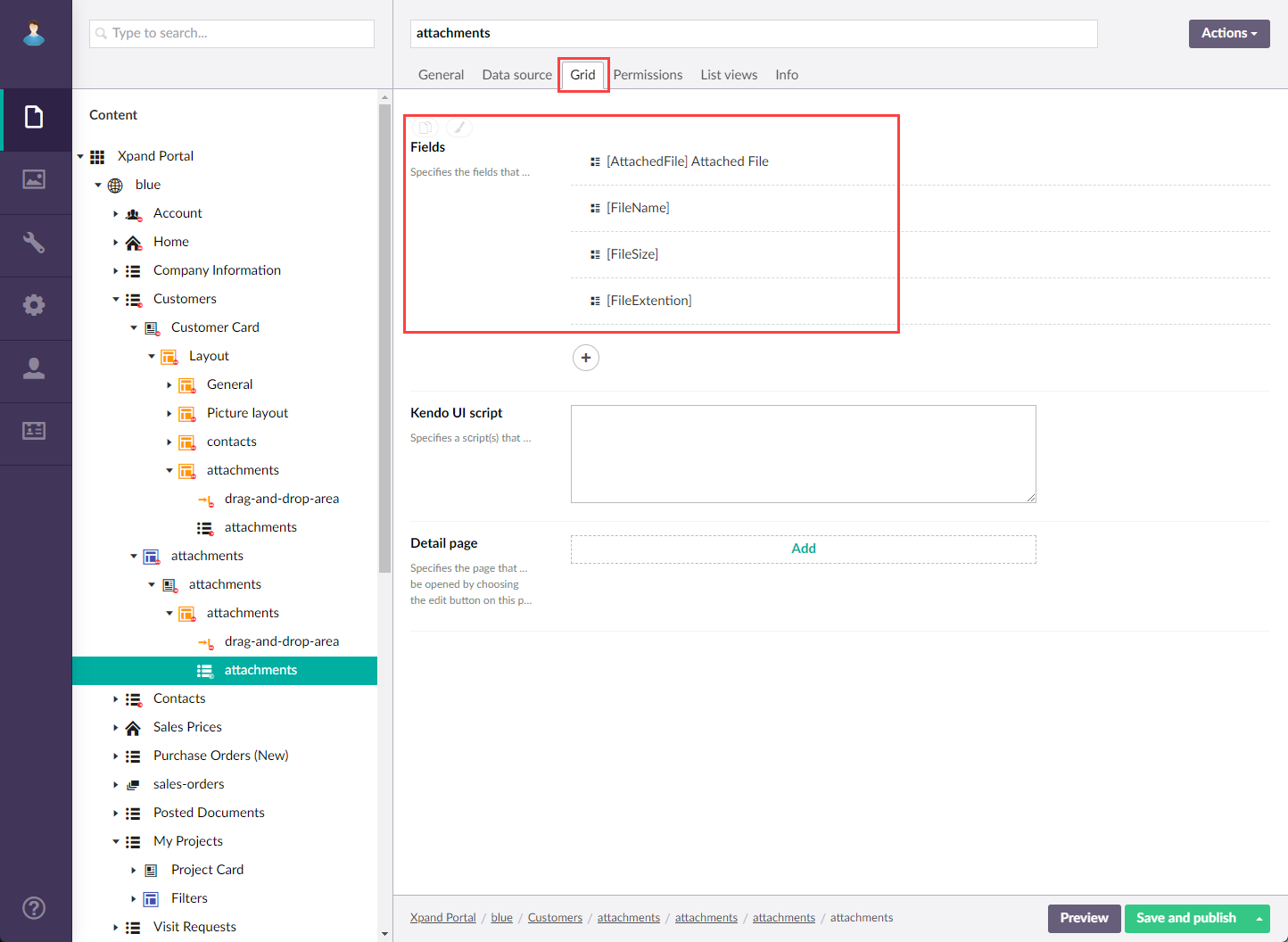
- On the Grid tab, the following fields should be present, which are used for storing attachment information.
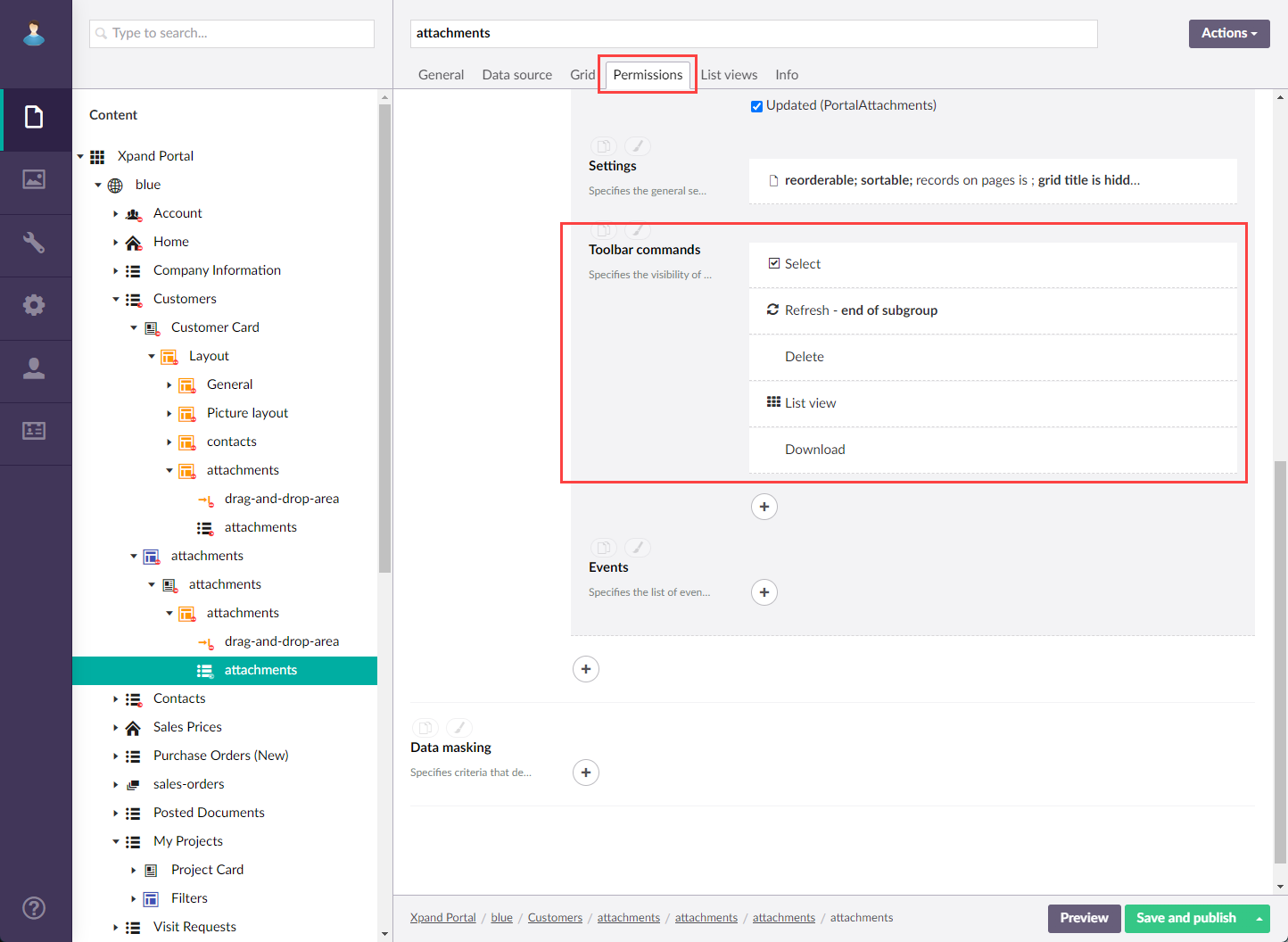
- On the Permissions tab, the following grid actions are recommended for members to be able to manage attachments
- Select - For members to be able to select attachments to perform actions (download and delete).
- Refresh - For members to be able to refresh the page to see the latest attachments.
- Delete - For members to be able to delete attachments.
- List view - For members to be able to switch between tile and list views.
- Download files - For members to be able to download attachments.
- On the Data source tab, in the Entity setting, the PortalAttachments entity must be selected, which was designed for the purpose of displaying attachments. Also, a filter must be set up where RelatedUniqueid = [parent] UniqueId.
- Select Save and publish to save the changes and publish them on the front end. Optionally, if you were editing the page, you can select Save and preview to preview how the page will look like on the front end.