Adding actions to grid pages
Actions above a grid on a grid page are used to perform various operations with records on the grid. You can add them to any grid page or grid page element.
Grid actions are based on predefined toolbar commands, however, you can customize the action title, action icon, and configure other action-specific settings. Some of the toolbar commands can be used to create several actions (for example, for the Export command, you can create separate actions to export data in different formats: one to export to Excel, and another to save data as PDF).
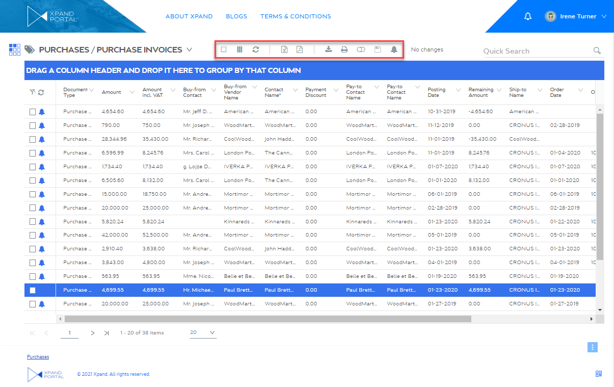
Certain action buttons (Select, Refresh, Filter, Edit inline, Column Visibility, and Scheduler) can be moved to the service menu in the top left corner of the grid page.
|
Availability of actions on a page depends on the member group permissions for that page. Thus, an action will be available for a portal member only if the portal member is assigned to a portal member group for which the action is allowed. |
To add an action to a grid page
- In the backoffice, open the page settings for a grid page, for which you want to add or edit a grid action.
- On the Permissions tab, next to Member group permissions, select Add Permission or edit the existing one.
- Under Member groups, select one or several member groups, for which the added grid actions below will be available. Alternatively, you can select the ~All~ check box to make the toolbar commands below available for all member groups (without the necessity to select every member group's check box) or select the Member Group check box to have all member groups selected at once.
 Note
NoteMember groups that you select here are common for three types of member group permissions settings: field visibility, general page settings, and toolbar commands. Therefore, steps 2 and 3 are performed only once for these three types of permission settings.
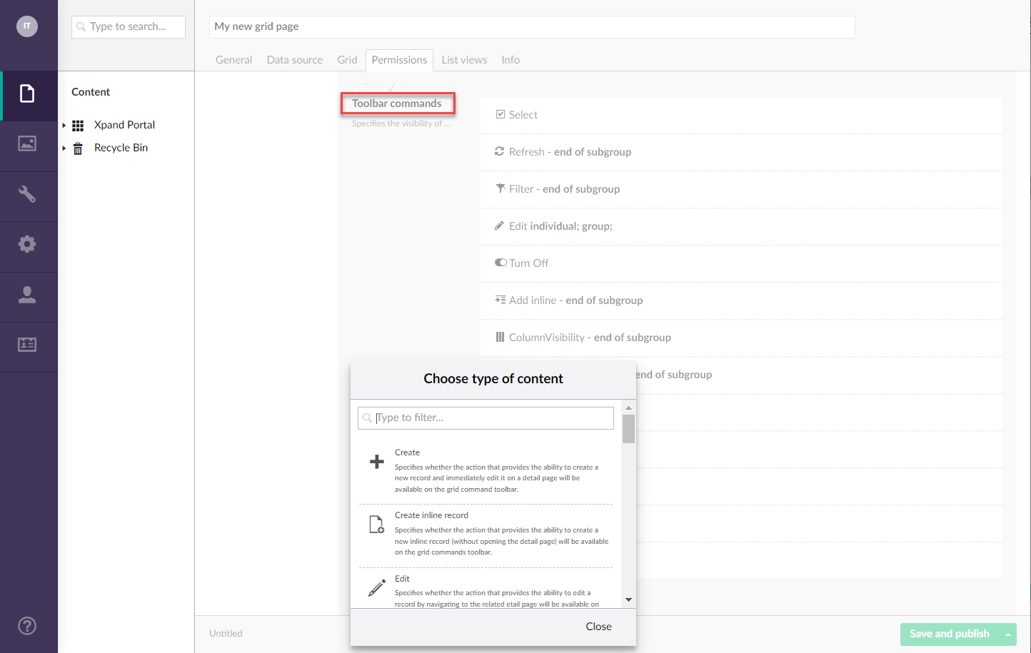
- After you have specified the member group(s), under Toolbar commands, select Add content to add a new toolbar/service menu command that will be available on this grid page for portal members that belong to the specified member groups.
- Select one of the available predefined toolbar commands to add a grid action and configure its settings:
Create
Use this command to add an action to a grid page toolbar that will create a new record and open the related detail page to edit editable fields. Available toolbar command settings:
- Command title - Specifies the caption of the action that will be displayed when the portal member points to the action icon. For example: New & Edit.
- Show command title - Use this switch to show or hide the action title. When the title is hidden, the portal members can still see the title in the tooltip when they hover over the action icon.
- Show command without icon - Use this switch to show or hide the action icon on the grid toolbar.
- Command icon - Specifies the icon that will be used for the action. Select the square and browse to an icon in the portal media library. You can leave this setting empty to use the predefined default icon for this toolbar command. You can leave this setting empty (in this case, the default icon, chosen by the development team, will be used) or choose an icon from one of the available icon libraries.
- Split command subgroup - Specifies whether the action created on the basis of this command will end the group of actions. An empty space will be displayed after the group of actions to separate it from the next group of actions.
- Command style - Specifies the style that will be applied to the command on the command toolbar.
- Highlighted - This style highlights the command background to make the action accentuated.
- Flat - This style removes the border around the command button, which makes it look flat.
Create inline record
Use this command to add an action to a grid page toolbar that will create a new record on a grid page (without opening the related detail page). Available toolbar command settings:
- Command title - Specifies the title of the action that will be displayed when the portal member points to the action icon. For example: New.
- Show command title - Use this switch to show or hide the action title. When the title is hidden, the portal members can still see the title in the tooltip when they hover over the action icon.
- Show command without icon - Use this switch to show or hide the action icon on the grid toolbar.
- Command icon - Specifies the icon that will be used for the action. Select the square and browse to an icon in the portal media library. You can leave this setting empty to use the predefined default icon for this toolbar command. You can leave this setting empty (in this case, the default icon, chosen by the development team, will be used) or choose an icon from one of the available icon libraries.
- Split command subgroup - Specifies whether the action created on the basis of this command will end the group of actions. An empty space will be displayed after the group of actions to separate it from the next group of actions.
- Command style - Specifies the style that will be applied to the command on the command toolbar.
- Highlighted - This style highlights the command background to make the action accentuated.
- Flat - This style removes the border around the command button, which makes it look flat.
Edit
Use this command to add an action to a grid page toolbar and/or to the grid lines that will open the detail (card) page for a selected record on the grid where the portal member can edit the record, upload and download documents, and perform other activities. Available toolbar command settings:
- Command title - Specifies the caption of the action that will be displayed when the portal member points to the action icon. For example: Edit.
- Show command title - Use this switch to show or hide the action title. When the title is hidden, the portal members can still see the title in the tooltip when they hover over the action icon.
- Show command without icon - Use this switch to show or hide the action icon on the grid toolbar.
- Enabled in grid column - Use this switch to hide or make this action available directly on the record line within the grid.
- Enabled on commands toolbar - Use this switch to hide or make this action available on the grid toolbar.
- Command icon - Specifies the icon that will be used for the action. Select the square and browse to an icon in the portal media library. You can leave this setting empty to use the predefined default icon for this toolbar command. You can leave this setting empty (in this case, the default icon, chosen by the development team, will be used) or choose an icon from one of the available icon libraries.
- Split command subgroup - Specifies whether the action created on the basis of this command will end the group of actions. An empty space will be displayed after the group of actions to separate it from the next group of actions.
- Command style - Specifies the style that will be applied to the command on the command toolbar.
- Highlighted - This style highlights the command background to make the action accentuated.
- Flat - This style removes the border around the command button, which makes it look flat.
Delete
Use this command to add an action to a grid page toolbar and/or to the grid lines that will delete a selected record on the grid. Available toolbar command settings:
- Command title - Specifies the caption of the action that will be displayed when the portal members points to the action icon. For example: Delete.
- Show command title - Use this switch to show or hide the action title. When the title is hidden, the portal members can still see the title in the tooltip when they hover over the action icon.
- Show command without icon - Use this switch to show or hide the action icon on the grid toolbar.
- Enabled in grid column - Use this switch to hide or make this action available directly on the record line within the grid.
- Enabled on commands toolbar - Use this switch to hide or make this action available on the grid toolbar.
- Command icon - Specifies the icon that will be used for the action. Select the square and browse to an icon in the portal media library. You can leave this setting empty to use the predefined default icon for this toolbar command. You can leave this setting empty (in this case, the default icon, chosen by the development team, will be used) or choose an icon from one of the available icon libraries.
- Split command subgroup - Specifies whether the action created on the basis of this command will end the group of actions. An empty space will be displayed after the group of actions to separate it from the next group of actions.
- Allow removing all records - Specifies whether members who have access to this action are allowed to delete records regardless of the their ownership. When this switch is disabled, a member will be able to delete only records that were created by that member.
- Command style - Specifies the style that will be applied to the command on the command toolbar.
- Highlighted - This style highlights the command background to make the action accentuated.
- Flat - This style removes the border around the command button, which makes it look flat.
Select
Use this command to add a check box to the grid lines that will select individual records and, optionally, an action to a grid page toolbar/service menu that will select all records on the page. Selecting records is required to perform certain other actions with records, such as export, deletion, downloading document attachments, etc. Available toolbar/service menu command settings:
- Command title - Specifies the caption of the action that will be displayed when the portal member points to the action icon. Note that this caption is shared with the same action in the context menu (when you select and hold (or right-click) a record), therefore set up a caption that will be suitable for both selecting a single record (using the context menu) and all visible records. For example: Select.
- Show command title - Use this switch to show or hide the action title. When the title is hidden, the portal members can still see the title in the tooltip when they hover over the action icon.
- Show command without icon - Use this switch to show or hide the action icon on the grid toolbar.
- Select all - Specifies whether the action that selects all records will be available on the toolbar.
- Split command subgroup - Specifies whether the action created on the basis of this command will end the group of actions. An empty space will be displayed after the group of actions to separate it from the next group of actions.
- Selected state icon - Specifies the icon that will be used for the action when the check box is selected. Select the square and browse to an icon in the portal media library. You can leave this setting empty to use the predefined default icon for this toolbar command.
- Cleared state icon - Specifies the icon that will be used for the action when the check box is cleared. Select the square and browse to an icon in the portal media library. You can leave this setting empty to use the predefined default icon for this toolbar command.
- Command style - Specifies the style that will be applied to the command on the command toolbar.
- Highlighted - This style highlights the command background to make the action accentuated.
- Flat - This style removes the border around the command button, which makes it look flat.
- Show in Service toolbar - Moves the button from the grid page toolbar to the service menu in the top left corner of the grid page.
Export
Use this command to add an action to a grid page toolbar that will export records currently displayed on the page to the specified format. You can use this toolbar command to add several actions. For example, one action that saves data as PDF and another action that exports data to Excel. Available toolbar command settings:
- Command title - Specifies the caption of the action that will be displayed when the portal member points to the action icon. For example: Export to Excel, Save as PDF, or Save as CSV.
- Show command title - Use this switch to show or hide the action title. When the title is hidden, the portal members can still see the title in the tooltip when they hover over the action icon.
- Show command without icon - Use this switch to show or hide the action icon on the grid toolbar.
- Export type - Specifies the format into which records will be exported. Select the field, and select one of the available formats. At present, the following formats are supported:
- CSV (Comma-separated values) - Records will be saved as a file in the CSV (comma-separated values) format.
- Excel - Records will be exported to Microsoft Office Excel.
- PDF - Records will be saved as a file in the PDF format.
- Command icon - Specifies the icon that will be used for the action. Select the square and browse to an icon in the portal media library. You can leave this setting empty to use the predefined default icon for this toolbar command. You can leave this setting empty (in this case, the default icon, chosen by the development team, will be used) or choose an icon from one of the available icon libraries.
- Split command subgroup - Specifies whether the action created on the basis of this command will end the group of actions. An empty space will be displayed after the group of actions to separate it from the next group of actions.
- Enable activity tracking - Use this switch to enable tracking of the member's activity for this action. When enabled, an act of using this action by a member will be tracked and shown in the member activity log.
- Command style - Specifies the style that will be applied to the command on the command toolbar.
- Highlighted - This style highlights the command background to make the action accentuated.
- Flat - This style removes the border around the command button, which makes it look flat.
- Confirmation settings - Specifies settings that allow you to configure how the confirmation message on export looks like.
- Title - Specifies the title that will be displayed at the top of the dialog window.
- Height - Specifies the height of the dialog window in pixels.
- Width - Specifies the adaptive width of the dialog window, The width will be automatically adjusted depending on the device the portal is opened on.
- Selected data export message - Specifies the text of a message that will be displayed when the action is used with some record(s) selected, which means that only selected data will be exported.
- All data export message - Specifies the text of a message that will be displayed when the action is used with no records selected, which means that all data from the page will be exported.
Refresh
Use this command to add an action to a grid page toolbar/service menu that will refresh data on the grid page. This action may be useful when the data source for a grid page is an external system. Available toolbar command settings:
- Command title - Specifies the caption of the action that will be displayed when the portal member points to the action icon. For example: Refresh.
- Show command title - Use this switch to show or hide the action title. When the title is hidden, the portal members can still see the title in the tooltip when they hover over the action icon.
- Show command without icon - Use this switch to show or hide the action icon on the grid toolbar.
- Command icon - Specifies the icon that will be used for the action. Select the square and browse to an icon in the portal media library. You can leave this setting empty to use the predefined default icon for this toolbar command. You can leave this setting empty (in this case, the default icon, chosen by the development team, will be used) or choose an icon from one of the available icon libraries.
- Split command subgroup - Specifies whether the action created on the basis of this command will end the group of actions. An empty space will be displayed after the group of actions to separate it from the next group of actions.
- Command style - Specifies the style that will be applied to the command on the command toolbar.
- Highlighted - This style highlights the command background to make the action accentuated.
- Fat - This style removes the border around the command button, which makes it look flat.
- Show in Service toolbar - Moves the button from the grid page toolbar to the service menu in the top left corner of the grid page.
Use this command to add an action to a grid page toolbar that will print out the selected records. Available toolbar command settings:
- Command title - Specifies the caption of the action that will be displayed when the portal member points to the action icon. For example: Print.
- Show command title - Use this switch to show or hide the action title. When the title is hidden, the portal members can still see the title in the tooltip when they hover over the action icon.
- Show command without icon - Use this switch to show or hide the action icon on the grid toolbar.
- Command icon - Specifies the icon that will be used for the action. Select the square and browse to an icon in the portal media library. You can leave this setting empty to use the predefined default icon for this toolbar command. You can leave this setting empty (in this case, the default icon, chosen by the development team, will be used) or choose an icon from one of the available icon libraries.
- Split command subgroup - Specifies whether the action created on the basis of this command will end the group of actions. An empty space will be displayed after the group of actions to separate it from the next group of actions.
- Command style - Specifies the style that will be applied to the command on the command toolbar.
- Highlighted - This style highlights the command background to make the action accentuated.
- Flat - This style removes the border around the command button, which makes it look flat.
Filter
Use this command to add an action to a grid page toolbar/service menu that will allow portal members to set filters on the grid page by column value. Available toolbar command settings:
- Command title - Specifies the caption of the action that will be displayed when the portal member points to the action icon. For example: Filter.
- Show command title - Use this switch to show or hide the action title. When the title is hidden, the portal members can still see the title in the tooltip when they hover over the action icon.
- Show command without icon - Use this switch to show or hide the action icon on the grid toolbar.
- Filtered state icon - Specifies the icon that will be used for the action when a filter or filters have been set. Select the square and browse to an icon in the portal media library. You can leave this setting empty to use the predefined default icon for this toolbar command.
- Unfiltered state icon - Specifies the icon that will be used for the action when there no filters set. Select the square and browse to an icon in the portal media library. You can leave this setting empty to use the predefined default icon for this toolbar command.
- Split command subgroup - Specifies whether the action created on the basis of this command will end the group of actions. An empty space will be displayed after the group of actions to separate it from the next group of actions.
- Pinned by default - Specifies whether the filter pane will be pinned by default when the grid page is opened. Regardless of this setting, the filter pane can always be pinned or unpinned by selecting the corresponding icon.
- Command style - Specifies the style that will be applied to the command on the command toolbar.
- Highlighted - This style highlights the command background to make the action accentuated.
- Flat - This style removes the border around the command button, which makes it look flat.
- Show action button in Service toolbar - Moves the button from the grid page toolbar to the service menu in the top left corner of the grid page.
|
To be able to use the filter pane, the desktop width of the grid must be more than 6. Otherwise, the filter pane will not be shown when using the action. |
Navigate to page
Use this command to add an action to a grid page toolbar that will open a related page on the portal. You can add a link to any existing page on the portal. Available command settings:
- Command title - Specifies the caption of the action that will be displayed when the portal member points to the action icon. It is recommended that you specify a title that corresponds to the page that the action will open.
- Show command title - Use this switch to show or hide the action title. When the title is hidden, the portal members can still see the title in the tooltip when they hover over the action icon.
- Show command without icon - Use this switch to show or hide the action icon on the grid toolbar.
- Navigate-to page link - Specifies the link to a portal page that will be opened when the portal member selects the action. Select Add and browse to an existing portal page.
- Command icon - Specifies the icon that will be used for the action. Select the square and browse to an icon in the portal media library. You can leave this setting empty to use the predefined default icon for this toolbar command. You can leave this setting empty (in this case, the default icon, chosen by the development team, will be used) or choose an icon from one of the available icon libraries.
- Split command subgroup - Specifies whether the action created on the basis of this command will end the group of actions. An empty space will be displayed after the group of actions to separate it from the next group of actions.
- Command style - Specifies the style that will be applied to the command on the command toolbar.
- Highlighted - This style highlights the command background to make the action accentuated.
- Flat - This style removes the border around the command button, which makes it look flat.
Set column visibility
Use this command to add an action to a grid page lines that will allow portal members to change column visibility on the grid page. Available toolbar command settings:
- Command title - Specifies the title of the action that will be displayed when the portal member points to the action icon.
- Show command title - Use this switch to show or hide the action title. When the title is hidden, the portal members can still see the title in the tooltip when they hover over the action icon.
- Show command without icon - Use this switch to show or hide the action icon on the grid toolbar.
- Command icon - Specifies the icon that will be used for the action. Select the square and browse to an icon in the portal media library. You can leave this setting empty to use the predefined default icon for this toolbar command. You can leave this setting empty (in this case, the default icon, chosen by the development team, will be used) or choose an icon from one of the available icon libraries.
- Split command subgroup - Specifies whether the action created on the basis of this command will end the group of actions. An empty space will be displayed after the group of actions to separate it from the next group of actions.
- Command style - Specifies the style that will be applied to the command.
- Highlighted - This style highlights the command background to make the it accentuated.
- Flat - This style removes the border around the command button, which makes it look flat.
- Show in Service toolbar - Moves the button from the grid page toolbar to the service menu in the top left corner of the grid page.
Download files
Use this command to add an action to a grid page lines that will download document attachments from the selected records on the grid. Available toolbar command settings:
- Command title - Specifies the title of the action that will be displayed when the portal member points to the action icon. For example: Download.
- Show command title - Use this switch to show or hide the action title. When the title is hidden, the portal members can still see the title in the tooltip when they hover over the action icon.
- Show command without icon - Use this switch to show or hide the action icon on the grid toolbar.
- Command icon - Specifies the icon that will be used for the action. Select the square and browse to an icon in the portal media library. You can leave this setting empty to use the predefined default icon for this toolbar command. You can leave this setting empty (in this case, the default icon, chosen by the development team, will be used) or choose an icon from one of the available icon libraries.
- Split command subgroup - Specifies whether the action created on the basis of this command will end the group of actions. An empty space will be displayed after the group of actions to separate it from the next group of actions.
- Enable activity tracking - Use this switch to enable tracking of the member's activity for this action. When enabled, an act of using this action by a member will be tracked and shown in the member activity log.
- Command style - Specifies the style that will be applied to the command on the command toolbar.
- Highlighted - This style highlights the command background to make the action accentuated.
- Flat - This style removes the border around the command button, which makes it look flat.
Notifications
Use this command to add an action to a grid page toolbar and/or grid lines that will allow portal members of the members groups within this permissions set to subscribe to changes on a record or unsubscribed from changes. This action is part of the Notifications functionality. You can add a link to any existing page on the portal. Available command settings:
- Enabled state caption - Specifies the title of the action that will be displayed when the portal member points to the action icon while the subscription to changes on a record(s) is enabled. For example: Unsubscribe or Stop notifying about changes.
- Show command title - Use this switch to show or hide the action title. When the title is hidden, the portal members can still see the title in the tooltip when they hover over the action icon.
- Show command without icon - Use this switch to show or hide the action icon on the grid toolbar.
- Disabled state caption - Specifies the title of the action that will be displayed when the portal member points to the action icon while the subscription to changes on a record(s) is disabled. For example: Subscribe or Notify about changes.
- Enabled in grid column - Use this switch to hide or make this action available directly on the record line within the grid.
- Enabled on commands toolbar - Use this switch to hide or make this action available on the grid toolbar.
- Enabled state icon - Specifies the icon that will be used for the action while subscription to changes on a record(s) is enabled. Select the square and browse to an icon in the portal media library. You can leave this setting empty to use the predefined default icon for this toolbar command.
- Disabled state icon - Specifies the icon that will be used for the action while subscription to changes on a record(s) is not enabled. Select the square and browse to an icon in the portal media library. You can leave this setting empty to use the predefined default icon for this toolbar command.
- Split command subgroup - Specifies whether the action created on the basis of this command will end the group of actions. An empty space will be displayed after the group of actions to separate it from the next group of actions.
- Command style - Specifies the style that will be applied to the command on the command toolbar.
- Highlighted - This style highlights the command background to make the action accentuated.
- Flat - This style removes the border around the command button, which makes it look flat.
Send email
Use this command to add an action to a page that will allow the portal member to send an email. This email can contain data from a record or simple text as well as file attachments if necessary. An email is based on an email templates that can be set up in the site settings. The recipients can be either filled in automatically (for example, with values from fields, constant values, etc.) or filled in manually.
- Command title - Specifies the caption of the action that will be displayed when the portal member points to the action icon. For example: Send Email.
- Show command title - Use this switch to show or hide the action title. When the title is hidden, the portal members can still see the title in the tooltip when they hover over the action icon.
- Show command without icon - Use this switch to show or hide the action icon on the grid toolbar.
- Enabled in the grid column - Use this switch to hide or make this action available directly on the record line within the grid.
- Enabled on commands toolbar - Use this switch to hide or make this action available on the grid toolbar.
- Command icon - Specifies the icon that will be used for the action. Select the square and browse to an icon in the portal media library. You can leave this setting empty to use the predefined default icon for this toolbar command. You can leave this setting empty (in this case, the default icon, chosen by the development team, will be used) or choose an icon from one of the available icon libraries.
- Split command subgroup - Specifies whether the action created on the basis of this command will end the group of actions. An empty space will be displayed after the group of actions to separate it from the next group of actions.
- Email template - Specifies which email template will be used for email sent with this action. You will be able to select a template that was set up in the site settings on the Settings tab under Email Templates.
- File uploader- Specifies the file uploader-related settings
- Allowed file types - Specifies the types of file formats that are allowed when uploading a file. The following file formats are supported: .jpg, jpeg, .png, and .gif. Leaving this empty will allow uploading files with all the mentioned file formats.
- Template - Specifies a predefined template that will be used to display this field.
- Recipient settings - Specifies the settings that define how the Send to field in the email will be filled in. You can select a field, the value from which will be used, from any portal entity as well as set filters. if you configure these settings, a drop-down list with available recipients, filtered by these settings, will be available to the portal member to select an email recipient(s).
- Lookup entity - Specifies the name of a portal entity that contains a field to which this field will look up.
- Lookup settings - Specifies the settings where you can configure the field from which the email recipient is taken from.
- Default recipient - Specifies the email recipient value will be filled in by default. Select Add content and configure the default recipient. You can specify a constant value, value from a field, date value, value from a field in a parent page, value from an entity, no. series value, or a data query.
- Constant value - Use this type to specify a constant value that will be filled in.
- Value-from member field name - Use this option to use a value from a member field (a field from the portal member settings). You will need to specify a member field the value will be taken from.
- Date value - Use this option if you want the field to be filled in with a date. The date may be calculated according to the specified method. For example, 1 day after the current date, 2 weeks before the current date, etc.
- Value from parent - Use this type to use a value from a parent entity field. You will need to specify a field from the parent entity if any.
- Value from entity - Specifies the entity and the field from this entity, the value from which will be retrieved in this field.
- No. series value - Specifies the number series value. With this value type, when a new record is created or in case the value is missing when you edit the field, the field is filled in automatically by increasing the previous value with the increment specified in the chosen number series setup.You will need to specify the code of the number series setup (in case there are many) to use for this field. Number series settings that you choose here are set up for the field in the entity setting.
- Data query - Use this option to use a query that will retrieve data. You will need to specify a data source query.
- Autosave changes upon sending email - Use this switch to enable or disable automatic saving of changes in field values, if any, on the page before sending an email with this action. If this switch is disabled, the portal member will have to manually save the changes prior to trying to send an email with this action.
- Skip email confirmation - Specifies that the email will be sent without a confirmation message.
- Send from member - Specifies whether an email will be sent from the portal member email address instead of the email address configured in the smtp setup.
- Remain on page on send - Use this switch to enable or disable automatic closing of the detail page upon sending an email.
- Navigate-to page on send - Specifies the page that will be opened after sending email or saving.
- Info message - Specifies the text of a message that is displayed after sending an email.
- Command style - Specifies the style that will be applied to the command on the command toolbar.
- Highlighted - This style highlights the command background to make the action accentuated.
- Flat - This style removes the border around the command button, which makes it look flat.
Compare
Use the command to add an action to a grid page that will provide the ability to compare selected records. Available toolbar command settings:
- Command title - Specifies the caption of the action that will be displayed when the portal member points to the action icon. For example: Compare.
- Show command title - Use this switch to show or hide the action title. When the title is hidden, the portal members can still see the title in the tooltip when they hover over the action icon.
- Show command title - Specifies that the action title is shown.
- Show command without icon - Use this switch to show or hide the action icon on the grid toolbar.
- Command icon - Specifies the icon that will be used for the action. Select the square and browse to an icon in the portal media library. You can leave this setting empty to use the predefined default icon for this toolbar command. You can leave this setting empty (in this case, the default icon, chosen by the development team, will be used) or choose an icon from one of the available icon libraries.
- Split command subgroup - Specifies whether the action created on the basis of this command will end the group of actions. An empty space will be displayed after the group of actions to separate it from the next group of actions.
- Enabled in grid column - Use this switch to hide or make this action available directly on the record line within the grid.
- Enabled on commands toolbar - Use this switch to hide or make this action available on the grid toolbar.
- Fields - Specifies which fields from the data source will be displayed during record comparison. Select Add Fields to select a field and configure its settings. To add a field, select it in the Name setting. You can specify a caption in the Caption that will be displayed if necessary. Other fields settings are not mandatory for record comparison. Add as many fields as you want to be displayed during record comparison.
- Column width (px) - Specifies the width of a column in the comparison window in pixels. If this value is too small, the values won't be visible or will be only partially visible. It's recommended that this width be not less than the longest value among the fields chosen to be displayed in the comparison window. If you're not sure, the recommended value is 200 or higher.
- Command style - Specifies the style that will be applied to the command on the command toolbar.
- Highlighted - This style highlights the command background to make the action accentuated.
- Flat - This style removes the border around the command button, which makes it look flat.
Inline edit
Use this command to add an action to a grid page toolbar/service menu that will enable the ability to edit records directly on the grid (without opening the related detail page). Available toolbar command settings:
- Disabled state caption - Specifies the caption of the action switch in the disabled state (the switch is set to OFF) that will be displayed when the portal member points to the action icon. In the state, the action will enable record editing in the grid if the member selects it to set the switch to ON. Therefore, this caption should indicate that inline editing will be enabled upon selecting. For example: Edit lines.
- Enabled state caption - Specifies the caption of the action switch in the enabled state (the switch is set to ON) that will be displayed when the portal member points to the action icon. In the state, the action will disable record editing in the grid if the member selects it to set the switch to OFF. Therefore, this caption should indicate that inline editing will be disabled upon selecting. For example: Disable line editing.
- Show command title - Use this switch to show or hide the action title. When the title is hidden, the portal members can still see the title in the tooltip when they hover over the action icon.
- Show command without icon - Use this switch to show or hide the action icon on the grid toolbar.
- Enabled state icon - Specifies the icon that will be used for the action in the enabled state (the switch is set to ON). Select the square and browse to an icon in the portal media library. You can leave this setting empty to use the predefined default icon for this toolbar command.
- Disabled state icon - Specifies the icon that will be used for the action in the disabled state (the switch is set to OFF). Select the square and browse to an icon in the portal media library. You can leave this setting empty to use the predefined default icon for this toolbar command.
- Split command subgroup - Specifies whether the action created on the basis of this command will end the group of actions. An empty space will be displayed after the group of actions to separate it from the next group of actions.
- Command style - Specifies the style that will be applied to the command on the command toolbar.
- Highlighted - This style highlights the command background to make the action accentuated.
- Flat - This style removes the border around the command button, which makes it look flat.
- Show action button in Service toolbar - Moves the button from the grid page toolbar to the service menu in the top left corner of the grid page.
Save
Use this command to add an action to a page that will allow you to configure automatic saving of changes in field values and, optionally, allow you to add a button to manually save changes if necessary. When there's at least one editable field (on inline edit or inline creation) for the member's role, and the Save action is not added to the page, field changes are saved automatically with default save settings. When the Save action is added, its save settings will be used instead of the default save settings. Available toolbar command settings:
- Command title - Specifies the title of the action that will be displayed on the button. For example: Save or Save Grid.
- Show command title - Use this switch to show or hide the action title. When the title is hidden, the portal members can still see the title in the tooltip when they hover over the action icon.
- Show command without icon - Use this switch to show or hide the action icon on the grid toolbar.
- Command icon - Specifies the icon that will be used for the action. Select the square and browse to an icon in the portal media library. You can leave this setting empty to use the predefined default icon for this toolbar command. You can leave this setting empty (in this case, the default icon, chosen by the development team, will be used) or choose an icon from one of the available icon libraries.
- Remain on page on save - Specifies whether the detail page will be automatically closed upon saving changes and the parent (grid) page opened. If you switch off this setting, the detail page remains open upon saving changes.
Note
This setting is not used for grid page actions.
- Automatically save after (ms) - Specifies after how many milliseconds changes on the page will be saved automatically. If you leave this field empty or set it to 0, the changes will be saved automatically upon leaving the page unless manually saved by the member. Note that 1000 milliseconds equals 1 second.
- Hide Save button - Specifies whether the Save button, which allows the member to manually save the changes, will be hidden. When the button is hidden, automatic saving still works as configured.
Note
As soon as the page has at least one editable field, the save status is always visible on the page regardless of whether the manual Save button is configured and regardless of whether the Save button is hidden or shown.
- Command style - Specifies the style that will be applied to the command on the command toolbar.
- Highlighted - This style highlights the command background to make the action accentuated.
- Flat - This style removes the border around the command button, which makes it look flat.
Complex modify
Use this command to add an action that allows the member to modify a record as well as records in other related pages at the same time according to the configured rules. When using this action, the member won't need to manually edit the selected record or related records: what changes the action makes, the conditions that must be met for the changes to be made, as well as which entities and records will be considered related are configured within the action settings.
- Command title - Specifies the caption of the action that will be displayed when the portal member points to the action icon. For example: Complex edit. Tip: We recommend giving a title that is based on the changes the action actually does. E.g.: Change ticket status and mark related entries as completed
- Show command title - Use this switch to show or hide the action title. When the title is hidden, the portal members can still see the title in the tooltip when they hover over the action icon.
- Show command without icon - Use this switch to show or hide the action icon on the grid toolbar.
- Command icon - Specifies the icon that will be used for the action. Select the square and browse to an icon in the portal media library. You can leave this setting empty to use the predefined default icon for this toolbar command. You can leave this setting empty (in this case, the default icon, chosen by the development team, will be used) or choose an icon from one of the available icon libraries.
- Split command subgroup - Specifies whether the action created on the basis of this command will end the group of actions. An empty space will be displayed after the group of actions to separate it from the next group of actions.
- Command style - Specifies the style that will be applied to the command on the command toolbar.
- Highlighted - This style highlights the command background to make the action accentuated.
- Flat - This style removes the border around the command button, which makes it look flat.
- Base dictionary key - Specifies the base dictionary key data from which, including its related dictionary keys, will be used to apply predefined command texts displayed on the front end when using this action. When you specify a key here, then edit this key in the dictionary (e.g. provide a description), and then use the action on the front end for the first time, the related dictionary keys with predefined texts are automatically created. You can adjust the text in those keys according to your needs. If you leave this setting empty, the default text entries will be used from the XFGrid.Command.ModifyRecord dictionary key group.
- Dialog window settings - Specifies the settings for the dialog window that will be displayed on each step when the action is used.
- Title - Specifies the title that will be displayed at the top of the dialog window that will be shown when the action is used.
- Height - Specifies the height of the dialog window in pixels. Set the height in accordance with the amount of content that you set up for the dialog window. With the default content, the recommended height is within 400 - 500 range.
- Width - Specifies the adaptive width of the dialog window, The width will be automatically adjusted depending on the device the portal is opened on. Recommended width: 4 out 12.
- Description - Specifies a description that will be displayed in the dialog window what the action is in process. Note that this description will remain visible in the dialog window until it's closed.
- Processing message - Specifies the message that will be displayed in the dialog window when the action is in process. Note that this description will remain visible in the dialog window until it's closed.
- Final message - Specifies the message that will be displayed in the dialog window after the action processing has finished. This message will be displayed both when processing is successful and when it fails (in the latter case, additionally an error message will be displayed). Note that this description will remain visible in the dialog window until it's closed.
- Items - Specifies various items (for example variable fields in double square brackets to show which values were modified) that will be displayed in the dialog window after the action processing has finished. We recommend that you set up here the list of fields that the action modifies. Examples of field variables: [[No]], [[StartingDate]], etc.
- Validation filters - Specifies validation filters that define the conditions that must be met for a record to be applicable for changes.
- Filter set title - Specifies the title of the filter set. This title will be displayed for the user during validation of this entity.
- Filter set filters - Specifies the filters that define the criteria that must be met for a record to be applicable for changes. Set up filters like in any other area of Xpand Portal backoffice.
- Skippable - Specifies that the member will be able to proceed with processing changes if the criteria in this filter set are not met. In this case, a confirmation message will be shown.
- Fields to update - Specifies validation filters that define the conditions that must be met for the a record to be applicable for changes. These validation filters are optional. Use them to narrow down the records that will be applicable for changes.
- Field - Specifies the field from the current data source (entity) the value of which will be updated when the action is used.
- Value - Specifies the value with which the field will be updated. There are many different ways to fill in a field that you can choose from:
- Constant value - Use this type to specify a constant value that will be filled in.
- Value-from member field name - Use this option to use a value from a member field (a field from the portal member settings). You will need to specify a member field the value will be taken from.
- Date value - Use this option if you want the field to be filled in with a date. The date may be calculated according to the specified method. For example, 1 day after the current date, 2 weeks before the current date, etc.
- Value from parent - Use this type to use a value from a parent entity field. You will need to specify a field from the parent entity if any.
- Value from entity - Specifies the entity and the field from this entity, the value from which will be retrieved in this field.
- No. series value - Specifies the number series value. With this value type, when a new record is created or in case the value is missing when you edit the field, the field is filled in automatically by increasing the previous value with the increment specified in the chosen number series setup.You will need to specify the code of the number series setup (in case there are many) to use for this field. Number series settings that you choose here are set up for the field in the entity setting.
- Data query - Use this option to use a query that will retrieve data. You will need to specify a data source query.
- Relations - Specifies related entities the records in which will be updated at the same time with the current entity when the action is used. You will need to specify the fields that will need to be updated in these related entities and with what values. Additionally, you set filters to define criteria that must be met for a record in a related entity to be applicable for changes.
- Related entity - Specifies the related entity the records in which will be updated at the same time with the current entity when the action is used. Records in all pages where this entity is used as data source will be updated as soon as the records meet the validation filters.
- Required - Specifies that at least one related entity that matches the filtering criteria must be present for it to be applicable for modification.
- Related entity filters - Specifies set(s) of validation filters that define the conditions that must be met for a related entity to be applicable for changes.
- Validation filters - Specifies validation filters that define the conditions that must be met for a record to be applicable for changes. These validation filters are optional. Use them to narrow down the records that will be applicable for changes.
- Filter set title - Specifies the title of the filter set. This title will be displayed for the user during validation of this entity.
- Filter set filters - Specifies the filters that define the criteria that must be met for a record to be applicable for changes. Set up filters like in any other area of Xpand Portal backoffice.
- Skippable - Specifies that the member will be able to proceed with processing changes if the criteria in this filter set are not met. In this case, a confirmation message will be shown.
- Related entity values - Specifies which fields from the related entity the values of which will be updated and with what values when this action is used.
- Field - Specifies the field from the related entity the value of which will be updated when the action is used.
- Value - Specifies the value with which the field will be updated. There are many different ways to fill in a field that you can choose from:
- Constant value - Use this type to specify a constant value that will be filled in.
- Value-from member field name - Use this option to use a value from a member field (a field from the portal member settings). You will need to specify a member field the value will be taken from.
- Date value - Use this option if you want the field to be filled in with a date. The date may be calculated according to the specified method. For example, 1 day after the current date, 2 weeks before the current date, etc.
- Value from parent - Use this type to use a value from a parent entity field. You will need to specify a field from the parent entity if any.
- Value from entity - Specifies the entity and the field from this entity, the value from which will be retrieved in this field.
- No. series value - Specifies the number series value. With this value type, when a new record is created or in case the value is missing when you edit the field, the field is filled in automatically by increasing the previous value with the increment specified in the chosen number series setup.You will need to specify the code of the number series setup (in case there are many) to use for this field. Number series settings that you choose here are set up for the field in the entity setting.
- Data query - Use this option to use a query that will retrieve data. You will need to specify a data source query.
- Deep validation - Specifies additional filters that define the criteria for the related entity's child entity(ies) that must be met for a related entity to be applicable for changes.
- Child entity - Specifies a related entity's child entity that must meet the criteria below for the related entity to be applicable for changes when the action is used.
- Records mandatory - Specifies that in this related entity's child entity at least one record must exist for the related entity to be applicable for changes when the action is used.
- Child entity filters - Specifies filters that define the criteria that this related entity's child entity must meet for the related entity to be applicable for changes when the action is used.
- Skip confirmation - Specifies that the confirmation message that asks the member whether they are sure that they want to make changes will not be shown when the action is used.
- Redirect-to page - Specifies the page that will be opened after the operations performed with this action will be completed. This can be useful when the action is added to a detail page, and the member, after using the action, may want to see the changes in records on the affected grid page.
Complex delete
Use this command to add an action that allows the member to delete a record(s) on a page as well as records on other related pages at the same time according to the configured rules. Related pages are configured in the action settings.
- Command title - Specifies the caption of the action that will be displayed when the portal member points to the action icon. For example: Complex delete. Tip: The title can be based on the rules that define records to be deleted.
- Show command title - Use this switch to show or hide the action title. When the title is hidden, the portal members can still see the title in the tooltip when they hover over the action icon.
- Show command without icon - Use this switch to show or hide the action icon on the grid toolbar.
- Command icon - Specifies the icon that will be used for the action. Select the square and browse to an icon in the portal media library. You can leave this setting empty to use the predefined default icon for this toolbar command. You can leave this setting empty (in this case, the default icon, chosen by the development team, will be used) or choose an icon from one of the available icon libraries.
- Editable in grid column - Specifies whether the action will be available in the grid column and the record context menu where it will be used to perform an action with an individual record.
- Enabled on commands toolbar - Specifies whether the action will be available on the grid commands toolbar where it will be used to perform an action with multiple selected records.
- Split command subgroup - Specifies whether the action created on the basis of this command will end the group of actions. An empty space will be displayed after the group of actions to separate it from the next group of actions.
- Allow removing all records - Specifies that the member can delete any record on this page even if they are not the owner of it.
- Command style - Specifies the style that will be applied to the command on the command toolbar.
- Highlighted - This style highlights the command background to make the action accentuated.
- Flat - This style removes the border around the command button, which makes it look flat.
- Base dictionary key - Specifies the base dictionary key data from which, including its related dictionary keys, will be used to apply predefined command texts displayed on the front end when using this action. When you specify a key here, then edit this key in the dictionary (e.g. provide a description), and then use the action on the front end for the first time, the related dictionary keys with predefined texts are automatically created. You can adjust the text in those keys according to your needs. If you leave this setting empty, the default text entries will be used from the XFGrid.Command.ComplexDeleteRecord dictionary key group.
- Dialog window settings - Specifies the settings for the dialog window that will be displayed on each step when the action is used.
- Title - Specifies the title that will be displayed at the top of the dialog window that will be shown when the action is used.
- Height - Specifies the height of the dialog window in pixels. Set the height in accordance with the amount of content that you set up for the dialog window. With the default content, the recommended height is within 400 - 500 range.
- Width - Specifies the adaptive width of the dialog window, The width will be automatically adjusted depending on the device the portal is opened on. Recommended width: 4 out 12.
- Description - Specifies a description that will be displayed in the dialog window what the action is in process. Note that this description will remain visible in the dialog window until it's closed.
- Processing message - Specifies the message that will be displayed in the dialog window when the action is in process. Note that this message will remain visible in the dialog window until it's closed.
- Final message - Specifies the message that will be displayed in the dialog window after the action processing has finished. This message will be displayed both when processing is successful and when it fails (in the latter case, additionally an error message will be displayed). Note that this description will remain visible in the dialog window until it's closed.
- Items - Specifies various items (for example variable fields in double square brackets to show which values were modified) that will be displayed in the dialog window after the action processing has finished. Examples of field variables: [[No]], [[StartingDate]], etc.
- Validation filters - Specifies validation filters that define the conditions that must be met for a record to be applicable for deletion.
- Relations - Specifies related entities the records in which will be deleted at the same time with the current entity when the action is used. Additionally, you set filters to define criteria that must be met for a record in a related entity to be applicable for changes.
- Related entity - Specifies the related entity the records in which will be deleted at the same time with the current entity when the action is used. Records in all pages where this entity is used as data source will be updated as soon as the records meet the validation filters.
- Related entity filters - Specifies set(s) of validation filters that define the conditions that must be met for records in a related entity to be applicable for changes.
- Related Entity values - Specifies the fields from the related entity the values of which will be updated as well as with what values when this action is used. Modifying field values with the Complex delete action can be useful in integration of Xpand Portal with another system: sometimes a record must contain a specific value, and only then it can be deleted or marked for deletion during data synchronization.
- Field - Specifies the field from the related entity the value of which will be updated when the action is used.
- Value - Specifies the value with which the field will be updated. There are many different ways to fill in a field that you can choose from:
- Constant value - Use this type to specify a constant value that will be filled in.
- Value-from member field name - Use this option to use a value from a member field (a field from the portal member settings). You will need to specify a member field the value will be taken from.
- Date value - Use this option if you want the field to be filled in with a date. The date may be calculated according to the specified method. For example, 1 day after the current date, 2 weeks before the current date, etc.
- Value from parent - Use this type to use a value from a parent entity field. You will need to specify a field from the parent entity if any.
- Value from entity - Specifies the entity and the field from this entity, the value from which will be retrieved in this field.
- No. series value - Specifies the number series value. With this value type, when a new record is created or in case the value is missing when you edit the field, the field is filled in automatically by increasing the previous value with the increment specified in the chosen number series setup.You will need to specify the code of the number series setup (in case there are many) to use for this field. Number series settings that you choose here are set up for the field in the entity setting.
- Data query - Use this option to use a query that will retrieve data. You will need to specify a data source query.
- Fields to update - Specifies the fields from the current data source the values of which will be updated as well as with what values when this action is used. Modifying field values with the Complex delete action can be useful in integration of Xpand Portal with another system: sometimes a record must contain a specific value, and only then it can be deleted or marked for deletion during data synchronization.
- Skip confirmation - Specifies that the confirmation message that asks the member whether they are sure that they want to make changes will not be shown when the action is used.
- Redirect-to page - Specifies the page that will be opened after the operations performed with this action will be completed. This can be useful when the action is added to a detail page, and the member, after using the action, may want to see the changes in records on the affected grid page.
- Mark as deleted for synchronization - Specifies that deleted records will be marked as deleted for synchronization with an ERP system. Selecting this may be useful if you use synchronization of Xpand Portal with another system, and you want deleted records to be also deleted in the other system after synchronization.
List view
Use this command to add an action that open grid records as a list of tiles without columns. Each record in a list view is shown in its own container (tile). The source data and style of each tile and its style are configurable in the grid page settings.
- Command title - Specifies the caption of the action that will be displayed when the portal member points to the action icon. For example: View tiles
- Command icon - Specifies the icon that will be used for the action. Select the square and browse to an icon in the portal media library. You can leave this setting empty to use the predefined default icon for this toolbar command. You can leave this setting empty (in this case, the default icon, chosen by the development team, will be used) or choose an icon from one of the available icon libraries.
- Show command title - Use this switch to show or hide the action title. When the title is hidden, the portal members can still see the title in the tooltip when they hover over the action icon.
- Show command without icon - Use this switch to show or hide the action icon on the grid toolbar.
- Back to grid action - Specifies that the Back to grid action, which closes the list view, is shown.
- Back to the grid action icon - Specifies the icon of the Back to grid action, which closes the list view.
- Command style - Specifies the style that will be applied to the command on the command toolbar.
- Highlighted - This style highlights the command background to make the action accentuated.
- Flat - This style removes the border around the command button, which makes it look flat.
- Split command subgroup - Specifies whether the action created on the basis of this command will end the group of actions. An empty space will be displayed after the group of actions to separate it from the next group of actions.
Import
Use this command to add an action that allows the member to import data into the grid page from an Excel or CSV file.
- Command title - Specifies the caption of the action that will be displayed when the portal member points to the action icon. For example: Import from Excel.
- Show command title - Use this switch to show or hide the action title. When the title is hidden, the portal members can still see the title in the tooltip when they hover over the action icon.
- Show command without icon - Use this switch to show or hide the action icon on the grid toolbar.
- Command icon - Specifies the icon that will be used for the action. Select the square and browse to an icon in the portal media library. You can leave this setting empty to use the predefined default icon for this toolbar command. You can leave this setting empty (in this case, the default icon, chosen by the development team, will be used) or choose an icon from one of the available icon libraries.
- Split command subgroup - Specifies whether the action created on the basis of this command will end the group of actions. An empty space will be displayed after the group of actions to separate it from the next group of actions.
- Command style - Specifies the style that will be applied to the command on the command toolbar.
- Highlighted - This style highlights the command background to make the action accentuated.
- Flat - This style removes the border around the command button, which makes it look flat.
- Dialog window settings - Specifies the settings for the dialog window that will be displayed on each step when the action is used:
- Title - Specifies the title that will be displayed at the top of the dialog window.
- Height - Specifies the height of the dialog window in pixels.
- Width - Specifies the adaptive width of the dialog window, The width will be automatically adjusted depending on the device the portal is opened on.
- Description - Specifies a description that will be displayed in the dialog window what the action is in process. Note that this description will remain visible in the dialog window until it's closed.
- Processing message - Specifies the message that will be displayed in the dialog window when the action is in process. Note that this message will remain visible in the dialog window until it's closed.
- Final message - Specifies the message that will be displayed in the dialog window after the action processing has finished. This message will be displayed both when processing is successful and when it fails (in the latter case, additionally an error message will be displayed). Note that this description will remain visible in the dialog window until it's closed.
- Items - Specifies additional elements that will be displayed in the dialog window after the action processing has finished. We recommend that you set up here the list of fields that the action modifies. Examples of field variable: [[No]], [[StartingDate]], etc.
- Import type - Specifies the file format that will be allowed to use for importing records with this action. Selecting the import type is mandatory.
- Excel - Select this type to use the action for importing data from an Excel workbook.
- CSV - Select this type to use the action for importing data from a comma-separated values (CSV) file.
- Unique fields - Specifies the field(s) that will be used to track unique values when importing records into the portal. This setup is mandatory. You can select multiple fields from the page data source table. Select Add Unique fields, and then, in the Field setting, select a field from the data source. If record validation(s) are enabled, they use this setting as well. For a record to be considered unique (non-duplicated), the value of at least one field set up here must be unique.
- Batch size - Specifies how many records will be processed in one data batch during the import of records. When nothing is specified here, the items per page value (the setting on the grid that specifies how many records to show on one page) will be used as the batch size.
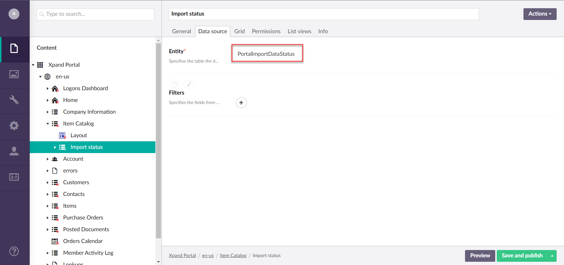
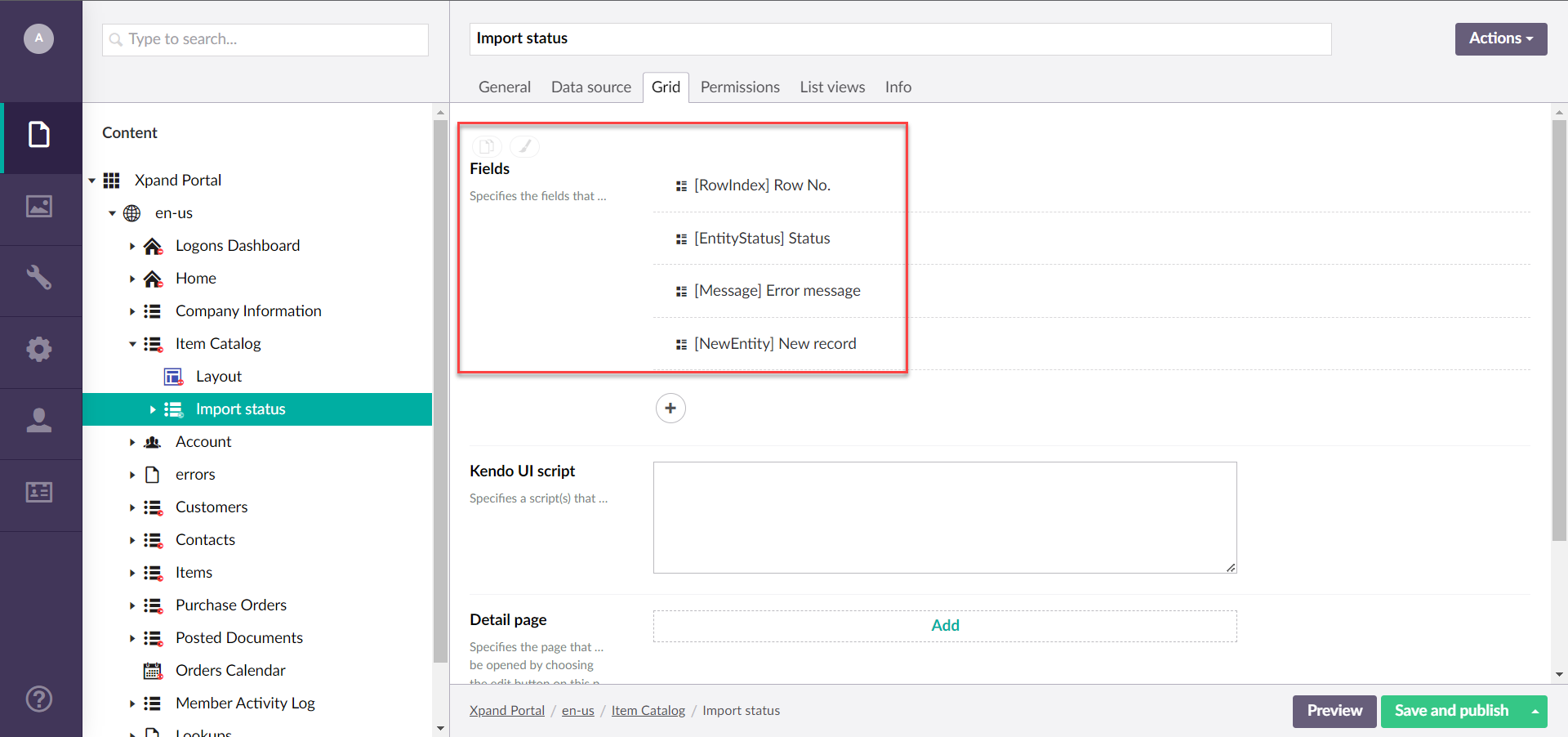
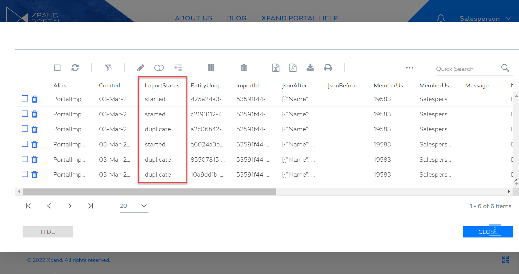
- Report page - Specifies the page that will be used to show a detailed report about imported data. This page will be available using the Details button on the Summary step of the import pop-up window. This page must be configured beforehand to be able to specify it here. For a report page, create a grid page anywhere on the portal using the PortalImportDataStatus entity as the data source. This entity is included in the portal by default.
 An example of fields that you can choose to show on the report page:
- Base dictionary key - Specifies the base dictionary key data from which, including its related dictionary keys, will be used to apply predefined command texts displayed on the front end when using this action. When you specify a key here, and then use the action, the related dictionary keys with predefined texts are automatically created. You can adjust the text in those keys to your liking.
- Validations - Specifies settings that allow you to set validations that will be performed during the import of data using this action.
- Enable field value validation & client events (obsolete caption: Enable portal record duplicate validation) - Specifies that field value validation is performed on the client side during data import. If disabled, the import runs faster, but validations configured in the Value validation field settings are skipped. When enabled, client events that are configured in the permission set for the grid, if any, are also run during import.
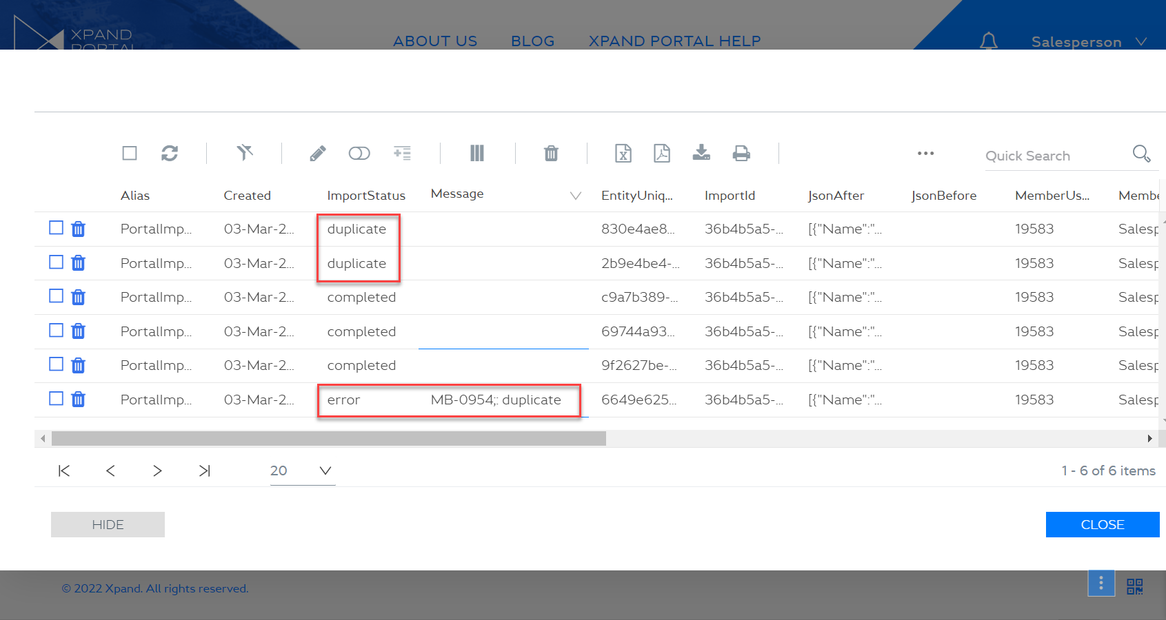
- Enable file record duplicate validation - Specifies that during data import records in the Excel/CSV file are verified to ensure that there are no duplicated records in the file. This setting uses the Unique fields setting to identify whether a record is unique (the value of at least one configured unique field must be the only existing field value for a record to be considered unique). If enabled and duplicated records are detected, information about them will be shown during data import, and the member will be able to choose how to handle errors. If duplicate validation is configured and enabled, and during data import duplicated records are detected in the Excel/CSV file, information about duplicates is displayed in the Import options dialog window where you select how to handle errors during import.
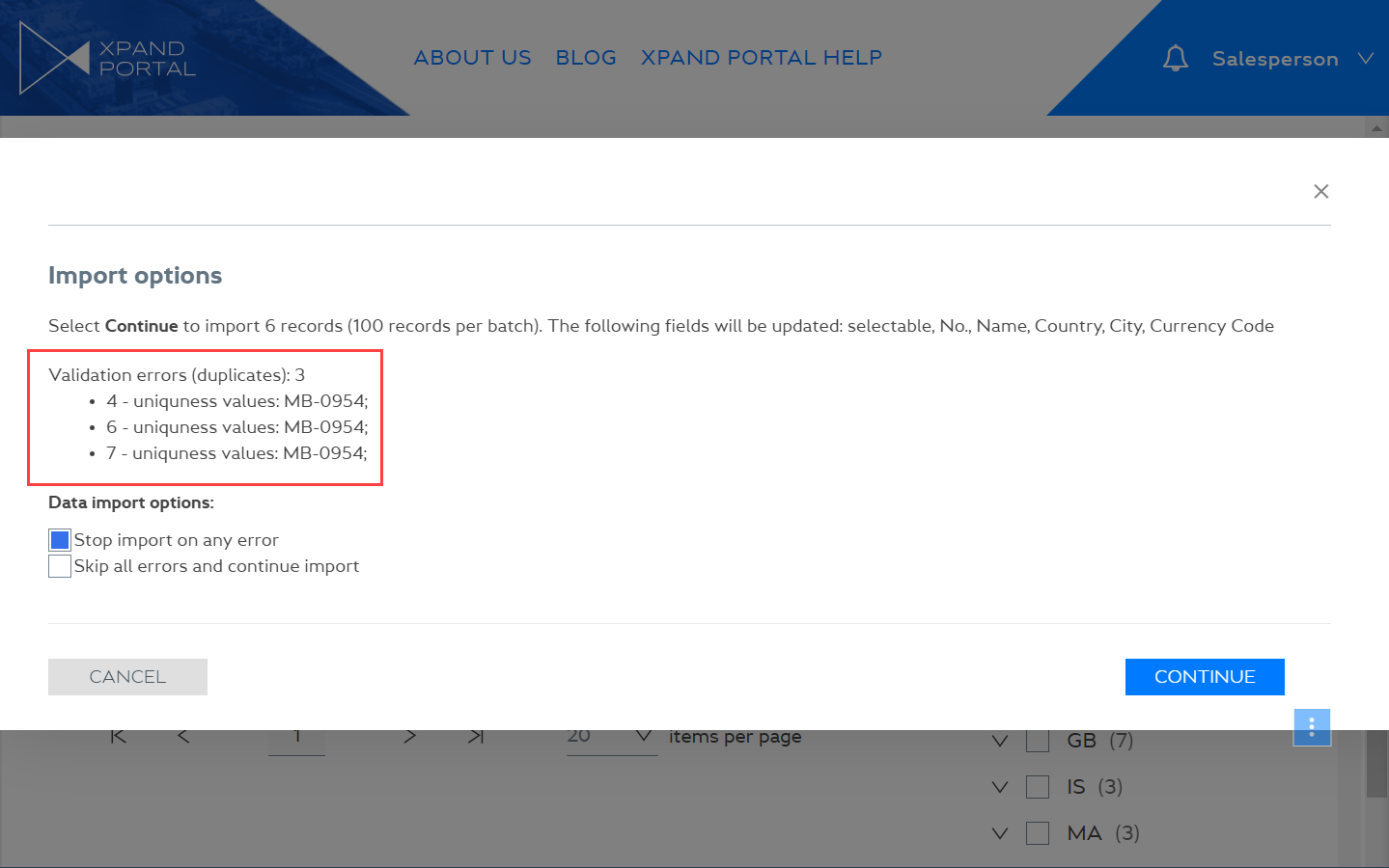
If you select the Stop import on any error option, the import will stop on any error that occurs, including duplicated records. On the portal import data status report page (the PortalImportDataStatus source entity), which can be opened by using the Details button on the import summary page, duplicate records will be shown with the duplicate import status.
If you select the Skip all errors and continue import option, all records are imported except the ones with errors (duplicated records are also considered as records with errors). In this case, on the portal import data status report page (the PortalImportDataStatus source entity), which can be opened by using the Details button on the import summary page, duplicate records will be shown with the error import status.
NoteAdditionally, during data import, the portal uses the Unique fields setting to identify whether a record is already available in the grid (if the value of the unique fields coincides, the record is considered to be the same). If a record is already exists in the grid, it will be updated with values from the Excel/CSV file, and a new record won't be created.
if the Excel/CSV file has multiple lines that are to update the same record in the grid, an error will occur and only the first found updated line will be applied.
Scheduler
Use this command to an action that will allow you to select view of an embedded calendar as well as filter records so that only records with events are shown. This command should be added to a grid page where you have configured an embedded calendar. Available toolbar command settings:
- Command title - Specifies the caption of the action that will be displayed when the portal member points to the action icon. For example: Calendar.
- Show command title - Use this switch to show or hide the action title. When the title is hidden, the portal members can still see the title in the tooltip when they hover over the action icon.
- Show command without icon - Use this switch to show or hide the action icon on the grid toolbar.
- Calendar page - Specifies the page of the embedded calendar that will be displayed on the grid. Browse to a calendar page that has already been configured.
- Command icon - Specifies the icon that will be used for the action. Select the square and browse to an icon in the portal media library. You can leave this setting empty to use the predefined default icon for this toolbar command. You can leave this setting empty (in this case, the default icon, chosen by the development team, will be used) or choose an icon from one of the available icon libraries.
- Enabled - Specifies whether the action will be enabled or disabled on the grid.
- Command style - Specifies the style that will be applied to the command on the command toolbar.
- Highlighted - This style highlights the command background to make the action accentuated.
- Flat - This style removes the border around the command button, which makes it look flat.
- Show in Service toolbar - Moves the button from the grid page toolbar to the service menu in the top left corner of the grid page.
- Repeat step 5 to add more actions to this permission set on this page if necessary.
- Optionally, you can create another permission set for toolbar commands (which also includes field visibility and general page settings permissions), by selecting Add Permission under Member groups permissions and repeating steps 2 through 6 for a different combination of member groups.
- Select Save and publish to save the changes and publish them on the front end. Optionally, if you were editing the page, you can select Save and preview to preview how the page will look like on the front end.