Comments (configuration)
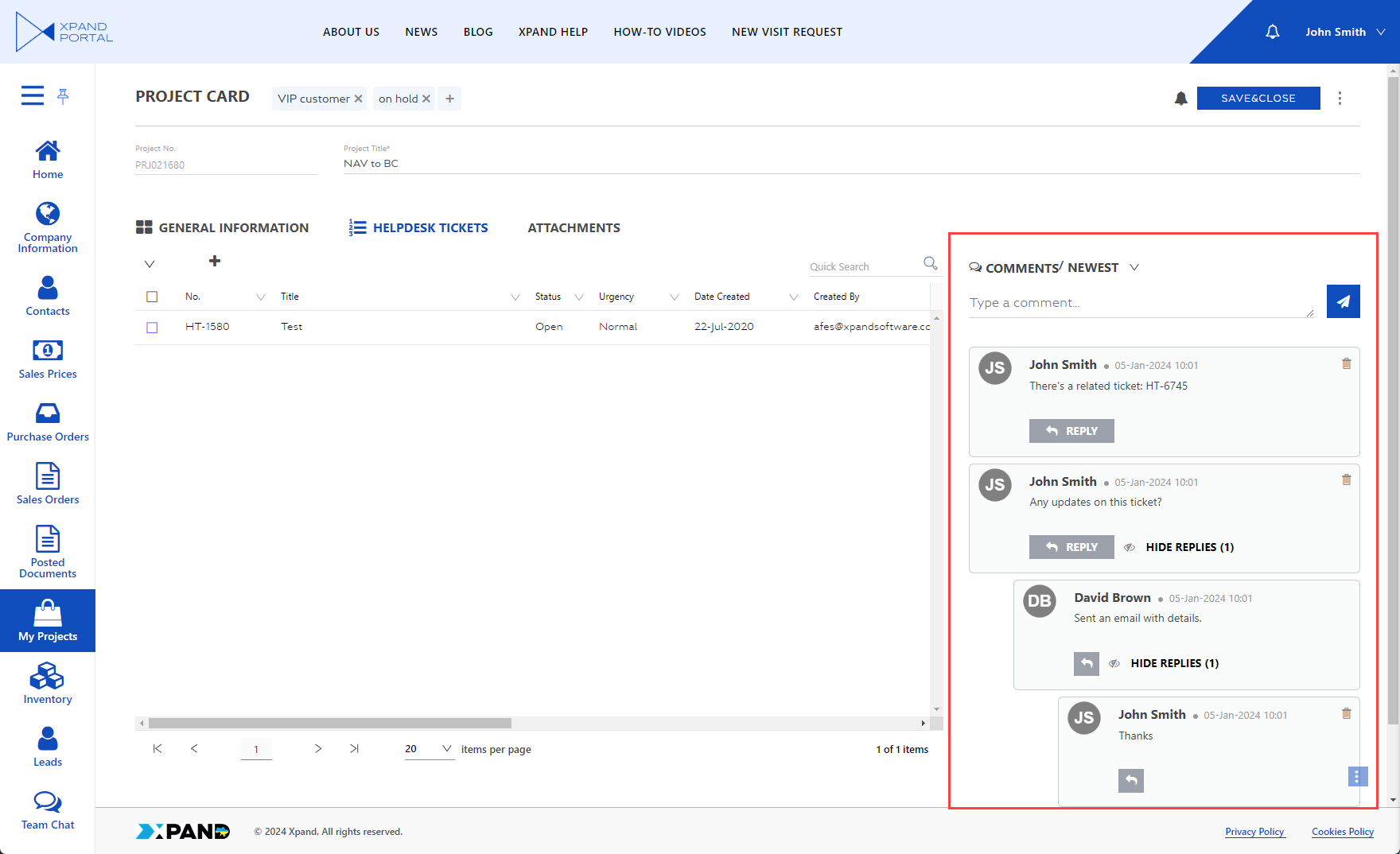
The comments functionality provides members with the ability to communicates and collaborate on portal pages by adding comments. Members may attach files to comments if this ability is configured.
There are two ways of configuring comments for a page:
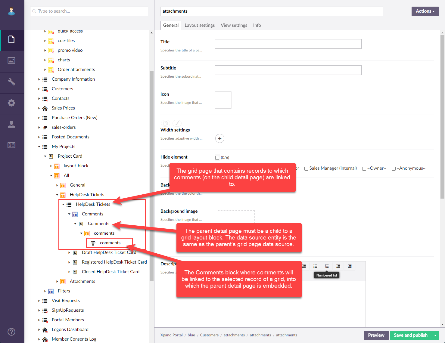
- Comments that will be related to a selected grid record: in this case, add the
 Comments block to a detail page layout block that is a child to a detail page, which in its turn is a child to a grid page layout block within a grid page that contains records to which comments will be added. Additionally, the data source entity of the parent details page must be the same as the data source entity of the detail page's parent grid page.
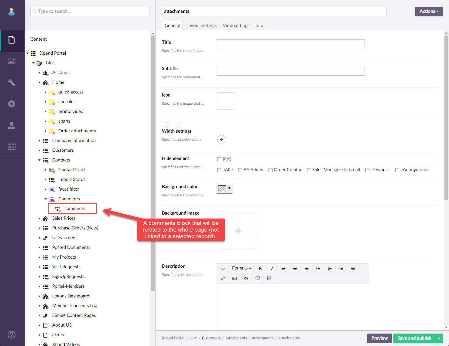
- Comments that will be related to the whole page (not linked to any record): in this case, add the Comments block to a detail, grid, or home (dashboard) page layout block where you want to have an independent comments section; the layout block's page doesn't need to be a detail page embedded into a grid page.
To configure a comments block
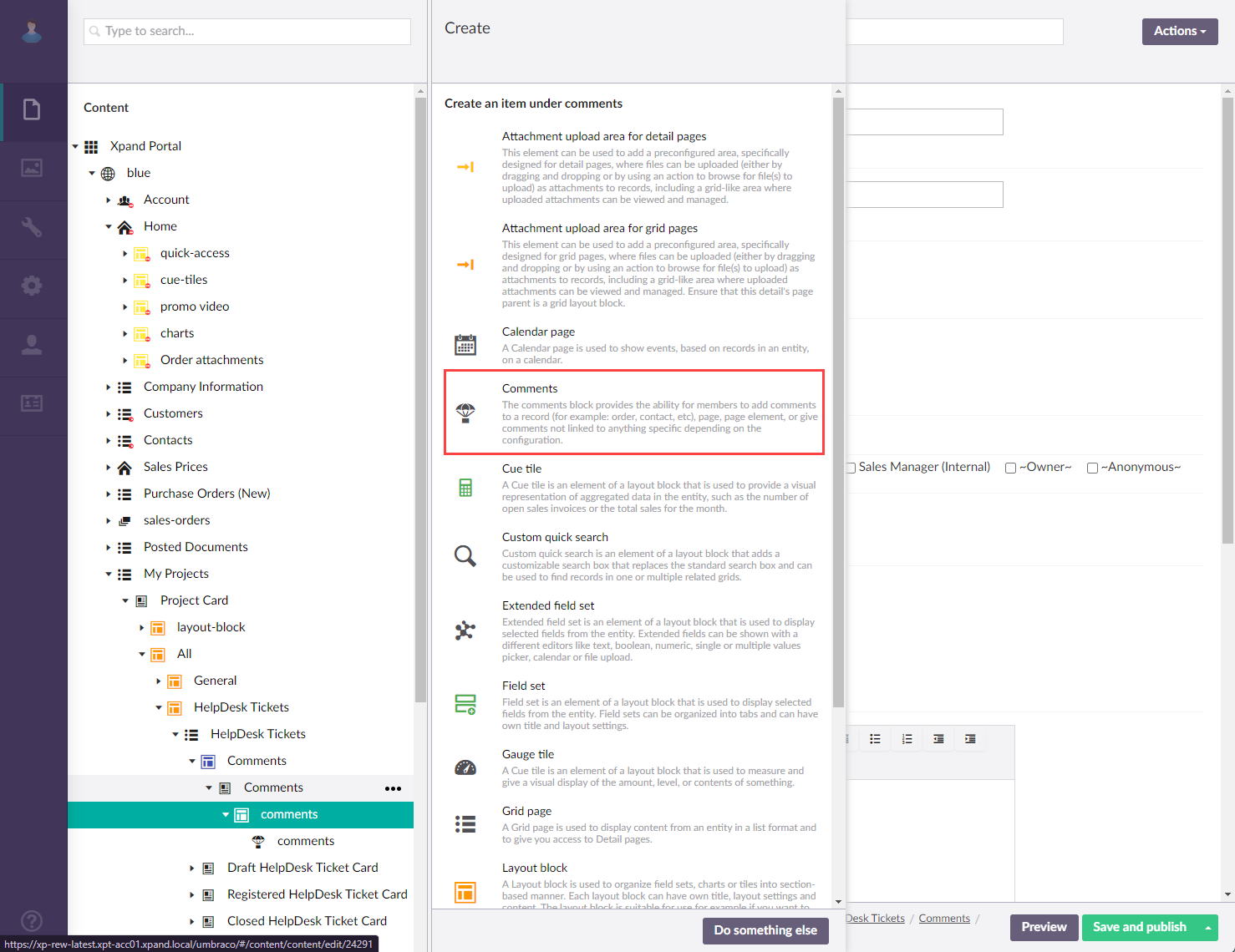
- On the
 grid,
grid,  detail, or
  dashboard layout block of a page where you want to add/configure a block where members will be able to add comments for the whole page, select the
  icon, and then select Comments. If you want comments to be linked to a selected grid record rather than the whole page, add comments to a detail page layout block, and make sure that the parent detail page is embedded into a grid page that contains records to which comments will be linked, and that the parent detail page and its parent grid page both have the same data source entity (see an example of the structure above).
 Note
NoteThe
Comments block includes pre-configured settings for quick and easy feature configuration; it is ready for use right after adding it to a layout block. However, you are free to adjust the settings if necessary according to your needs. - On the General tab, configure/adjust the general settings:
- Titles - Specifies the settings where you can configure the title of various elements on this page.
- Title - Specifies the title that will be displayed in the header of the created page or page element.
- Subtitle - Specifies the subtitle that will be displayed in the header of the created page or page element.
- Icon - Specifies the image that will be displayed in front of the title if specified. Adding an icon is optional. You can leave this setting empty (in this case, the default icon, chosen by the development team, will be used) or choose an icon from one of the available icon libraries.
- Responsive behavior - Specifies the settings that define how this page part or UI element responds to different viewport widths by adjusting its width and visibility at each responsive breakpoint.
- Hide element - Specifies that the element will be hidden for specific member groups. Select one or several member groups, for which this layout block element will be hidden. Alternatively, you can select the ~All~ checkbox to hide it for all member groups (without the necessity to select every member group's checkbox) or select the Hide element checkbox to have all member groups selected at once.
- Description - Specifies a description of this layout block element.
- Content-from page - Specifies the page the content of which will be displayed instead of the content of this page when this page is opened via a direct link. The URL in the address bar will remain that of the original page. For a page element, filling in this setting is not required.
- Redirect-to page - Specifies the page that will be displayed instead of this page when this page is opened via a direct link. The URL in the address bar will be that of the target page. For a page element, filling in this setting is not required.
- Module assignment & protection - Specifies settings that allow you to assign this content element (localization, page, etc.) to an internal module as well as to protect this element from certain operations (copying, changing, deletion). Select the Configure button to configure module assignment & protection or the Change button to edit existing configuration if it has already been configured.
- Titles - Specifies the settings where you can configure the title of various elements on this page.
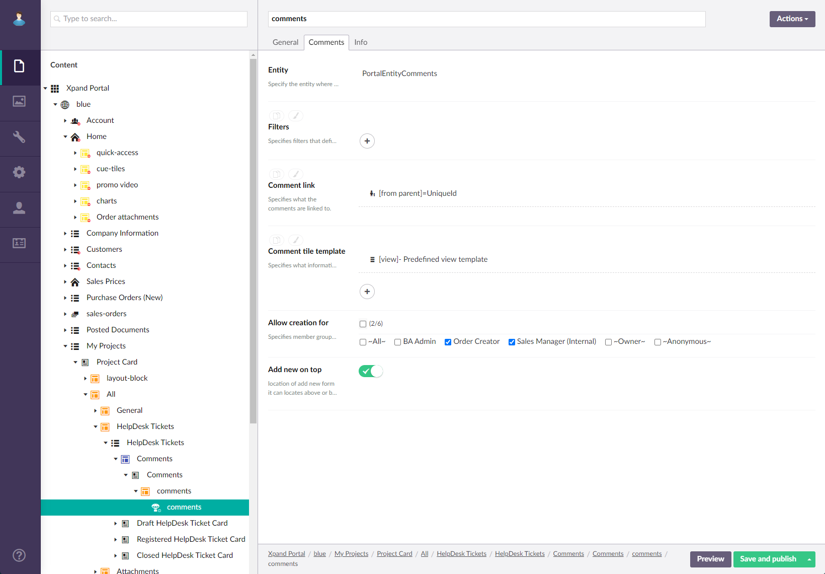
- On the Comments tab, configure/adjust the following settings:
- Entity - Specify the entity where comments will be stored. For comments, use the PortalEntityComments entity.
- Fields to update - Specifies the entity fields that are related to the comment and will be updated with the specified value when a comment is saved. If you want the comments to be synchronized with Business Central comments, this setting must be configured: specify the fields that are the primary key fields of the entity that is synchronized with BC. Select Add Field to configure a new field to update.
- Field - Specifies the entity field that will be updated when a comment is saved.
- Value - Specifies the value that the field will be updated with or where this value is taken from when a comment is saved.
- Filters - Specifies filters that define which comments will be displayed. Add filters or filters groups to limit comments that will be displayed only to those that meet the filters conditions.
- Comment tile template - Specifies what information comments include as well as how they look like.
- Enabled - Specifies whether this tile set is shown. You can use this option to temporarily disable a tile set why preserving its configuration.
- Action title - Specifies the caption of the action that opens this list view. The title may, for example, represent the way data is displayed in this view or describe the field(s) chosen as data source.
- Fields - Specifies the fields from the data source the data from which will be shown on tiles in this list view.
- Tile width - Specifies the width of a single tile in this list view.
- Hidden for - Specifies the member roles for which this list view will not be shown.
- Allow creation for - Specifies member groups the members of which are allowed to give comments.
- Comment input field on top - Specifies that the comment input field where the member adds a new comment is located at the top of the comments block. If disabled, the comment input field is located at the bottom of the comments block.
- Comment character limit - Specifies the maximum number of characters allowed in a comment. If this setting is empty, the comment length will only be limited by the comment container.
- On the Attachments tab, configure the ability to attach files to comments if you are going to use it.
- Enabled - Specifies that the ability to attach files to a comment is enabled.
- Source entity - Specifies the entity where attachments are stored.
- File destination field - Specifies the field from the selected grid where attachments are stored.
- File name field - Specifies the field from the selected grid where the name of the attached file is stored.
- File extension field - Specifies the field from the selected grid where the extension of the attached file is stored.
- File size field - Specifies the field from the selected grid where the size of the attached file is stored.
- Fields to update - Specifies the entity fields that are related to attachments and will be updated with the specified value when a comment with attachments is saved. These fields may also be required for data synchronization. If you want the comments to be synchronized with Business Central comments, this setting must be configured: specify the fields that are the primary key fields of the entity that is synchronized with BC. Select Add Field to configure a new field to update.
- Field - Specifies the entity field that will be updated when a comment is saved.
- Value - Specifies the value that the field will be updated with or where this value is taken from when a comment is saved.
- Filters - Specifies the filters that define which comment attachments are displayed.
- Allowed file types - Specifies the file formats that are allowed for attachments. The list of file formats that are available for selection here can be expanded by adding dictionary items to the XPortal.Files.Types dictionary key.
- Max. no. of files - Specifies the maximum number of attachments that can be uploaded for a single comment. If this setting is empty, the default limit is 10 files.
- Max file size (MB) - Specifies the maximum allowed size of an attachment in megabytes.
- Select Save and publish to save the changes and publish them on the front end. Optionally, if you were editing the page, you can select Save and preview to preview how the page will look like on the front end.