Creating detail pages
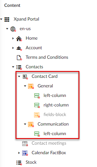
A detail page is a page that displays detailed information about a record in the form of card with tabs. A detail page may also have lines. In the backoffice, detail pages can be identified by the  icon. Detail pages are normally created as child pages to a grid page. Content of grid pages (field sets, grid, etc.) is enclosed into
  layout blocks or
  simple content pages as child pages to the detail page.
To create a grid page, you need to create several elements:
- Detail page - the detail page itself that will host all other detail page elements, and link it with the parent grid page.
- Layout blocks or simple content pages that will host the content of the grid page.
- Layout block content elements (only what you need):
- A header with field sets and/or extended field sets. A field set represents a set of fields that will be displayed in one column. If you want fields to be presented in several columns (useful when you have a lot of fields on the header), you need to create several field sets as child pages to the parent layout block.
- Lines (grid). You can create a grid page for the detail page lines in the same way as an independent grid page; only in this case, you can create this grid page as a child page to the parent layout block within the grid page tree structure.
- Extended field set. On detail (card) pages layout blocks, in addition to normal fields sets, you can add an extended field set. For fields in an extended field set, you can configure additional data types, which are not available in the standard field set. Extended field sets can be added along with normal field sets within the same layout block if necessary.
- Layout block elements
A detail page can be available as a separate page, which is opened when the portal member edits the records on a grid page using the Edit action, or it can be embedded directly into a grid page where it will be shown in a separate layout block.
To create a new detail page
- In the backoffice, go to Content.
- Select the content node, and then select a
 grid page for which you want to create a detail page.
 - Select the
 icon of the selected node (the icon appears when you point to the node title). Alternatively, select and hold (or right-click) the selected node, and then select Create.
 - Select Detail page in the Create dialog window that appears.
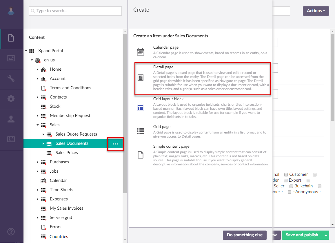
- If you have at least one content template of the detail page type, the created template(s) will be available for selection to use as a basis for the new page. Otherwise, this step is not shown. You can select Blank in case you don't want to use a template.
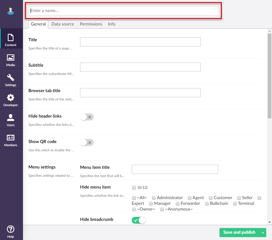
- On the header, enter the page name that will be used to identify it in the backoffice.
General tab
- On the General tab, fill in general settings.
Basic
- Titles - Specifies the settings where you can configure the title of various elements on this page.
- Title - Specifies the title that will be displayed in the header of the created page.
- Subtitle - Specifies the subtitle that will be displayed in the header of the created page.
- Browser tab title - Specifies the title of the web browser tab that will be displayed when the page is opened and the member points to the browser tab.
- Hide breadcrumb - Specifies that the page breadcrumb trail is not shown. A breadcrumb trail is used as a navigational aid to help portal members keep track and maintain awareness of their location within the portal.
Menu
- Menu item title -Specifies the title of the menu item, which will be displayed in the navigation pane for this page.
- Menu item icon - Specifies the icon of the menu item for this page. Select the square and browse to the icon in the portal media library.
- Menu item color - Specifies the color of the menu for this page.
- Divider after menu item - Specifies whether a split line will be displayed after this menu item.
- Hide menu item for - Specifies whether the link to the page will be displayed in the main menu for the selected member groups.
Advanced
- Width settings - Specifies the adaptive grid width settings for the grid per device. The width is automatically adjusted depending on the device the page is opened from.
- Content-from page - Specifies the page the content of which will be displayed instead of the content of this page when this page is opened via a direct link. The URL in the address bar will remain that of the original page.
- Redirect-to page - Specifies the page that will be displayed instead of this page when this page is opened via a direct link. The URL in the address bar will be that of the target page.
- Module assignment & protection - Specifies settings that allow you to assign this content element (site, page, page element, etc.) to an internal module as well as to protect this element from certain operations (copying, changing, deletion). Select the Configure button to configure module assignment & protection or the Change button to edit existing configuration if it has already been configured.
- Titles - Specifies the settings where you can configure the title of various elements on this page.
Data source tab
- On the Data source tab, specify the source of data for this grid page. If the source of data is external, portal integration must be set up and configured with the corresponding external system.
- Entity - Specifies the table data from which data will be retrieved for this page. This table may represent any entity to suit your business needs. The list of available entities depends on the system your portal is integrated with.
- Filters - Specifies the filter(s) which can be used to narrow down the records that will be retrieved from the specified entity by specified criteria. You can add filters individually, in groups, or in combination of individual filters and groups. Grouped clauses operate as a single unit separate from the rest of the query, similar to putting parentheses around a mathematical equation or logic expression. The AND or OR operator specified for the filter group applies to the whole group. Global filters (filters that are set up for the entire site) can be added automatically when you select or change the data source entity in case the entity has a global filter assigned to it. Global filters have the GLOBAL tag. Global filters can also be automatically added or cleared from portal pages or page parts in the global filter settings. Setting filters is optional and depends on what kind of data you want to be displayed on the page.
- To add an individual filter, select Add content, select
 Filters, configure the filter settings below, and then select Create:
- Title - Specifies the title of the filter.
- Logic – Specifies the logic of the filter:
- AND – Use this type to find records in the data source that meet the criteria in both the current and previous clause.
- OR – Use this type to find records in the data source that meet the criteria in either the current or previous clause.
- Field – Specifies the field from the source entity the value of which will be used to filter records on the page.
- Operator – Specifies a symbol that denotes a logical operation.
- Value – Specifies the value of the field that will be used to filter records on the page. You can specify constant value or use a method to retrieve data. Select Add content and configure the type of value and its settings:
- Constant value – Specifies a constant value that will be used as a filter condition during lookup. If the value of the specified field is equal (or more, or less, etc., depending on the operator) to this value, the filter condition will be met.
- Date-time value – Specifies a date-time value that will be used as a filter to retrieve data.
- Value-from member field name – Specifies a field from the portal member settings, the value from which will be used as a filter.
- Value from parent entity field – Specifies a field from a parent entity on the portal, the value from which will be used as a filter during lookup.
 Caution
When a grid page is embedded into a detail page, you normally set up this filter (Value from the parent entity field = UniqueId [ParentEntityName]) so that records on this embedded grid are filtered by a field value on the parent entity. This will work for records that are directly created on the portal. However, be aware that there might be scenarios when this filter fails to apply, which may reveal all grid records (unfiltered) for a member role that is not supposed to see all records. For example, this may happen when records on the grid are synchronized from an ERP (in this case, Value from the parent entity field = UniqueId [ParentEntityName] will not work and additional filter configuration is needed). For detailed information, see Grid filter configuration tips.
- Value from entity - Specifies the entity and field from this entity the value from which will be used as the filtering condition for records in the entity table.
- Address field – Specifies the name of a query string parameter (the part of a uniform resource locator (URL) that assigns values to specified parameters), which will be used as a condition for the field value in this filter.
- Field – Specifies a field from the current entity (an entity, to which the field that you are configuring lookup settings for belongs) the value from which will be used as a filter during lookup. This may be useful if you want to see value for the lookup entity that are related to the current entity.
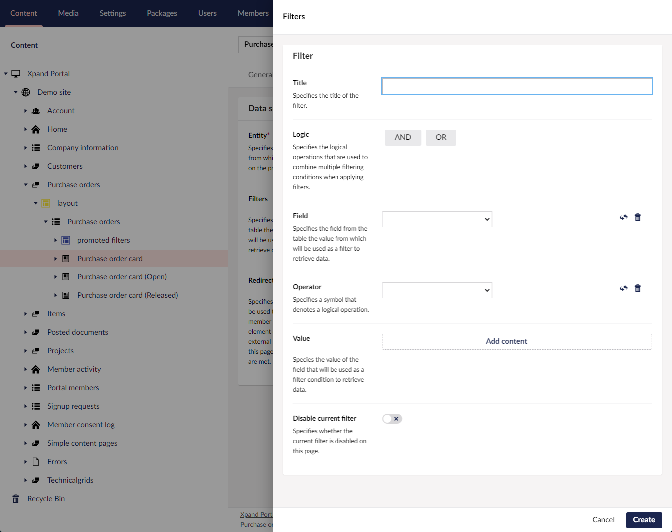
- Disable current filter – Use this switch to temporarily disable the filter for this page.
- To add a filter group, select Add content, select
 Filters group, configure the filter group settings below, and then select Create:
- Title - Specifies the title of the filter.
- Logic– Specifies the logic of the filter group:
- AND – Use this type to find records in the data source that meet the criteria in both the current and previous clause.
- OR – Use this type to find records in the data source that meet the criteria in either the current or previous clause.
- Filters in group – Specifies filters that will belong to this filter group. The Logic setting above will be applied to the whole group of filters. Select Add content to add a new filter to the group, and configure its settings in a similar way you configure settings for individual filters.
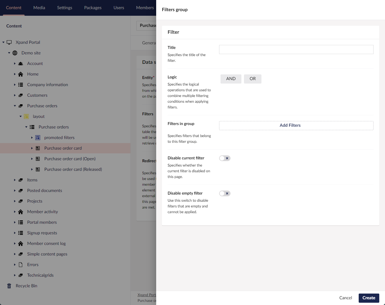
- Disable current filter - Specifies whether the current filter is disabled on this page.
- Disable empty filter - Use this switch to disable filters that are empty and cannot be applied.
- To add an individual filter, select Add content, select
- Redirect Conditions - Specifies the rules that will be used to redirect the member to another page, page element or external URL if the configured conditions are met. This is optional.
- Enabled - Specifies whether this redirect condition is enabled.
- Title - Specifies the title of a page or UI element on a page to which redirection is performed.
- Filters - Specifies the fields the values of which will be used as conditions to identify whether to redirect the member to another page or page element. E.g. To meet a condition, the value of a certain field must be equal to a certain value. Select Add content to add filters or filter groups.
- Destination - Specifies the page, page element or external URL to which the member will be redirected when trying to open the detail page. Select Add content and select the destination type:
- Internal - Specifies an internal destination to which the member will be redirected when trying to open the detail page if the condition is met.
- Redirect-to page - Specifies an internal page or page element to which the member will be redirected when trying to open the detail page if the condition is met.
- Query string - Specifies the query string that contains the address field the value from which will be compared with the value of the field specified as the field filter to define whether the data retrieval conditions are met. This setting can also be useful if you use the breadcrumbs on the page and want the breadcrumb trail to be available on the detail page after you are redirected to this detail page from another page. In this case, to take the breadcrumb from another page, for example, add the following query string: id=[[UniqueId]]&bc=[[breadCrumbLink]]
- External - Specifies an external page to which the member will be redirected when trying to open the detail page if the condition is met.
- Redirect-to external URL - Specifies the URL of an external page to which the member will be redirected when trying to open the detail page if the condition is met.
- Internal - Specifies an internal destination to which the member will be redirected when trying to open the detail page if the condition is met.
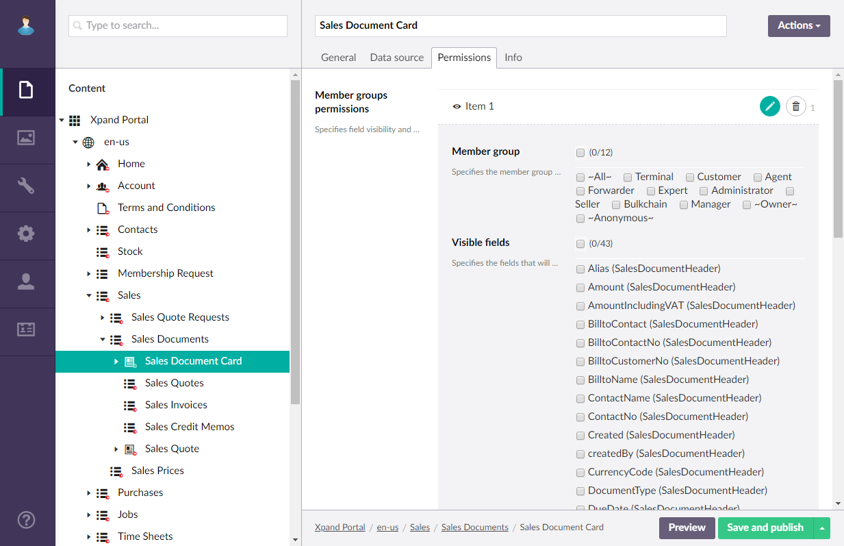
Permissions tab
- On the Permissions tab, configure member group permissions for this detail page. These permissions define visibility of fields, toolbar commands (actions) and JavaScript events that will be available on the page for members depending on the member group(s) they belong to. Select Add permission to create a new permissions set. You can create several permissions sets to these page settings tailored to specific member groups according to your business needs. A portal member will have access to a page feature only if this member is assigned to a member group for which this feature is enabled and allowed. If a member group is present in multiple permission sets on the same page, its group members will have access to data or page feature if access is allowed at least in one of those permission sets.
 Note
NoteNormally, fields on a detail page are enclosed as field sets into layout blocks. Therefore, permissions for fields availability must also be configured in the settings for field sets.
- Optionally, you can configure data masking in case you want to hide sensitive data in certain fields. On the Permissions tab, go to Data masking settings, select Add Data masking to add a new data masking rule set, and then fill in the fields as described below:
- Data masking rules - Specifies sets of criteria that must be fulfilled for data in the fields below to be masked in order to protect sensitive information. Select Add content to add a new rule where you specify filters or filter groups that will be used as criteria that must be met to mask data.
Note
At least one data masking rule must be configured, otherwise, data masking won't work.
- Masked fields - Specifies the fields the data in which will be masked if the criteria in the data masking rules are fulfilled.
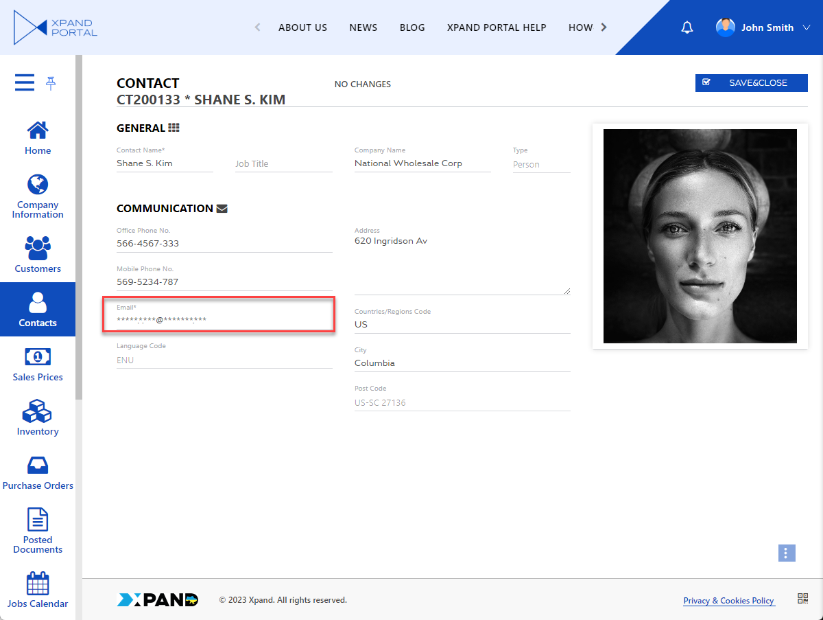
- Data masking symbol - Specifies the symbol that will be displayed instead of every character in the field value in case the field value must be hidden according to the data masking criteria. If a field meets the data masking criteria but is empty, no data masking symbol will be shown (i.e., the field will remain empty). The data masking pattern setting defines which types of characters will be hidden by this data masking symbol. For example: *
- Data masking pattern - Specifies a regular expression that defines which characters in the field value will be hidden in case the field value must be hidden according to the data masking criteria. For example, if you want to hide any single character that is a letter or a digit (but keep any other symbol, such as @), use the following expression: [a-zA-Z0-9] where [ ]: indicates a character set (meaning any character that matches any of the characters), a-z: represents all lowercase letters from 'a' to 'z', A-Z: represents all uppercase letters from 'A' to 'Z', and 0-9: represents all digits from '0' to '9'.
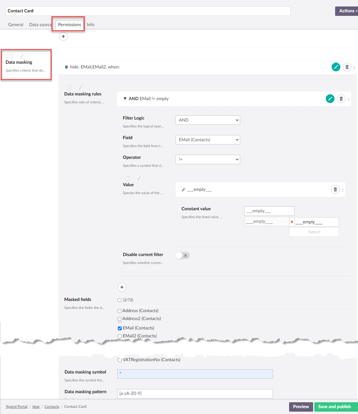
- Data masking rules - Specifies sets of criteria that must be fulfilled for data in the fields below to be masked in order to protect sensitive information. Select Add content to add a new rule where you specify filters or filter groups that will be used as criteria that must be met to mask data.
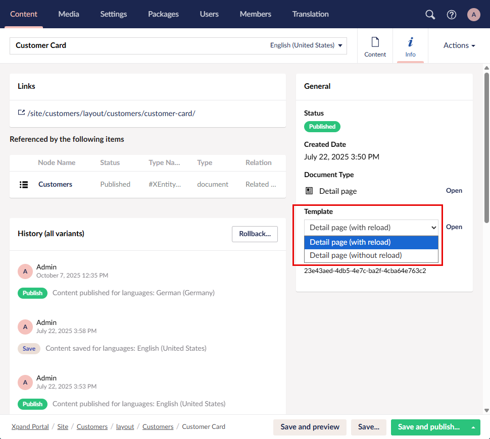
- Optionally, in the Info section, in the Template setting, you can choose a template that will be used for the detail page. The template defines how the detail page transitions into the edit mode:
- Detail page (with reload) - When a new record is created, the page automatically reloads to transition into the edit mode. This template is used by default.
- Detail page (without reload) - When a new record is created, the page immediately changes into the edit mode; page reloading doesn't happen.
- Select Save and publish to save the changes and publish them on the front end. Optionally, if you were editing the page, you can select Save and preview to preview how the page will look like on the front end.
- Go to the settings of the parent grid page, for the records of which this detail page should be opened upon using the Edit action on the grid page, and set the Detail page setting on the Grid tab to the created detail page.
Creating a detail page is the initial stage of page configuration. Now you need to add layout block(s) to it, and then add content to the layout block(s), such as field sets, extended field sets, grid, or layout block elements.