Series chart (configuration)
A series chart is an element of a  grid,
grid,  detail, or
  dashboard layout block that is used to present information from a data source in the form of a graph.
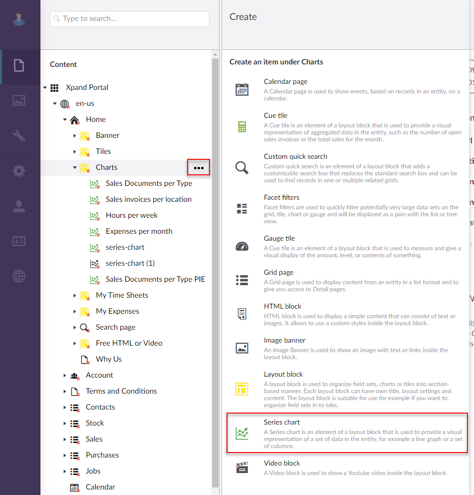
To add a series chart to a page
- In the backoffice, go to Content and expand the node of a
 grid page,
  detail page, or
  dashboard (home) depending on where you want to add a chart.
 - Select the
 icon next to the corresponding layout block node ( grid, detail, or home dashboard). Alternatively, select and hold (or right-click) the node, and then select Create.
 - Select
 Series chart.
- On the header, enter the series chart name that will be used to identify it in the backoffice.
- On the General tab, fill in general settings as follows:
- Titles - Specifies the settings where you can configure the title of various elements on this page.
- Title - Specifies the title of a page or UI element on a page.
- Subtitle - Specifies the subordinate title of a page or a UI element on a page.
- Icon - Specifies the image that will be displayed next to the series chart title. Adding an icon is optional. You can leave this setting empty (in this case, the default icon, chosen by the development team, will be used) or choose an icon from one of the available icon libraries.
- Responsive behavior - Specifies the settings that define how this page part or UI element responds to different viewport widths by adjusting its width and visibility at each responsive breakpoint.
- Hide element - This setting hides the series chart from the home page . It can be configured per member group. In the layout block page settings, on the General tab, in the Hide element setting, select one or several member groups, for which this Video block will be hidden. Alternatively, you can select the ~All~ check box to hide it for all member groups (without the necessity to select every member group's check box) or select the Hide element check box to have all member groups selected at once.
- Content-from page - Specifies the page the content of which will be displayed instead of the content of this page when this page is opened via a direct link. The URL in the address bar will remain that of the original page.
- Redirect-to page - Specifies the page that will be displayed instead of this page when this page is opened via a direct link. The URL in the address bar will be that of the target page.
- Navigate-to page - Specifies the portal page that will be displayed when the portal members selects this series chart.
- Module assignment & protection - Specifies settings that allow you to assign this content element (site, page, page element, etc.) to an internal module as well as to protect this element from certain operations (copying, changing, deletion). Select the Configure button to configure module assignment & protection or the Change button to edit existing configuration if it has already been configured.
- Titles - Specifies the settings where you can configure the title of various elements on this page.
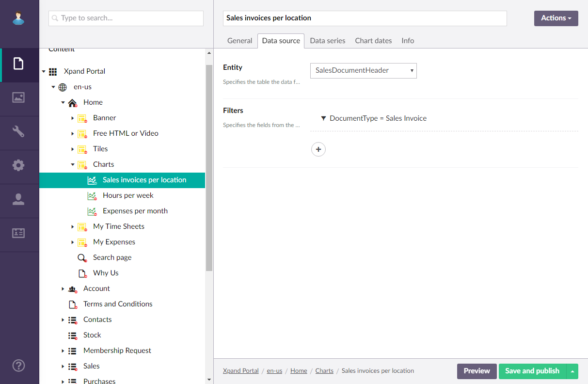
- On the Data source tab, specify the source of data for this series chart. If the source of data is external, portal integration must be set up and configured with the corresponding external system.
- Entity - Specifies the table data from which data will be retrieved for this series chart. The list of available entities depends on the system your portal is integrated with.
- Filters - Specifies the filter(s) which can be used to narrow down the records that will be used from the specified entity by specified criteria. You can add filters individually, in groups, or in combination of individual filters and groups. Grouped clauses operate as a single unit separate from the rest of the query, similar to putting parentheses around a mathematical equation or logic expression. The AND or OR operator specified for the filter group applies to the whole group. Setting filters is optional and depends on what kind of data you want to be displayed on the page.
- To add an individual filter, select Add content, select
 Filters, and the configure filter settings:
- Field – Specifies the field from the source entity the value of which will be used to filter records on the page.
- Operator – Specifies a symbol that denotes a logical operation.
- Value – Specifies the value of the field that will be used to filter records on the page. You specify constant value or use a method to retrieve data. Select select Add content and configure the type of value and its settings (see the Creating a Grid page topic for information on how to configure filter settings).
- Type – Specifies the type of the filter:
- AND – Use this type to find records in the data source that meet the criteria in both the current clause and the previous clause.
- OR – Use this type to find records in the data source that meet the criteria in either the current clause or the previous clause.
- Disable current filter – Use this switch to temporarily disable the filter for this page.
- To add a groups filters, select select Add content, select
 Filters group, and the configure filter group settings:
- Type – Specifies the type of the filter group:
- AND – Use this type to find records in the data source that meet the criteria in both the current clause and the previous clause.
- OR – Use this type to find records in the data source that meet the criteria in either the current clause or the previous clause.
- Filters in group – Specifies filters that will belong to this filter group. The Type setting above will be applied to the whole group of filters. Select the
 icon to add a new filter to the group, and configure its settings in a similar way you configure settings for individual filters.
- Type – Specifies the type of the filter group:
- To add an individual filter, select Add content, select
- On the Chart tab, configure the following settings:
Data series
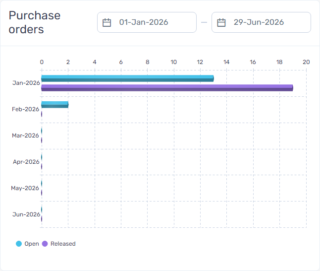
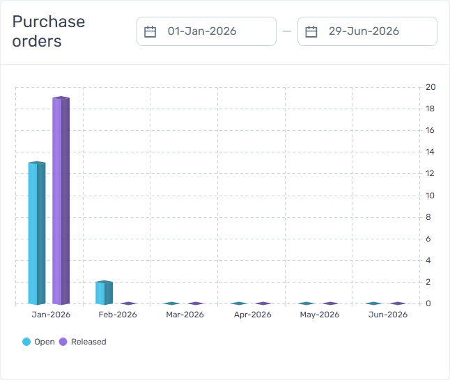
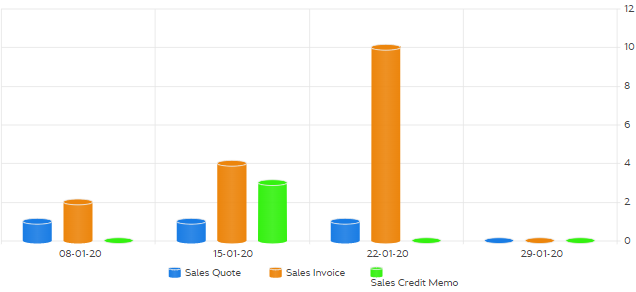
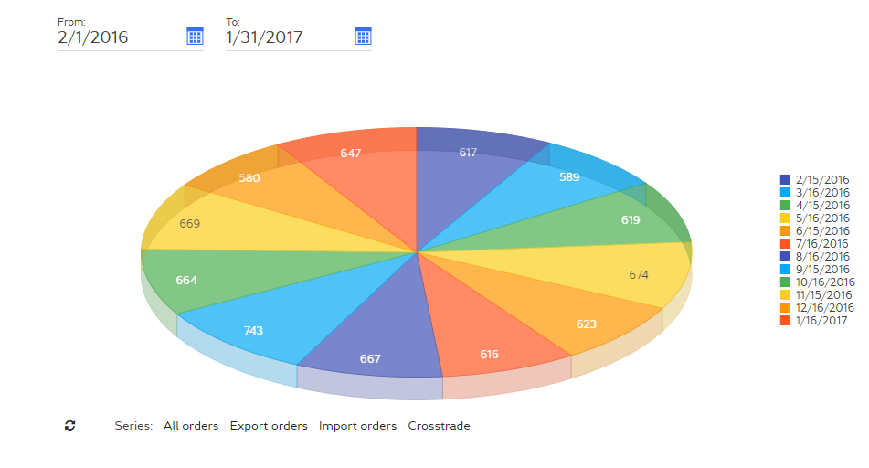
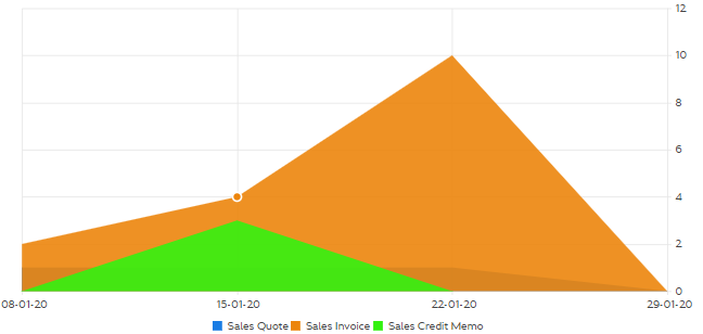
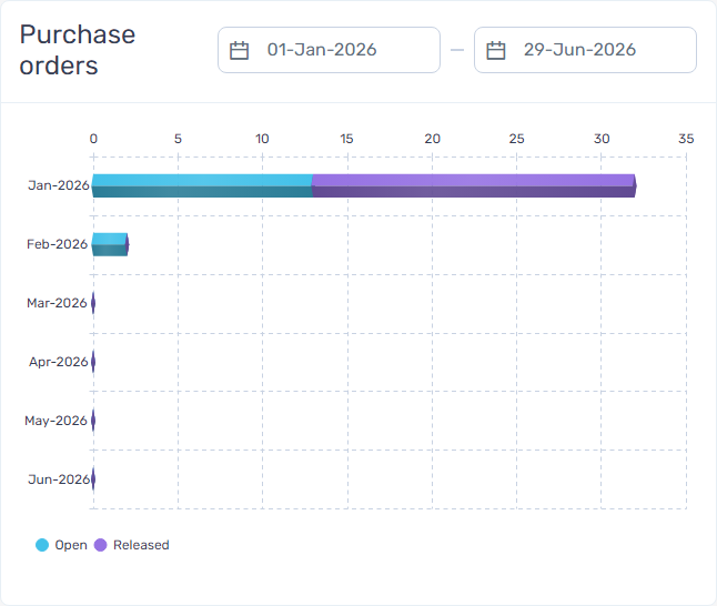
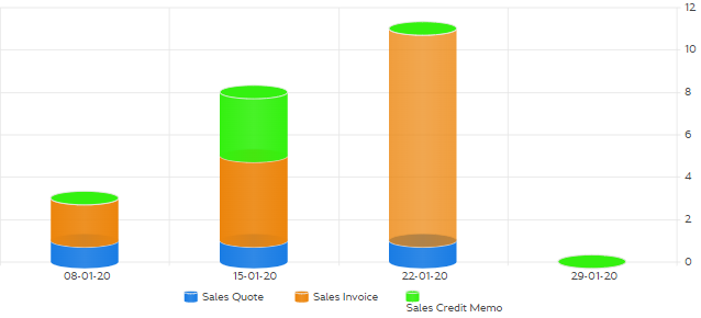
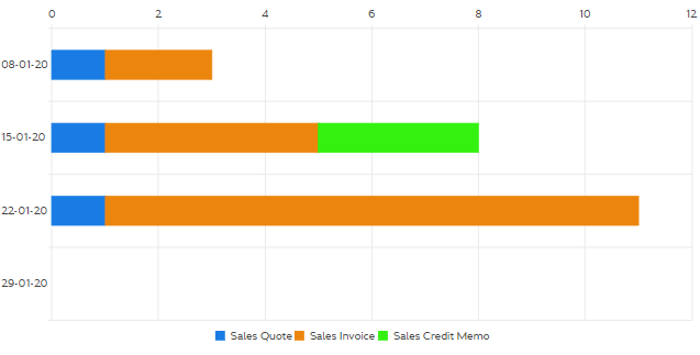
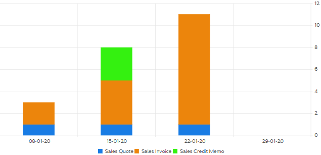
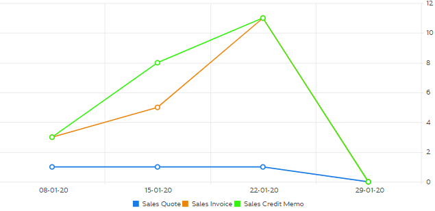
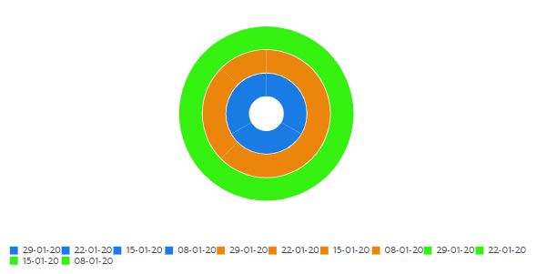
- Chart type - Specifies how the chart will look like. Data can be presented in areas, bars, columns, lines, sunburst, etc. Examples of chart types:
- 3D bar column (horizontal)
- 3D bar column (vertical)
- 3D column
- 3D donut
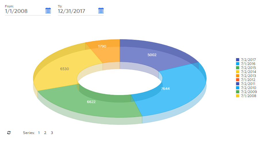
- 3D pie
- Area
- Bar
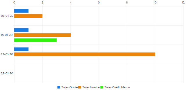
- Column
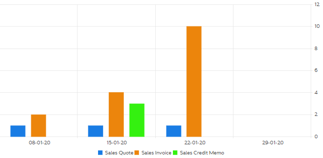
- Line
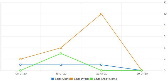
- Pie
- Stacked 3D bar (horizontal)
- Stacked 3D bar column

- Stacked 3D column
- Stacked bar
- Stacked column
- Stacked line
- Sunburst
- 3D bar column (horizontal)
- Show empty series - Use this switch to allow or forbid the portal to display a chart without any data to display.
- Chart tooltip format -Specifies the format of that tooltip that will be displayed when a portal member points to chart elements. Format example: #= category #: #= value #
- Charts setup - Specifies the settings that define chart elements. Select Add content to add a chart element. There are two types of chart elements that you can add: static or dynamic chart element. (1) A static series chart displays record statistics filtered by a specific field value; for every field value, you have to manually set up a chart element. (2) A dynamic series chart displays record statistics for all or specifically chosen multiple values of a selected field from the data source; for every unique value, chart elements (bars, lines, columns, etc.) will be generated automatically.
- Legend - Specifies legend that will be displayed under the chart for filtered data in this chart element.
- Date field - Specifies the field from the source data table(s), the value from which will be used for building data in chronological order. This field can be used for date series charts (e.g. with the chart type Bar or Area).
- Data series color - Specifies the color of this element filtered data series in this element.
- Aggregations - Specifies how data for this chart element will be aggregated. By default, the number of records is counted and displayed. Additionally, data can be aggregated as follows:
 Sum value - A sum of all values of a field will be calculated and displayed in the tile. Select a field the values of which will be summed up on all records.
 Average value - The average of all values of a field will be calculated and displayed in the tile. Select a field the average values of which will be calculated on all records.
 Min. value - The lowest value of all values of a field will displayed in the tile. Select a field the lowest value of which from all records will be shown.
 Max. value - The highest value of all values of a field will displayed in the tile. Select a field the highest value of which from all records will be shown.
 Caution
Aggregation methods other than the default one (counting of records) may impact performance.
- Conditional formatting rules - Specifies rules that define formatting that will be applied to the chart element color on condition that the chart elements value is within the range specified in the condition. This is the same setting as conditional formatting rules for all chart elements, but specific to this chart element. If you set up conditional formatting rules both on the chart (for all chart elements) and on the chart element levels, the conditional formatting rules on the chart level (for all chart elements) will have a higher priority. See the description of the conditional formatting rules settings above.
- Condition range - Specifies the range of values that serves as a condition for applying the formatting set up for this condition rule. If a chart element value is within the condition range, the rule formatting is applied to the chart element.
- Lower bound value - Specifies the lowest allowed value for the condition to be met. If the field is empty, there is no lower bound limit (all values below the upper bound value meet the condition).
- Upper bound value - Specifies the highest allowed value for the condition to be met. If the field is empty, there is no upper bound limit (all values above the lower bound value meet the condition).
- Chart element color - Specifies the chart element color that will be applied if the chart element value is within the condition range.
- Font color - Specifies the font color that will be applied to the text of the series chart if the value is within the condition range.
 Note
NoteAt the moment, the font color can only be applied in labels and some chart types (Area, Line, Pie, Stacked Line, Sunburst).
- Condition range - Specifies the range of values that serves as a condition for applying the formatting set up for this condition rule. If a chart element value is within the condition range, the rule formatting is applied to the chart element.
- Font color - Specifies the font color that will be applied to the chart series text.
Note
At the moment, the font color can only be applied in labels and some chart types (Area, Line, Pie, Stacked Line, Sunburst).
- Field - Specifies the field the values from which will be used to automatically create chart elements. For every unique value, a new tile will be automatically added. You can set a filter by specific field values.
Note
This setting is available only for dynamic chart elements.
- Sorting - Specifies how dynamic chart elements will be sorted. Sorting by value is based on the alphabetical or numeric order of the value of the field that is used for creating gauges. In additional, you can choose either ascending or descending sorting. Select one of the available options. This setting is available only for dynamic chart elements.
-
Max. number of chart elements - Specifies the maximum number of chart elements that can be automatically created. This is useful if the field that you use for creating chart elements may have many unique values, and you don't want the chart to be overcluttered with chart elements. By default, the limit is 20 chart elements. This setting is available only for dynamic chart elements.
-
Filters - Specifies the filter(s) for data in this chart element.
- Labels, legend, and axes - Specifies the settings that define labels, legend, and axes display.
- Show labels/notes - Use this switch to show or hide chart labels or notes that are displayed above chart elements.
- Axis/legend/label text color - Specifies the color of text in axes, legend, and labels/notes.
- Axis/legend/label background color - Specifies the background color for labels and notes.
- Label template - Specifies the template that can be used to display labels. In the template, you can use fields to have a field value retrieved automatically and shown in the label (#=value#).
- Hide legend - Use this switch to hide the chart legend. By default, this switch is disabled and the legend is shown.
- Hide axes - Use this switch to hide the chart axis lines. By default, this switch is disabled and the axis lines are shown.
- Axis text angle (h) - Specifies the angle of the horizontal axis, the text will be rotated at.
- Axis text angle (v) - Specifies the angle of the vertical axis, the text will be rotated at.
- Conditional formatting - Specifies rules that define formatting that will be applied to the chart element color on condition that the chart element value is within the range specified in the condition. You can set up conditional formatting rules for all charts elements or separately per chart element. Conditional formatting for all chart elements will have a higher priority over the rules set up for a specific chart element. Using conditional formatting is optional.
- Condition range - Specifies the range of values that serves as a condition for applying the formatting set up for this condition rule. If a chart element value is within the condition range, the rule formatting is applied to the chart element.
- Lower bound value - Specifies the lowest allowed value for the condition to be met. If the field is empty, there is no lower bound limit (all values below the upper bound value meet the condition).
- Upper bound value - Specifies the highest allowed value for the condition to be met. If the field is empty, there is no upper bound limit (all values above the lower bound value meet the condition).
- Chart element color - Specifies the chart element color that will be applied if the chart element value is within the condition range.
- Font color - Specifies the font color that will be applied to the text of the series chart if the value is within the condition range.
Note
The font color in Condition formatting cannot be applied to the legend of the chart—it will always have the basic series color.
- Condition range - Specifies the range of values that serves as a condition for applying the formatting set up for this condition rule. If a chart element value is within the condition range, the rule formatting is applied to the chart element.
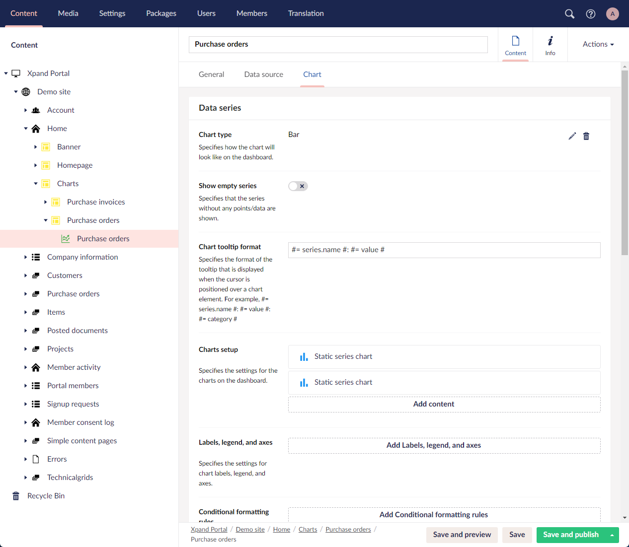
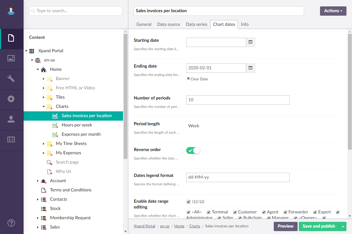
Chart dates
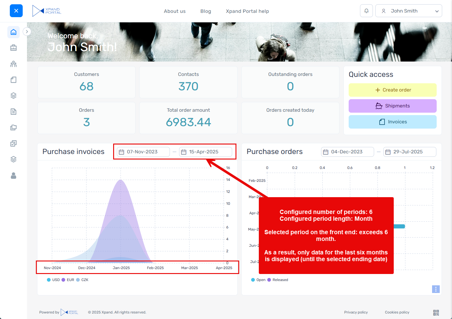
- Starting date -Specifies the starting date for data on the chart if it is a date series chart. If you leave this setting empty, the chart starting date will be calculated using the Number of periods and Period Length settings (under Period) as follows: Starting date = Ending date - Number of periods (expressed in specified period length). If the Ending date setting is empty, the current date will be used. If the Number of periods setting is empty, the earliest date for which data is available will be used as a starting date.
- Ending date - Specifies the ending date for data on the chart if it is a date series chart. If this setting is empty, the current date will be used as the ending date.
- Reverse order - Specifies whether the data will be displayed in reverse chronological order from the ending date to the starting date.
- Dates legend format - Specifies the format that defines how the period legend will be displayed. For example: dd-MM
- Period - Specifies the settings that allow you to set up how periods are displayed on the chart.
- Number of periods - Specifies the number of periods that will be displayed on the chart.
- Period length - Specifies the length of each period on the chart. Select Day, Week, Month, Year or Auto to have the optimal period length selected automatically.
NoteIf there is a period limitation (the Period length and Number of periods settings are configured), and, on the chart, the member chooses a starting or ending date that makes the selected period bigger than what can be displayed on the chart according to these settings, the selected ending date and configured number of periods as well as period length will define the viewable period in that case. The other date is not automatically adjusted: this means that the filter will show a period that is impossible to display while the displayed data will be for the maximum period that is possible to show counting backwards from the selected ending date.
For example:
- Date range - Specifies the settings that allow you to set up various aspects related to the date range on the chart.
- Hide date range for - Specifies the member roles for which the date range filter will not be shown.
- Editing - Specifies the settings that allow you to set up editability of the date range on the chart.
- Enable date range editing - Specifies whether the portal members will be allowed to edit the starting and/or ending date in the series chart to have data displayed for a different period. This settings can be configured per member group. Only members that were added to the members groups that you select here will have this menu item available in their navigation pane. If you leave this check box cleared, the menu item will be visible to all member groups.
- Editable starting date - Use this switch to allow or forbid portal members to change the starting date in the series chart when they want to have data displayed for a different period. This settings depends on the Enable date range editing settings.
- Editable ending date - Use this switch to allow or forbid portal members to change the ending date in the series chart when they want to have data displayed for a different period. This settings depends on the Enable date range editing settings.
- Select Save and publish to save the changes and publish them on the front end. Optionally, if you were editing the page, you can select Save and preview to preview how the page will look like on the front end.
Note
The layout settings of the parent layout block determine how this layout block element will be displayed on the page (on a tab, on top or below of other content elements, etc.).