Front end overview
Xpand Portal does not have a predefined layout with a fixed set of pages. The look and available data are different in every implementation and depend on the data source of the portal as well as on your business needs. However, certain features that can be used by portal members are common for all pages, and these features are covered in this chapter.
|
Availability of features on a specific portal page is configured in the backoffice and also depends on the permissions of the role that a portal member is assigned to. |
Page types
Pages that can be created for the portal can be broken down into categories described below.
|
All screenshots used in this help center serve as an example of an Xpand Portal implementation. The portal menu, available pages and data accessible will be different in your case. |
Dashboard (also referred to as Home Page)
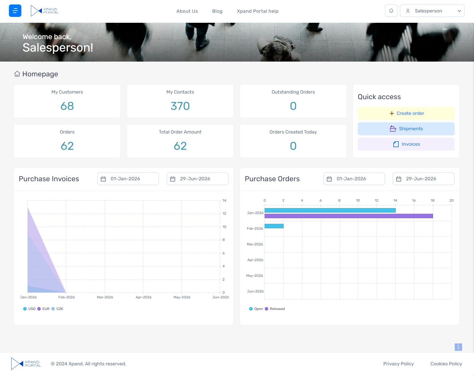
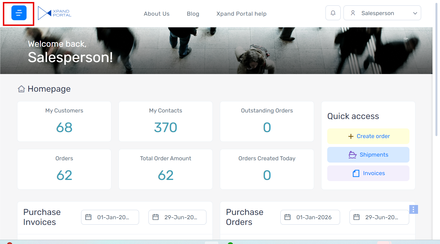
The dashboard is a home page of the portal where you can get a summary of information in the form of tiles with statistics, key information in easy-to-read graphs, list of related documents, etc. This information is tailored to the portal member who is currently signed in. The tiles or graph elements may be designed to serve as a link to the related list page with detailed information. The dashboard is the first page that is opened when you sign in to Xpand Portal for the first time. This page can be accessed from any page by selecting the Xpand Portal logo in the top left corner of the header.
Most elements including links on the header, layout, graphs, images, data, and list views are customizable from the backoffice.
An example of a dashboard is shown in the screenshot below.
Grid page
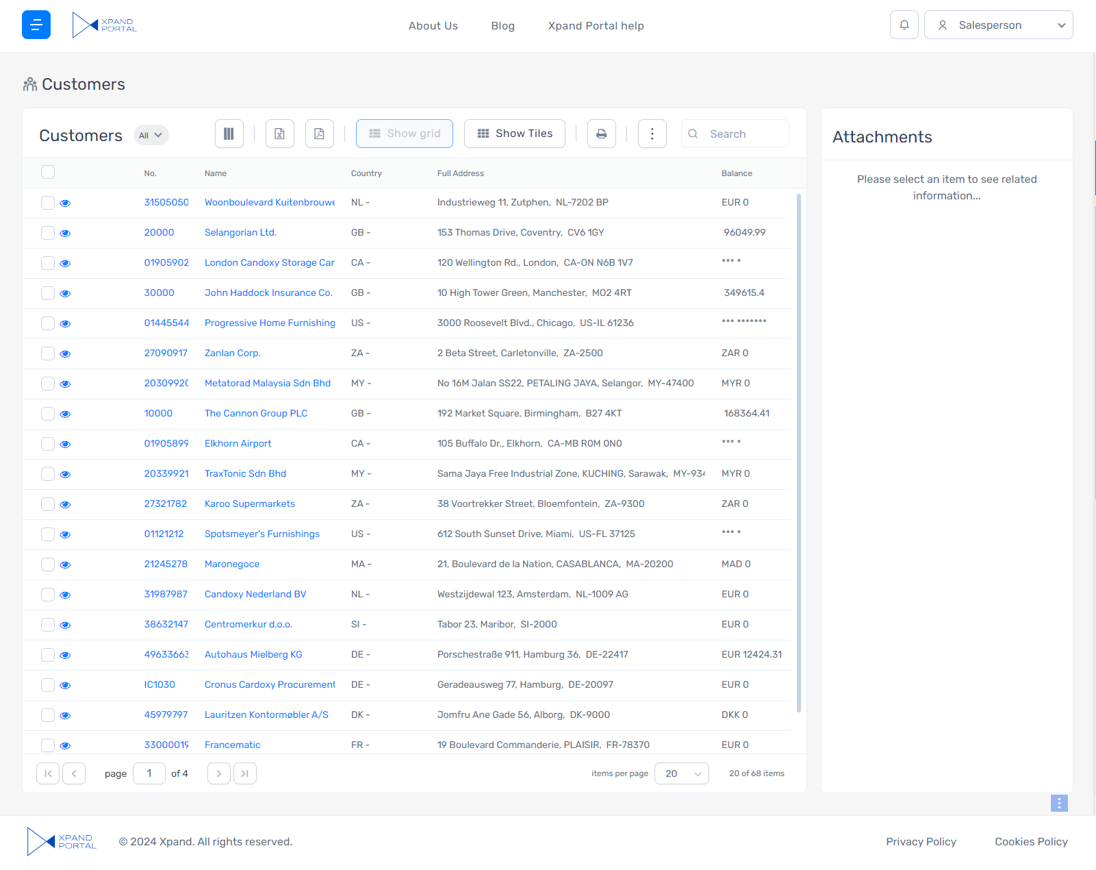
A grid page presents information in the form of a list. The list may be edited with the help of a related Card page if the page is configured this way. A grid page may include various functions that help you work with data on the page, such as the ability to change the order of columns, resize a column, sort records, group records, print out the page, export data to Excel, save data as PDF, create/modify/delete records, etc.
|
The set of functions on a page depends on the page configuration in the backoffice as well as on the permissions of the role to which the current portal member belongs to. |
A grid page may be used to display documents, notions, records, or any other information suitable for the list format.
An example of a grid page is shown in the screenshot below.
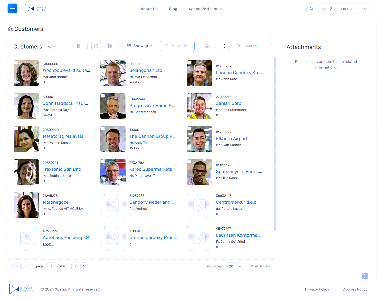
If configured, the grid page may also show records in the form of tiles.
Detail page
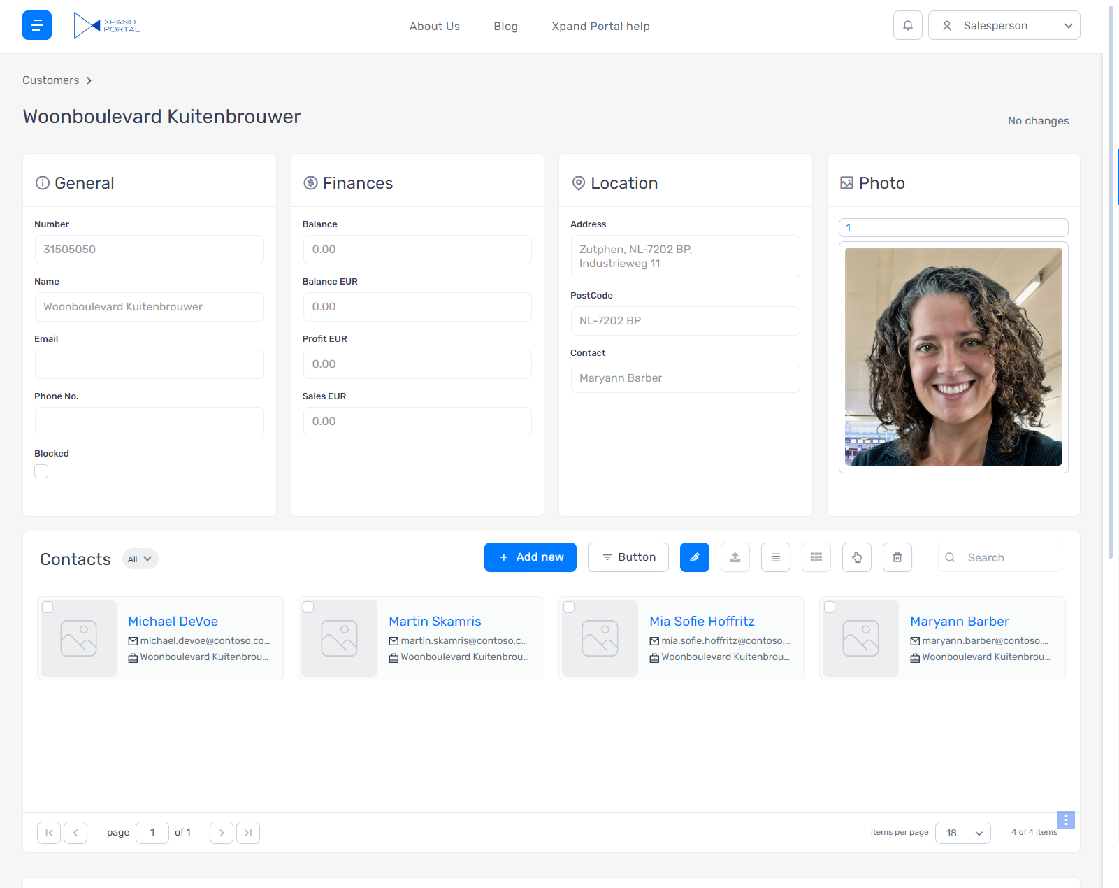
A detail page presents information in the form of a card. This card may contain a header and lines (grid). Often a detail page is used to edit or view a record from a grid page. Use tabs to switch between the header, lines or other sections if available.
An example of a detail page is shown in the screenshot below.
Simple content page
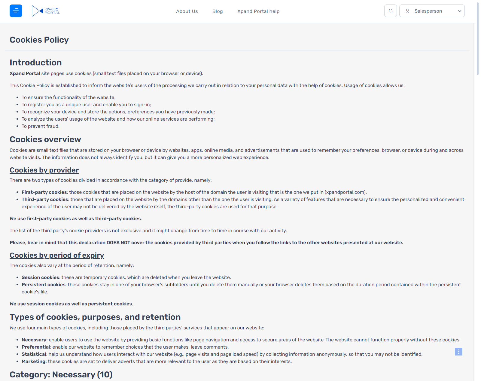
A simple content page displays simple content, which is not based on any data source, in the form of text and images. Such a page is suitable, for example, for a description of your company, your services or contact information.
An example of a simple content page is shown in the screenshot below.
Account-related pages
Account-related pages are pages that are used to manage the accounts of portal members as well as the process of signing in or signing out. Account-related pages are the following:
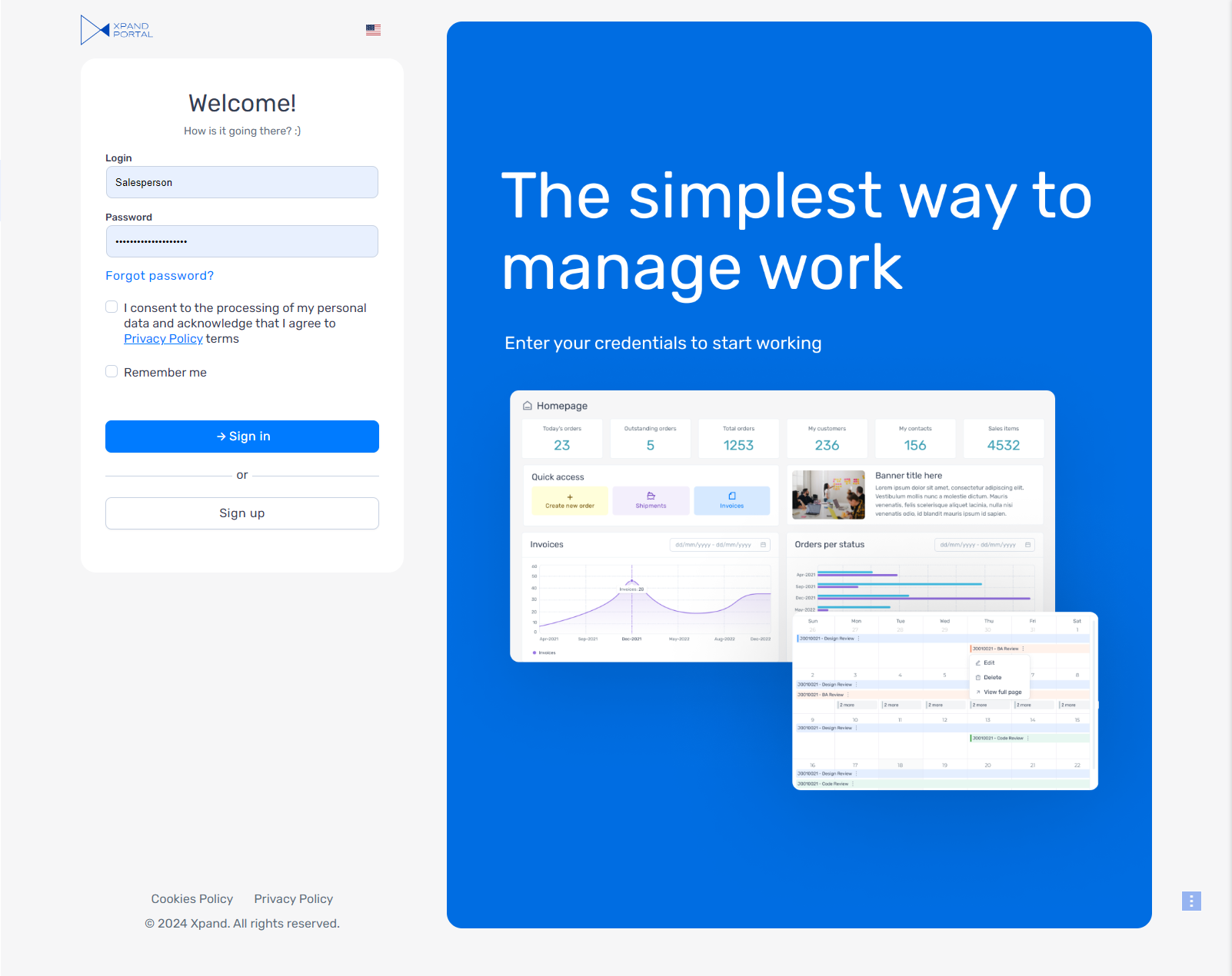
- Login page - A portal page that will be opened when a portal member is signing in. This page has the following components: the logo, portal language selection menu, a title and subtitle, the fields for signing in where you enter your user name and password, a link to restore your password, a link to request membership, a login image, and the copyright text. All these components are also customizable in the backoffice.
- Logout page - A portal page that will be opened when a portal member is signing out.
- Account registration page - A portal page that will be opened when a new portal member is signing up on the portal.
- Password recovery page - A portal page that will be opened when a portal member has forgotten their password and selected Forgot Password? link to recover it.
- Verification page - A portal page that will be opened after a portal member has filled in the username and password to authenticate the login attempt. This page is opened only if the 2-factor authentication feature is turned on.
- Account Information - A portal page where the portal member can view account information, such as user name, login, and personal data, if available, as well as perform various actions with their account information, such as edit user name and login, export personal data, and request that the admin delete their member account.
Calendar page
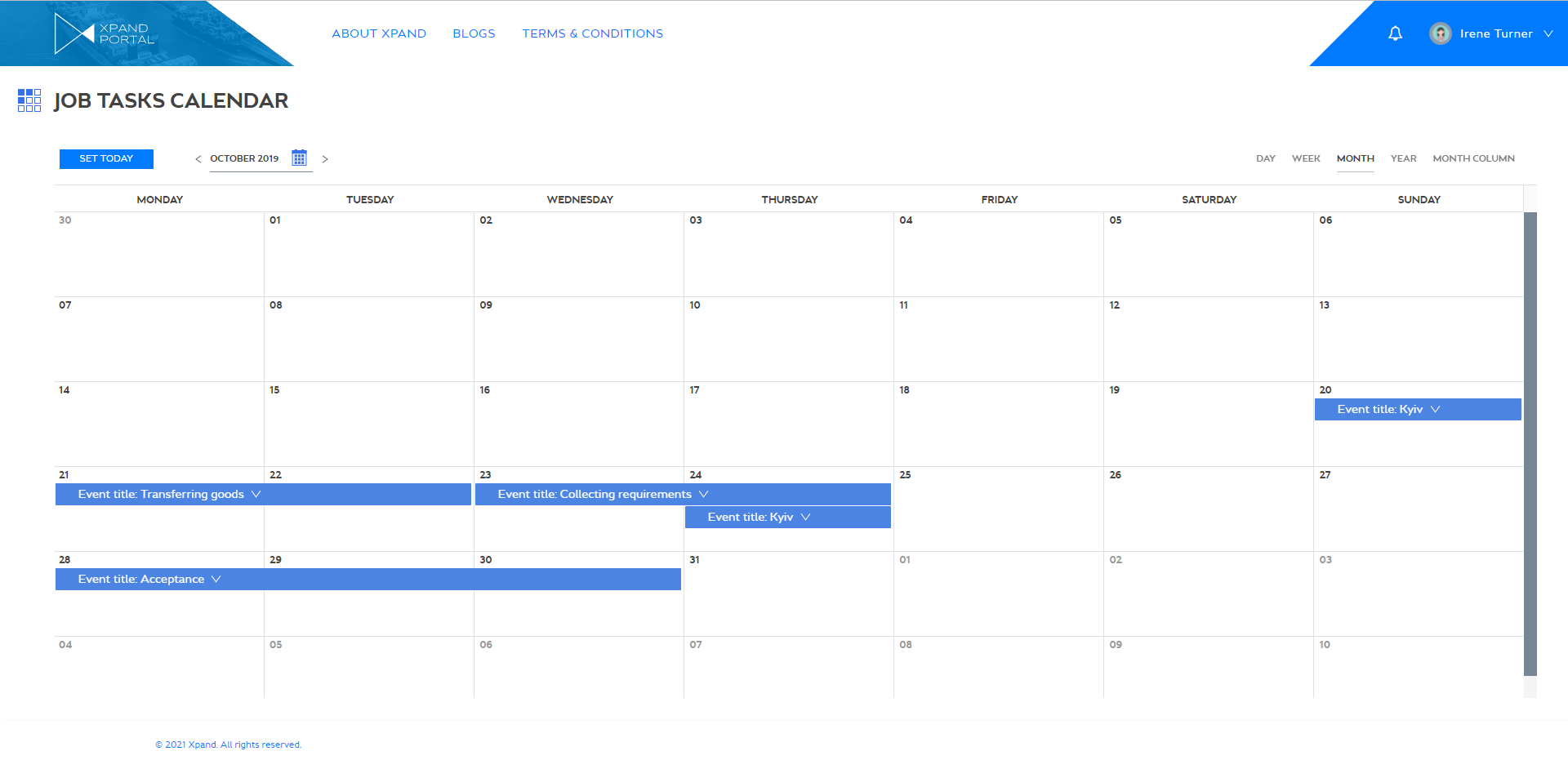
A Calendar page displays a calendar with items (bars) that represent events, based on records in the source entity. The duration of a calendar event is defined by data in the date-time fields of the related record. A calendar event may show detailed information from a record according to the calendar settings; you decide what information will be shown in calendar events.
The calendar view can be arranged to show the daily view, only show days in the week, show the month, or show the year.
If necessary, you can link the calendar to a grid and/or detail page so that you could open a page with detailed information about the related record the event is based on.
Navigation pane (menu)
Navigation pane, located on the left side of the portal window, can be customized according to your preferences. It may contain different useful links you wish to be easily accessible while working with the portal. You can set it up to display links to pages and links to the saved personalization views.
To open the menu, select the ![]() icon in the top left corner on any portal page.
icon in the top left corner on any portal page.
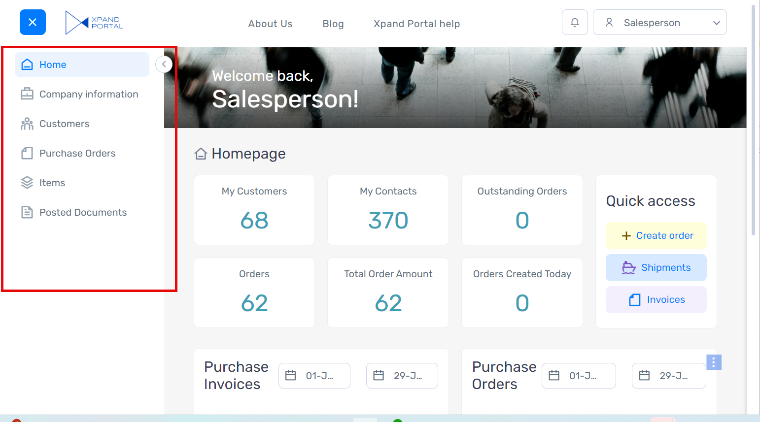
Select the ![]() icon to hide the menu at any time.
icon to hide the menu at any time.
|
The pin state is saved in the browser cookies and, as a result, preserved after changing the look of the navigation pane (the Menu view setting). Clearing browser cookies will revert the pin state to its default value: the menu is unpinned. Regardless of the configured menu view, the member can always close/open the menu and pin/unpin it when necessary. |
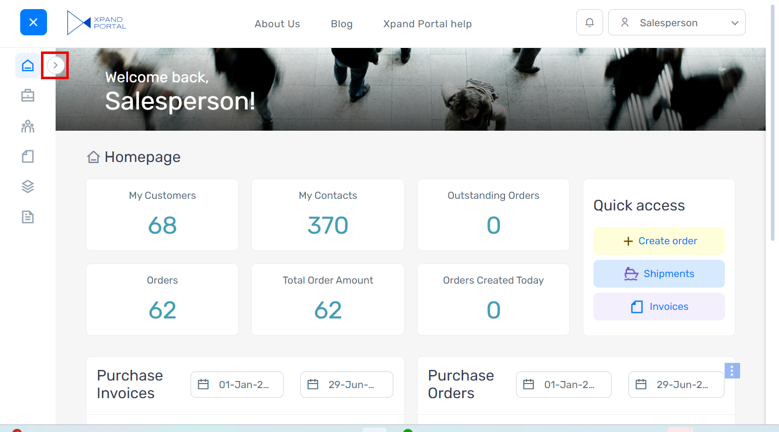
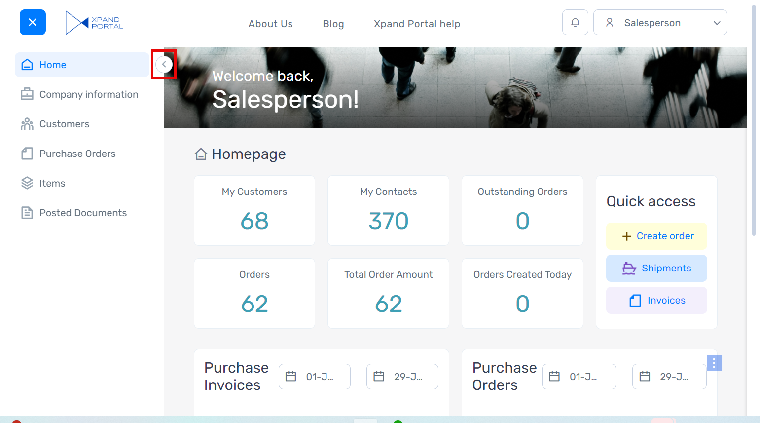
Use the ![]() and
and ![]() icons to expand and collapse the menu. The collapsed state only shows the menu item icons with titles.
icons to expand and collapse the menu. The collapsed state only shows the menu item icons with titles.
Expanded menu example:
Collapsed menu example:
