Creating a Calendar page
A Calendar page is a page that displays a calendar with items (bars) that represent events, based on records in the source entity. The duration of a calendar event is defined by data in the date-time fields of the related record. A calendar event may show detailed information from a record according to the calendar settings; you decide what information will be shown in calendar events.
The calendar view can be arranged to show the daily view, only show days in the week, show the month, or show the year.
If necessary, you can link the calendar to a grid and/or detail page so that you could open a page with detailed information about the related record the event is based on.
In the backoffice, a Calendar pages can be identified by the  icon.
icon.
There are four types of calendar pages:
- Stand-alone calendar – This calendar is a stand-alone page. Events in such a calendar are based on records from a single related entity. A related detail page is normally created as a child page.
- Calendar embedded in a grid page – This calendar is embedded into a grid page. Calendar days are grid columns. Events in such a calendar can be based on records from two entities: one entity is the grid, into which the calendar is embedded, and another entity is used to retrieve starting and ending date-time of events for the related parent entity. For example, you can set up a grid with a list of contacts (parent entity for the embedded calendar) and embed a calendar to show planned meetings (another entity from which meeting date and time is retrieved for each contact if available). To be able to view an embedded calendar page on the grid page, you must also add a Calendar action to the grid.
- Calendar embedded in a grid page within a Layout Block – This calendar is embedded into a grid page, but displayed in a layout block. The layout block of such a calendar must be a child page to the grid page where you want to have the calendar displayed. This type of calendar configuration also requires a parent entity and a related entity, data from which will be filtered by the same field between two entities. For this calendar, the Calendar action is not required.
- Calendar embedded into a detail page – This calendar is embedded into a detail (card) page. Events in this calendar are based on records from a singe entity (like in a stand-alone calendar). The calendar is added with the help of an extended field set field with the Extended Calendar Editor data type. This calendar type may be useful when you want to edit event start date-time and end date-time by selecting a time frame on the calendar.
To create a stand-alone Calendar page
- In the backoffice, go to Content.
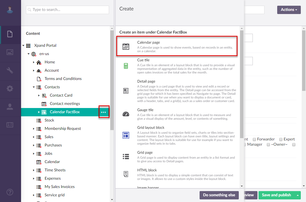
- Select the
 icon next to the site localization node (or select and hold (or right-click) the node, and then select Create), and then select Calendar page.
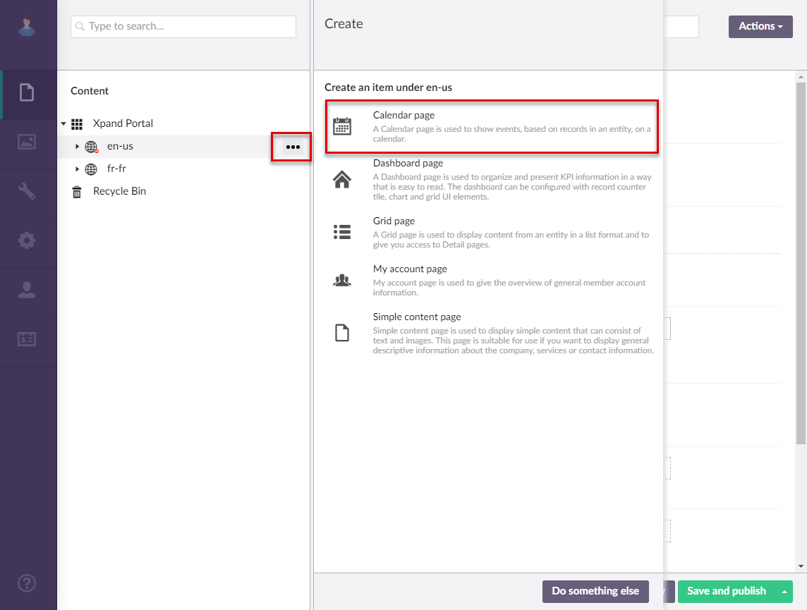
- If you have at least one content template of the Calendar page type, the created template(s) will be available for selection to use as a basis for the new page. Otherwise, this step is not shown. You can select Blank in case you don't want to use a template.
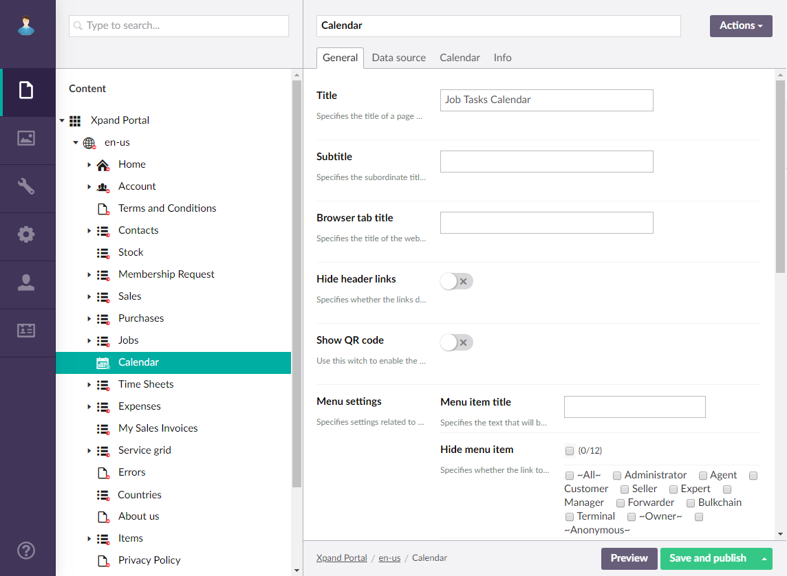
- On the header, enter the page name that will be used to identify it in the backoffice.
- On the General tab, fill in general settings for the new page:
- Title – Specifies the title that will be displayed in the header of the created page.
- Subtitle – Specifies the subtitle that will be displayed in the header of the created page.
- Browser tab title – Specifies the title of the web browser tab that will be displayed when the page is opened and the member point to the browser tab.
- Hide header links – Use this switch to hide or make visible again the links, which can be added when you configure site localization, in the page header.
- Show QR code – Use this switch to display a Quick Response (QR) code in the bottom right corner of the page. The QR code contains the link to this page. You can then publish the generated QR code wherever you need, which will open this page on the portal.
- Menu settings
- Menu item title – Specifies the title of the menu item, which will be displayed in the navigation pane for this page.
- Hide menu item – Specifies whether the menu item for this page will be hidden, and for which member groups. Only members that were added to the members groups that you select here will have this menu item available in their navigation pane. If you leave this check box cleared, the menu item will be visible to all member groups.
- Hide breadcrumb – Use this switch to hide or make visible again the page breadcrumb trail at the top of the page. A breadcrumb trail is used as a navigational aid to help portal members keep track and maintain awareness of their locations within the portal.
- Menu item icon – Specifies the icon of the menu item for this page. Select the square and browse to the icon in the portal media library.
- Menu item title color – Specifies the color of the menu item for this page.
- Split menu – Specifies whether a split line will be displayed after the menu item of this page.
- Compact menu – Specifies whether menu items will be displayed as icons in the main menu (navigation pane) for this page.
- Hidden menu – Specifies whether the main menu (navigation pane) will be hidden when this page is opened. The navigation can always be accessed by selecting the corresponding icon at the top of the page.
- Content-from page - Specifies the portal page that will be displayed instead of the created page. The path on the address bar will be that of the original page. Use this setting only if you want to redirect the member to another existing portal page. Select Add to add a page that will be displayed instead of the source page.
- Redirect-to page - Specifies the portal page that will be displayed instead of the created page. The path on the address bar will be that of the target page. Use this setting only if you want to redirect the member to another existing portal page. Select Add to add a page that will be displayed instead of the source page.
- Module assignment & protection - Specifies settings that allow you to assign this content element (localization, page, etc.) to an internal module as well as to protect this element from certain operations (copying, changing, deletion). Select the Configure button to configure module assignment & protection or the Change button to edit existing configuration if it has already been configured.
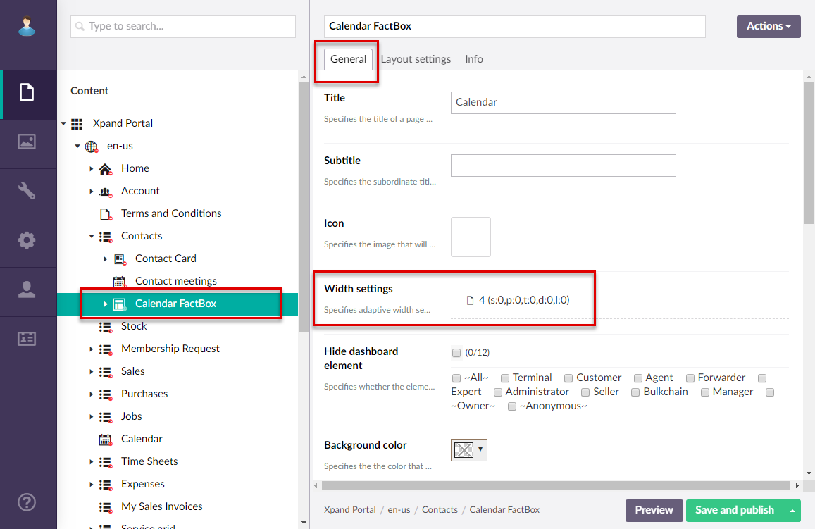
- Width settings - Specifies the adaptive grid width settings for this page per device. The width is automatically adjusted depending on the device the page is opened from.
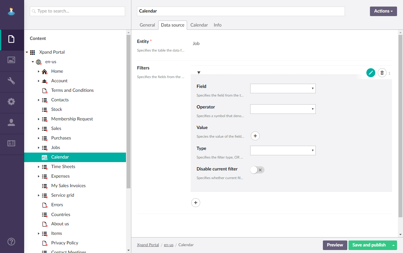
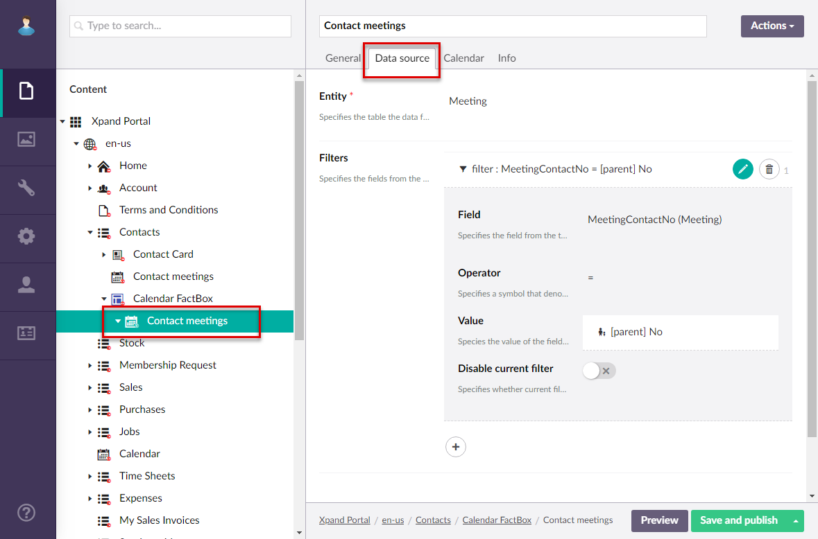
- On the Data source tab, specify the source of data for this grid page. If the source of data is external, portal integration must be set up and configured with the corresponding external system.
- Entity - Specifies the table data from which data will be retrieved for this grid page. This table may represent any entity to suit your business needs. The list of available entities depends on the system your portal is integrated with.
- Filter - Specifies the filter(s) which can be used to narrow down the records that will be retrieved from the specified entity by specified criteria. You can add filters individually, in groups, or in combination of individual filters and groups. Grouped clauses operate as a single unit separate from the rest of the query, similar to putting parentheses around a mathematical equation or logic expression. The AND or OR operator specified for the filter group applies to the whole group. Global filters (filters that are set up for the entire site) can be added automatically when you select or change the data source entity in case the entity has a global filter assigned to it. Global filters have the GLOBAL tag. Global filters can also be automatically added or cleared from portal pages or page parts in the global filter settings. Setting filters is optional and depends on what kind of data you want to be displayed on the page.
- To add an individual filter, select the
 icon, select
 Filters, and the configure filter settings:
- Field – Specifies the field from the source entity the value of which will be used to filter records on the page.
- Operator – Specifies a symbol that denotes a logical operation.
- Value – Specifies the value of the field that will be used to filter records on the page. You specify constant value or use a method to retrieve data. Select the icon and configure the type of value and its settings:
- Constant value – Specify a constant value that will be used as a filter condition during lookup. If the value of the specified field is equal (or more, or less, etc., depending on the operator) to this value, the filter condition will be met.
- Value-from member field name – Specify a field from the portal member settings, the value from which will be used as a filter.
- Value from parent entity field – Specify a field from a parent entity on the portal, the value from which will be used as a filter during lookup.
- Address field – Specify the name of a query string parameter (the part of a uniform resource locator (URL) which assigns values to specified parameters), which will be used a condition for the field value in this filter.
- Date-time value – Specify a date-time value that will be used as a filter to retrieve data.
- Field – Specify a field from the current entity (an entity, to which the field that you are configuring lookup settings for belongs to) the value from which will be used as a filter during lookup. This may be useful if you want to see value for the lookup entity that are related to the current entity.
- Type – Specifies the type of the filter:
- AND – Use this type to find records in the data source that meet the criteria in both the current clause and the previous clause.
- OR – Use this type to find records in the data source that meet the criteria in either the current clause or the previous clause.
- Disable current filter – Use this switch to temporarily disable the filter for this page.
- To add a groups filters, select the icon, select
 Filters group, and the configure filter group settings:
- Type – Specifies the type of the filter group:
- AND – Use this type to find records in the data source that meet the criteria in both the current clause and the previous clause.
- OR – Use this type to find records in the data source that meet the criteria in either the current clause or the previous clause.
- Filters in group – Specifies filters that will belong to this filter group. The Type setting above will be applied to the whole group of filters. Select the icon to add a new filter to the group, and configure its settings in a similar way you configure settings for individual filters.
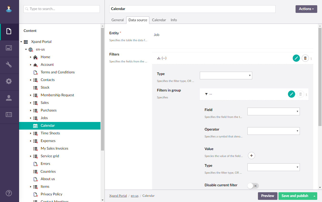
- Type – Specifies the type of the filter group:
- To add an individual filter, select the
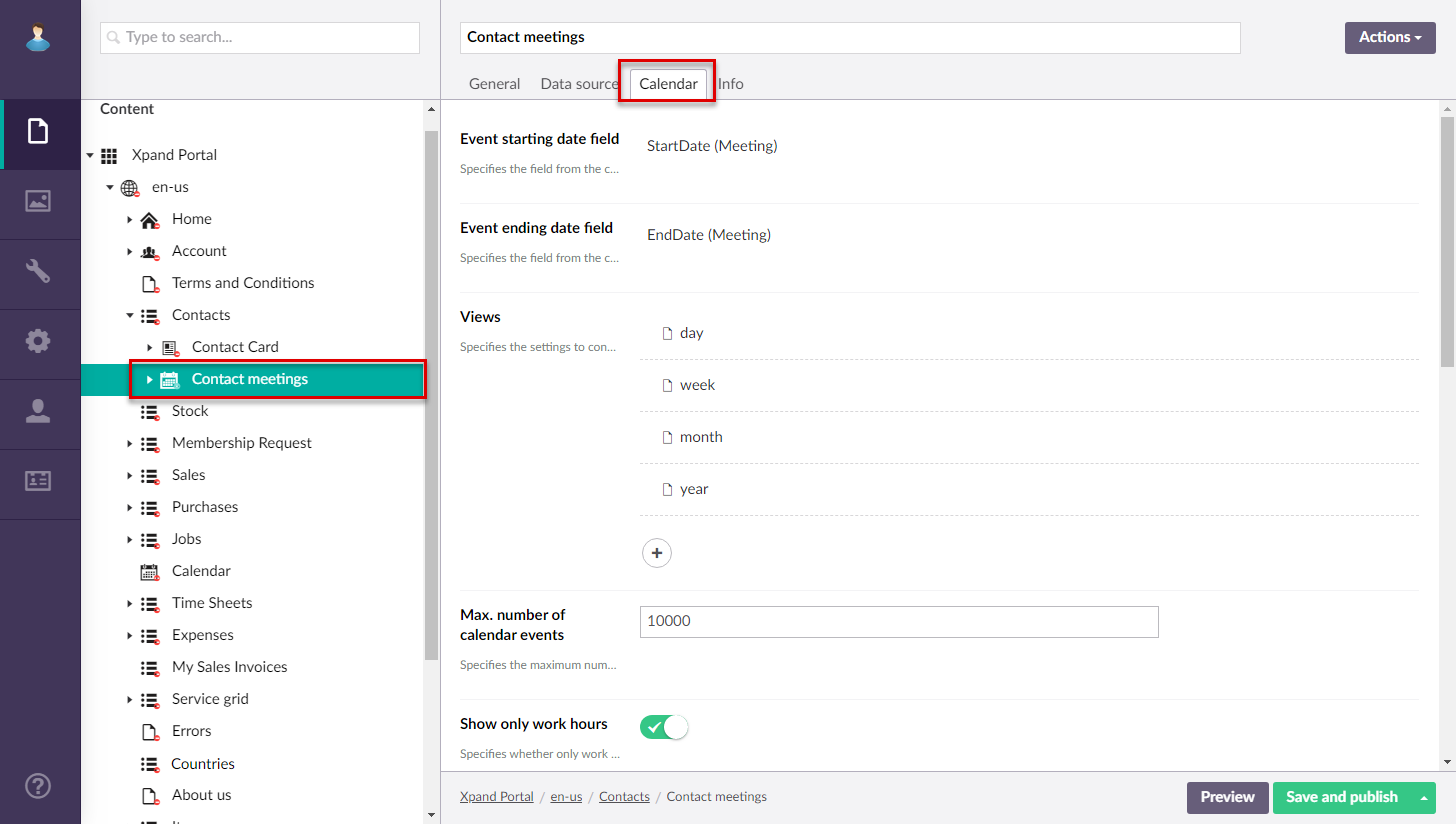
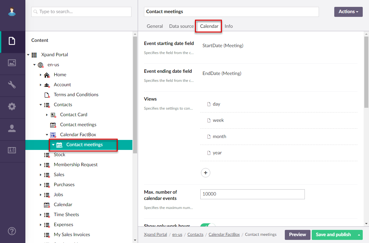
- On the Calendar tab, configure the calendar settings:
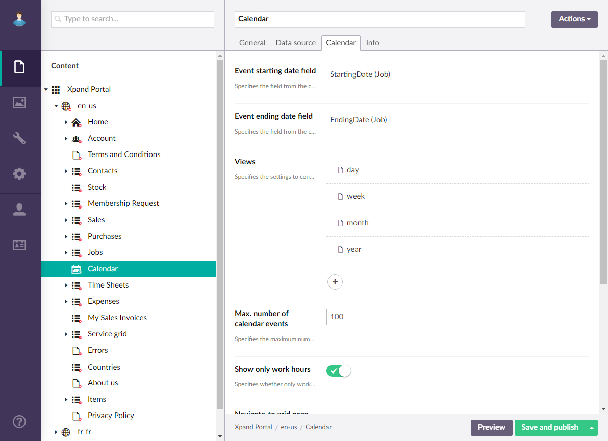
- Event starting date field – Specifies a date-time field from the data source entity that will be used to identify the starting date or starting date and time of an event. Availability of fields for selection depends on the entity, specified in the Data source tab. Note that the format of the date in the value that will be retrieved from the specified field should correspond to the portal date configuration: e.g. dd-MM-yyyy. If the field value contains both date and time, the expected format is as follows: dd-MM-yyyy HH:mm:ss (where the date format con be different depending on your configuration). Thus, make sure that value in the specified in the data source conforms to the expected format for the calendar to work correctly.
- Event ending date field – Specifies a date-time field from the data source entity that will be used to identify the ending date or starting date and time of an event. Note that the ending date is not included in the event duration.Thus, the ending date must be the next day after the date when the event is supposed to end. Availability of fields for selection depends on the entity, specified in the Data source tab. The expected date and time format in the value of the selected field is the same as for the Event starting date field setting.
- Views – Specifies settings for each view that can be available on the calendar. Select the icon to add a view to the calendar and configure how events will be displayed in that view. Add a view for each time period that you want to be available on the calendar. For each view you configure the following:
- Title – Specifies the title of the calendar view that will be displayed on the calendar view selection pane. You can leave this title empty to use the default title.
- View – Specifies the period for which events are displayed:
- Day - Each cell represents an hour in a day and you see events for a single day.
- Week - Each cell represents an hour in a day and you see events for a week.
- Month - Each cell represents a day and you can see events for a whole month spread across several lines.
- Month Column - Each line represents an event and days of the month are shown as columns; the number of lines depends on the number of events.
- Year - Each line represents an event and months are shown as columns; the number of lines depends on the number of events.
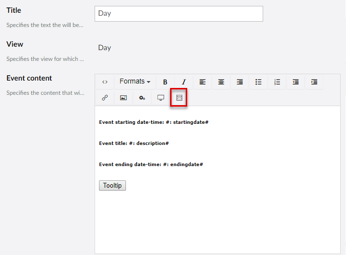
- Event content – Specifies the content of each event in this calendar view. You can add plain text, a variable, a button to view event tooltip, or a link to the related detail page. For example, to add a field variable (the value from a source entity field retrieved) for the Start Date field (field name is StartingDate), add the following code to the event content: #: startingdate# This code means that value from the field with the StartingDate name will be shown in the event bar. Ensure you use lowercase for the field name in the field variable. You can use the Insert template action to add predefined code pattern, which you can then adjust to suit your needs. If you use a template, you will probably need to change the field names in the variables that correspond to the fields in your source entity.
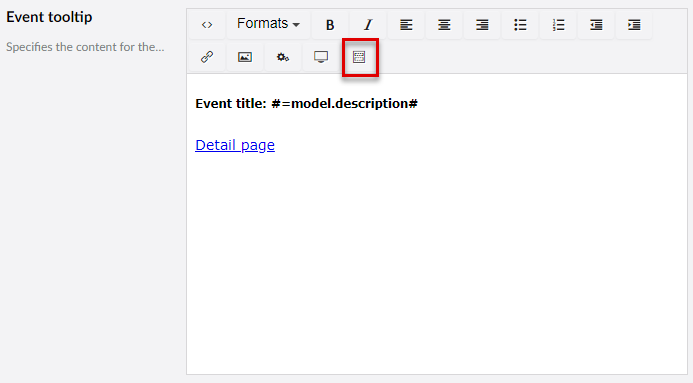
- Event tooltip – Specifies the content of the tooltip for each event in this calendar view. You can add plain text, a variable, or a link to the related detail page. If you specify a tooltip, ensure that you add a Tooltip button to the event content that would be used to open this tooltip. You can use the Insert template action to add predefined code pattern, which you can then adjust to suit your needs. In the event tooltip template, in the variable, you need to replace the field name with the one that corresponds to a field in your source entity after the =model. part. For example, in the Event title: #=model.description# code, you need to replace description with the name (written in lowercase letters) of a field that corresponds to the event title.
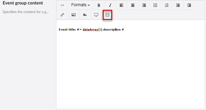
- Event group content – Specifies the content of the event group that will be displayed in the calendar cell in case the maximum number of events in a cell has been reached. This content will be displayed as a unified content instead of the content of each individual cell. You can use the Insert template action to add predefined code pattern, which you can then adjust to suit your needs. In the event tooltip template, in the variable, you need to replace the field name with the one that corresponds to a field in your source entity after the =dataArray[i]. part. For example, in the Event title: #= dataArray[i].description # code, you need to replace description with the name (written in lowercase letters) of a field that corresponds to the event title.
- Show view – Specifies whether this view will be shown on the Calendar page and for which member groups.
- Max. number of cell events – Specifies the maximum number of events that can be displayed in a calendar cell. If this number is exceeded, the event group content will be displayed instead of the content of each individual event.
- Max number of calendar events – Specifies the maximum number of events that can be displayed in the calendar.
- Show only work hours – Specifies whether the calendar will display only work hours. If you enable this, ensure that the Work hours start time and Work hours end time settings are configured as well.
- Navigate-to grid page – Specifies the grid page to which the member will be navigated when selecting the Read more link int he bottom right corner of the Calendar page. The link becomes available if you specify a grid page in this setting. The link to a grid page can also be added to the event content (use a predefined template for the event group content).
- Navigate-to detail page – Specifies the grid page to which the member will be navigated when selecting the corresponding link in a calendar event content. The link must be added to the event content (you can use a predefined template for that).
- Event color field – Specifies a field from the data source entity the value of which will be used to identify color of the event background. This can be useful if you want calendar events to have different colors. The color in the field value must be specified in the W3C named color format. E.g. Blue, Green, Lime, Orange, Pink, etc. Availability of fields for selection depends on the entity, specified on the Data source tab.
 Note
NoteFor events an embedded calendar, the Event colors setting is used to apply colors to events.
- First Day of week – Specifies the starting day of the calendar week.
- Work hours start time – Specifies time when the working hours start. Specify only the starting hour in the following format: HH. E.g. 09.
- Work hours end time – Specifies time when the working hours end. Specify only the ending hour in the following format: HH. E.g. 18.
- Event colors – Specifies the list of colors that will be automatically applied to events in an embedded calendar. Each line will have a different color, taken from this setting. Select the icon to add colors with the help of the color picker. If you do not these custom colors, or the number of lines with events exceeds the number of added colors, the same default color will be used.
- Select Save and publish.
Now, the created Calendar page can be opened on the front end.
To create a calendar embedded into a grid page
- In the backoffice, go to Content.
- Create a grid page, or use an existing one, the data source of which will be used to retrieve the starting and ending date of events in the embedded calendar. Ensure that this grid page configuration has the following:
- A portal entity, specified as data source, with the necessary fields:
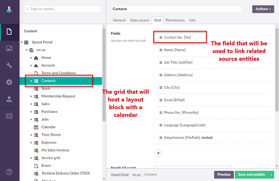
- A field that will be used to link this grid and the grid page into which the calendar will be embedded. For example, a field with the number or name of the entity, common for both grids.
- A field the value of which will be used to retrieve the starting date or date and time of an event.
- A field the value of which will be used to retrieve the ending date or date and time of an event.
- The mandatory fields mentioned above are displayed on the grid.
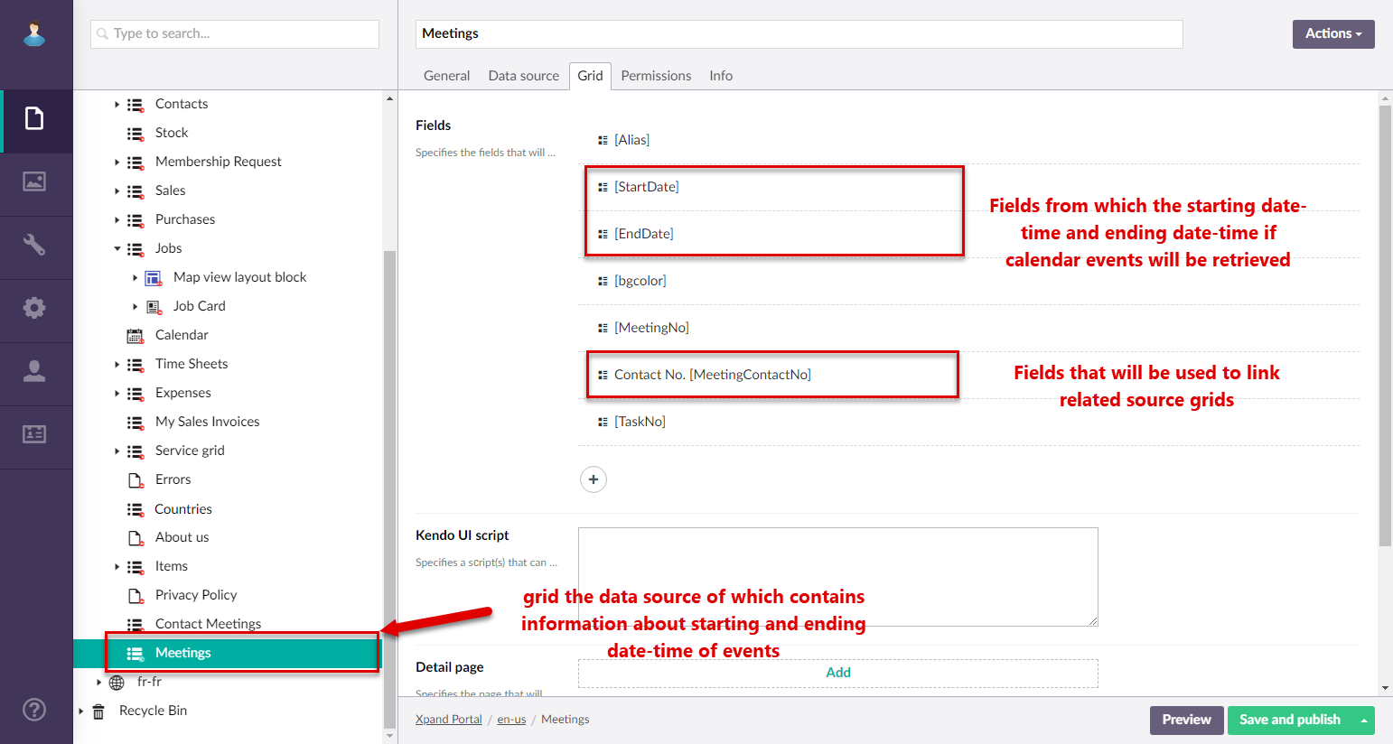
- A portal entity, specified as data source, with the necessary fields:
- Create a grid page, or use an existing one, the data source of which will be used to filter events retrieved from another linked portal entity. A calendar page will be embedded into this page. Ensure that this grid page configuration has the following:
- A field that will be used to link this grid and the grid page from calendar event information is retrieved.
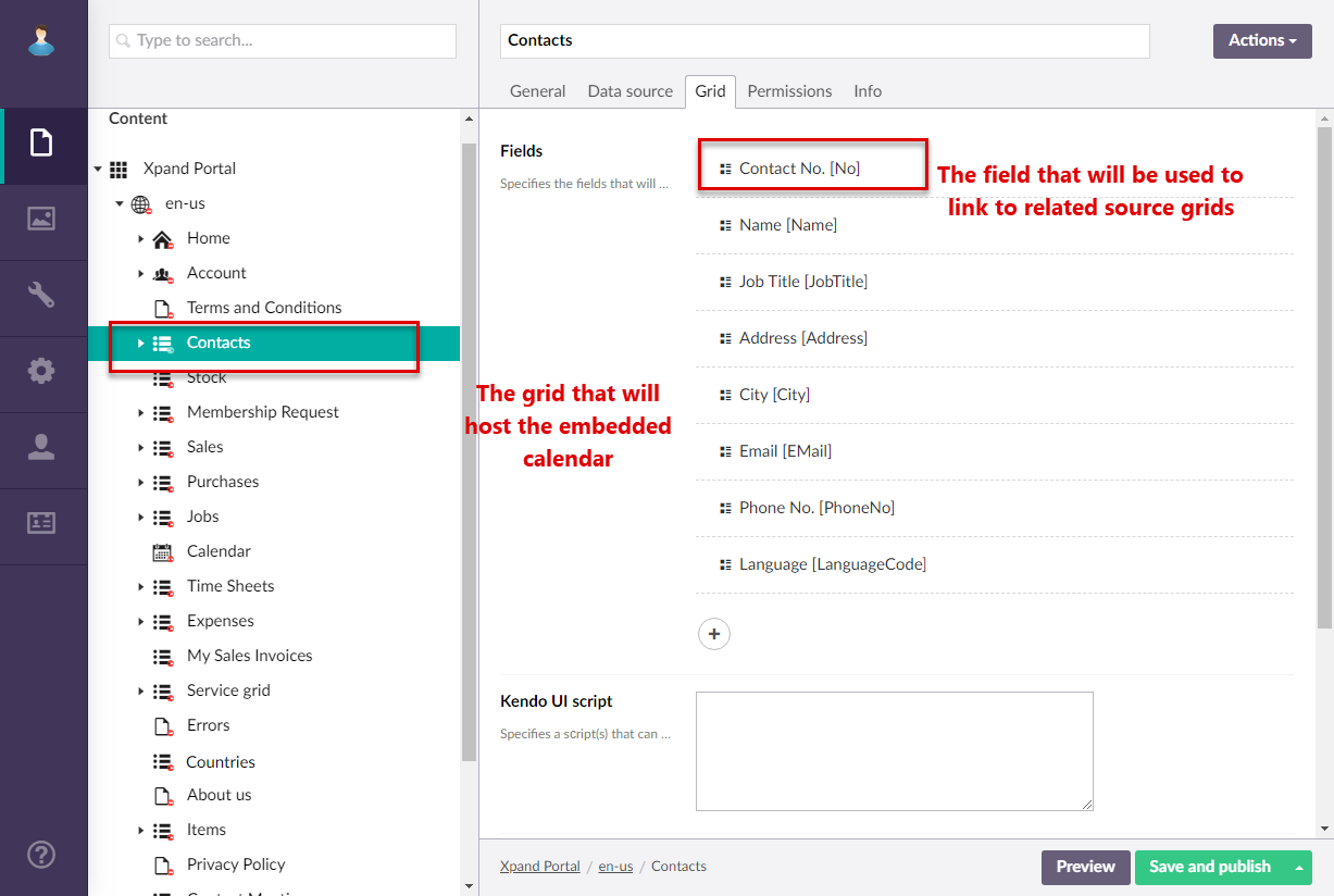
- The linking field mentioned above must be displayed on the grid.
- A field that will be used to link this grid and the grid page from calendar event information is retrieved.
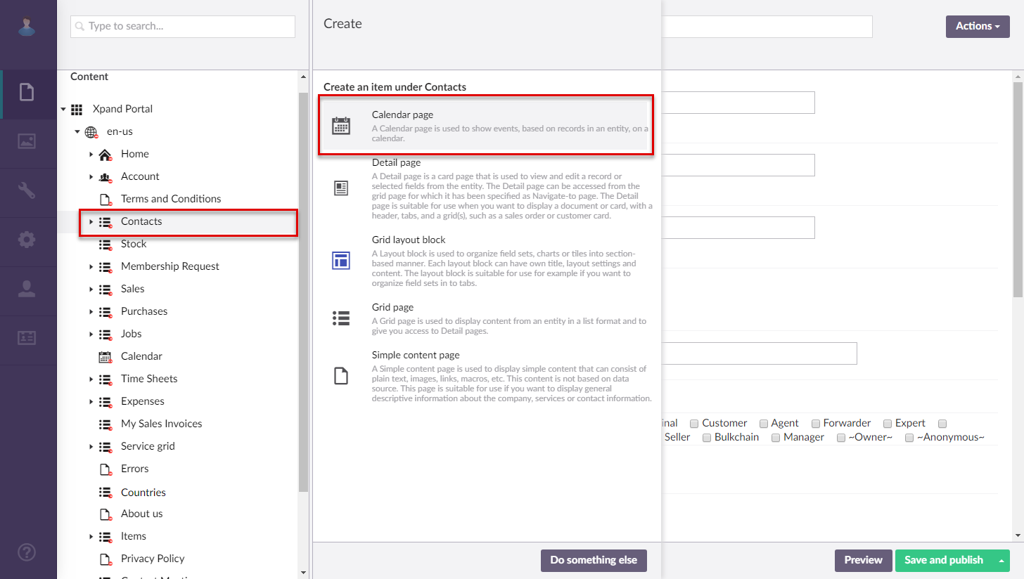
- Select the icon next to the site grid page that will host an embedded calendar, and then select Calendar page.
- On the header, enter the page name that will be used to identify it in the backoffice.
- On the General tab, fill in general settings for the new page:
- Title - Specifies the title that will be displayed in the header of the created page.
- Subtitle - Specifies the subtitle that will be displayed in the header of the created page.
- Browser tab title - Specifies the title of the web browser tab that will be displayed when the page is opened and the member point to the browser tab.
- Hide header links - Use this switch to hide or make visible again the links, which can be added when you configure site localization, in the page header.
- Show QR code – Use this switch to display a Quick Response (QR) code in the bottom right corner of the page. The QR code contains the link to this page. You can then publish the generated QR code wherever you need, which will open this page on the portal.
- Menu settings
- Menu item title -Specifies the title of the menu item, which will be displayed in the navigation pane for this page.
- Hide menu item - Specifies whether the menu item for this page will be hidden, and for which member groups. Only members that were added to the members groups that you select here will have this menu item available in their navigation pane. If you leave this check box cleared, the menu item will be visible to all member groups.
- Under Menu Settings, you may want to select the Hide menu item check box for all or some member roles. This may be useful if you want this calendar page to be accessible only in the form of embedded calendar. If you do not hide the menu item, the calendar will also be available through the menu as a stand-alone calendar.
- Fill in other settings on the General tab in a similar way to creating a stand-alone calendar page.
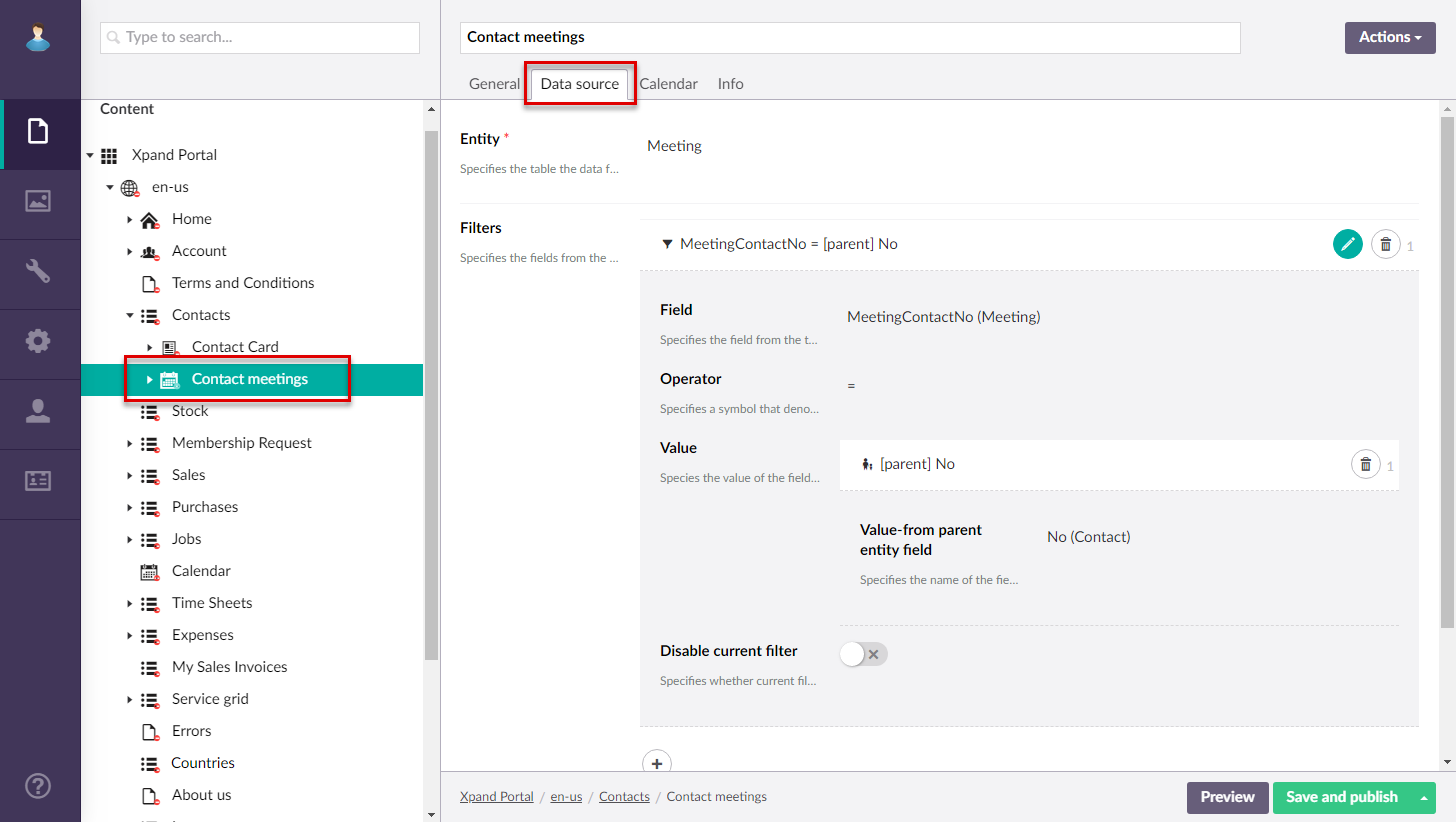
- On the Data source tab, in the Entity field, select the entity from the grid that contains starting and ending date-time of calendar events (created/configured in step 2 of this procedure).
- Under Filters, add a filter to combine two related grids (the one with starting and ending date-time of calendar events and another with the entity by which calendar events will be sorted) by filling in fields as follows:
- Field – Select the field from the source entity of the grid that contains starting and ending date-time of calendar events that has a corresponding field in the parent entity of this calendar page.
- Operator – Set this operator to =.
- Value – Select Value-from parent entity field, and then select the field that corresponds to the field specified in the Field setting above.
- On the Calendar tab, configure the settings as follows:
- Event starting date field – Specifies a date-time field from the data source entity that will be used to identify the starting date or starting date and time of an event. For an embedded calendar, you need to select a field from the source entity that contains starting and ending date-time information for events. Note that the format of the date in the value that will be retrieved from the specified field should correspond to the portal date configuration: e.g. dd-MM-yyyy. If the field value contains both date and time, the expected format is as follows: dd-MM-yyyy HH:mm:ss (where the date format con be different depending on your configuration). Thus, make sure that value in the specified in the data source conforms to the expected format for the calendar to work correctly.
- Event ending date field – Specifies a date-time field from the data source entity that will be used to identify the ending date or starting date and time of an event. For an embedded calendar, you need to select a field from the source entity that contains starting and ending date-time information for events. Note that the ending date is not included in the event duration.Thus, the ending date must be the next day after the date when the event is supposed to end. Availability of fields for selection depends on the entity, specified in the Data source tab. The expected date and time format in the value of the selected field is the same as for the Event starting date field setting.
- Views – Specifies settings for each view that can be available on the calendar. Select the icon to add a view to the calendar and configure how events will be displayed in that view. Add a view for each time period that you want to be available on the calendar. For each view you configure the following:
- Title – Specifies the title of the calendar view that will be displayed on the calendar view selection pane. You can leave this title empty to use the default title.
- View – Specifies the the period for which events are displayed. For an embedded calendar, all views are displayed in the form of columns:
- Day - Each column represents an hour in a day and you see events for a single day. What line represents depends on the source entity where the Calendar action will be added.
- Week - Each column represents a day of week and you see events for a week. What line represents depends on the source entity where the Calendar action will be added.
- Month - Each columns represents a day of a month and you can see events for a whole month. What line represents depends on the source entity where the Calendar action will be added.
- Month Column - Each columns represents a day of a month and you can see events for a whole month. For an embedded calendar, this view is the same as the Month view. What line represents depends on the source entity where the Calendar action will be added.
- Year - Each column represents a month in a year and you see events for a whole year. What line represents depends on the source entity where the Calendar action will be added.
- Event content – Specifies the content of each event in this calendar view. You can add plain text, a variable, a button to view event tooltip, or a link to the related detail page. For example, to add a field variable (the value from a source entity field retrieved) for the Start Date field (field name is StartingDate), add the following code to the event content: #: startingdate# This code means that value from the field with the StartingDate name will be shown in the event bar. Ensure you use lowercase for the field name in the field variable. You can use the Insert template action to add predefined code pattern, which you can then adjust to suit your needs. If you use a template, you will probably need to change the field names in the variables that correspond to the fields in your source entity.
- Event tooltip – Specifies the content of the tooltip for each event in this calendar view. You can add plain text, a variable, or a link to the related detail page. If you specify a tooltip, ensure that you add a Tooltip button to the event content that would be used to open this tooltip. You can use the Insert template action to add predefined code pattern, which you can then adjust to suit your needs. In the event tooltip template, in the variable, you need to replace the field name with the one that corresponds to a field in your source entity after the =model. part. For example, in the Event title: #=model.description# code, you need to replace description with the name (written in lowercase letters) of a field that corresponds to the event title.
- Event group content – Specifies the content of the event group that will be displayed in the calendar cell in case the maximum number of events in a cell has been reached. This content will be displayed as a unified content instead of the content of each individual cell. You can use the Insert template action to add predefined code pattern, which you can then adjust to suit your needs. In the event tooltip template, in the variable, you need to replace the field name with the one that corresponds to a field in your source entity after the =dataArray[i]. part. For example, in the Event title: #= dataArray[i].description # code, you need to replace description with the name (written in lowercase letters) of a field that corresponds to the event title.
- Show view – Specifies whether this view will be shown on the Calendar page and for which member groups.
- Max. number of cell events – Specifies the maximum number of events that can be displayed in a calendar cell. If this number is exceeded, the event group content will be displayed instead of the content of each individual event.
- Max number of calendar events – Specifies the maximum number of events that can be displayed in the calendar.
- Show only work hours – Specifies whether the calendar will display only work hours. If you enable this, ensure that the Work hours start time and Work hours end time settings are configured as well.
- Navigate-to grid page – Specifies the grid page to which the member will be navigated when selecting the Read more link int he bottom right corner of the Calendar page. The link becomes available if you specify a grid page in this setting. The link to a grid page can also be added to the event content (use a predefined template for the event group content).
- Navigate-to detail page – Specifies the grid page to which the member will be navigated when selecting the corresponding link in a calendar event content. The link must be added to the event content (you can use a predefined template for that).
- Event color field – This field is not used in an embedded calendar. It specifies a field from the data source entity the value of which will be used to identify color of the event background. This can be useful if you want calendar events to have different colors. The color in the field value must be specified in the W3C named color format. E.g. Blue, Green, Lime, Orange, Pink, etc. Availability of fields for selection depends on the entity, specified on the Data source tab.
NoteFor events an embedded calendar, the Event colors setting is used to apply colors to events.
- First Day of week – Specifies the starting day of the calendar week.
- Work hours start time – Specifies time when the working hours start. Specify only the starting hour in the following format: HH. E.g. 09.
- Work hours end time – Specifies time when the working hours end. Specify only the ending hour in the following format: HH. E.g. 18.
- Event colors – Specifies the list of colors that will be automatically applied to events in an embedded calendar. Each line will have a different color, taken from this setting. Select the icon to add colors with the help of the color picker. If you do not these custom colors, or the number of lines with events exceeds the number of added colors, the same default color will be used.
- Select Save and Publish.
- Open the page settings for the parent grid where you want to have the calendar embedded, and go to the Permissions tab.
- Add a Calendar action. Ensure that in the Calendar action settings, in the Calendar page field, you specify the page of the embedded calendar that has just been created.
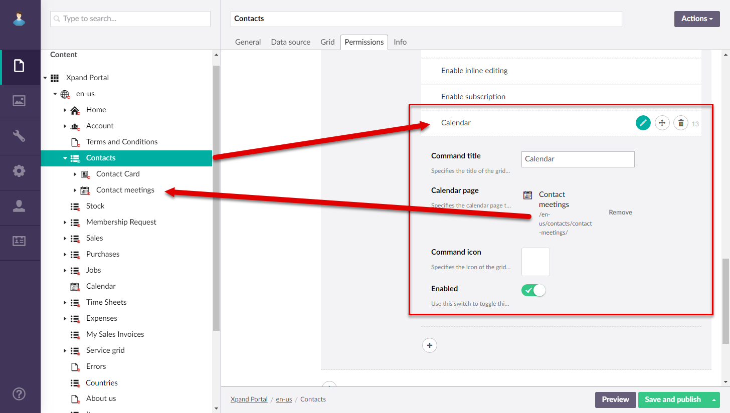
- Select Save and Publish.
Now you can view the embedded calendar by opening the grid page where you added the Calendar action.
To create calendar embedded into a grid page within a layout block
- In the backoffice, go to Content.
- Create a grid page, or use an existing one, the data source of which will be used to retrieve the starting and ending date of events in the embedded calendar. Ensure that this grid page configuration has the following:
- A portal entity, specified as data source, with the necessary fields:
- A field that will be used to link this grid and the grid page into which the calendar will be embedded. For example, a field with the number or name of the entity, common for both grids.
- A field the value of which will be used to retrieve the starting date or date and time of an event.
- A field the value of which will be used to retrieve the ending date or date and time of an event.
- The mandatory fields mentioned above are displayed on the grid.
- A portal entity, specified as data source, with the necessary fields:
- Ensure that on the General tab, you specify the width of the grid under Width settings. This is necessary to ensure that the grid fits the page next to the layout block with the calendar.
- Create a grid page, or use an existing one, the data source of which will be used to filter events retrieved from another linked portal entity. A calendar page will be embedded into this page. Ensure that this grid page configuration has the following:
- A field that will be used to link this grid and the grid page from calendar event information is retrieved.
- The linking field mentioned above must be displayed on the grid.
- A field that will be used to link this grid and the grid page from calendar event information is retrieved.
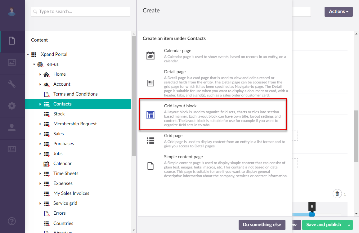
- Select the icon next to the site grid page that will host an embedded calendar in a layout block, and then select
 Grid layout block.
- On the header, enter the page name that will be used to identify it in the backoffice.
- On the General tab, specify the title of the layout block and other settings if necessary.
- Ensure that you specify the width of the layout block under Width settings. This is necessary to ensure that the layout block fits the page next to the grid. Otherwise, it will be displayed below or above the grid depending on the layout settings.
- Save and publish the changes on the layout block.
- Select the icon next to the created layout block, and then select Calendar page.
- On the header, enter the page name that will be used to identify it in the backoffice.
- On the General tab, fill in general settings for the new page:
- Title - Specifies the title that will be displayed in the header of the created page.
- Subtitle - Specifies the subtitle that will be displayed in the header of the created page.
- Browser tab title - Specifies the title of the web browser tab that will be displayed when the page is opened and the member point to the browser tab.
- Hide header links - Use this switch to hide or make visible again the links, which can be added when you configure site localization, in the page header.
- Show QR code – Use this switch to display a Quick Response (QR) code in the bottom right corner of the page. The QR code contains the link to this page. You can then publish the generated QR code wherever you need, which will open this page on the portal.
- Menu settings
- Menu item title -Specifies the title of the menu item, which will be displayed in the navigation pane for this page.
- Hide menu item - Specifies whether the menu item for this page will be hidden, and for which member groups. Only members that were added to the members groups that you select here will have this menu item available in their navigation pane. If you leave this check box cleared, the menu item will be visible to all member groups.
- Under Menu Settings, you may want to select the Hide menu item check box for all or some member roles. This may be useful if you want this calendar page to be accessible only in the form of embedded calendar. If you do not hide the menu item, the calendar will also be available through the menu as a stand-alone calendar.
- Fill in other settings on the General tab in a similar way to creating a stand-alone calendar page.
- On the Data source tab, in the Entity field, select the entity from the grid that contains starting and ending date-time of calendar events (created/configured in step 2 of this procedure).
- Under Filters, add a filter to combine two related grids (the one with starting and ending date-time of calendar events and another with the entity by which calendar events will be sorted) by filling in fields as follows:
- Field – Select the field from the source entity of the grid that contains starting and ending date-time of calendar events that has a corresponding field in the parent entity of this calendar page.
- Operator – Set this operator to =.
- Value – Select Value-from parent entity field, and then select the field that corresponds to the field specified in the Field setting above.
- On the Calendar tab, configure the settings as follows:
- Event starting date field – Specifies a date-time field from the data source entity that will be used to identify the starting date or starting date and time of an event. For an embedded calendar, you need to select a field from the source entity that contains starting and ending date-time information for events. Note that the format of the date in the value that will be retrieved from the specified field should correspond to the portal date configuration: e.g. dd-MM-yyyy. If the field value contains both date and time, the expected format is as follows: dd-MM-yyyy HH:mm:ss (where the date format con be different depending on your configuration). Thus, make sure that value in the specified in the data source conforms to the expected format for the calendar to work correctly.
- Event ending date field – Specifies a date-time field from the data source entity that will be used to identify the ending date or starting date and time of an event. For an embedded calendar, you need to select a field from the source entity that contains starting and ending date-time information for events. Note that the ending date is not included in the event duration.Thus, the ending date must be the next day after the date when the event is supposed to end. Availability of fields for selection depends on the entity, specified in the Data source tab. The expected date and time format in the value of the selected field is the same as for the Event starting date field setting.
- Views – Specifies settings for each view that can be available on the calendar. Select the icon to add a view to the calendar and configure how events will be displayed in that view. Add a view for each time period that you want to be available on the calendar. For each view you configure the following:
- Title – Specifies the title of the calendar view that will be displayed on the calendar view selection pane. You can leave this title empty to use the default title.
- View – Specifies the the period for which events are displayed. For an embedded calendar, all views are displayed in the form of columns:
- Day - Each column represents an hour in a day and you see events for a single day. What line represents depends on the source entity where the Calendar action will be added.
- Week - Each column represents a day of week and you see events for a week. What line represents depends on the source entity where the Calendar action will be added.
- Month - Each columns represents a day of a month and you can see events for a whole month. What line represents depends on the source entity where the Calendar action will be added.
- Month Column - Each columns represents a day of a month and you can see events for a whole month. For an embedded calendar, this view is the same as the Month view. What line represents depends on the source entity where the Calendar action will be added.
- Year - Each column represents a month in a year and you see events for a whole year. What line represents depends on the source entity where the Calendar action will be added.
- Event content – Specifies the content of each event in this calendar view. You can add plain text, a variable, a button to view event tooltip, or a link to the related detail page. For example, to add a field variable (the value from a source entity field retrieved) for the Start Date field (field name is StartingDate), add the following code to the event content: #: startingdate# This code means that value from the field with the StartingDate name will be shown in the event bar. Ensure you use lowercase for the field name in the field variable. You can use the Insert template action to add predefined code pattern, which you can then adjust to suit your needs. If you use a template, you will probably need to change the field names in the variables that correspond to the fields in your source entity.
- Event tooltip – Specifies the content of the tooltip for each event in this calendar view. You can add plain text, a variable, or a link to the related detail page. If you specify a tooltip, ensure that you add a Tooltip button to the event content that would be used to open this tooltip. You can use the Insert template action to add predefined code pattern, which you can then adjust to suit your needs. In the event tooltip template, in the variable, you need to replace the field name with the one that corresponds to a field in your source entity after the =model. part. For example, in the Event title: #=model.description# code, you need to replace description with the name (written in lowercase letters) of a field that corresponds to the event title.
- Event group content – Specifies the content of the event group that will be displayed in the calendar cell in case the maximum number of events in a cell has been reached. This content will be displayed as a unified content instead of the content of each individual cell. You can use the Insert template action to add predefined code pattern, which you can then adjust to suit your needs. In the event tooltip template, in the variable, you need to replace the field name with the one that corresponds to a field in your source entity after the =dataArray[i]. part. For example, in the Event title: #= dataArray[i].description # code, you need to replace description with the name (written in lowercase letters) of a field that corresponds to the event title.
- Show view – Specifies whether this view will be shown on the Calendar page and for which member groups.
- Max. number of cell events – Specifies the maximum number of events that can be displayed in a calendar cell. If this number is exceeded, the event group content will be displayed instead of the content of each individual event.
- Max number of calendar events – Specifies the maximum number of events that can be displayed in the calendar.
- Show only work hours – Specifies whether the calendar will display only work hours. If you enable this, ensure that the Work hours start time and Work hours end time settings are configured as well.
- Navigate-to grid page – Specifies the grid page to which the member will be navigated when selecting the Read more link int he bottom right corner of the Calendar page. The link becomes available if you specify a grid page in this setting. The link to a grid page can also be added to the event content (use a predefined template for the event group content).
- Navigate-to detail page – Specifies the grid page to which the member will be navigated when selecting the corresponding link in a calendar event content. The link must be added to the event content (you can use a predefined template for that).
- Event color field – This field is not used in an embedded calendar. It specifies a field from the data source entity the value of which will be used to identify color of the event background. This can be useful if you want calendar events to have different colors. The color in the field value must be specified in the W3C named color format. E.g. Blue, Green, Lime, Orange, Pink, etc. Availability of fields for selection depends on the entity, specified on the Data source tab.
NoteFor events an embedded calendar, the Event colors setting is used to apply colors to events.
- First Day of week – Specifies the starting day of the calendar week.
- Work hours start time – Specifies time when the working hours start. Specify only the starting hour in the following format: HH. E.g. 09.
- Work hours end time – Specifies time when the working hours end. Specify only the ending hour in the following format: HH. E.g. 18.
- Event colors – Specifies the list of colors that will be automatically applied to events in an embedded calendar. Each line will have a different color, taken from this setting. Select the icon to add colors with the help of the color picker. If you do not these custom colors, or the number of lines with events exceeds the number of added colors, the same default color will be used.
- Select Save and Publish.
Now you can view the embedded calendar by opening the grid page where you added the Calendar action.
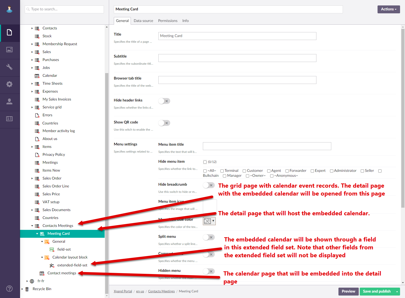
To create calendar embedded into a detail page
- In the backoffice, go to Content.
- Create a grid page or use an existing one that will contain calendar event records. These calendar event records will be edited through a detail (card) page with an embedded calendar. Ensure the data source of this grid page is the same entity as the entity that will be used for the calendar embedded into a child detail page.
- Create a detail page, including necessary child elements, or use an existing one that will host the embedded calendar. Ensure that this detail page configuration has the following:
- A layout block with a standard field set that will show some fields from the calendar page entity. Remember to adjust the width of the layout block to leave room for another layout block with the calendar.
- A layout block with an extended field set. One of the fields on this extended field set, with the Extended Calendar Editor data type, will be used to host an embedded calendar. Remember to adjust the width of the layout block to leave room for another layout block with fields.
- Create a stand-alone calendar page that will be embedded into the detail page. Ensure that the calendar page uses the same data source as the detail page. For this scenario, when a calendar page is embedded into a detail page, this stand-alone calendar page can be located anywhere in the portal structure (in this example, it was created as a child page to the related grid page). See above how to create a stand-alone calendar page.
- Open the setting for standard field set of the detail page where the calendar page will be embedded. Add several event record fields that will be shown next to the calendar. Ensure you add editable date-time fields for the event starting and ending date-time.
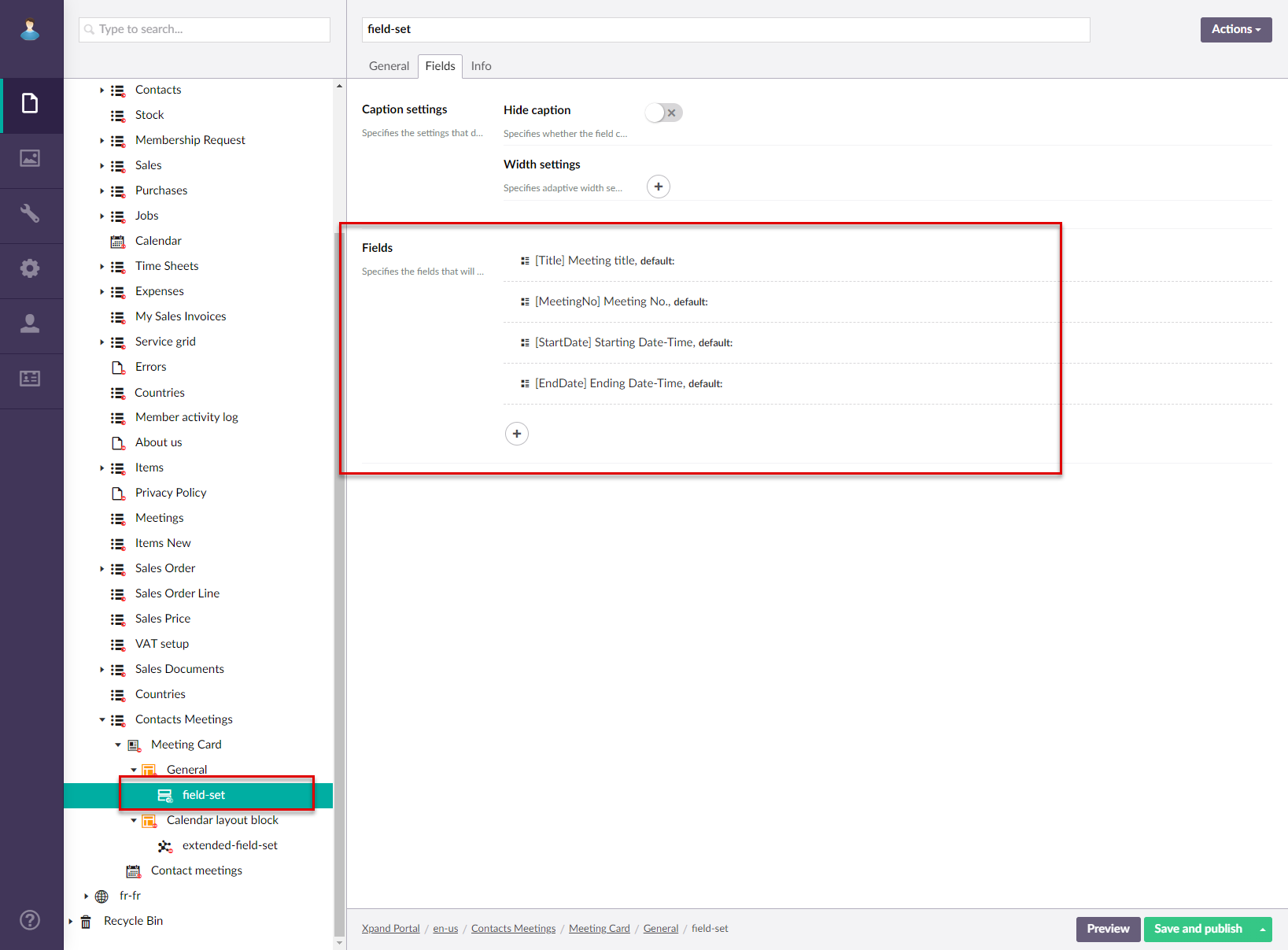
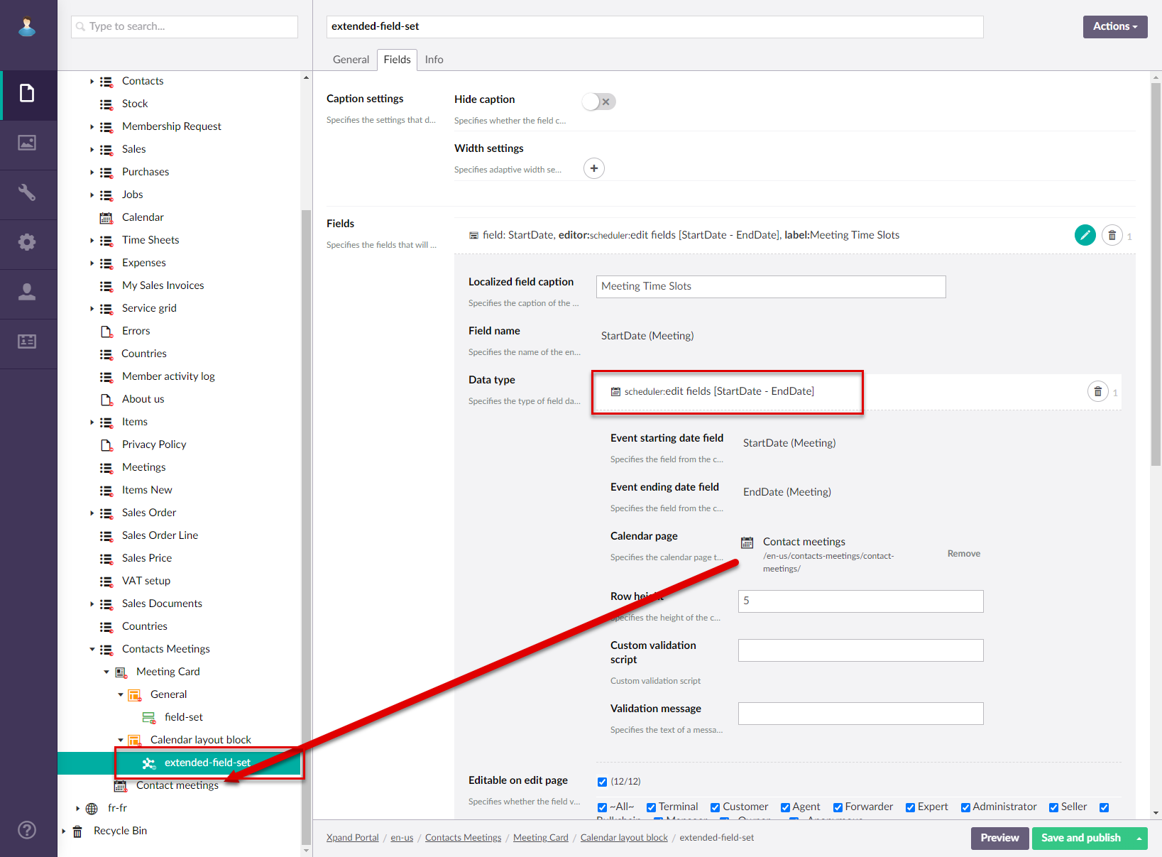
- Open the settings for the extended field set of the detail page where the calendar page will be embedded.
- On the Field tab, under Fields. select the icon to add a new field.
- In the Localized field caption field, type a caption of the embedded calendar that will be displayed above the embedded calendar.
- In the Field Name field. select one of the fields that stores either the starting or ending date-time of events.
NoteFor the calendar embedded into a detail page, you need to embed the calendar into one of the fields that stores either the starting or ending date-time of events. You don't need to add another field to the extended field set in this scenario.
- Set the data type to Extended Calendar Editor and fill in the settings as described below:
- Event starting date field - Specifies the field from the calendar source entity that stores the starting date-time of calendar events.
- Event ending date field - Specifies the field from the calendar source entity that stores the ending date-time of calendar events.
- Calendar page - Specifies the calendar page that will be embedded into the detail page. Select the Add button, and then navigate-to a stand-alone calendar page that will be embedded. Use the calendar page that you created earlier in this procedure.
- Row height - Specifies the decimal value that defines the height of row in the embedded calendar. The bigger this number the more information calendar events will be able ti displayed. However, with with big row height, less rows will be visible at a time, and the member will have to scroll down the calendar. Recommended value: from 10 till 50.
- Custom validation script - Specifies script that will be executed to validate the field value. Using a custom validation script is optional.
- Validation message - Specifies the text of the error message that will be displayed in case the custom validation script fails.
- Select Save and Publish.
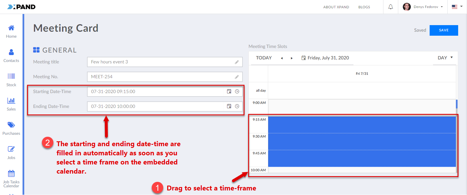
Now you can view the embedded calendar by opening a detail page with the embedded calendar. When you-re creating a new calendar record using the Create command (with this command you edit fields on the detail page), you can fill in the fields with the starting and ending date-time by simply selecting the corresponding time frame on the embedded calendar.
|
If you don't want the embedded calendar page to show existing calendar events when you open the detail page (because you are creating a new event), you can add a filter on the Data Source tab of the stand-alone calendar page that was embedded into the detail page to filter out all records. Although, this depends on your preferences and business needs. |
 Tip
Tip