Adding field sets
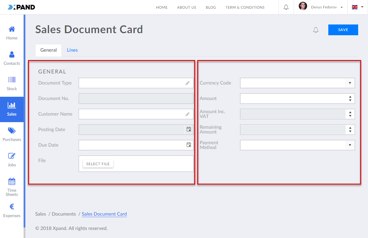
A field set is a collection of fields from a detail page data source that can be added to a detail page within a detail page layout block.
A field set will be displayed in one column. If you want fields to be presented in several columns (useful when you have a lot of fields on the header), you need to create several field sets as child pages to the parent layout block.
To add a field set to a layout block of a detail page
- In the backoffice, go to Content.
- Select the content node, and then, under a
 detail page node, select a
  block for which you want to add a field set.
 - Select the
 icon of the selected node (the icon appears when you point to the node title).
 - Select
 Field set in the Create dialog window that appears.
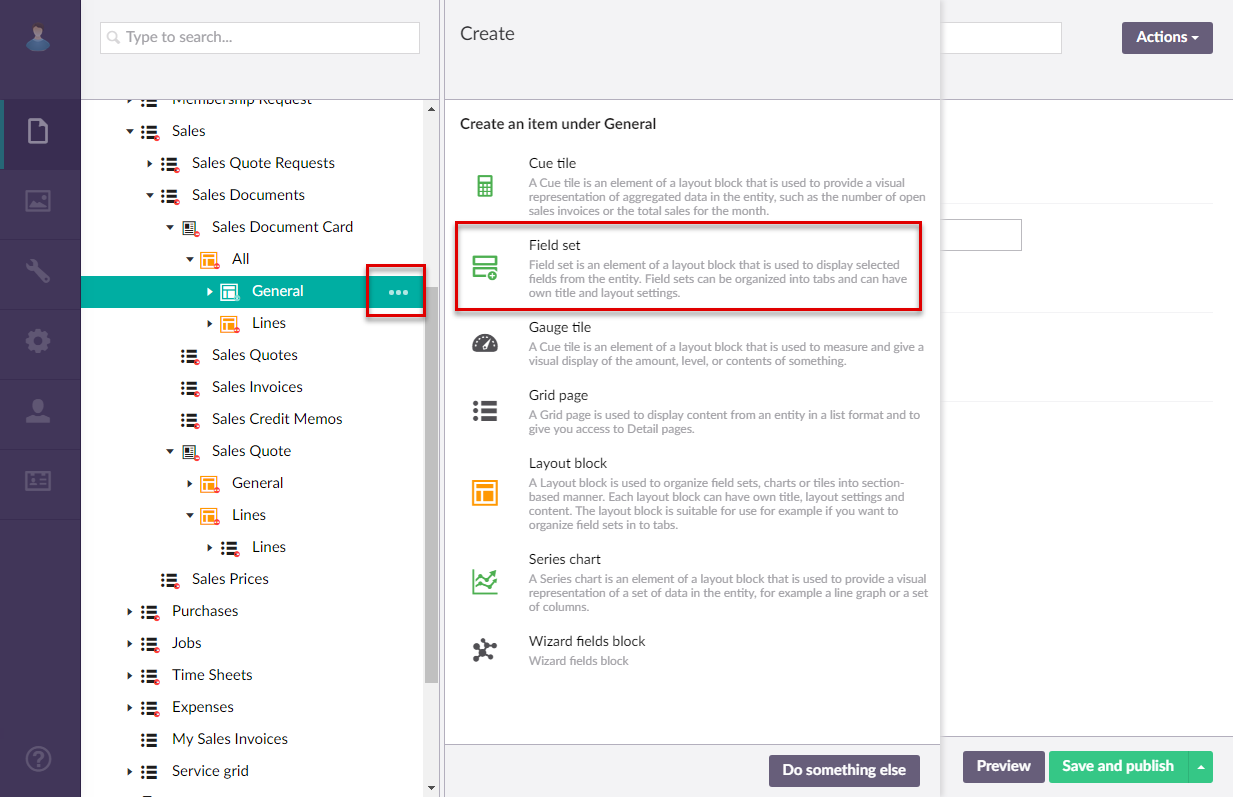
- If you have at least one content template of the field set page type, the created template(s) will be available for selection to use as a basis for the new page. Otherwise, this step is not shown. You can select Blank in case you don't want to use a template.
- On the header, enter the field set name that will be used to identify it in the backoffice. Note that if the layout block view type is set to Tab, this name will be displayed as the tab caption.
- On the General tab, fill in general settings.
- Title - Specifies the title of the field set. For field sets, you can leave this empty.
- Subtitle - Specifies the subtitle of the field set. For field sets, you can leave this empty.
- Icon - Specifies the image that will be displayed in front of the layout block title.
- Width settings - Specifies the adaptive grid width settings for the field set per device. The width is automatically adjusted depending on the device the page is opened from.
- Hide element - This setting hides the field set from the home or detail page. It can be configured per member group. Select one or several member groups, for which this field set will be hidden. Alternatively, you can select the ~All~ check box to hide it for all member groups (without the necessity to select every member group's check box) or select the Hide element check box to have all member groups selected at once.
- Background color - Specifies the color that will be used as background of this field set.
- Background image- Specifies the image that will be displayed in the background of this field set.
- Description - Specifies a description of this field set.
- Navigate-to page - Specifies the portal page that will be displayed when the portal member edits a record on the layout block. For field set within detail pages, filling in this setting is usually not required.
- Content-from page - Specifies the page the content of which will be displayed instead of the content of this page when this page is opened via a direct link. The URL in the address bar will remain that of the original page.
- Redirect-to page - Specifies the page that will be displayed instead of this page when this page is opened via a direct link. The URL in the address bar will be that of the target page.
- On the Fields tab, configure caption settings and which fields from the data source (taken from the parent detail page) will be displayed on this field set.
- Caption settings
- Hide caption - Use this switch to hide field caption from the data set.
- Width settings - Specifies the adaptive grid width settings for the field set per device. The width is automatically adjusted depending on the device the page is opened from.
- Fields - Specifies the fields that will be available on the field set.
Select the icon to add a new field. To change the default position of a field, hold the
  icon and then drop the field in the required position. Use the
  icon to remove a field if necessary or the
  icon to edit an existing field.
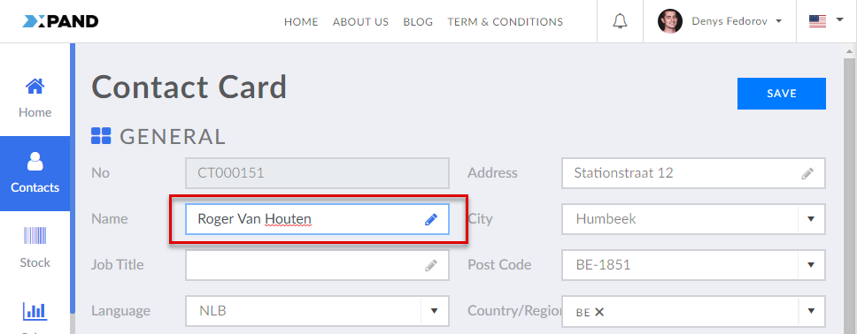
- Caption - Specifies the field caption for this site localization.
- Name - Specifies the name of the field from which data is retrieved. Select an available field from the list. The list of available fields depends on the data source settings configured on the Data source tab of the parent detail page.
- Editable (existing record) - Specifies whether it will be allowed to edit the field value on an existing record and for which member groups.
- Editable (new record) - Specifies whether it will be allowed to edit the field value when creating a new record with this field (using the command that creates a new record and opens the detail page) and for which member groups.
- Data type - Specifies the data type that defines how field value will be edited and displayed. Ensure that the data type corresponds to the data type of the field in the data source, which is specified in Media > Site settings > Entities > [Entity_Name] > Fields > [Field_Name] > Field Settings tab > Type. If you select a data type that is not logically compatible with the original field type, the field value may not be displayed. Also, you may want to choose a different data type in case you want to change the purpose of the field on the portal. You can leave this setting empty to preserve the source data type. Note that there are additional data types, with extended options, which are available only for fields in an extended field set. Select one of the available data types:
- Default (Text) - This data type denotes text string.
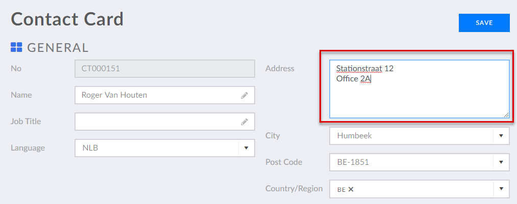
- Multiline - This data type denotes text string with the ability to add multiple lines of text.
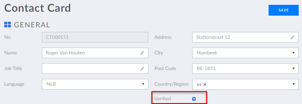
- Boolean - This data type indicates whether the value is true or false. A check box will be shown that can be selected or cleared.
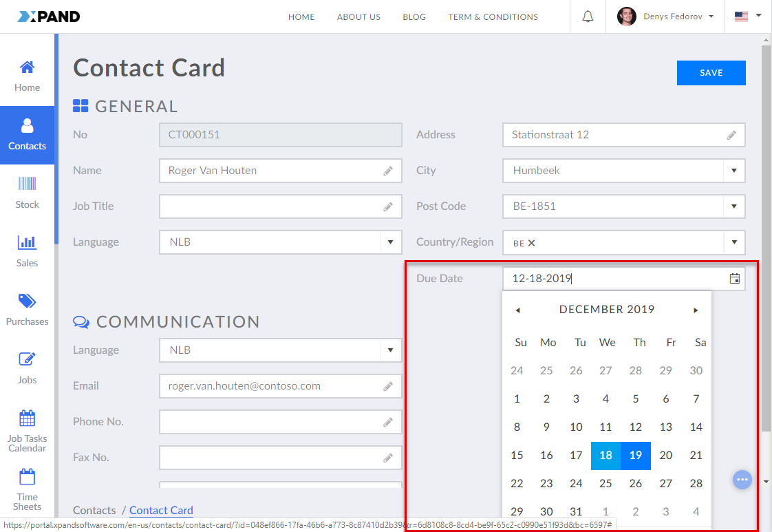
- Date - Denotes a date value. The displayed text format of the date may be determined by other date-related settings. The field will also have a calendar control that the member will be able to use to set a date.
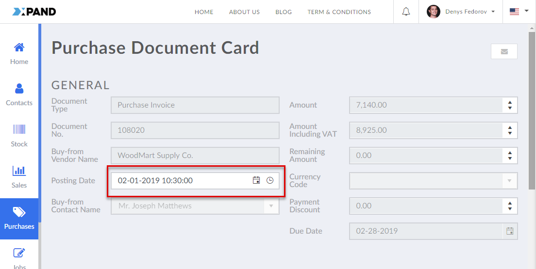
- DateTime - Denotes a date & time value. The field will also have a calendar control that the member will be able to use to set a date as well as a time control to set time.
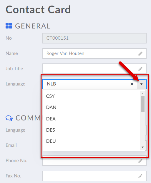
- Option - This data type denotes an option value. The member will be able to use the drop-down list to select an option.
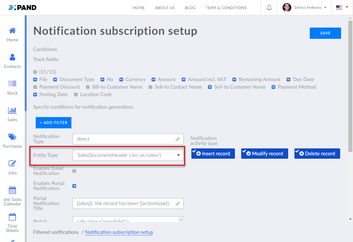
- Entity type (Entity type filter) - This data type denotes a filter by entity type. This data type is used to add a filter by entity type to a notification subscription setup page.
- Hidden - With this data type the field, both the caption and value, will be hidden on the page.
- Multiselection - This data type denotes an option value with the ability to select multiple options.
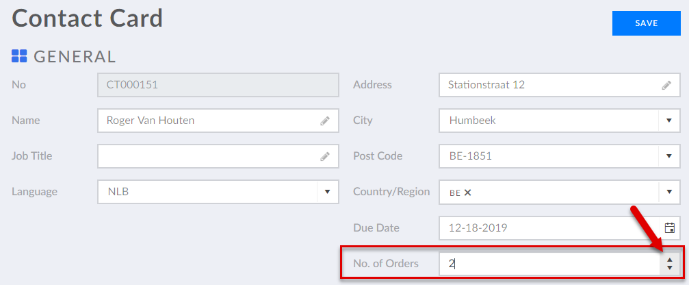
- Numeric - This data type stores numeric values with up to 2 numbers after comma. The field will have a control to increase or decrease the value with step 1.
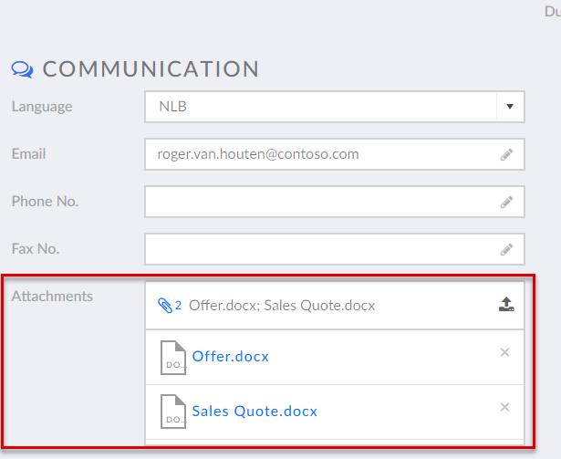
- Upload (Attachment) - This data type denotes a file attachment. This data type is used when you want to use the field to upload, store, and download files. The field will have a control that will allow members upload files. All uploaded files will be displayed in the field value. Members will be able to download files by selecting the file name in the field in the edit mode. Downloaded files can be removed if necessary.
- Entity filter - This data type denotes a filter by entity. At present, this data type is not used for fields in a standard field set.
- Default (Text) - This data type denotes text string.
- Default value (Autofill method) - Specifies the method that defines how the field value is automatically filled in (when a new record with this field is created) or updated:
- Constant value - Use this method to specify a constant value that will be filled in by default.
- Value-from member field name - Use this method to use a value from a member field (a field from the portal member settings) as the default value. You will need to specify a member field the value will be taken from.
- Date value - Use this method if you want the field to be filled in with a date. The date may be calculated according to the specified method. For example, 1 day after the current date, 2 weeks before the current date, etc.
- Value from parent - Use this method to use a value from a parent entity field as the default value. You will need to specify a field from the parent entity if any.
- Value from entity - Use this method to use a value from a field in a chosen entity. You will need to select an entity and its field the value of which will be filled in by default.
- No. series value - With this method, when a new record is created or in case the value is missing when you edit the field, the field is filled in automatically by increasing the previous value with the increment specified in the chosen number series setup.
- No. series code - Specifies the code of the number series setup (in case there are many) to use for this field. Number series settings that you choose here are set up for the field in the entity setting.
- Data query - With this method you can use a query that will retrieve data. You will need to specify a data source query.
- Automated value - With this option, the field value is automatically filled in or updated using one of the filling methods (lookup, aggregate, formula, or conditional) after the value of a related trigger field is changed.
- Title - Specifies the internal title for descriptive purposes only. It helps identify the setting set but is not displayed on the front end.
- Filling method - Specifies the method that defines how this field is filled in, updated, or (re)calculated when the value of a related trigger field is changed. Only one method is allowed:
- Aggregate - The value is a number that is calculated using the sum, average, min, max, or count operation, performed on a set of values or records.
- Trigger fields - Specifies the fields where a change in value will trigger the automatic filling, updating, or (re)calculation of this field value.
- Source entity - Specifies the entity that contains data that will be used for value calculation.
- Filters - Specifies the filter(s) that will be used to limit the records that are used in the field value calculation.
- Aggregation type - Specifies the type of operation that will be performed on a set of records found in the source entity using the specified filter. If you leave this empty, the calculated field value will be the number of found records that meet the specified filters.
- Sum value - Specifies that a sum of all values of a field will be calculated and displayed. You will need to select a field the value of which will be calculated.
- Average value - Specifies that the average of all values of a field will be calculated and displayed. You will need to select a field the value of which will be calculated.
- Max. value - Specifies that the highest value of all values of a field will displayed. You will need to select a field the value of which will be calculated.
- Min. value - Specifies that the lowest value of all values of a field will displayed. You will need to select a field the value of which will be calculated.
- Conditional - The value is filled in or updated with a specified value when the configured condition(s) are met.
- Title - Specifies the internal title for descriptive purposes only. It helps identify the setting set but is not displayed on the front end.
- Trigger fields - Specifies the fields where a change in value will trigger the automatic filling, updating, or (re)calculation of this field value.
- Conditions - Specifies the condition(s) that define how the field will be filled in after the value of a related trigger field is changed.
- Title - Specifies the internal title for descriptive purposes only. It helps identify the setting set but is not displayed on the front end.
- Filters - Specifies the filter(s) that will be used to limit the records that are used in the field value calculation.
- Value - Specifies the value that will be used to fill in or update the field if the filters are met.
- Lookup - The value is retrieved from a field(s) in a related record when the value in the trigger field(s) is changed.
- Title - Specifies the internal title for descriptive purposes only. It helps identify the setting set but is not displayed on the front end.
- Trigger fields - Specifies the fields where a change in value will trigger the automatic filling, updating, or (re)calculation of this field value.
- Source entity - Specifies the entity that contains data that will be used for value calculation.
- Filters - Specifies the filter(s) that will be used to limit the records that are used in the field value calculation.
- Source fields - Specifies the field(s) from the specified source entity the value(s) of which can be looked up to fill in or update this field.
- Lookup sorting - Specifies the field the value of which will be used to sort the found records during lookup. This is used to identify which value(s) to retrieve first when multiple records are found. If this is not configured, the value(s) will be taken from the records that are found first.
- Max. no. of values per field - Specifies the maximum number of values that can be retrieved for each source field in case multiple records are found. Multiple values will be filled in through the comma (,) separator in the order that is defined by the lookup sorting. If this setting is empty, one value is retrieved for each specified source field.
- Formula - The value is calculated using a formula.
- Title - Specifies the internal title for descriptive purposes only. It helps identify the setting set but is not displayed on the front end.
- Trigger fields - Specifies the fields where a change in value will trigger the automatic filling, updating, or (re)calculation of this field value.
- Formula type - Specifies the type of formula that will be used to calculate the field value. Select the edit icon and select one of the formulas. Selecting a formula type is mandatory.
- Formula - Specifies the formula that will be used to calculate the field value. After you select a formula type, this setting is filled in with a template that can be updated. Use field variables for formula values. If you chose the custom formula type, you need to write the formula from scratch.
E.g. [[FieldValueA]] + [[FieldValueB]] where FieldValueA and FieldValueB are the names of the fields the values of which are used in the formula.
- Comment - Specifies a comment about this set of settings.
- Allow autofill on page load - Specifies that the trigger that can automatically fill in or update the field is verified every time the page is opened. If disabled, the field is updated only when the corresponding condition is met.
- Required – Specifies whether having value in this field will be mandatory. If you enable this switch, the member will not be able to leave the field empty when editing value; an error message will be displayed.
- Value validation – Specifies a validation or multiple validations that will be applied to the field value on the grid page or detail card. When the field isn't editable, validations will not be applied. Value validation can also be set up on the entity level. Select the icon and select the type of validation:
- Required - Specifies a validation that verifies whether the field after having been edited contains value.
- Enabled - Specifies whether this validation is turned on. If the validation is disabled, it will not be run when entering a field value.
- Validation message - Specifies the text of an error message that will be displayed if the validation criteria are not fulfilled.
- Field length - Specifies validation that verifies whether the length of the field after having been edited is within the specified length range.
- Enabled - Specifies whether this validation is turned on. If the validation is disabled, it will not be run when entering a field value.
- Validation message - Specifies the text of an error message that will be displayed if the validation criteria are not fulfilled.
- Minimum length - Specifies a numeric value that will be used as the minimum field length value when validating the field.
- Maximum length - Specifies a numeric value that will be used as the maximum field length value when validating the field.
- Regular expression - Specifies a validation that verifies whether the field value after having been edited meets the format defined by a regular expression.
- Enabled - Specifies whether this validation is turned on. If the validation is disabled, it will not be run when entering a field value.
- Validation message - Specifies the text of an error message that will be displayed if the validation criteria are not fulfilled.
- Regular expression - Specifies a regular expression that defines the format that the field value must meet to pass the validation. Refer to this site for help on creating a regular expression. Several examples:
Explanation: Only letters from A to Z letters are valid; case sensitive. Value: [A-Z]
Explanation: The following characters are not allowed: <>\/$. Value: [^<>\/\$]+
- Email - Specifies validation that verifies whether the field value that is email after having been edited meets the predefined criteria of email.
- Enabled - Specifies whether this validation is turned on. If the validation is disabled, it will not be run when entering a field value.
- Validation message - Specifies the text of an error message that will be displayed if the validation criteria are not fulfilled.
- Custom validation - Specifies a client- and/or server-side validation that verifies whether the field value after having been edited fulfils the criteria that are defined in a custom or predefined script/code.
- Enabled - Specifies whether this validation is turned on. If the validation is disabled, it will not be run when entering a field value.
- Validation message - Specifies the text of an error message that will be displayed if the validation criteria are not fulfilled.
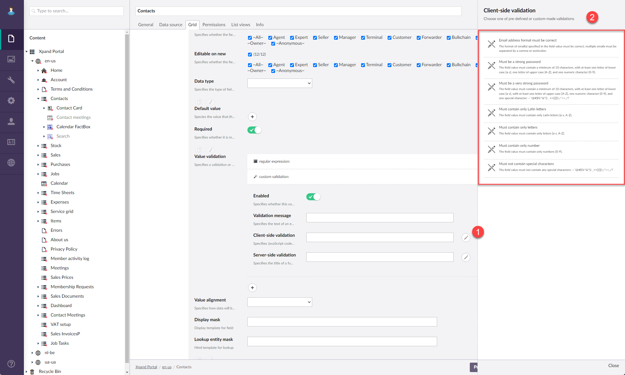
- Client-side validation - Specifies JavaScript code that defines validation criteria that must be fulfilled on the client side after the field value is changed. Select the icon next to the setting to select one of pre-defined or custom-made validations. If you use both client- and server-side validation, they must validate the same. After you select a predefined custom validation, the required settings will be filled in automatically. If you need additional custom validation that would suit your needs, contact the portal development team.
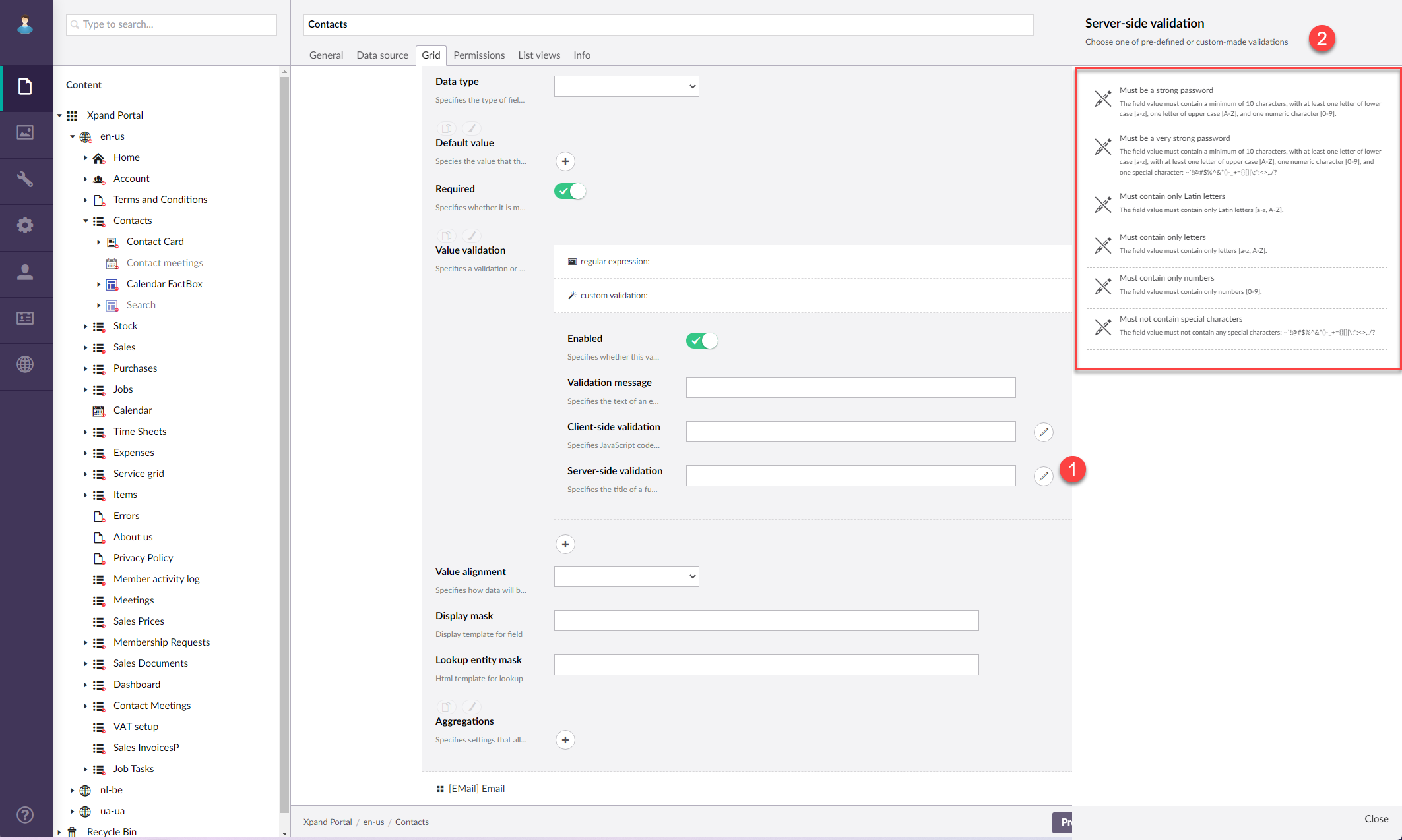
- Server-side validation - Specifies the title of a function in a custom piece of code that defines validation criteria that must be fulfilled on the server side after the field value is changed. Select the icon next to the setting to select one of pre-defined or custom-made validations. Server-side validation may be useful when multiple users are trying to change the same field value. If you use both client- and server-side validation, they must validate the same. After you select a predefined custom validation, the required settings will be filled in automatically. If you need additional custom validation that would suit your needs, contact the portal development team.
- File size/type - Specifies a validation that verifies whether the size of an uploaded file doesn't exceed the maximum allowed size and/or that the file type belongs to the allowed file types.
- Enabled - Specifies whether this validation is turned on. If the validation is disabled, it will not be run when entering a field value.
- Validation message - Specifies the text of an error message that will be displayed if the validation criteria are not fulfilled.
- Maximum file size - Specifies the maximum allowed file size in KB to fulfil the validation criteria.
File type(s) validation message - Specifies the text of an error message that will be displayed if the allowed file type(s) validation criteria are not fulfilled. - File type(s) - Specifies the list of allowed file type(s) to fulfil the validation criteria. Allowed file types must be listed as file extensions and, if more than one, separated by a comma without spaces. Example: .docx,.xlsx,.png
- No. of selected options - Specifies a validation that verifies whether the number of selected options in an extended field with the multiselection or multiple picker data type is within the allowed range of selectable options.
- Enabled - Specifies whether this validation is turned on. If the validation is disabled, it will not be run when entering a field value.
- Validation message - Specifies the text of an error message that will be displayed if the validation criteria are not fulfilled.
- Min. no. of selected options - Specifies the minimum number of options that can be selected in the field to fulfil the criteria.
- Max. no. of selected options - Specifies the maximum number of options that can be selected in the field to fulfil the criteria.
- Google reCAPTCHA - Specifies validation that verifies whether the Google reCAPTCHA test has been passed successfully.
- Enabled - Specifies whether this validation is turned on. If the validation is disabled, it will not be run when entering a field value.
- Validation message - Specifies the text of an error message that will be displayed if the validation criteria are not fulfilled.
- Validation message title - Specifies the title that will be displayed on the validation message.
- Google reCAPTCHA version - Specifies the version of the Google reCAPTCHA that is used for this validation. Select the version for which the site key and secret key were obtained during the reCAPTCHA account registration and which are specified in the site localization additional settings.
- Required - Specifies a validation that verifies whether the field after having been edited contains value.
- Value alignment – Specifies how value in the field as well as field caption will be aligned. Select one of the following options:
- Center – Value will be centered. This type of alignment will be used by default if you leave the setting empty.
- Left – Value will be aligned left.
- Right – Value will be aligned right.
- Data format - Specifies the display format for the field value. This setting is optional. It defines how the value will look like and what additional properties the field value will have.
- Hyperlink - Use this option to turn the field value into a hyperlink that opens an internal or external page.
- Title - Specifies the title of the format expression. This title is only used for back end purposes.
- Internal page - Specifies an internal page that the hyperlink in the field value will lead to.
- External page - Specifies the URL of an external web page that the hyperlink in the field value will lead to.
- URL query & parameters - Specifies the part of a Uniform Resource Locator (URL) that follows the question mark "?" and contains parameters or key-value pairs used to send additional information to a web server. This query may include variables in double square brackets, such as [[fieldname]], which will be replaced with the corresponding value.
- Open link in - Specifies how the link will be opened: in a new window, in a popup window, in the same frame, or in the same window.
- Percent of progress - Use this option when you need the value to display the progress in percentages.
- Show alert - Use this option when the field value is used to show an alert(s). Note: This functionality is under development.
- Fully custom format string - Use this advanced option to format the field data using a fully custom string, which may include plain text, variables, function calls, templates, etc.
- Title - Specifies the title of the format expression. This title is only used for back end purposes.
- Format expression - Specifies expression that defines how data looks like. It may include plain text, variables, function calls, templates, etc. You can select preconfigured format expressions if necessary. For examples of configuration using this setting, see Data format string configuration examples. Use the
 icon next to the setting to insert a predefined common expression.
- Tags - Use this option to provide the ability to add new or existing tags to a record as well as to manage tags that have already been added.
- Title - Specifies the title of the format expression. This title is only used for back end purposes.
- Action icon - Specifies the image that is used as the icon of the action that provides the ability to add new or existing tags to a record. To use the default icon, leave this empty.
- Entity - Specifies the entity where added tags are stored. By default, the PortalTags entity is used, which was designed for this purpose.
- Tag group name - Specifies the name of a tag group, to which tags that are added in this field are assigned. If you leave this empty, the tags added in this field won't have any tag group. The tag group defines which tags are suggested when selecting a tag to add (on any page): only tags from the same tag group and tags without a tag group are suggested.
 Tip
TipYou can use field variables in tag group names to create a complex group, the name of which would be generated using field value(s) from a record where tags are added. For example: [[fieldname1]]-[[fieldname2]] where "fieldname1" and "fieldname2" are the names of fields from the page source entity. This means that a tag is assigned to a tag group with the current values of these two fields and will be suggested only if the same fields in the given entity have the same value on a record where you are trying to add a tag.
- Allow new tags - Specifies that members are allowed to create new tags in this field. If disabled, members can only add existing tags to a record.
- Dialog window settings - Specifies the settings that allow you to configure the dialog window that will be displayed when adding new tags or managing tags that have already been added. When the member uses the action that provides the ability to add new/existing tags or delete tags that have already been added, this dialog window is displayed.
- Title - Specifies the title that will be displayed at the top of the dialog window. Recommended value: Add Tags.
- Height - Specifies the height of the dialog window in pixels. Recommended value: 500.
- Width - Specifies the adaptive width of the dialog window, The width will be automatically adjusted depending on the device the portal is opened on.
- Formatting rules - Use this type to configure conditions that must be met so that specific formatting is applied to the field value.
- Title - Specifies the title of the formatting rule set. This title is only used for back end purposes.
- Format expression - Specifies expression that defines how data looks like. It may include plain text or variables. If you configure this setting, the field value will be replaced with the one that corresponds to this expression.
- Formatting rules - Specifies sets of conditions that must be met so that specific formatting is applied to the field value.
- Title - Specifies the title that is used to identify this setting set in the backoffice.
- Rules - Specifies conditions that must be met so that this page part is displayed or formatting is applied depending on where you are setting this up. These rules are set up in the same way as filters on the Data source tab in the grid or detail page settings.
- Style - Specifies formatting that is applied to the field value if the conditions are met.
- Font color - Specifies font color that is applied to the field value if the conditions are met.
- Background color - Specifies the background color that is applied to the field value if the conditions are met.
- Border color - Specifies the border color of a border that is applied to the field value if the conditions are met.
- Tooltip - Specifies the text of the tooltip that will be displayed when hovering over the tooltip icon in the field if the conditions for this rule set are met.
- Enabled - Specifies that this condition set is active.
 Note
NoteConditional formatting in this case is applied to the field value. You can also set up conditional formatting for other places: detail layout block and grid record (see the settings for the grid page).
- Hyperlink - Use this option to turn the field value into a hyperlink that opens an internal or external page.
- Tooltip text - Specifies a help message which appears when a cursor is positioned over the field caption.
- Width settings - Specifies the adaptive width of the field. The longer the caption the longer the width is recommended. If you do not specify the width, the default width will be used.
- Lookup entity mask – Specifies the template (mask) that defines how field options will look like in the drop-down list with the member selects the AssistButton in the field. You can combine variables in double square brackets (fields from this entity) with text constants. E.g.: Country: [[countryname]] Code: [[code]]
- Caption settings
- Select Save and publish to save the changes and publish them on the front end. Optionally, if you were editing the page, you can select Save and preview to preview how the page will look like on the front end.
- Repeat steps 3 through 9 to add more field sets if necessary.